
It’s crazy to think it’s nearing the end of my undergraduate career. Looking back at my COMM 388 course, I can definitely say it was one of my favourite classes I’ve been in at UBC. Here are some of my key takeaways.
Design Method: Experience Map
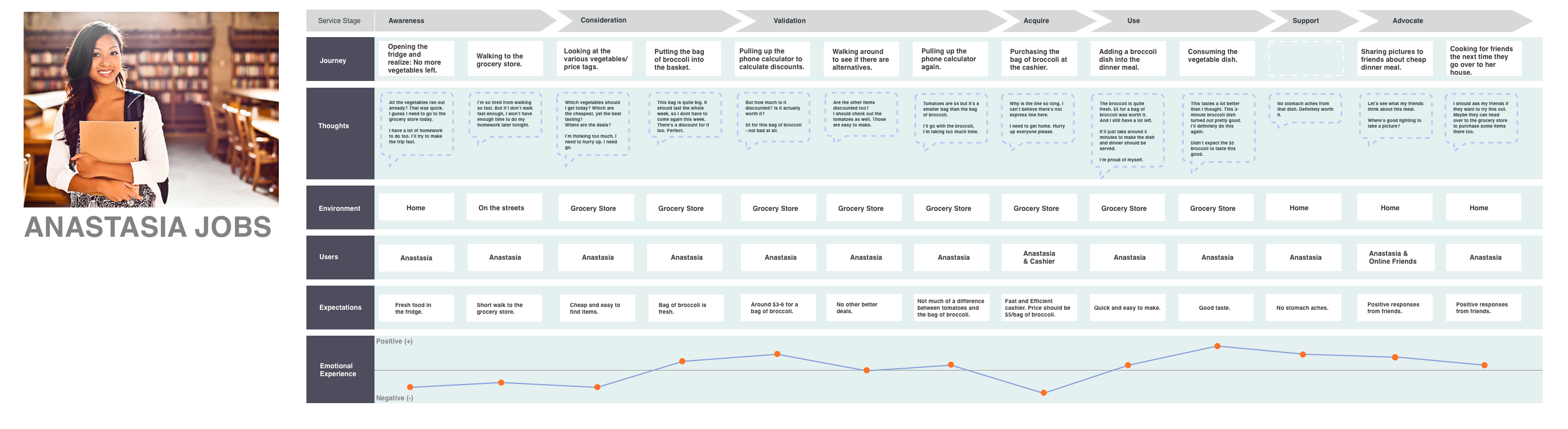
As a User Experience Designer, I can say that some of the design methods that were shared with the class were familiar to me. That being said, I was really excited when I got to see them. An example would be the Experience Map. I realized through the practice of creating experience maps in class that there are many ways to going about this. On a side project I’ve working on (shown below) is an Experience Map for Anastasia Jobs who goes on a grocery-shopping trip. Through the explanation of what an experience map during class, it showed me the bigger picture of why an experience map is necessary. Through this design method, I realized that it really identifies all the pain points that need to be solved.
Video: Innovation Lifecycle
My favourite video throughout this course was definitely Innovation Lifecycle by Thomson Reuters. I found it very interesting to see so many people involved within a project. As a UX Designer, it really resonates with my role; as I get to work with software developers, project managers, clients, etc. Not only that, part of my job consists of constant iterations and improvements. Similar to the video, it goes back to the user, where they provide feedback on if the “pill” works or not.
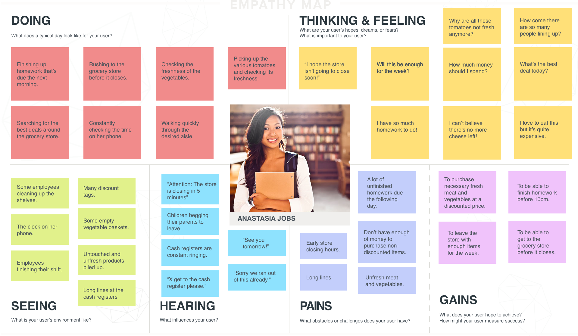
Design Method: Empathy Map
To be honest, I didn’t know the purpose of this even after having done it before this class. My example is shown below. Luckily, after constant practice in class and hearing different groups apply the empathy map to their projects, its purpose finally became clear to me: to focus and understand users.
A little something I’ve learned:
In order for many products or services to be successful, they need to be user-focused. In order to be user-focused, one needs to know the user. After knowing the user, the product must be built for the user. And finally, after building the product/services for the user, the users will automatically come.
At first, I didn’t know what to expect from this course. I mainly took the course because the title “design” got me interested. I wouldn’t say this course changed my thinking process, but it definitely strengthened how I like to think. Even during the course, I would continuously search for “bad designs,” and think of ways to improve them. Or even good designs, and think about how they’re good. An example would be the layout of the Rose Garden, the pattern of it encourages those who walk by to take a photo (like me) or just be amazed by its details.

I can definitely say this course helped a lot with my future career as I’m trying to make my way into UX career path. It’s definitely hard to explain what “design” is. However, I can now go on for hours of what design actually means, without being unsure what it actually means.
When I was younger, I definitely thought design as just colour and shapes, and many people still think that. They say how simple design is, but when they actually dive deep into the different steps and techniques, they realize how much researching, thinking, and implementing actually goes into one single design.
Design. It’s not just colours and shapes.
Cheers,
A.