Monthly Archives: October 2014

A Creative Friday Morning

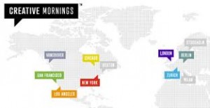
Today I attended CreativeMornings, a monthly gathering of creative professionals who assemble at SFU Woodwards to listen to a guest speaker, while enjoying a free breakfast and coffee.

creative mornings

The speaker at today’s event was Ryan Opina, VP of User Experience at Engine Digital. Interestingly, before the event started I didn’t know that Opina was the speaker, or that the lecture would be related to digital marketing. A friend had given me wrong information about the event, so I was pleasantly surprised when the actual topic of conversation was revealed.

Opina talked about how he came to work in digital marketing, a field he wouldn’t have predicted he would end up in after finishing a degree in Human Factors. His lecture was very interesting and engaging, and I thought that it really tied in to what we’ve been learning about in COMM 464, particularly with respect to user experience and usability design. Opina spoke about how his work looks at human behaviour and psychology, and tries to anticipate what the user will need in order to maximize their enjoyment of a website or app. He also talked about how consumer behaviour plays a huge part in the gaming industry, where the goal is to turn players into “whales.”

Having just taken a consumer behaviour class, many of the concepts that Opina spoke about were familiar and still fresh in my mind. What was interesting for me, was hearing Opina talk about how these concepts are applied in the digital realm. He spoke about online men’s fashions retailer Frank & Oat, and how it credits a small portion of each purchase back into the shoppers account, so they always have a store credit to apply to their next purchase. I thought this was a great example of an effective loyalty program for online shoppers.

Overall, I really enjoyed Opina’s lecture, and the way that it re-emphasized, for me, the connection between consumer behaviour and digital marketing.
Facebook plus Instagram works wonders for #GLApacked campaign

I was drawn to the Mercedes Benz #GLApacked campaign by an article in AdWeek titled Mercedes Generated 54% More Traffic by Running Ads on 2 Major Social Sites. The gist of the article is that this summer, Mercedes ran a branding campaign across Facebook and Instagram simultaneously, then used a direct response Facebook ad campaign to drive traffic to it’s website. Mercedes claims that it’s the first brand to simultaneously run Instagram & Facebook promos, and based on these results, it likely won’t be the last.

Screen Shot 2014-10-02 at 11.53.28 AM

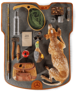
I have to admit that while I’m not drawn to Mercedes as a brand that I would be interested in buying, I really love the #GLApacked campaign. Basically, what Mercedes did is ask a bunch of influencers to take artsy photos of the items that they would pack for a vacation, on a 54″ by 45″ GLA trunk mat. While the layouts submitted weren’t exactly realistic, they were cute and creative, and I admit that I spent way too much time looking through them.

GLA 2gla with dog

According to Mercedes, this campaign was intended to capture a younger generation of car buyers, and I think it’s succeeded. By offering the campaign across several social media outlets, Mercedes provided ample opportunity for users to submit content, and to share content that they liked. The campaign’s focus on packing the items for “your ideal road trip” allowed users to submit an image that really showed off their individual style – something that definitely appeals to millennials. Overall, I think this campaign was very effective at integrating Facebook and Instagram, as well as Twitter and Mercedes Benz’ #GLApacked website.


Simple, beautiful, and ad free…

I requested an invite on ello.co a couple of weeks ago primarily out of curiosity, after hearing all the buzz about the new “anti-Facebook.” Of course, Ello was too overloaded with invite requests to send one to me, but fortunately a friend invited me so I didn’t have to wait. I signed up this morning and spent some time looking around and trying to figure out what Ello is all about.

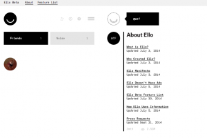
Screen Shot 2014-10-01 at 11.50.11 AM

The first thing I noticed is how incredibly simple the Ello website is.  Where’s all the stuff? There is no bright blue text, massive photos, or endless requests for farm animals and candy crush lives. The few icons that do exist are small, simple, and black and white.  I found myself confused by the amount of white space – something I’m obviously not used to seeing online. Ello is so simple, I found it difficult to use.

Once I got the general layout and functions figured out, I spent some time checking out which profiles to follow. There are lots of creative people on Ello, so there is a surprising amount of interesting content to sift through. That said, the absence of people I know, coupled with how difficult it would be to find such people (you can currently search only by username) makes it unlikely that I’ll spend a lot of time on Ello in the near future.

And for these reasons — lack of members and lack of a familiar user interface — I’m not convinced that Ello is the next Facebook. But, I do think that Ello is on the right track. Everyone I know is dissatisfied with Facebook’s increasingly intrusive use of personal information, and is sick of the constant stream of ads. I’m glad that Ello is challenging the Facebook model, even if it’s just for the time being. I’m definitely curious to see what comes of it.