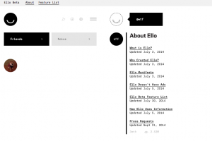
I requested an invite on ello.co a couple of weeks ago primarily out of curiosity, after hearing all the buzz about the new “anti-Facebook.” Of course, Ello was too overloaded with invite requests to send one to me, but fortunately a friend invited me so I didn’t have to wait. I signed up this morning and spent some time looking around and trying to figure out what Ello is all about.

The first thing I noticed is how incredibly simple the Ello website is. Where’s all the stuff? There is no bright blue text, massive photos, or endless requests for farm animals and candy crush lives. The few icons that do exist are small, simple, and black and white. I found myself confused by the amount of white space – something I’m obviously not used to seeing online. Ello is so simple, I found it difficult to use.
Once I got the general layout and functions figured out, I spent some time checking out which profiles to follow. There are lots of creative people on Ello, so there is a surprising amount of interesting content to sift through. That said, the absence of people I know, coupled with how difficult it would be to find such people (you can currently search only by username) makes it unlikely that I’ll spend a lot of time on Ello in the near future.
And for these reasons — lack of members and lack of a familiar user interface — I’m not convinced that Ello is the next Facebook. But, I do think that Ello is on the right track. Everyone I know is dissatisfied with Facebook’s increasingly intrusive use of personal information, and is sick of the constant stream of ads. I’m glad that Ello is challenging the Facebook model, even if it’s just for the time being. I’m definitely curious to see what comes of it.