Author Archives: DraganaMilisic

Snapchat Launches Snapcash

Screen Shot 2014-11-18 at 9.58.33 AM

Through a partnership with peer-to-peer payment provider Square, Snapchat will soon be offering U.S. Snapchatters over the age of 18 the opportunity to send friends an e-transfer by way of private message. Once the Snapchatter has set up an account linked to his/her debit card, the transfer process will be as easy as sending a regular Snapchat.

The biggest issue with Snapcash seems to be concerns over security. Given that Snapchat had a massive security breach in January 2014 that caused over 4.6 million usernames and passwords to be published online, the idea of handing over banking info is one that some Snapchatters will no doubt be weary of. And for good reason. Snapchat is obviously in tune to this, however, as it makes it abundantly clear that all banking info will be handled solely by Square Cash – which has a much better reputation for properly managing confidential info.

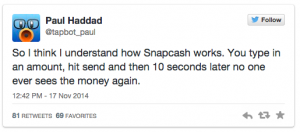
Another issue with Snapchat, although more comical in nature than anything, is that Snapchat’s entire platform is based on messages that disappear after a few seconds. (Or not, per “the Snappening” of October 2014) So what does this mean for your cash transfer? A funny interpretation was posted in this Mashable article:

Screen Shot 2014-11-18 at 10.01.46 AM

Hilarity aside, the success or failure of Snapcash will definitely have implications for Snapchat overall, as this is clearly a major step towards offering ads and possibly a “purchase now” feature similar to what Twitter has been experimenting with.

The Modern Approach to Embracing Negative Feedback

Screen Shot 2014-11-18 at 7.37.45 AM

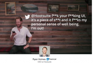
What do Hootsuite and Dominoes have in common? Apparently, a common approach to using negative consumer feedback to discover opportunities for change and improvement. This article on LinkedIn was posted four days ago by Ryan Holmes, and is titled “Your product is a piece of sh#t: How my company responded to this.”  The article discusses how Hootsuite took inspiration from Domino’s response to a bad PR incident, in which Domino’s asked its consumers for feedback, then published the feedback (both good and bad) before using it to make changes to its product. The campaign was a huge success, with Domino’s now doing better than ever. Hootsuite took the same approach when it came time to redesign the Hootsuite dashboard, and reports that users have been happy with its open and transparent approach to the project.

Screen Shot 2014-11-18 at 7.39.57 AM

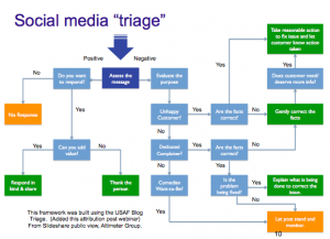
This reminded me of the the social media triage discussion we had early in the semester, where we learned how to assess and respond to positive and negative comments posted about our client company on Facebook. What I think we can learn from both Domino’s and Hootsuite is that in dealing with negative comments, it’s not enough to simply “let post stand and monitor” in the long term, because there may be valuable information in these negative posts. And as is noted in the article, using pre-existing customer feedback from social media is much cheaper than doing market research in the form of focus groups. The big takeaway for me from this article is that monitoring is not enough; negative feedback should be viewed as an opportunity for improvement.


Slate Cosmetics to Feature YOU As It’s Next Model

While I’m fully aware of the fact that one of my recent blog posts was about Sephora, I came across an AdAge article about another cosmetics company that I thought warranted discussing. The article is all about New York-based Slate Cosmetics, which will be the first cosmetics company to launch entirely digitally. The cosmetics won’t be sold at any brick-and-mortar retailers, at least initially, which is quite interesting given that consumers often will want to try new products before they might be convinced to switch over from tried-and-tested favourites.

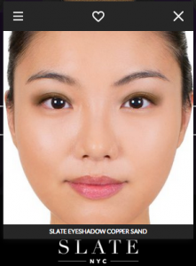
To overcome this potential problem, Slate is using Looking Glass technology developed by Modiface, which allows the user to upload an image of their face, and experiment with different shades of makeup to find what suits them best.

Screen Shot 2014-11-16 at 1.22.42 PM

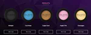
The brand officially soft launched in early November, and isn’t even selling it’s products yet, so it’s a bit too soon to tell how successful it will be. That said, I think the very limited product offering, seen below, is telling of the extend to which the brand is willing to invest in this test launch.

Screen Shot 2014-11-16 at 1.17.12 PM


My opinion on this is that it’s not going to work out well unless the company offers a no questions asked return policy. Even as a frequent online beauty product shopper, I would be highly hesitant to switch over to a brand new product line without some of sort of sampling first. Of course, the Modiface technology is intended to replace this sampling process, but for me, this is not enough.

All in all, this one is just not for me.

Election App Boosts Voter Engagement

In recent weeks, it’s been nearly impossible to drive through the city and not notice the election signage distributed throughout most residential neighbourhoods. I was particularly interested in what the voter turnout would be this year, given that low voter turnout in past elections was a hot topic of conversation.

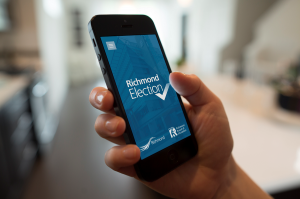
For that reason, I was drawn to an article in Vancity buzz about an app created by the City of Richmond, that provides potential voters with a one-stop-shop for all of their election info needs. The app allows the user to find information about their designated voting place, and more importantly, provides access to candidate profiles.

richmond election


This sort of app appeals to me personally, because I’ve found that it can be very difficult to make an educated decision when it comes to voting, because so much of the messaging that’s out there is one-sided. Putting everything into a quick and easy-to-access digital format effectively eliminates the search for information, which I think would make people more likely to vote.

As for the result, Richmond did see an increase in voter turnout this year, at 32.4 per cent, compared to 23.4 per cent in 2011. While it’s unclear how much of that boost can be attributed directly to the app, it certainly couldn’t have hurt.

The trend towards (reverse) showrooming

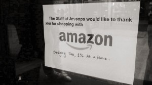
As evidenced by this sign posted in a window at British camera retailer, Jessops, showrooming is a phenomenon that has had a significant impact on many brick-and-mortar retailers. And as creative as these retailers can get with their customer service offering, at the end of the day, it is difficult to convince shoppers that they should pay more money than they absolutely need to.

Jessops

As a self-confessed showroomer, I can totally relate to the thrill of getting a great item at a low price. And, for certain high-markup products such as clothing, the savings benefit of going online can be huge. There’s no need to explain how important this is when you’re on a tight budget.

For this reason, I was surprised by an article in Business Insider that discusses the emerging trend of reverse showrooming, or webrooming, where the customer researches a product online but actually buys the product in a brick-and-mortar shop. The article goes on to claim that webrooming is even more prominent than showrooming – with 69% of American’s webrooming, and only 49% showrooming.

After reading the article, I realized that I’m also guilty of webrooming, mostly for items that I know little about. For instance, if I’m trying to buy the latest video game as a holiday gift, I do my research online, but will typically buy the game in-store because I like being able to see what it looks like before I buy it.

Connecting this back to the Jessop’s window sign, while brick-and-mortar retailers might be losing out to cheaper online retailers, webrooming creates the possibility to take back some of this business. I think there is definitely the opportunity to do this with with small electronic goods, such as cameras, that seem to come in an endless variety of choices, but look almost identical to the untrained eye. Hopefully Jessops can find a way to take advantage of webrooming customers such as myself, to offset sales lost to online retailers.

How Sephora pulls me through the conversion funnel

Screen Shot 2014-11-16 at 11.38.37 PM

Sephora is one company that truly understands how online consumers shop, and what is needed to take the consumer from brand awareness, through the conversion funnel to purchase, experience, and recommend. Here’s why Sephora will always have a share of my beauty product spending…

But first, a bit of backstory: I’ve followed Sephora since before it existed in Canada, when an in-store Sephora experience was a novelty reserved for trips down to Seattle. At that time, there was nothing similar to Sephora in Canada (or Vancouver, at least) which in explains the buzz generated when Sephora announced it was finally going to open a store in Vancouver. As part of the group of consumers that was excited about Sephora coming to Canada, you’d think that I would become a regular in-store shopper, right? Wrong. More of my Sephora purchases are done online than in-store, and I tend to spend more money when I shop online. So what is Sephora.com doing that has me hooked?

First of all, Sephora understands that beauty product purchases usually are not made on a whim; it takes time, and sometimes even research, to decide what to buy. To account for this, items that are added to the shopping cart remain there – even if it takes days to come back to it. Anyone that has ever spent time creating the perfect “shopping cart” only to have it all lost due to inactivity can relate to how important this is.

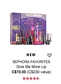
Secondly, the Sephora online shopping experience is superior in that hundreds of additional products can be found online, including bundled, limited time, products that offer exceptional value, such as this:

Screen Shot 2014-11-16 at 11.23.52 PM

Third, Sephora offers a way for customers to make a “favourites” list, and share it with friends who might be into similar products. This is a great way to turn a solo online shopping experience into a social experience. And from a business perspective, increased consumer engagement is always a good thing.

Screen Shot 2014-11-16 at 1.50.24 PM

And most importantly, given the individual nature of beauty products, the return policy is simply amazing.

All of these factors together make Sephora a “best in class” online retailer from my perspective. And the result: a repeat buyer that’s sure to sing the praises of the brand to anyone who’ll listen. This is the online conversion funnel at it’s best.

A Creative Friday Morning

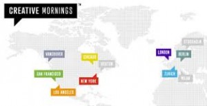
Today I attended CreativeMornings, a monthly gathering of creative professionals who assemble at SFU Woodwards to listen to a guest speaker, while enjoying a free breakfast and coffee.

creative mornings

The speaker at today’s event was Ryan Opina, VP of User Experience at Engine Digital. Interestingly, before the event started I didn’t know that Opina was the speaker, or that the lecture would be related to digital marketing. A friend had given me wrong information about the event, so I was pleasantly surprised when the actual topic of conversation was revealed.

Opina talked about how he came to work in digital marketing, a field he wouldn’t have predicted he would end up in after finishing a degree in Human Factors. His lecture was very interesting and engaging, and I thought that it really tied in to what we’ve been learning about in COMM 464, particularly with respect to user experience and usability design. Opina spoke about how his work looks at human behaviour and psychology, and tries to anticipate what the user will need in order to maximize their enjoyment of a website or app. He also talked about how consumer behaviour plays a huge part in the gaming industry, where the goal is to turn players into “whales.”

Having just taken a consumer behaviour class, many of the concepts that Opina spoke about were familiar and still fresh in my mind. What was interesting for me, was hearing Opina talk about how these concepts are applied in the digital realm. He spoke about online men’s fashions retailer Frank & Oat, and how it credits a small portion of each purchase back into the shoppers account, so they always have a store credit to apply to their next purchase. I thought this was a great example of an effective loyalty program for online shoppers.

Overall, I really enjoyed Opina’s lecture, and the way that it re-emphasized, for me, the connection between consumer behaviour and digital marketing.

Facebook plus Instagram works wonders for #GLApacked campaign

I was drawn to the Mercedes Benz #GLApacked campaign by an article in AdWeek titled Mercedes Generated 54% More Traffic by Running Ads on 2 Major Social Sites. The gist of the article is that this summer, Mercedes ran a branding campaign across Facebook and Instagram simultaneously, then used a direct response Facebook ad campaign to drive traffic to it’s website. Mercedes claims that it’s the first brand to simultaneously run Instagram & Facebook promos, and based on these results, it likely won’t be the last.

Screen Shot 2014-10-02 at 11.53.28 AM

I have to admit that while I’m not drawn to Mercedes as a brand that I would be interested in buying, I really love the #GLApacked campaign. Basically, what Mercedes did is ask a bunch of influencers to take artsy photos of the items that they would pack for a vacation, on a 54″ by 45″ GLA trunk mat. While the layouts submitted weren’t exactly realistic, they were cute and creative, and I admit that I spent way too much time looking through them.

GLA 2gla with dog

According to Mercedes, this campaign was intended to capture a younger generation of car buyers, and I think it’s succeeded. By offering the campaign across several social media outlets, Mercedes provided ample opportunity for users to submit content, and to share content that they liked. The campaign’s focus on packing the items for “your ideal road trip” allowed users to submit an image that really showed off their individual style – something that definitely appeals to millennials. Overall, I think this campaign was very effective at integrating Facebook and Instagram, as well as Twitter and Mercedes Benz’ #GLApacked website.


Simple, beautiful, and ad free…

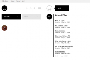
I requested an invite on ello.co a couple of weeks ago primarily out of curiosity, after hearing all the buzz about the new “anti-Facebook.” Of course, Ello was too overloaded with invite requests to send one to me, but fortunately a friend invited me so I didn’t have to wait. I signed up this morning and spent some time looking around and trying to figure out what Ello is all about.

Screen Shot 2014-10-01 at 11.50.11 AM

The first thing I noticed is how incredibly simple the Ello website is.  Where’s all the stuff? There is no bright blue text, massive photos, or endless requests for farm animals and candy crush lives. The few icons that do exist are small, simple, and black and white.  I found myself confused by the amount of white space – something I’m obviously not used to seeing online. Ello is so simple, I found it difficult to use.

Once I got the general layout and functions figured out, I spent some time checking out which profiles to follow. There are lots of creative people on Ello, so there is a surprising amount of interesting content to sift through. That said, the absence of people I know, coupled with how difficult it would be to find such people (you can currently search only by username) makes it unlikely that I’ll spend a lot of time on Ello in the near future.

And for these reasons — lack of members and lack of a familiar user interface — I’m not convinced that Ello is the next Facebook. But, I do think that Ello is on the right track. Everyone I know is dissatisfied with Facebook’s increasingly intrusive use of personal information, and is sick of the constant stream of ads. I’m glad that Ello is challenging the Facebook model, even if it’s just for the time being. I’m definitely curious to see what comes of it.

Marriott can ‘teleport’ you to Hawaii or London

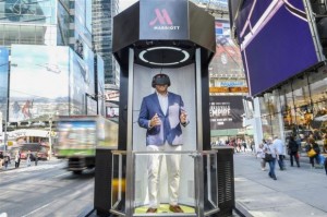
A recent article published by AdAge discusses the latest addition to Marriott’s “Travel Brilliantly” marketing campaign: a ‘teleporter’ that uses virtual reality to transport consumers to locations such as a sandy beach in Hawaii, or the top of one of London’s highest buildings. The teleporter relies on technology by Oculus Rift and 3-D, 360 live action video by VFX studio Framestore (of Gravity fame), and can even simulate the mist and wind that would be felt atop of London’s Tower 42. The teleporters will be touring through nine U.S. cities including New York and San Francisco, September through November.

Teleporter in use in NYC

Teleporter in use in NYC

At a time when achieving meaningful consumer engagement is becoming increasingly difficult, Marriott’s teleporters create a new and unexpected way for consumers to interact with the brand. I imagine that this must be especially difficult for hotels, which for much time have had to rely on website photos and 360-degree videos (which can be surprisingly inaccurate, from my experience) to attract customers. I can see virtual reality technology playing a large role in the travel and hospitality industry in the future, especially for purchases where consumer experience is hard to explain, but is a major selling point.

Equally as impressive as Marriott’s teleporter is the amount of earned media attention that Marriott has received since the campaign was announced on September 18th, on numerous news websites, marketing blogs, and of course, social media.

But, the big question that I have about the campaign is, how will Marriott convert this virtual reality marketing into hotel stays? Sure, the Marriott teleporters might make the consumer want to go to London or Hawaii… but will they choose to stay at a Marriott? I’m not convinced that the connection is strong enough to actually increase room sales – and I assume that this is, in part, an objective for this campaign.