“Technology is neither good, nor is it bad, nor is it neutral” – Melvin Cransberg
Episode 60 – Leading Lines: The future of digital literacies.
The future of nursing? This fear, of being replaced by robots, has been around for many years in the field. It is also a common theme in future themed science fiction. Now, this reality may be approaching.
The Task
I have to admit, I had a really, really hard time with this task. It requires a level of creativity that I just do not have available to me at this time.
I went through several prompts until I could find one that I thought I could work with.
Describe or narrate a scenario about an artwork found a few years into a future in which order is deliberately coordinated or imposed. Your description should address issues related to the court system and elicit feelings of awkwardness.
The museum was quiet as two men in crisp, tailored suits stood amid the large marble halls. The first man looked around and contemplated the various pieces of art on the walls. His eyes skimmed a blank space and he frowned.
“What is that blank space on the wall?” He turned to his friend in confusion, watching as the other man turned to observe the space with a disinterested hum.
“I think there was a painting there a few years ago.” The man stated in a bored manner as he looked at the obvious blank space on the otherwise packed, but orderly wall. There was even a space where the plaque would have gone, removed from sight, “They haven’t gotten around to replacing it yet. Funds.”
“What? What was wrong with the painting? Was it offensive?” The first man questioned. The second man fixed the lapels of his pristine suit and shrugged half-heartedly.
“I think it was an abstract.” He replied, eyes scanning the space absently. “It was there before the ruling came down from the Supreme Court of Canada about abstract art.”
“What’s wrong with abstract art?”
“It goes against the law of orderliness.” The second man explained, his tone becoming didactic, like a professor in a classroom. “The law states that every piece of art has to contribute to the greater good…a past leader, for example, and has to elicit a feeling of happiness or satisfaction towards the government. An abstract painting, particularly one with disparaging colours like red or blue is against this law. Hence, it was probably taken down. Nothing to be done I suppose. It was against the law”.
The curator approached the pair; a dour looking man with a pair of spectacles around his neck on a loose chain. He came to a stop next to them and stared up at the blank space; almost unseeingly. The two men looked to him in confusion as he began speaking unprompted.
“The painting was about questioning the establishment and thinking critically about what you are seeing. It wasn’t unhappy or seditious at all, and yet when the Supreme Court decides…” The man eyed the two knowingly, before his gaze shot back to the blank space. “…It must be carried through, hm?”
“I mean, we can’t have anything out of place, making us question the order of things and causing confusion for the masses. Especially art.” The curator took on an air of sad thoughtfulness, and said “what is the purpose of art, after all? Is it not there as an expression of thought or emotion?”
“How does one single entity decide on what is art and what is acceptable, after all?” He expressed passionately, gesturing wildly around him at the museum walls with their orderly paintings and statues of Prime Ministers, Heads of State and War Heroes.
The two men looked at each other and then at the gesturing man and decided to quickly take their leave. Being not inclined to debate Supreme Court law with this strange little man who was not part of their rule-bound, orderly world.
I chose to curate this list of links to other’s works in one page, rather than separate posts. I’m not sure whether this is good or poor, but this is the way I structure things in my brain.
I chose Amy’s page as this is one of the tasks that I didn’t complete, though I was very interested in the topic of the task, that of language shaping the way we think.
I resonated with what she was saying in terms of language and gender – some languages, such as French and German, use gender to identify objects in the sentence, and her post really made me think about this phenomenon. I grew up in Montreal, and (used to) speak French fairly fluently. I hadn’t thought about the use of gender in language in many years, and this post brought back my questions about why the choice of gender was assigned to various objects. For example, in French, why is a beach feminine (la plage) and a city centre masculine (le centre-ville)? As an animist (someone who believes that all things have a spirit, including inanimate objects), this resonates with me as I hadn’t thought about this use of language for a very long time.
Amy used WordPress to publish her blog, which is a free (for UBC students) and easy to use platform for blog posts. Is this platform identified as feminine or masculine in French? I don’t know. 🙂
I also used WordPress, for the same reasons, and found her site easy to use to find what I wanted to – her menu is clear, and it is easy to find the task I was looking for as navigation is direct and well laid out. One thing I do find difficult with WordPress formatting is that the text comes out as one long scrolling text, which can be intimidating for someone who has lower English literacy. I like the way she interspersed quotations to break up the long paragraphs, as otherwise, it can be visually discouraging.
I enjoyed the description of her personal experiences with language and how they impact her teaching including her musings on her own pedagogy when teaching social studies. Ultimately, we try to teach critical thinking in our subjects, and viewing subject matter from various perspectives is part of that process. She makes an intriguing point about the use of gender being embedded in a language in this way, and how this will be impacted in societies where the identification of gender is becoming more fluid.
I chose Petro’s Voice to Text task because it was quite different from mine, though similar in some ways as well. As I did, he discovered that written speech is more easily understood from others perspectives. He notes that if this was a written, rather than verbal text, he could take the time to better craft the story, with proper punctuation and grammar conventions. I really like the way he notes that he doesn’t “have a dictionary” in his mind as he’s writing. He concludes that he did get his story across, though the execution left much to be desired.
The format used is Padlet, which is a little more visually appealing to me. The navigation is similar to WordPress, though the layout seems simpler and less intimidating to look at from an accessibility point of view. I also like that the comments section is very visually different from the main blog, and has a nice background graphic that, again, makes it more visually appealing. I also liked that the initial page you land on is a distinct home page with some info about him.
While he did discuss his post in terms of the course material, he didn’t clearly link it to pedagogy. Some of this can be implied in that he speaks of the difficulty of presenting things orally vs written formats and he is an ESL teacher. One conclusion that could be made from this post is that he thinks very carefully about how he is presenting language in both oral and written formats.
I enjoyed reading this post as it is very personable and easy to read, having a more conversational tone than formal academic posting.
I really connected with Lubna’s post. While I did a rap, her aural presentation of her bag objects was much more unique and personal.
While I had to go back to look at her original photo to see what some of the objects were, I did already have a sense by listening to the ‘soundtrack’ that went with them before I checked with the original picture. The fact that the recordings were made by her (curating her own soundtrack) also lended a much more personal aspect to the post. She states this was a more visceral experience, and I would agree with this sentiment. I really liked how each sound was carefully chosen to signify a much broader and deeper context than her written words could convey.
She also identified a personal assumption that was challenged in this task, about the idea that all academic work was in English, which demonstrates her deep thinking about how language shapes the way we think and interact with the world.
Lubna also used WordPress, though hers looks much better than mine. She has included a more robust menu navigation than mine, including archived files by month, and her picture affixed to each page/post. This is much more visually appealing than a block of paragraphs like mine.
I can see that her ideas about pedagogy are multimodal and flexible, and that she is willing to challenge her own assumptions and beliefs through the learning process. It is also clear that she can translate the visceral experience to a metacognitive process, contextualizing meaning-making in a new and different way.
This was a very personal and intimate view into her world, and I really enjoyed interacting with this post, understanding the context, if not the actual words spoken in her sound clips.
This post struck me at a very deep level and presented a viewpoint that I am working on challenging. This post really made me consider my own thinking about viewpoints and context. This is a really thoughtful post about de-colonizing the curated list by excluding Western European composers in a deliberate manner.
I am very involved with de-colonizing the nursing program I work in, though surprisingly, I didn’t think of this as I worked on this task. Chris’s post struck right at the heart of decolonization and spoke about the systematic erasure of Indigenous culture. There is a bias that was evident in the original list, as it was curated by White, European men. That Chris was able to recognize this bias and counteract it with his list is impressive and speaks to his ability to look at biases and challenge assumptions that many may not realize.
He also used WordPress, as it is free and easy to use. The formatting was simple, straightforward and easy to read. The menu navigation was humble and unassuming, with no distractors. Is this indicative of a straightforward and unassuming style of teaching, while being aware of biases and encouragement of critical thinking to challenge personal assumptions?
This post was most striking for me, as it very much challenged my own biases and caused me to recognize the biases that exist in my own thinking. This was very thought provoking and I enjoyed looking at the challenge that this post presented to my own assumptions.
I connected with this assignment as it rang true to my own struggles with the assignment and using the palladio app. She, like me, fought to understand the basic tenets of the assignment and the app, having little experience with data visualization.
She also came to the same conclusions I did: That without more information than was provided, we were unable to determine why those particular tracks were chosen. This data visualization only showed the statistical information of what songs were chosen, rather than the reasons why the data (songs) were chosen in the first place. It also didn’t tell us what was missing from the song list. She included some probing questions in her reflections and strong insights in her Implications section. Which I didn’t include in my post.
Kristine used Padlet, I believe, for her posts. I only assume this because of the layout of the home page in tiles, rather than lists of links like, for example, WordPress would use. I like the creativity of this format in the home page, with it’s less structured visuals and colourful background graphic. The post itself is black on white print – high contrast, which makes it easier to read in terms of accessibility.
I also enjoyed and commented on her personal story of how she and her husband choose selections for their DJ business, according to the demographic of the event they are working on. This requires pre-knowledge of the event and who would be attending, and meeting with the organizers themselves to get a feel for what is wanted. I think this reflects her own teaching style, wanting to make a personal connection with the intended audience, getting to know them to be able to tailor an approach specifically for that particular audience.
The thoughts about implications of what this type of data curation can have in the ‘real world’ are insightful and very thought provoking.
I chose this post because it was one that I did not do as I chose the other option. I was interested in seeing how this option was manifested by others.
Though this post is short, this person did present some probing questions about the use of AI technology. It would have been nice to see what their answers were for the situations (what did they choose for the situation), or perhaps a summary of what they decided. They did summarize the overall experience and what was considered in making the decision. They also had some great discussion about how AI is used and how it’s use is flawed. With AI not being able to contextualize important decisions, they suggest that it should explain how it came to the decision, and that these decisions are based purely on historical data, which contains biases.
I believe Google sites was chosen as a platform here, though this was not easy information to find on the page. I also had a hard time finding what this person’s name was, so went by what was listed in the student’s websites list the professor had uploaded. From an accessibility point of view, the text was a little difficult to read, as it was very small and not high contrast. The background graphic was very nice, and added to the visual appeal, though it was difficult to read the small black print against the pink background.
Due to the short piece, it is difficult to determine how this task is influenced by their pedagogy, though there is some great critical questions posed about the use of AI technology in life changing decisions and how we should be using it.
I chose this option as I’ve always been fascinated by science fiction and the ways in which life imitates art through venues like sci-fi.
I’ve seen AI generated art before, and saw that human faces were the most difficult thing for the programs to ‘draw’.
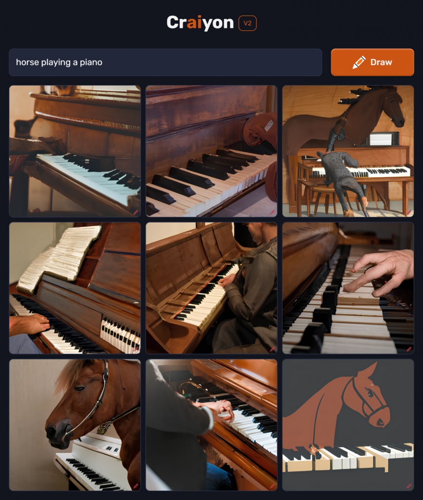
When I went to Craiyon, I input two prompts.
The first prompt was “Horse playing a piano”
This image is not at all what I expected. I pictured a horse, sitting on a piano stool, literally with a hoof on the keyboard. What I got was horses and pianos, put into the same picture, superimposed on each other. Some of the images, like the first one in the upper left corner, are partly there with the image I wanted, but the others are not really depicting the topic of the picture I wanted.
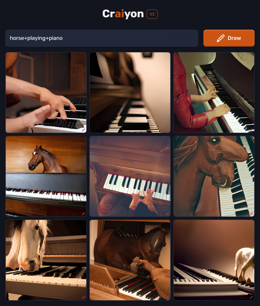
I tried a Boolean search, “horse+playing+piano” to see if I would get something closer to what I wanted.
Using this search term, I got a little closer, particularly the bottom left picture of the two horses licking the piano keyboard. This could be a picture of grazing horses superimposed on a piano keyboard, as they’d have to be standing on top of the piano from that angle…But it is closer to the image I had in mind. Even the middle one on the right is much closer, though seems a bit distorted. It is at least a painting, rather than images put into the same picture.
The next prompt was “Beautiful flowers in a field”. I was curious to see what the computer would interpret as ‘beautiful’.
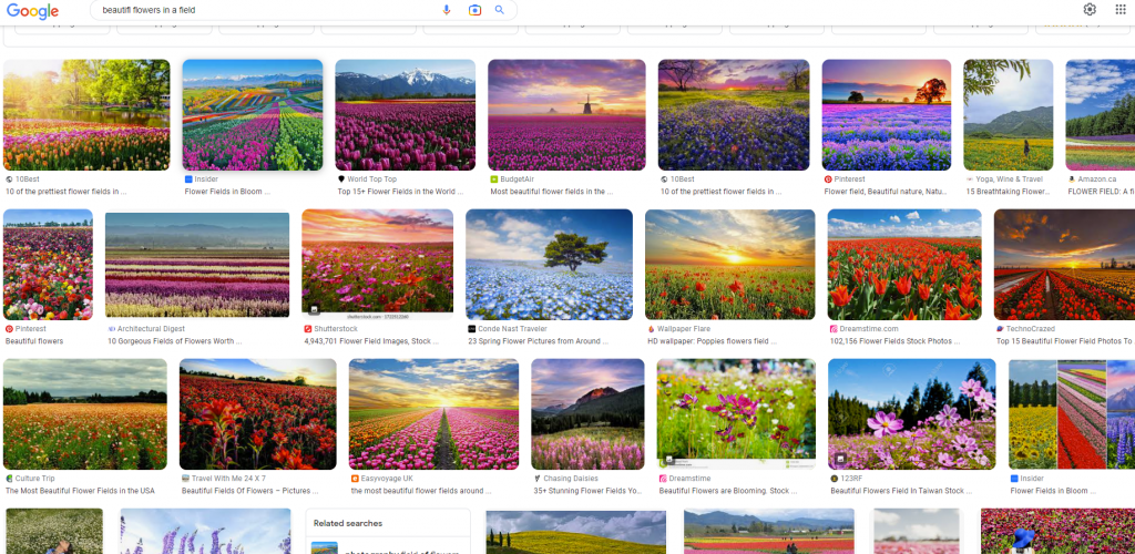
This image is basically a Google search of colourful wildflowers in a field. I wonder if the term ‘beautiful’ was pulled from many of the titles on the internet of pictures of flowers. So the computer took this as an interpretation of the keyword beautiful. This just seems like a Google Image search that I could have done myself. Which I did below.
I did a Google Image search using the same prompt and got very similar images:
I then looked at different AI generated art programs using the same prompt as ‘horse playing piano’, in Night Cafe and Hot Pot.ai. These seem to be just images, gathered from the web, of the keywords I used, like “horse” and “piano”, or “flowers” and “field”, just superimposing the images in the same frame in some way. This seems like the same process that Craiyon used.
Night Cafe resulted in this:
Definitely more of a painting/drawing than previous composite images in Craiyon, but no piano at all.
This is from Hot Pot.ai. More of a horse and a piano painting, but not really the horse playing a piano. The piano is even turned away from the horse, like in the other pictures, so it’s basically just sitting there, and not making a lot of sense in the context of the picture. This is one huge difference about human vs machine thinking – contextual factors and inference based on those factors.
I’ve been thinking about this topic of AI generated ‘art’ and the podcasts speaking about AI being more about detecting patterns from large amounts of data (mostly historical data) and collating it into something like a graph, percentage or rate.
Why does a computer want to paint/make a picture? It doesn’t. It was told to. The only motivation is from the user.
Why does an elephant want to paint a picture? We don’t really know why, but there has to be a motivation to do so (through training, whether positive or negatively enforced, or just wanting to please their handler), or the elephant wouldn’t do it. You can see that all three elephants in this video painted different pictures. Maybe because they were trained to do so from different handlers, but the question remains – is this the same as human learning or more akin to machine learning?
Training/education vs machine learning is food for debate, certainly. It also got me thinking about art and music and how these, like other forms of art, both express and evoke emotion. I looked at whether music could be generated through AI and what the difference might be. I did find two videos that demonstrate the contrast. The first one is a computer generated piece of music based on Chopin (the video creator didn’t want his video embedded, so I just have the link). https://youtu.be/iDFQ4EyxErk
Then you can listen at this video from a (very talented) person, about their take on several classical musicians at a birthday party fighting over the last piece of cake. Both are interpreting various styles of classical composers. So, what would the difference be?
Can you hear the difference between the computer generated piece and the musician generated piece? What are your thoughts?
What does this have to do with algorithms? As Dr. O’Neil reiterates over and over, the algorithm is only as good as the data that is input into it. How was the algorithm designed? Why? What is it supposed to do? These, and many other questions about use, motivation and consequences of the algorithm must be asked to have them truly work the way we want them to.
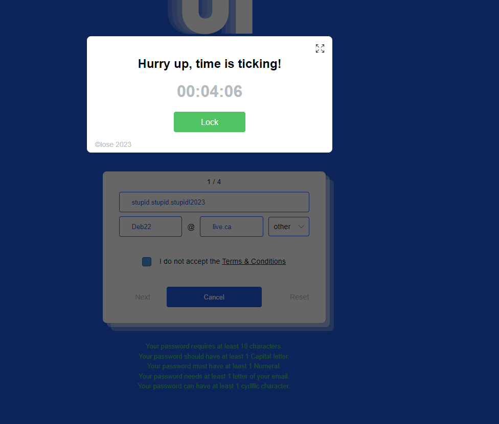
This was probably the most frustrating, annoying thing I’ve ever worked with! While there are apps out there that could compete with this one, it did make the point – with a sledgehammer. In an article about usability, Woolgar (1990, p. 60), states:
“It should be clear by now that technology, and information technology (IT) in particular, is just the latest excuse for doing social science.”
I was not able to get past the first page, despite discovering how to get around the deceptions – “send to bottom” and the “close” button hidden in the corner of the nag screen for the timer. I also had to select and de-select the agreement box many times, an obvious ploy to make you agree to their terms despite the double negative in the sentence. You can’t proceed unless you do not agree to the privacy terms – so your information is available for them to use any way they want. A subtle and deceptive manipulation to get around privacy laws.
This exercise, to me, is akin to the whole subversive subliminal advertising controversy in the ’60’s and ’70’s. This debate was around advertising companies using subtle images or words embedded in advertising to increase sales, usually around sexual content. More recently, Gherasim & Gherasim (2020) discuss the use of neuromarketing. This is the use of neuroscience to influence the consumer public: “…the subliminal suggestions it contains can be compared to the hypnotic ones. Such advertising messages are therefore intended to influence a consumer’s intention to buy, without the consumer being aware of the true source of motivation.” (p. 41).
“…the subliminal suggestions it contains can be compared to the hypnotic ones. Such advertising messages are therefore intended to influence a consumer’s intention to buy, without the consumer being aware of the true source of motivation.” (p. 41).
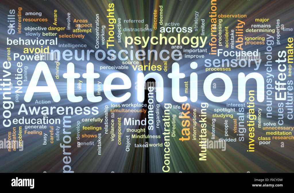
This is similar to the issues of the attention economy – marketers, businesses and developers wanting to force users into paying attention to what they want them to pay attention to. This is clear in this case of the game. This ‘game’ is trying to configure the user, as Woolgar (1990) puts it by dictating what is deemed important by the people designing it.
Could this phenomenon of the attention economy, and perhaps also neuromarketing, be compared to the use of ‘clickbait’ to increase views in social media platforms? Particularly for those content creators who are monetized or trying to get monetized?
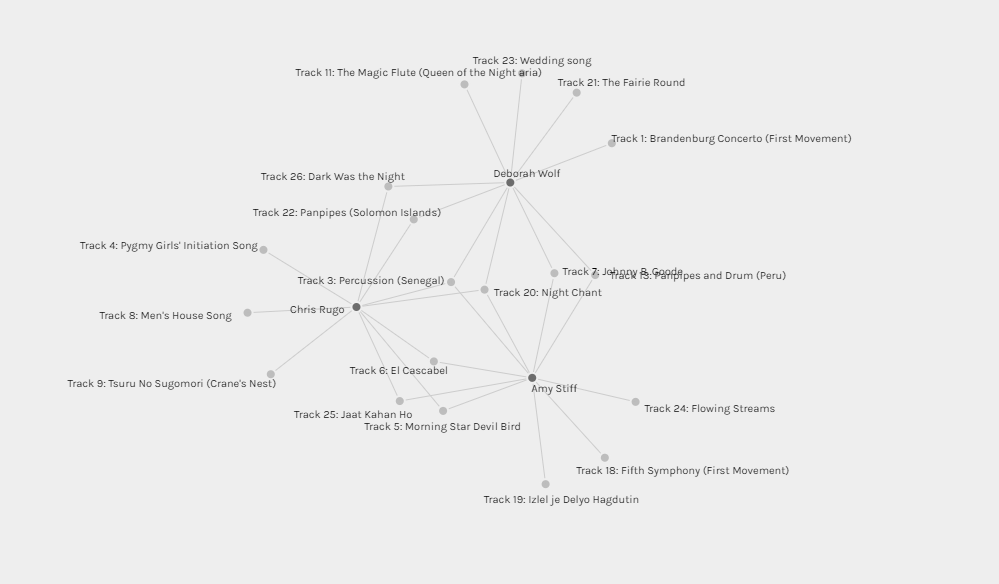
The visualization can certainly give you the links and connections between curators and their choices, however, it does not indicate why those particular tracks were chosen. For instance, for my own, I reordered the tracks in a specific way to match the evolutionary progress of the planet that was presented in the first part of the record. Each person has their own personal reasons for choosing what they did, including the original NASA curators of the Golden Record.
Without going through each person’s website, there is no way to understand the reasons behind their choices, unless we make some grand assumptions about the culture and biases of the people curating the lists. For example, while they are from all different backgrounds and places in the world, they all have an interest in education/technology, all are in a Master’s program at a Canadian University and have a high degree of literacy. Other than these commonalities, however, you cannot make assumptions about why people chose the tracks they did and why others were rejected.
For example, Amy and I have 4 tracks in common. These tracks were chosen for very different reasons – mine as above, Amy’s for how the piece made her feel, generally hopeful and positive. For Chris and I and Amy, there are only two tracks that all three of us have in common. The reasons are very different, mine for evolutionary progress, Amy for personal feelings and Chris for the de-colonizing aspect of each of the song on the list, excluding white, European settlers.
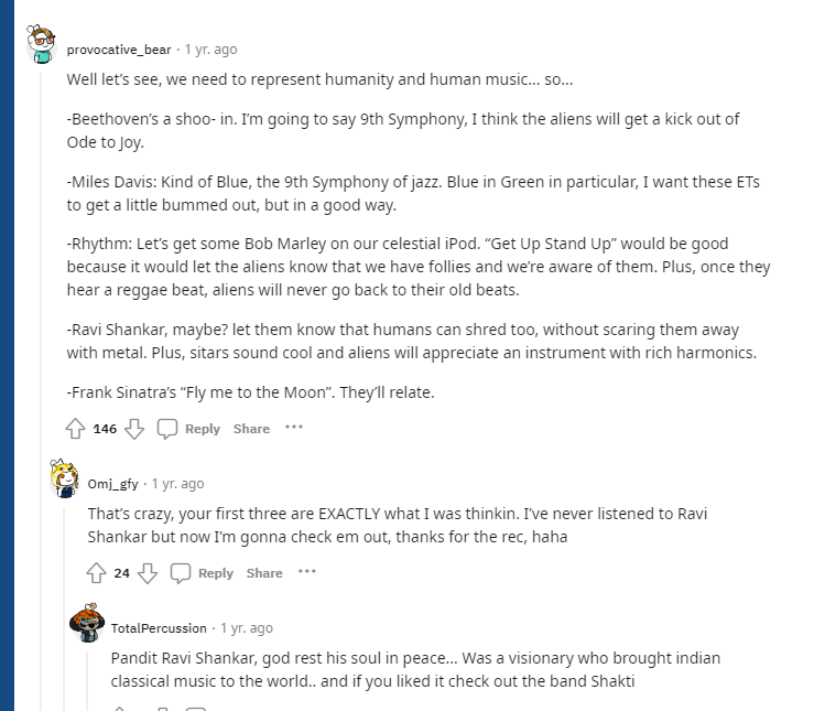
one data visualisation
The most popular choice was Track 6: El Cascabel (though I didn’t chose this one). The least popular was Track 12: Tchakrulo. There is no explanation through this tool why these choices were the most popular or least popular, we just get the data. To understand why these were chosen or discarded, one has to go to the source to discover the reasons. While two tracks were tied with 20 out of 20 choosing them, there were only 4 nodes in common between these two. Again, there are no explanations as to why this was the case.
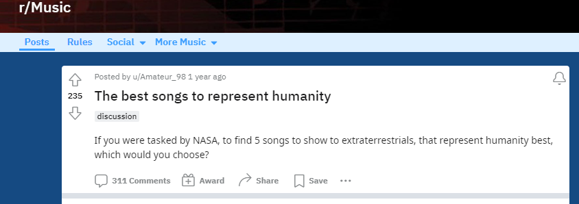
Overall, one conclusion that can be drawn is that the person curating the list/selection has innate biases that will influence what makes the list and what doesn’t. The original list itself was selected by humans with their own biases, with no explanation of why, in the vast collection of worldwide music and song, these particular pieces were chosen over others. In the podcast Twenty Thousand Hertz (Voyager Golden Record, 2019) about the Golden Record collection, the curator(s) discuss their reasoning for choosing the 21 songs they did to represent humanity as a whole.
While it is very difficult to be completely without bias, one needs to recognize and understand the reasoning behind the bias. Setting clear parameters as to why the pieces were chosen in the first place can contribute to understanding the selection. For example, many people chose the pieces they did because of the way the piece of music makes them feel – this experience may be very different for each individual. Others were more logical about choices, though even the logical choices were biased. It would be interesting to set the list of a representation of humanity to a true computer intelligence and see what it comes up with. In her book “Atlas of AI”, Kate Crawford (2021) says there is no true artificial intelligence. All computer data is dependant upon many human factors – the computational power available, parameters input, what data is chosen to input in the first place, and so on (Crawford, 2021).
A quick Google search of “what music best represents humanity” reveals a huge variety of opinions and lists as varied as the population itself. This list, from Beethoven to Bob Marley to Frank Sinatra, is representative of mostly Western/North American culture, who make up a huge percentage of Reddit users. An example of inherent unconscious cultural bias.
It would be intriguing to see what a farm worker from Nepal would list, or someone from a Muslim or Communist community would list as representative of humanity as a whole.
Any list, curated by human beings, is going to inherently include choices made from personal context and exclude those from personal context, regardless of how logically the parameters are applied. This is particularly true for collections that are more emotive in nature, such as art.
Francisco, F. A. M. O. S. (2021, May 5). Kate Crawford on “Atlas of AI: Power, Politics, and the Planetary Costs of Artificial Intelligence” [Video]. YouTube: Virtual Wednesdays. https://www.youtube.com/live/KcefG-0InLE?feature=share
Smith Rumsey, A. (2017, February 7). Why Digitize?. CLIR. https://www.clir.org/pubs/reports/pub80-smith/pub80-2/
For this task, I was struck by the current emphasis in education around multi-modal presentation of content. The increased focus on accessibility and diversity within learners has necessitated a change of venue from the traditional classroom lecture style teaching. There is more focus on concept based teaching, flipped classrooms and various forms of literacy (prose literacy, numerical literacy, digital literacy, health literacy, and many others) as mentioned in the New London Group (1996) work.
In the re-design of this task, I wanted to present a completely different form of presentation. In his article, Gee (2005) discusses musical notation and rap and it’s relationship to literacy:
What do we want to say of someone, for instance, who can understand and even compose rap songs (words and music), but cannot read or write language or musical notation? Of course, in traditional terms, this person is illiterate in terms of both language and musical notation. But yet he or she is able to understand and compose in a language style that is distinctively different from everyday language and in a musical form that is distinctively different from other forms of music. We might want to say that the person is literate in the domain of rap songs (as a distinctive domain combining language and music in certain characteristic ways), though the person is not print literate or musical-notation Literate.
Gee, 2005, p. 17
This resonates with me, as there is a theme of multimodality that can appeal to different styles of learner and hits different parts of the brain. I have no musical background at all, so really had to use a different type of creativity that I’m not used to using. I did enlist the help of my young adult daughter to help match the words to the cadence of the song.
To start, I had to decide on the background rhythm tone – bright and happy or heavier and dark? I also had to consider copyright, so looked through YouTube’s free library of music in the Hip Hop/Rap genre.
Once the music was established came the task of making the words fit into the cadence of the music, which was a huge challenge. This required a much different idea of literacy and structure that demanded thinking very differently about the structure of a sentence. This was very difficult for someone with very structured ideas of writing and grammar. This for sure requires a different type of literacy that challenged me to push my boundaries.
References
Anno Domini Beats. (2022). Culture. YouTube Audio Library.
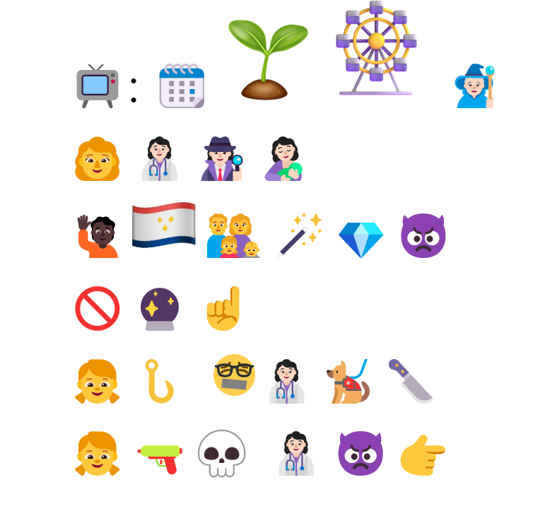
The biggest challenge for this task was finding the appropriate emojis. Even when entered into my post, this platform does not want to support them and all I got at the end was lines of question marks. I finally had to screenshot the word document to create a .png and upload it onto the page as an image (is this an example of the breakout of the visual?).
The challenge of trying to find the symbols (emojis) for what I wanted to convey was the first hurdle to get over, as there wasn’t the exact emoji for what I wanted to represent, so I had to search all over the place to find what I wanted. I also found that, just like a library literature search, you had to carefully define your terms, as many of the things I wanted to find didn’t seem to exist. This process is, I think, similar to the challenges in making graphics or visuals on a page accessible by providing alternate descriptions in written form, like Ekphrasis that Boltor (2001) notes. Trying to summarize a picture, image or symbol into written words is a challenge in itself, and part of the reason why we use graphics and symbols to convey concepts or ideas. To then have to summarize in words the image being presented is an extra layer of complexity and challenge that needs to be accounted for in our more visual culture.
I found that what Gretchen McCullough stated in The Allusionist podcast (Zaltzman, 2019) about needing emojis to provide context for tone when communicating by writing are used extensively in our digital culture, in emails and texts. Bolter (2001) reiterated this thought in his chapter discussing graphics, text and ASCII (p. 72). However, when trying to convey a complete story in pictograph format, things get lost in translation, and are also grounded in the culture in which you are communicating. Engelbart (1963) discusses symbology to represent concepts and the difficulties in doing so in the absence of written word symbols. As Engelbart (1963) writes, “a lack of words for some types of concepts makes it difficult to express those concepts…” (p. 13).
This visual outbreak has influenced culture in many ways. For example, I use PowerPoint a great deal in my work. Some of the principles in effective powerpoint presentations are to limit the number of words on a “slide” and use images more (Phillips, 2014). This is yet another demonstration of how visual representation has overtaken media, pedagogy and business.
I also found that I ordered my visual representation in the same way that I would a written text, from left to right in a line, then back to the left for the beginning of the next line and so on (Kress, 2005). I was looking at representing ideas and concepts rather than individual syllables or words. Even starting with the title, as like a chapter heading, is an example of trying to translate the written format conventions into graphic representations.
References
Bolter, J. D. (2000). The breakout of the visual [E-book]. In Writing space: Computers, hypertext, and the remediation of print (2nd ed., pp. 47–76). Lawrence Erlbaum Associates. https://doi.org/10.4324/9781410600110
I haven’t physically written anything in a very long time, as most of my written communication is done digitally. E-mails, texting, writing reports, evaluating student assignments, and all other written communication is done via laptop or smartphone. I have found that I can type faster than I can write (on a laptop/desktop, rather than on a phone), so getting my thoughts on paper tends to flow faster by typing rather than manually writing.
I found this task quite difficult. Because I usually don’t write anything by hand, it took me a long time, as my ‘writing muscles’ are stiff. I also found the word count challenging. Because I don’t write by hand, I had no idea how long a 500-word written paragraph should be. Doing this in a word processing program like MS Word is easy. I found I was manually counting the words as I went.
Using digital word production is my preference over manual writing due to the ease of use, ease of correction, ease of editing and speed of production. For someone who is not particularly eloquent and socially awkward, it is good to be able to take the time to type something out and easily correct it to ensure my message comes across the way I mean it to.
Even this post has been edited several times before posting.
“While the spoken word can travel faster, you can’t take it home in your hand. Only the written word can be absorbed wholly at the convenience of the reader.” – Kingman Brewster, Jr.
Hello!
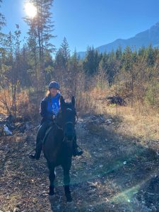
I’m Deborah. This is my eighth course in the MET program. I live in Squamish, British Columbia with my 21 year old daughter, a little old dog and young tabby cat. On the weekends, I volunteer at a horse rescue in Squamish and lease one of the horses there. I ride him almost every weekend (except in the winter). I have been an RN for over 30 years and currently have been teaching in the nursing program at a polytechnic in Burnaby, British Columbia for 8 years.
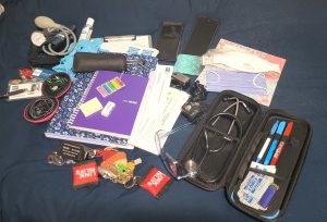
For this task, I chose my nursing bag. I carry this bag every day at work. I teach in a nursing program in the third year of a three year accelerated program in a home care nursing context. I have a group of eight clinical students at a home health unit in Vancouver, BC. I bring this bag to the health unit and with me when the students visit clients at their homes with either wounds or for chronic disease management.
In my bag is:
My BCIT employee ID card and swipe card for the unit on a chain lanyard.
My BCIT RN name tag
Sets of ear buds for Zoom calls and presentations
An accordion file folder containing:
– student weekly schedule
– assignment guidelines
– weekly module/lesson plan
– home care nursing resources/forms
My notebook for recording items to discuss during huddles and post clinical conferences
Tape flags & sticky notes
Plastic case for surgical masks and N95 masks (PPE)
My goggles (PPE “Stoggles”)
My stethoscope case with pens, Frixion eraser, alcohol swabs and gloves
My reading glasses
A pad
Sphygmomanometer (BP cuff)
An oximeter (device using light beam to read the level of oxygen contained in red blood cells)
A clipboard
Extra alcohol swabs
My work phone
My personal phone
My house keys (has a pocket CPR mask on it)
My car keys (also has a pocket CPR mask on it)
A headlamp
Gloves
Hand sanitizer
I use most of these items in my day at work with the students. I use my PPE’s on every visit with my students. I use the clipboard to store the client information (address, etc.) and then write notes on the student’s performance on the visit to enter into the clinical evaluation at mid-term and final. My reading glasses I use daily as well. The stethoscope, BP cuff and oximeter are used more rarely, but knowing I have them in case they are needed is comforting and the unit doesn’t provide these. The headlamp I use for almost every wound care visit as some client’s homes don’t have enough light to see. My work phone I use throughout the day to not only connect with my students (“I’m on my way”; “meet in front of the client’s apartment building”; “our meeting is in room 227”; etc.), but also to keep up with the other clinical faculty during the day – we often have new faculty members who have questions that come up during the clinical day with their students. I use my personal phone every day, of course – paying for parking in Vancouver, for example.
In terms of texts, they are more similar to the older interpretations of the concept, such as tektōn (craftsman), as I carry my ‘tools of the trade’. Nursing is often called an ‘art and a science’ and tends to sit in either Humanities or Health Sciences as opposed to Medicine. The stethoscope is an iconic symbol of the (Western) medical profession and is a tool that almost every nurse uses in the course of their work. It is a tool that skilled artisans (nurses, in this case) use to create their treatises. Using numbers and other data, we translate these symbols (numbers and words) into meaning that health care professionals can understand and communicate to each other. This communication takes the form of verbal, written, and electronic information that is transmitted within the medical and health care community. The other parallel is in the word technē referring to, in this case, a skill or skills – not only in teaching the art of nursing but also performing the skills required for the nursing profession. The other items, such as the notebook demonstrate less of a reliance on phones or laptops as alot of what I do offers no opportunities for use of these things during student home visits – I am either holding a light for the student doing wound care or demonstrating the application technique for something like compression stockings. So I am not able to use my phone or tablet during these visits, and have to jot down notes afterwards – usually while sitting in my car before going to the next visit. I have thought about using a speech to text app, but can’t find one that works for me, and it’s easier for me to scribble notes on a page rather than trying to view tiny text on a phone screen – my age showing there :).
Some of the text technologies in my bag are obvious, like my pen and papers and phones. I like using the Frixion pens because they are erasable ink. This may show that I am not always confident in what I write down and am often erasing and changing things. Some are not so obvious, such as the BP cuff. While the cuff gives you numbers, you still record them somehow either by writing them down or printing out a reading from the machine, and from them, interpret what they mean. The same applies to the pulse oximeter. The machine records something that’s happening internally, as in this case, the amount of oxygen present in the red blood cells, and provides a number that is recorded and must be interpreted. These indicate that language and communication is through scientific and imperial evidence.
I think, in this case, the papers and notebook provide clues to my prose literacy – the ability to read and write at not only a basic level, but also at an advanced level, along with jargon from both educational and health professional lenses. The other items speak to what we call health literacy – the ability to ‘access, comprehend, evaluate and communicate information as a way to promote, improve and maintain health in a variety of settings across the life course’ (Public Health Agency of Canada, n.d.). I could probably get a tablet and stylus that I can write my notes in and carry with me, but I haven’t yet done that. I also worry about privacy when recording client or student information in a device. The paper I can shred without it going to another country via the internet.
I struggle a lot with anxiety and imposter syndrome, which (I don’t think) shows in my outward appearance. The feedback I have received from students is one of calmness and a huge wealth of experience and knowledge. Inwardly, though, I don’t feel that. The notes in my notebook guide me to remember points to speak about as my social anxiety often prevents me from remembering things. I carry my PowerPoint notes pages for our weekly clinical conferences, and these are often in script format to cover my anxiety. I don’t really need such prescriptive texts, but I feel more secure when I have everything written out and have an idea of what I’m going to say beforehand. A Toastmaster, I am not.
I’ve been an RN for a very long time. 15 or 25 years ago, I was working in acute care hospitals. While I didn’t carry a bag, I did carry a lot of items around with me in a belt bag/fanny bag. I would have bandage scissors, tape, gloves, penlight, pen/pencils, piece of paper for writing down vital signs and other assessment information on my patients, my stethoscope, alcohol swabs, clamps for IV’s – why do you think nursing scrubs have so many pockets? Now, I have all these things in my bag, plus items that I don’t have handily available like BP cuffs and oximeters, as well as items for teaching clinical, which I wasn’t doing previously.
I’m not sure whether archeologists would see educator (unless my name tag was included), but they would definitely see items from a medical profession. They may think I’m a traveling medical professional, if the BP cuff and stethoscope and other equipment are recognizable to them. If the papers had survived the time capsule, they may indicate someone who had to coordinate people, and maybe evaluate their thinking or performance. In terms of engagement with text technologies, there are several cues that indicate the person used equipment/technology to interpret data for them and was immersed in digital technology. Things like the gloves and light may also indicate that there were some elements that were hands-on and dependant more on other types of interpretive or cognitive skills rather than actual text technologies.
Reference
Public Health Agency of Canada. (n.d.). Public Health Agency of Canada – Canada.ca. https://www.canada.ca/en/public-health.html?utm_source=VanityURL