I am glad this visualization has been provided, as I was curious to know what songs my peers had selected for last week’s assignment, and what implications could be made about our collective mind.
This visualization displays the popularity each song had for the curation. Pieces like the Fifth Symphony, Jaat Kahan Ho, Percussion, Johnny B.Goode, and Melancholy Blues were very popular. I wonder how much this popularity is biased. Could it be that these pieces were selected because of the Fifth Symphony’s high status and recognition in music, the current trends of interest in Indian and Eastern culture (Jaat Kahan Ho), or the familiarity and cultural resonance they evoked in the listeners? (Johnny B.Goode, and Melancholy Blues). I actually selected all of these pieces for my curation (apparently) based on other reasons, but this visualization makes me reflect on how my decisions were most likely biased by my cultural background. Of course, this is only one perspective and way of interpreting the data. We could also argue that these pieces have an essential element that evokes universal acclaim, meaning that they are truly special. I believe it can be seen in both ways and there is truth in both scenarios. This makes me think about ‘best songs of all time’ rankings in which often at the top we’ll find songs like “Imagine” by John Lennon, “Like a Rolling Stone” by Bob Dylan, or “Hey Jude” by The Beatles. It seems like their position is influenced by both biased cultural factors and true specialness.
The visualizations of communities of individuals with similar responses were useful to play with assumptions we could make about how these individuals would agree with one another. While looking at Community 4 (see image below) we can see how these 5 individuals would agree unanimously in several cases. However, it’s interesting to observe how some of them have some choices that don’t meet with any of the rest. Would these be points of disagreement? Could it represent potential conflict in some way? I don’t think this represents an issue in this case, as this curation is a playful exercise. But how about in other contexts such as dating or other kinds of relationship services? Also, It is interesting to think about how these connections are a digital representation of connections that exist in our daily relationships. I can imagine how the individuals who are close to us (particularly friends) represent numerous connections of ideals and preferences. Similarly, the difficulty we encounter in relationships could be seen as isolated (or conflicting) nods.
Of course, the graph only represents one level of agreement, which is the selection of the pieces. However, the rationales for the curation could be quite different, even conflicting. One individual could have selected the pieces based on emotional content, while another could have selected them based on cultural diversity. On the surface, the decision is the same, yet the motive is different. This could create some issues and misinterpretations of data. For example, let’s imagine that two individuals decided to have a celery drink instead of a Coca-Cola. We could make the assumption that both prefer the taste of celery drinks and are in agreement in that area. Yet, on further investigation, one individual might have chosen the celery drink only because of its health benefits and, in fact, doesn’t like the taste of celery at all, while the other individual loves the taste of celery and didn’t consider the health benefits so relevant. I believe this shows how much information can be erroneously interpreted and the potential danger of algorithms, particularly in ethical dimensions.
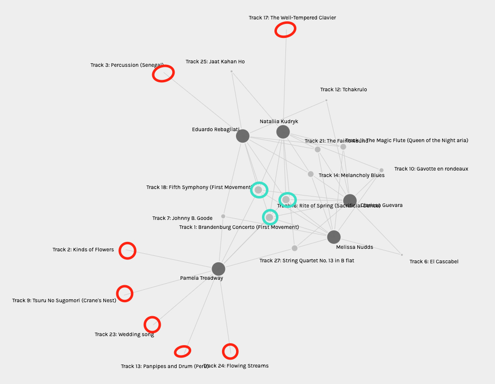
Image: Community 4
Green: unanimous agreement
Red: representations of possible disagreements