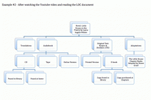
I chose to analyze RW & Co’s website because I like to shop from this website. (I first attempted to make a heirarchal organization for Pinterest but gave up after a few levels because I couldn’t draw an image that showcased how cyclical the clicking of an image is.)
 In my opinion, a user of RW & Co’s website can quickly understand the story being told (which changes depending on the season). The homepage is simple and allows the reader to quickly scan several eye-catching categories that link back to the general navigation page on level 2. Faulkner descibres how “categorization helps [users] navigate [a] website much faster” (2011). RW & Co’s website is a flat hierarchal structure that only involves 3 vertical levels in all but one category. The sales category has four levels but despite adding another level this category is still easy to navigate. Without the additional level in the sales category, the items would be more difficult to find. RW & Co’s labels are “specific” and “[easy] to understand” (Whitenton, 2013). The navigation bar on the top and bottom of homepage remains consitent on any page the user navigates too and the second level with the clothing navigation remains consistent when the user is looking at clothing images. By doing this, the user does not have to continually hit the back button or start over again to navigate to a new category of clothing.
Faulkner and Hayton have an interesting debate about the left justification of a navigation bar (2011). RW & Co’s website uses an “inverted-L navigation” which is consistent with most other shopping websites (Faulkner & Hayton, 2011). This consistency may allow the user to “recognize and categorise conventional elements before they examine the content” which may “make it easier for users to navigate the website” (Faulkner & Hayton, 2011). Faulkner and Hayton point out that research has not consistently shown that left-navigation assists users and that “users readily adapt” (2011). While, I believe a left justification helps me navigate shopping websites because I am familiar with this set-up for this genre of websites, I also read several blogs. The blogs I read are set up with a right-navigation bar. I think consistency among different website genres helps users navigate websites. With that said, I think I could easily adapt to a new set-up because I am quite comfortable with the Internet.
Overall, I think RW & Co’s website is well-designed and cannot find any major changes that would need to be made to make the website more efficient. The only suggestion I might make is a further break down of clothing categories. For instance, in the sweater category it might be helpful to be able to locate cardigans, pull overs or other types of sweaters or be able to search by colour. Those are two features I like using on other shopping websites.
Works Cited:
Faulkner, X. & Hayton, C. (2011). When left might not be right. Journal Of Usability Studies, 6 (4), pp. 245–256.
RW&CO.. (2014). Welcome to rw&co. – fashion apparel for him and her. [online] Retrieved from: http://www.rw-co.com/on/demandware.store/Sites-Rwco_CA-Site/default/Home-Page [Accessed: 1 Mar 2014].
Whitenton, K. (2014). Flat vs. deep website hierarchies. [online] Retrieved from: http://www.nngroup.com/articles/flat-vs-deep-hierarchy/ [Accessed: 1 Mar 2014].


