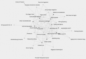
What do visualizations of network connections show us about commonalities and patterns? Creating graphs with the available data from our class’s selections of top ten songs from the Voyager Gold Album immediately grouped data into five sets and organized people based on similarities of their preference.
Group 5 Graph
A challenge in interpreting this data is finding the relevance and practical applicability of preference as noted through the curation of 10 songs from the Voyager Gold Album. In a quantitative network graph of a subway system, where nodes are central to the modelling of the system and are ranked based on number of links or length of pathway in order to model risk or interruptions and the effect on the entire system, the data collected may not provide information on personal issues of accessibility or reasoning for chosen pathways, and therefore a mix of quantitative and qualitative data provides more information to interpret the graph.
The Pallidio graphs can manipulate the data to display the most and least connections. The song, Jaat Kahan Ho has 31 connections, the most of all the tracks, whereas Panpipes and the Fairie Round both have the least amount of connections, connecting to 5 people and not one student overlaps among the two lowest rated songs.
The most connections vs. the least connections
This screenshot of the graph demonstrates an understanding of preference among the group, where individual difference is accounted for and incorporated into the larger data set.
Narrowing the Focus
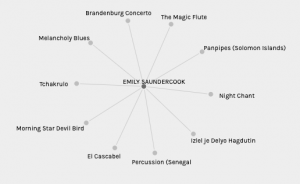
My choices
In the data set, ‘Group 5,’ my curation was aligned with 10 other classmates to form a group of 11. Isolating different elements of this group provides a clear picture of song selections and the song that connected our entire grouping, ‘El Cascabel.’ In Group 5, there were multiple nodes with many connections, ‘El Cascabel’ with 11 connections,
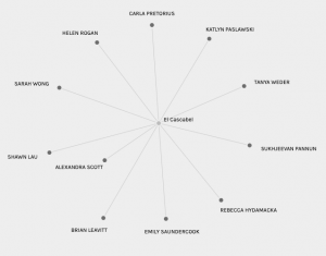
The song that connected all of group 5
‘Jaat Kahan Ho’ with 10 connections and ‘Percussion Senegal’ with 9 connections. Additionally, there were seven nodes that had two connections, five nodes that had six connections and three nodes that had eight connections. By grouping the data, it is clear that Group 5 was connected based on multiple nodes demonstrating the cohesiveness of the group based on interconnection of choices. The similarity of preference is further evidenced by
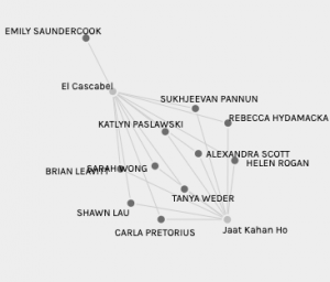
Similar Preference with Individual Difference
the selection of both ‘Jaat Kahan Ho’ and ‘El Cascabel,’ however, individual difference is noted as I am the lone outlier of the group. Individuality of selection is represented only twice in Group 5 as only two nodes exist with one person. To further illustrate how alike members of Group 5 were in their selections, I averaged the amount of links that Brian, Katlyn and myself had to others by adding the total connections from each node and dividing by ten nodes. The averages were: Brian, 6, Katlyn, 6.5, and Emily, 6. Therefore within Group 5, there was roughly a 60% rate of connection among all group members and the group was more interconnected than sparsely connected.
Connecting the dots with other data visualizations
The following site, https://hedonometer.org/timeseries/en_all/, provides a data visualization for the project “Average Happiness for Twitter.” This project, similar to our class data, provides general trends that connect large groups of people. This project provides information on a global scale and provides key events and dates in order to understand the importance of holidays and the reception of major news stories. Looking at these patterns is only part of the story, yet provides insight into how individuals rank events (like song choices) as important aspects in their daily lives.