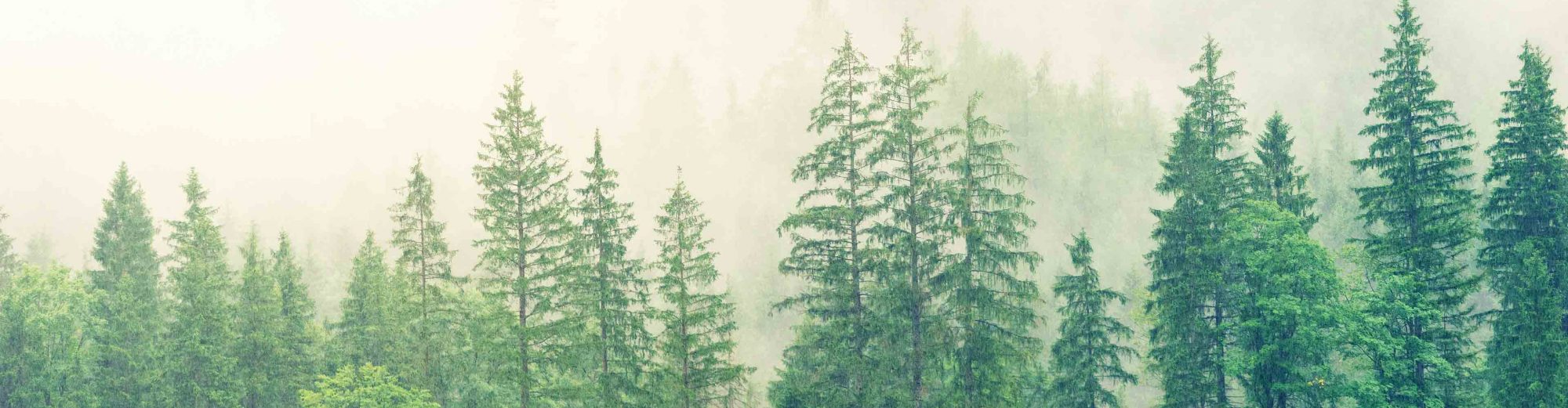
Example 1. This map was created using QGIS to show the locations of critical habitat for the Marbled Murrelet within the Olympic Peninsula.
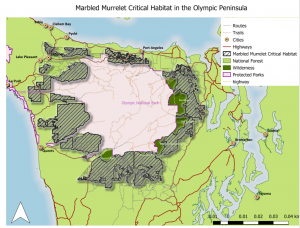
Example 2. I made this map as part of my graduate research project. It shows the locations of bird-window and bird-vehicle collisions within the City of Vancouver. For more information about my project and how I made this map, please see the ‘Graduate Research Project’ tab on the menu bar.
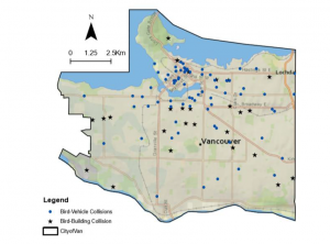
Example 3. This map was created to show hotspots of heart disease within the southern United States. I used data obtained from the Centre for Disease Control and Prevention and mapped hotspots for multiple years. I was also able to animate this map to show each year in chronological order to provide a better visual of changes over time.
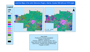
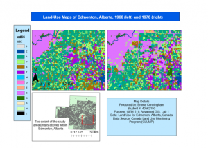
Example 4. These maps show the extent of various land-uses for the city of Edmonton, Alberta for the years 1966 and 1976. They were produced using Fragstats metrics and data obtained from the Canada Land Use Monitoring Program (CLUMP).
Using these maps I investigated changes in land-uses over time (ie. between 1966 and 1976) and reported the findings from a conservation perspective. This was done by generating a transition matrix and creating summary plots to assess changes in both woodland and urban patches across the landscape and interpret the impact these changes have on wildlife populations.
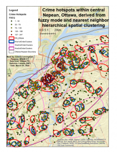
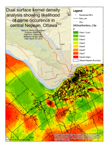
Example 5. These maps were created to show the spatial distribution of various crimes within Nepean, Ottawa between 2005 and 2006. My aim was to investigate the extent of clustering (ie. hot spots) and spatial autocorrection among these crimes and interpret these patterns. I used a variety of statical methods including nearest neighbour, kernel density estimation, and spatial-temporal hotspots to examine the nature of the spatial distribution. I also experimented with adjusting the statistics for baseline population differences to understand how this can have a significant influence on how the results are interpreted.
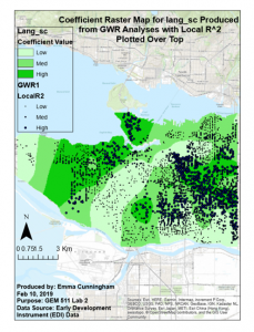
Example 6. This map shows the results of a geographically-weighted regression that I performed using data obtained from the City of Vancouver. My aim was to create a model that could predict a child’s learning abilities based on a small set of variables related to the child. I used a variety of tools including explanatory regression analysis, grouping analysis, and generating coefficient raster files.
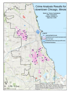
Example 7. I made this map to show trends in violent crime within downtown Chicago, Illinois, following the ArcGIS Workflow: Analyzing Violent Crime. A variety of tools were used including optimized hotspot analysis, create space time cube, and emerging hotspot analysis tool.
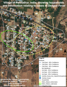
Example 8. This map was created to highlight cases of Dengue Fever within a small village in southern India. To make this map, I used a variety of tools including average nearest neighbour, spatial autocorrelation, incremental spatial autocorrelation, central features, and standard deviation ellipse tool.
GIS software & programs used to create these maps include:
- ArcMap
- ArcGIS Pro
- QGIS
- Python Scripting for ArcGIS
- Google Earth Engine
- Fragstats
- CrimeStat