This week, the team has been tasked with exploring how we might be able to manipulate the graphical styles of our data in order to make it interesting for a musical context. The Land group has explored a variety of alterations, including changing the graph type of data, overlaying several datasets, or altering the units of the graph into rates of change. Each of these methods, among many more, can be useful for altering the visual (and hence auditory) aspects of these datasets.
One of our members, Mackenzie Millward, explored how different iterations of graphical styles could potentially have influences on the musicality of the sonifications. Specifically, she looked at data on the frequency of natural disasters from a database hosted by the Université catholique de Louvain and explored how small alterations to the style can have changes on the musical style.

This is the standard scatter-plot data, which has every data value as a single point. She pointed out that the sounds created by playing each of these points in a staccato style (short and detached notes) could provide an interesting musical style with a more jarring and punctuated feeling. Plotting these data in other ways can have other stylistic changes, however:

Connecting these points to form a straight-line graph and plotting these lines and sonifying the lines in addition to the points could make the increases and decreases of the notes much more clear. It would still have a jarring and punctuated style in the same sense as the single points, but there would be a more connected musicality to it. As the slopes suddenly change, there would be audible differences to how the speed with which the notes change. One more alteration to these graphs could make for a less jarring, smoothed out style of music:
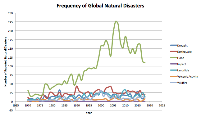
This smoothed graph takes the values and plots the best fit smooth line to connect them. If this entire line was sonified instead of the individual data points, it would create a more melodic and smooth sound than the individual data points.The increases and decreases, along with the rate of change occurring to this data, would be made clear in a more connected way with this graph. Through these alterations, Mackenzie was able to show how sonifying not just points, but also the lines connecting these points, would be able to change the nature of the sounds. She suggested that combining datasets with different styles, such as scatter-plot graphs and smooth line graphs, could create interesting musical interactions for the symphony.
Kylee Dyck, another student in the Land group of the project, looked into resource usage. She had two datasets, one of which represented energy production from coal, and one that represented energy production from natural gas. Kylee had a hunch that these two datasets were somehow related to each other – when one of them exhibited an increase, the other would decrease. In this way, Kylee thought that they may be inversely correlated, or “antiphase” of each other. She overlayed these graphs to observe this more visually:
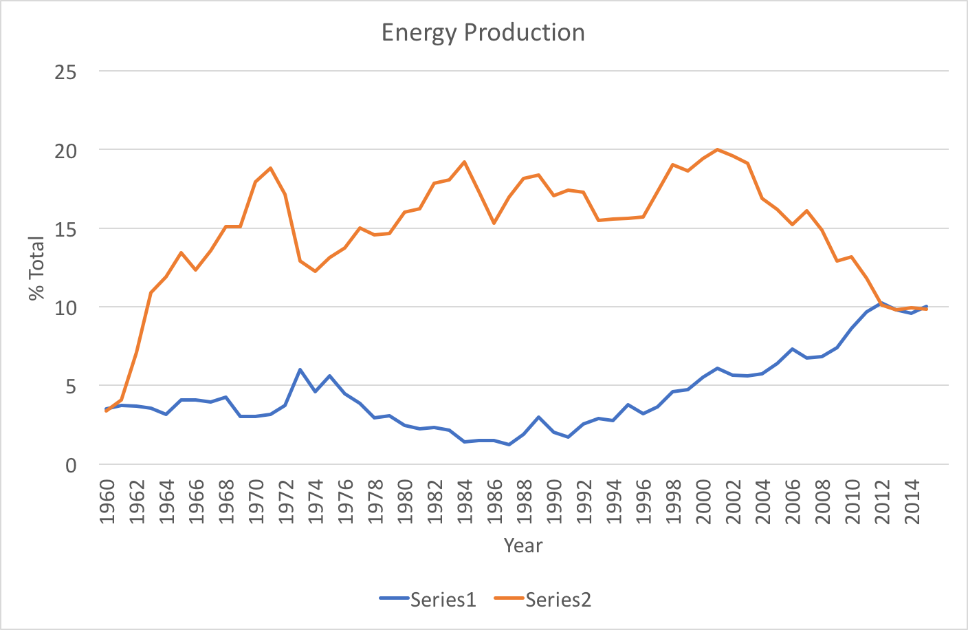
At some points in time, it can be seen that there are clearly inverse relations. For example, from 1976-1980, the graphs visually seem reflective of each other. Coal, graphed as “Series2”, exhibits an increase when natural gas exhibits a decrease, and vice versa. However, we discussed in class how these relations can be skewed due to the units of the y-axis. Being a percentage of a total with other values not shown means that other sources, such as hydro energy, wind energy, and solar energy could also impact these values. They aren’t dependent solely on each other, but also other values that are omitted from the graph. Regardless, these relations could make for an interesting pair of auditory signals after being sonified, and could likely be elaborated on with other energy datasets to make an interesting composition.
Lastly, the dataset I worked on developing was related to human populations in several major geographical areas. This dataset was not from a previous set I found, but was found this week after more research. Data was available for individual countries, but for the sake of visual simplicity, I chose to graph major regions:
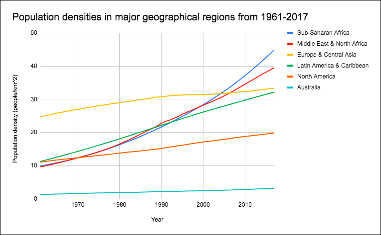
This graph conveys population densities over time. It is important to recall that these are densities and not absolute values, as this value is influenced by the size of land area. For this reason, I thought I would alter this data into a form that makes increases more clear. I transformed it into a % growth per year by putting the data into the equation:
(Nt+1 – Nt) / Nt x 100%
I plotted these values over time to create a graph that shows the percentage that the population density changes per year. This conversion cancels the units, and means that the percent change of the population density is equal to the percent change of the absolute population in each area, making comparisons more clear:
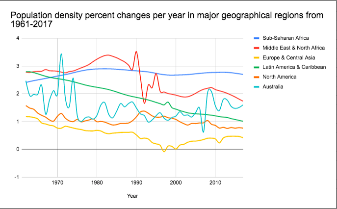
There are interesting aspects to this graph that give hints about how populations are changing in different parts of the world. Sub-Saharan Africa has a consistent and high growth rate of almost 3% per year, whereas Europe, Central Asia, and North America have consistently low growth rates of 1% or less. Some regions, such as the Middle East, North Africa, and Latin America are exhibiting decreases, meaning that their population is still growing, but the rate at which it is increasing is getting smaller as time progresses.
The 6 datasets overlayed on top of each other could be used to create musical interactions for a larger range of instruments, and the % growth has some more interesting and erratic values than the original graph.
Overall, the team has developed some very interesting data manipulations that could be used to develop the musicality of the symphony. I’m excited to see how we keep moving forward with this project, and looking forward to the next steps we’ll be able to take towards communicating this data with the public and symphony audience.