This week we were tasked with manipulating our datasets that we have been working with for the past few weeks to create different representations of the data that will change the outcome of the sonification. This will cause the sound of the music to be different than the original sonification of our data. Some manipulations of data could include looking at different aspects of the data (monthly averages rather than annual), graphing correlations between different datasets, graphing trend and peaks instead of a line, and more.
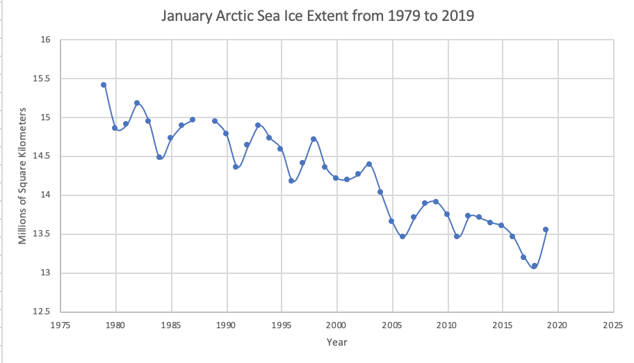
Isabelle continued her analysis on sea ice extent in the Arctic. Her first analysis included the annual average of Arctic sea ice extent from 1979 to 2018 and this week she represented that same data in two different ways including a comparison of the monthly average of Arctic sea ice extent between 1979 and 2018 (Figure 1) and the Arctic sea ice extent in January from 1979 to 2018 (Figure 2). These manipulations resulted in very different graphs, and therefore different musical sounds from sonification.
Figure 1:
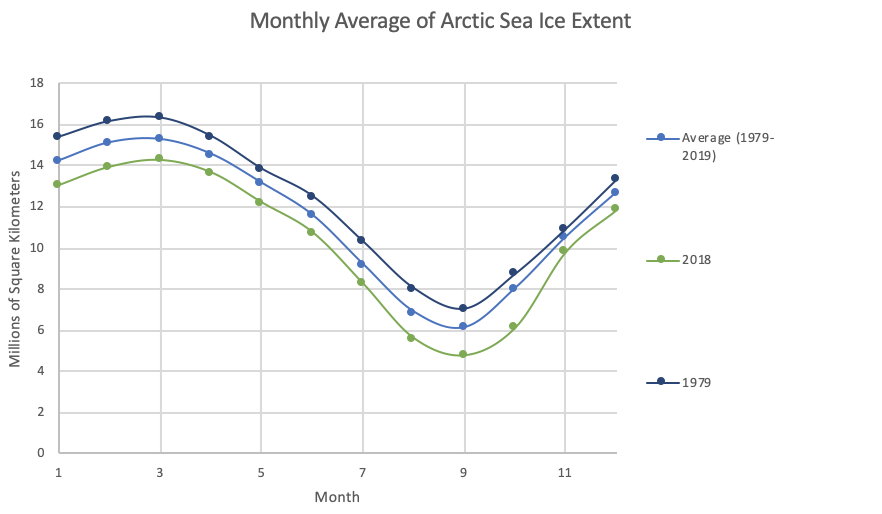
Figure 2:
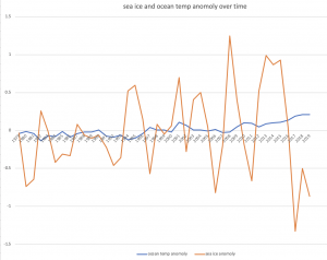
Theresa tried to find connections or correlations between her datasets to make it more interesting. She overlaid her ocean temperature anomaly and sea ice anomaly graph (Figure 3) and noticed that while there are no wild fluctuations in the ocean temperature anomaly from year to year, there is a noticeable fluctuation in the sea ice anomaly from year to year. What is also noticeable is that ocean temperature is steadily rising and the sea ice anomaly is fluctuating dramatically every year. Underlaying the smaller background fluctuations of ocean temperature allows depth to be added to the music.
Figure 3:
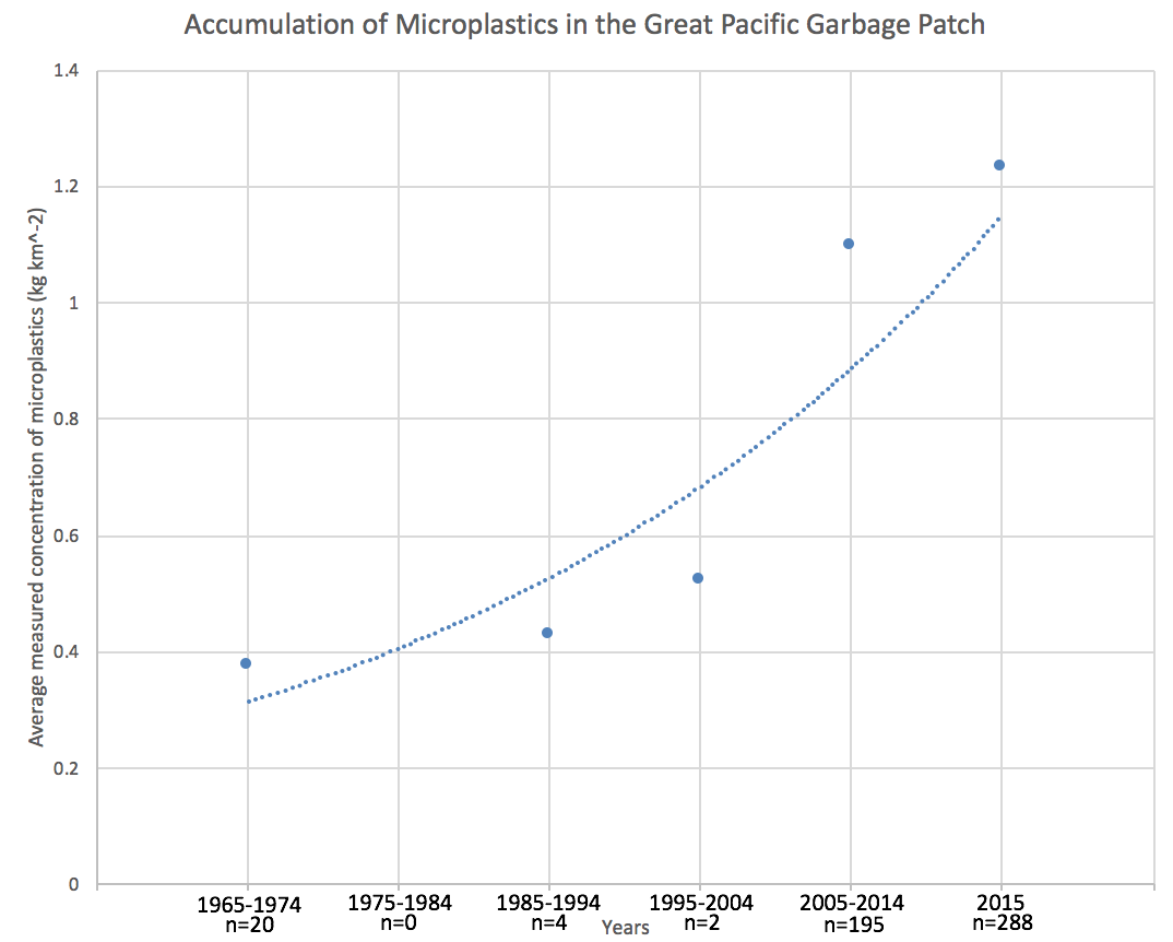
I played around further with my data on microplastic accumulation in the Great Pacific Garbage Patch and decided to plot each sampling year and the average concentrations of microplastic in grams per kilometer squared (Figure 4). My original analysis of the data included change in the average concentration of microplastics in grams per kilometer squared for each decade (Figure 5). This graph consisted of less data points but demonstrated a clear exponentially increasing trend in microplastic accumulation whereas the new manipulation, although there are more data points, does not clearly demonstrate any trend until the last few year (2011, 2012 and 2015). These two manipulations of the data would have very different musical sounds based on data points and trends, however, I believe they would finish off the same, representing high accumulation of microplastics in the Great Pacific Garbage Patch.
Figure 4:
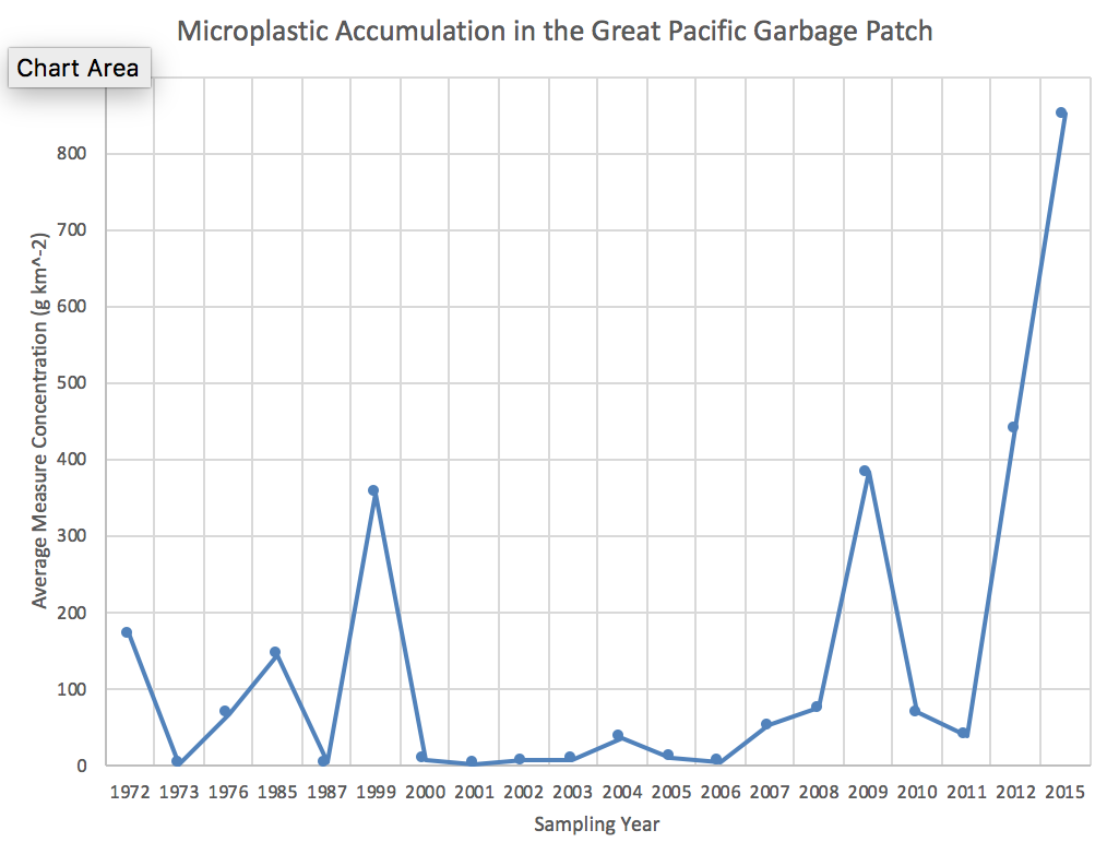
Figure 5:
Hopefully these new manipulations will be useful in the Earth Symphony and add some new dimension to the original analyses. Also, these new manipulations will be useful practice for future datasets that we find.