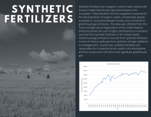
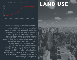
This week, land, air, and water and broke off into our respective groups to focus on displaying the data to the general public. In the land group, we each narrowed down and chose one graph each to display on the infographic. Graphs were chosen according to how general the data was. The purpose was to display standard climate change information on the brochures so that the audience can grasp the material as opposed to a topic very niche or specific which can be difficult to understand the significance and context of. Choosing broader graphs also gives the audience a better grasp of the current state of the world and the major issues it is facing. The three graphs we chose to include were synthetic fertilizers, global LPI, and total human-altered land. Mackenzie and Graydon managed to combine their graphs together in order to produce two graphs overall. These graphs were chosen because they show clear patterns and were thus attention-grabbing, clearly demonstrating upwards trends for the synthetic fertilizer and land-use graphs and a downwards trend for the LPI graph. Each graph was associated with a brief explanation to aid viewers comprehension. We are currently working on making each group’s brochure uniform in terms of font, colour scheme, graph design, etc.
Below I have attached a sample brochure made by Graydon for land data.