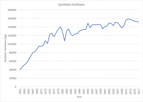
This week we were each tasked with collecting one more data set relating to land-based climate change issues. I found another data set from FAOSTAT which tracked greenhouse gas emissions sourced from synthetic fertilizers. I filtered this data to include only data from the United States ranging from 1961-2017. I also filtered the types of fertilizers to include only those measured in gigagrams: direct emissions of CO2eq and N2O, indirect emissions of N2O that leaches, N2O that volatilizes, N2O, CO2eq, and emissions of N2O and CO2eq. After graphing the finalized data, the results showed (not surprisingly) a distinct upwards trend with some minor fluctuations (image shown above).
These trends have major implications for climate change, as synthetic fertilizers are, by definition, composed of combinations of chemicals and other inorganic substances. Impacts of synthetic fertilizers includes killing off essential micro-bacteria in the soil, water contamination, leaching, and pollution, increasing soil nitrate concentrations, and the list goes on. N2O is produced by the microbial processes of nitrification as well as de-nitrification, resulting in direct emissions on site and indirect emissions after volatilization/re-deposition and the leaching process. CO2 is primarily released during the making, transportation, and distribution/application of synthetic fertilizers.
We were also tasked with considering alternate ways to express one of the three data sets we have already collected. I chose to further analyze the data set on global biodiversity I found last week. Looking at the metadata, I thought it might be interesting to compile all the data on adverse ecosystem and animal index related columns (showing negative trends) and graph it alongside the human-related data (showing positive trends). It would be interesting to visually display the relationship between human activities and biodiversity losses, as just from looking at the raw data, they appear to be inversely related. To do this, all of the biological/biophysical and human data would need to be standardized (using index values).
Another interesting topic we discussed during our weekly meeting that was also related to inverse relationships was the Keeling Curve and oxygen concentrations in the atmosphere. The Keeling Curve graphs the accumulation of carbon dioxide in the atmosphere, initially recorded by Charles Keeling. This graph became one most influential pieces of scientific evidence in terms of climate change, for the first time showing that CO2 concentrations are rising and thus that fossil fuels are building up in the atmosphere. Keeling’s findings prompted further research on this matter, leading to wide-spread awareness and understanding of the magnitude if this issue.
Sources:
Soil Organic Matter and its Role in Crop Production; Franklin Elmer Allison