The task this week was to observe environmental datasets that may have more than one ‘signal’ present contributing to the distribution of data and think about why this may be happening.
Life is complex, therefore environmental data is commonly represented by multiple signals
For this week, the ‘Land’ group looked into:
1. Agricultural; The percentage of land used for agricultural practices (arable and livestock) for different countries on a global distribution. It was interesting to see that for a country with a large area, such as Canada, the percent of agricultural uses was minimal in comparison. This is most likely due to the influence of external factors such as: most of the land being covered in ice/snow for the majority of the year, thus being unable to produce crops or grazing lands in this environment.
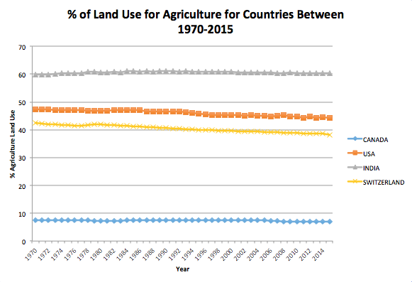
Figure 1: The 4 countries chosen here are pulled from a larger dataset, used to show a comparison between countries with a larger area yet a smaller agricultural footprint and countries with a smaller area that have increased agricultural practices. Created by M. Millward and sourced from OurWorld In Data 2015.
2. Synthetic Fertilizers; The use of various types of nitrogenous fertilizers show an overall increasing trend over time and the dominant signal is the increased amount (gigagrams) of direct and indirect fertilizer emissions sourced from the United States. These trends have further implications on climate change beyond the direct emissions associated with the fertilizers themselves because the increased levels of fertilizers may also be a response to agricultural practices. An increased use of synthetic fertilizers allow for the global demand for food to be met and agricultural emissions (being one of the most significant contributors to climate change) plotted on the same graph would show a clear correlation.
3. Precipitation-Snow; The plot shown below has a clear sinusoidal wave function reflecting the seasonal changes. Intuitively, in peak summer temperatures the snow cover is lower than in peak winter temperatures, therefore an assumption can be determined that the snow cover in the northern hemisphere is correlated with the environmental conditions (particularly temperature). Upon closer examination, the best-fit line drawn through the graph shows a slight decrease over the years which may be interpreted as global warming or as another possibility such as a negative feedback loop correction.
Snow has significant effects on many aspects of the environment – it has strong albedo to reflect solar radiation back from Earth, it can act as a thermal blanket over organisms such as plants or aquatic organisms, and it replenishes water sources in the coming spring.
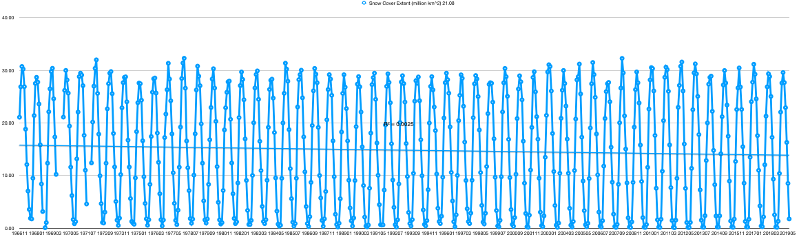
Figure 2: Monthly snow coverage over the Eurasian continent between 1996-2019. Created by G. Gillies and sourced from Estilow et al, 2015.
Sources
Estilow, T. W., Young, A. H., Robinson, D. A. (2015). A long-term Northern Hemisphere snow cover extent data record for climate studies and monitoring. Earth System Science Data, 7, 137-142. doi: 10.5194/essd-7-137-2015
OurWorld in Data. (2015). “How much land do countries use for agriculture”. WorldBank 2015 World development indicators. Retrieved from: ‘https://ourworldindata.org/’