As we get further into the semester, we have begun transitioning from purely data-based research to looking into ways to communicate our findings to the general public. So far, the two main methods discussed were posters and brochures. Specifically, infographics were proposed as a means of representing the data, as these visual tools are useful in displaying and simplifying complex information in an eye-catching manner. The posters, in whichever form they will ultimately take, will be designed to be displayed at Science World. Because the typical audience of Science World tends to be younger than the average symphony-goer, the posters would be made taking this into account. Brochures would be designed such that they serve to help the audience interpret the the sounds they are hearing while at the event. One page could be dedicated to each each piece or type of data (i.e. air). This would provide a means for the audience members to understand what they are hearing to a deeper extent, but at their own leisure.
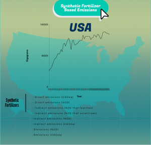
I looked into infographics using Piktochart this week for the synthetic fertilizer data set that I previously found. After exploring different options, I think a common template could be used for each poster, then have the details individualized for each theme (air, water, & land). I have a attached a rough example of an infographic I made in only 5 minutes using Piktochart.
Another supplementary contribution to the symphony we discussed was the option of displaying pictures or videos to go along with the music. For example, pictures of the graph corresponding to the piece being played could be displayed, or even just pictures that are relevant to the theme of land, water, or air. Making trends and patterns audible could give the audience members a whole new perspective and meaning to climate change. By enhancing this experience with visual aids with the goal of making it more impactful and creating a long-lasting impression, those members of the audience that are visual learners may take more away from the symphony. In addition, having small interjections between each piece to briefly describe the data set being played and its significance would also help the audience’s interpretation and ability to grasp the concepts. In our next few meetings we will continue to develop these ideas and eventually materialize some of them!