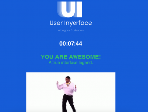
This was a very interesting exercise in UI and attention. Something I noticed was how important it is to actually read what you are clicking on before you do it, for example the big green “no” button and the check box that said “select all” which wiped out all my answers! This reminded me of going to the grocery store with my mom not too long ago where she was trying to use the self checkout for the first time and did not actually read the instructions on the debit machine before she clicked the button. She assumed the machine was asking if she accepted the transaction and wanted to proceed, but it was actually asking if she wanted cash back (which she did not) and we had to cancel the transaction and start over again. The “roadblock” on this site that stumped me for the longest amount of time was when the box saying to hurry up and showing my clock popped up for the first time. It took about two minutes for me to figure out where to click to get rid of the box so I could continue with the task. Something I noticed on this site, as I have seen on other sites recently that can be confusing is where there are two side by side buttons to choose from (eg. male/female, on/off, yes/no) where one is in colour while the other is white. It is hard to tell whether the one in colour is the one selected or if it is the one that is white. This exercise is a good way of finding out what design aspect we are used to and expect when using online sites and technology, and what happens when best practices in UX and UI are not adhered to. We don’t often notice these small details until they are gone.
This experience makes it clear how important it is to use predictable, expected, and recognizable buttons and elements in websites and forms. This is an example of a time when it is best not to reinvent the proverbial wheel and think outside the box- because your users are most definitely looking inside the box (literally). Having a site with unclear expectations and confusing mechanics is bound to create high rates of frustration and drive away users.