Welcome to our Movable Feast
EXPERIENCE DESIGN
INTRO TO USER EXPERIENCE
Since a previous A2 on User Experience (UX) provided a solid foundation for learning about this topic, we decided to take an innovative approach for the movable feast. We strongly encourage you to see their project to explore the concepts of UX.
User Experience focuses on the following elements which you will be evaluating for our innovation: Is the app valuable, accessible, desirable, useful, usable, findable, and credible?
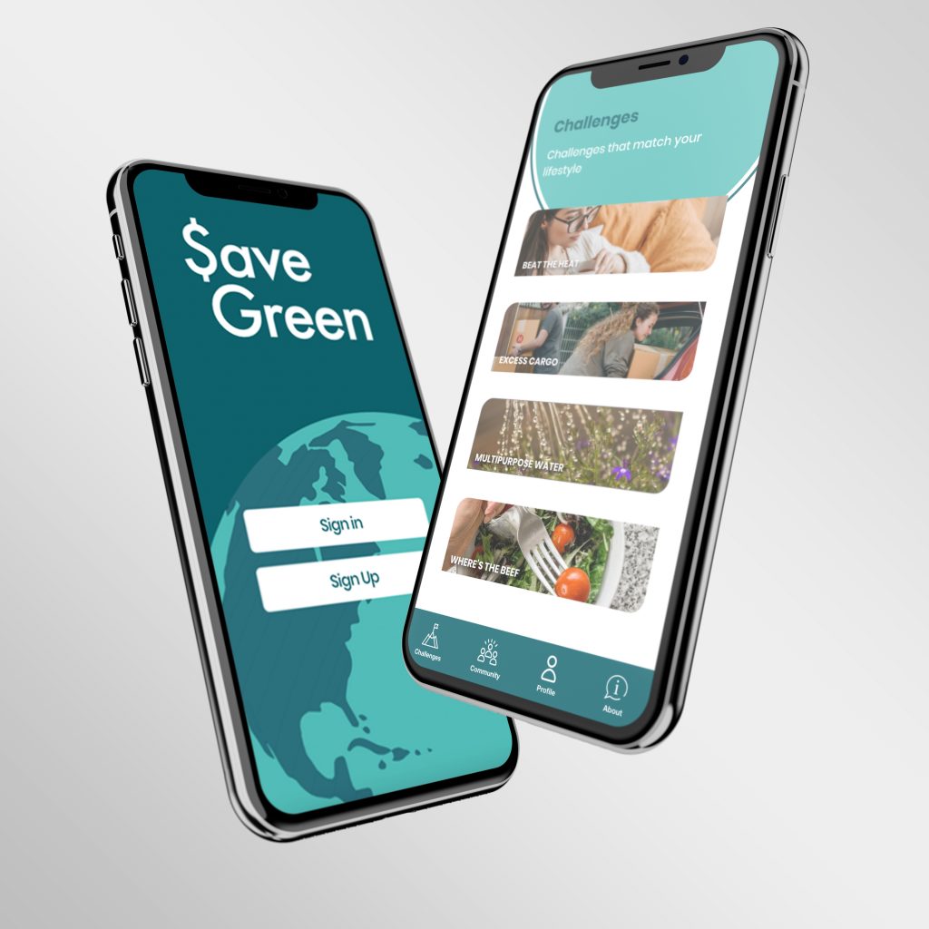
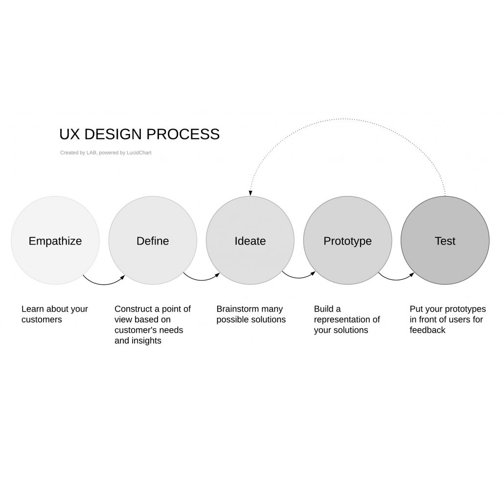
We followed research about UX to build a mobile app following the procedures for UX Design and User Interface Design (UI).
OUR GOAL:
To share our process of UX Design with you, alongside tools that educators can use to engage students in UX Design Processes.
OUR PROCESS
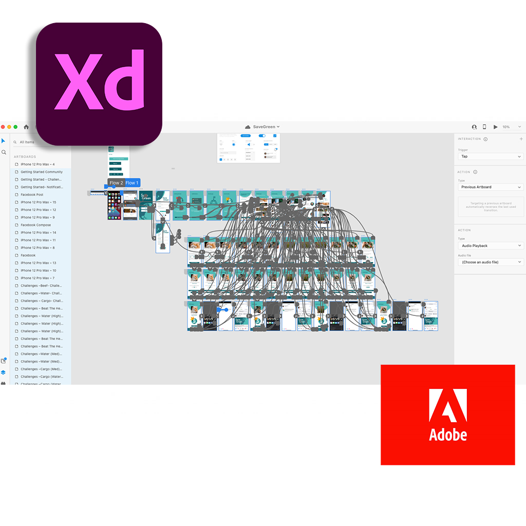
For this project we utilized Adobe XD which is a vector-based UX design tool for web apps and mobile apps, developed and published by Adobe Inc. It is available for macOS and Windows, however, some versions of iOS and Android allow for a preview directly on mobile devices. There are alternatives to the Adobe application such as MarvelApp, UXPin, Proto, and many more.

CHOOSE YOUR OWN ADVENTURE
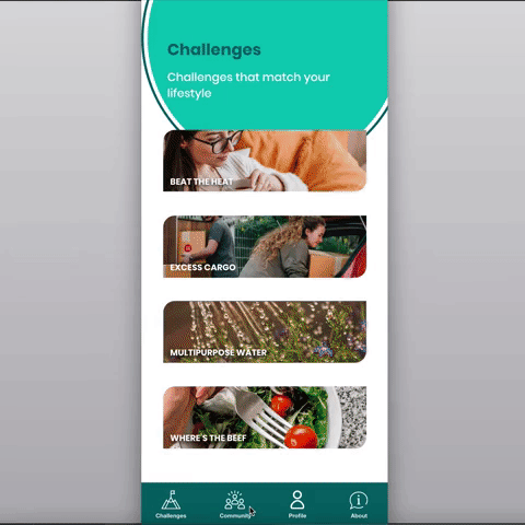
Please start by watching the following video to learn more about our innovation. Before the end of each video are clickable options for you to continue exploring our project. Learn about our process, explore our app, and discover one of four challenges for you to complete.
Having difficulties? Explore the full playlist of videos on YouTube
USER TESTING
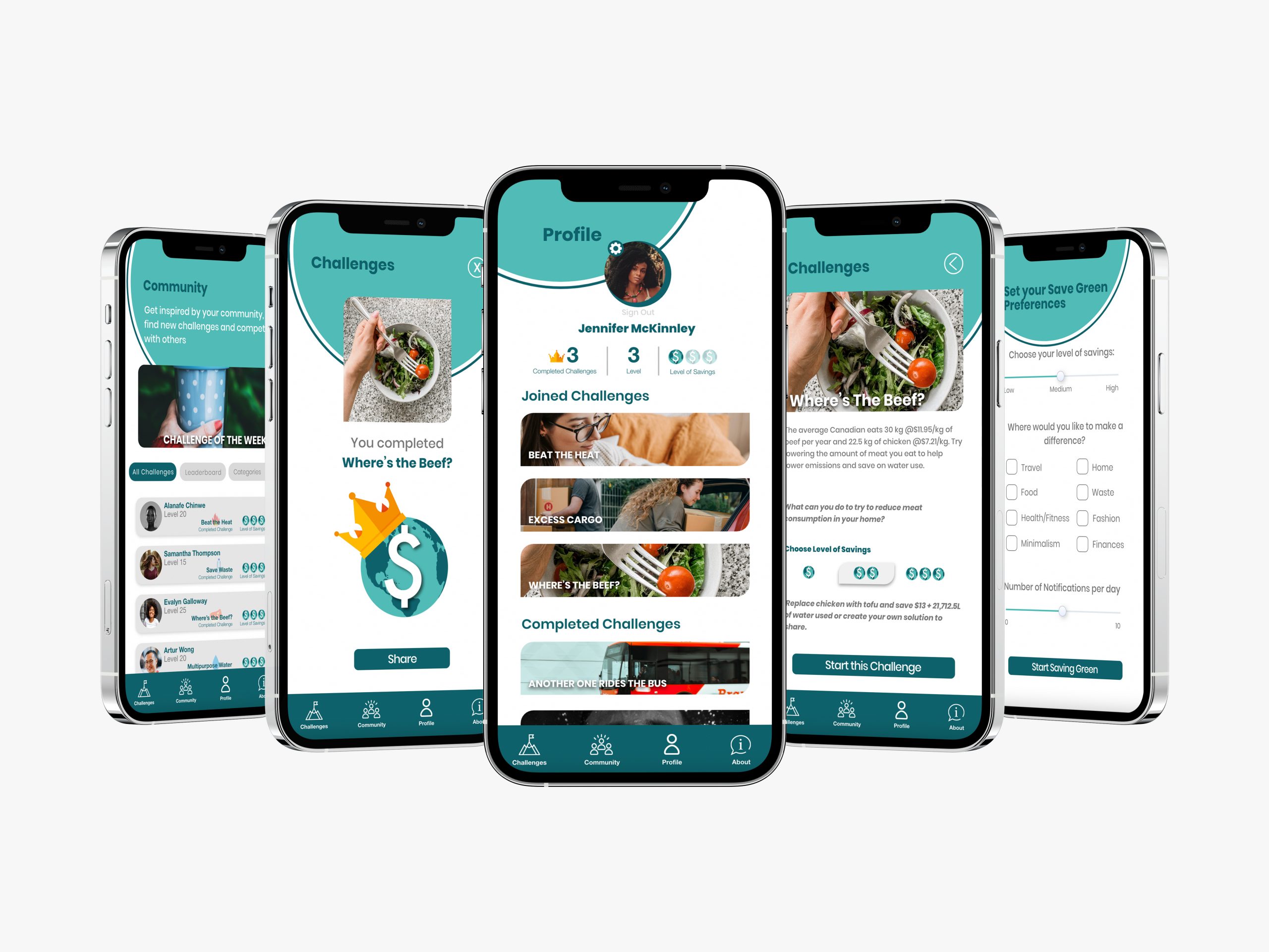
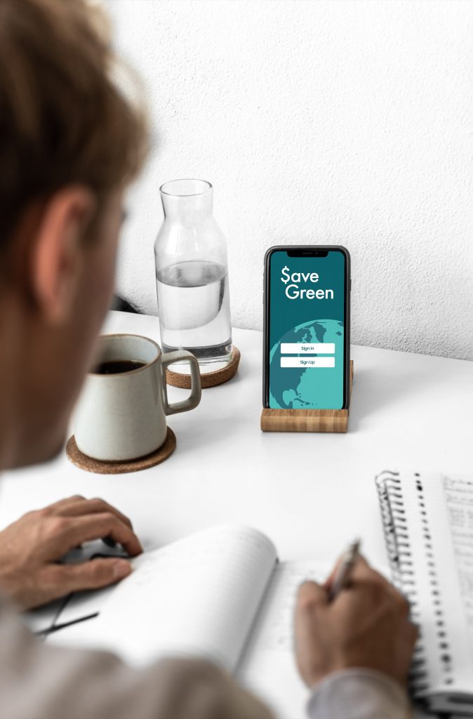
One of the final stages of UX design should be user testing. You are the user tester! Click on the button to access our app on a mobile or desktop browser to experience the mobile application our group designed. In the discussion section below, question #3 requests a voice screen recording of your first interaction with the app. Please keep in mind that it is still only a demo product and not all features are interactable at this time.
We suggest downloading the Adobe XD application on your mobile device to have a more authentic user testing experience. Use the following credentials to log in as a google user not Adobe login:
Username: savegreenapp@gmail.com
Password: savegreen2021
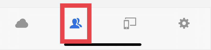
Click on the shared with you option in the menu bar to access the app.
Please log out of the Adobe XD application when you complete exploring the Save Green app.
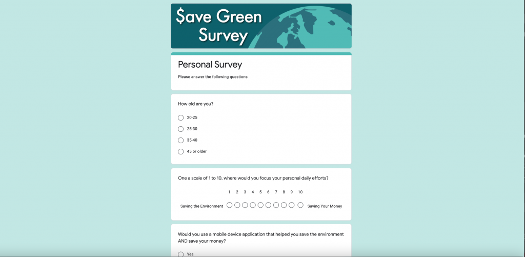
USER EXPERIENCE SURVEY
Complete this Google Form to share your UX and perspectives on UX Design while using our application.
DISCUSSION
There are two items to include in your reply to this post on this blog and one Google Drive upload:
- Complete one of the four challenges in the App, tell us which challenge you chose, and post your creative solution using a similar strategy as if you were posting to social media. For example, include a message of what you might say to share your experience and/or link to a picture, a tweet, or a short video.
- Choose one of the 3 questions below to further research, discussion, and share:
- Share an example from your UX in Save Green that you believe succeeded or failed in UX design.
- What do you believe is the value of UX design in relation to mobile technology and education?
- Accessibility, Credibility, Usefulness, and Functionality are all aspects to consider through the process of UX design. If you could only focus on one of these factors, which do you believe is the most important. Please explain your answer briefly.
- Screen and voice record your first interaction with the app on your mobile device. You can use Recordit for iOS or AZ screen recorder on Android. Upload your video to this Google Drive folder. While recording talk through the app – think out loud. We need to hear your thoughts to improve the experience.
PROJECT SUMMARY
Thank you to everyone for your participation in our Movable Feast! We greatly enjoyed reading your responses and seeing your User Experience interactions with our application. For many, this was the first time seeing an app prototype and interacting with UX Design, and we valued your comments as you explored the prototype. For others, this was the next step in their UX Design journey and we appreciate your advanced suggestions to help us further develop this application. A prototype is not a fully functional version of a program with complete interactable features. Rather, it is an iterative way to explore the development and design of concepts and to see how people would choose to explore and use an application before full design integration and programming. We encourage you in your own learning journeys to explore app design and engage yourself in the UX Design cycle to become innovators for mobile technology.

PARTICIPANT SURVEY RESULTS
Survey results are in! View the survey results here. The questions would normally be asked during the empathize and testing portion of UX Design. We learned that our app has found a potential market and could benefit its users with a strong balance of saving money and saving Earth. The survey indicated the challenges were relatable to your lifestyles and the comments demonstrated that many of you are already trying to build sustainable practices. One strong comment was to increase the dexterity of challenges, and with a full team working on this application, those challenges could be extended and developed with stronger impact and influence. The question that surprised us most was in regards to data collection: most users were either unsure (50%) or unwanting (31%) of an application that tracked data across other applications. Thank you for your participation this week!

EXPERIENCE DESIGN
This project enabled participants to explore User Experience (UX) through their testing of our application, alongside discovering the UX design process through building the application. Save Green app featured constructs of Experience Design which involves the potential to optimize the usefulness of the world around us. The app utilized AI technologies to connect our application’s challenges to the lifestyles of the users. Since this was a prototype, the challenges were custom made, but after seeing the impact these four challenges have had on our peers, we know that these connections would demonstrate applicable integration in the user’s daily life.
Congratulations UX Team,
Every time someone demonstrates how our lifestyle can be dangerous to the environment, our attention is captured immediately. However, keep up with a diet without beef or butter demands willpower and discipline. Unfortunately, it is easy and ordinary to postpone our intention for tomorrow, and tomorrow maybe never happen. Your App is a good starter for behavioral change regarding Saving Green (nature and money) because some people are more sensitive to the planet’s health while others are more sensitive to their own pocket. Saving green mixed these two advantages, which is a pretty smart strategy.
Wow, great work everyone! Great idea! I could defiantly see this app being a real thing and would totally support it!
What can you do to try and reduce meat consumption in your home?
Personally, I don’t eat meat at home my partner and I eat Vegan throughout the week and eat whatever we want on the weekend. This doesn’t only save us money but drastically cuts down our grocery bill. We use alternatives like beans, tofu, nuts, and vegan protein powder to get enough protein.
1. What do you believe is the value of UX design in relation to mobile technology and education?
The major value of a mobile app like Save Green is that you can easily refer to it throughout the day and in different environments. The app seems easy to use which will make it especially applicable to the older population with less confidence using technology. The gamification aspect is fantastic, it would be neat to see some sort of financial incentive from companies that make solar panels, use recycled products, sustainable products in the form of coupons.
Great job team, I loved the immersive opportunity to experience an app prototype. I didn’t know much at all about user design/experience before this, so it was very informative.
My choice of challenge was the water challenge which seemed to have some good practical ideas. The social media element of posting my challenges wasn’t that appealing to me, but for others the social and community feature might be motivating and add to the experience.
To address your question about the most important aspect, I believe that would be functionality since all the other aspects fall into place if the app is functional. For example, an app can’t be very useful if it doesn’t function. I would imagine that in any design, one must have an end goal/objective first, and then plan the road map to get there, just like a class lesson plan, but then there are always unknown variables that come into play.
Thanks, Marlis,
If the point of experience design is to optimize the usefulness of the real world around us, I think the idea would be successful if the app could create a level of engagement that helped to save money or the environment or both. Motivations to share (or not) within a community are adjacent to the main purposes. Certainly a significant sticking point for many when opting in to data collection.
Hi Experience Design team,
I like your slide presentation on the blog. Nice videos inserted to help give context to the project. And great idea using Adobe XD to create a prototype of a mobile app demonstrating Experience Design. I like to see you included the Design Cycle and Design Thinking. I like that your prototype has the user choose various challenges to reduce environmental footprint and save money.
I went back to the moveable feast to look at the Experience Design provocation. I also did a quick search of Experience Design vs User Experience Design.
My brief understanding from these is that UX is different from Experience Design. UX focusses on 2 dimensions whereas Experience Design focusses on three or more dimensions and is trying to include as many senses as possible and as much of the various contexts around you as possible. It is about integrating multiple contexts into an augmented experience.
I am a bit confused by your project at times as you seem to mention UX design and Experience Design interchangeably. Also, I feel the challenges in your prototype are half monolithic linear (here are a few options to choose from) and half social, open, real-world narrative. (come up with your own solution to this problem)
I wonder, how would the prototype utilize multiple contexts, location, time, purpose to enhance learning about ways to save the environment in a tangible way?
And how does the app exemplify Experience Design? And combine it with Mobile affordances?
What if the app steered you away from the meat dept at the grocery store, and instead, steered you to the aisles with ingredients for a low resource intense meal? And on the screen there was an Augmented Reality scene showing you the pro’s and con’s or how the low resource meal saved X amount of water or CO2? And it showed what the meal would look like and who else has made it in your circle?
I believe Experience Design could be utilized in education by having students explore curriculum through the lens of Applied Design Skills and Technology by having students go out into the world and have an Experience Design learning opportunity where they look at something and create a better way that it could be. What if they pointed their screen at a bike path and were then able to design a better bike path in real time? All while learning about the benefits of biking, bike paths etc….?
Hi Toby,
You raise good points about distinguishing UX and Experience Design. Our intention was to follow UX principles to create a prototype experience following the definition in the feast, that Experience Design is about optimizing the usefulness of the real world around us.
The app (had it been real and fully functional) is a blend of the two:
UX: User experience was applied when we used the design process to create the prototype.
Experience Design: Save Green uses the AI and the affordance of a mobile device to read the environment around you to increase engagement in the product itself. We hoped the introductory video would have clarified that point. The scenario that you described in the grocery aisle would be a great user case for this type of app. Our assumption is that location services are turned on and the app is aware of personal preferences, past purchases, and level of interest in the challenges.
We did in the end use them unapologetically interchangeably. While designing a product you have to consider the experience of the human to ensure that it is a viable product and use the design process through the empathy stage. And luckily it elicited some detailed and constructive feedback during the week.
I found your project to be very useful and insightful; however, my initial introduction to the app was difficult to navigate. It took some time to finally access the app through my macbook. I tried an Iphone XR, Iphone 12 and Iphone 11 smart devices to no prevail. I kept getting booted out. It could be the retro internet (out in the boonies) wifi service I receive.
The videos and information provided were very exciting. I found the survey and small tasks interesting and in my opinion a good learning tool. Once I got the hang of the app (testing), I found myself going back to try another activity. How can my students benefit from an app like $ave Green? How can this type of software be applied to everyday life?
Students today are becoming more aware of life cycles in the world and how it is effected by global warming, population and over crowding. $ave Green is another mobile tool my students can benefit. I am continuously learning in this course. Your team has done an excellent job. Thank you for sharing.
Hello Tyrone,
Thank you for your constructive feedback.
I contacted Adobe regarding the issues that some had getting into the app prototype. Were you having difficulty logging in on the Adobe XD application on your phone or accessing the prototype through the links for the mobile and desktop browser experience or both? When did it boot you out? Adobe will find this information useful for releasing update fixes for their application. We chose this app primarily because Adobe XD are one of the leading software prototyping software and I used it in one of my classes. There were no issues in terms of prototype accessibility.
Thank you for your continued effort in getting into the application. As an app tester, I’m glad you recognized the value of Save Green. We posted the results from the survey and we saw that the idea was at the least a viable product idea.
I’m finding it so interesting reading through all of the different experiences that we had trying to use the app. I think it speaks so well to how important UX Design really is and also how important it is to thoroughly test a product on multiple devices and platforms. This is a great project and so nicely demonstrates the topic. Thanks again team UX!
Hi Team:
I tried signing in with my Android SmartPhone. It prompts to the sign in page, but it does prompt the keyboard. I have no way of logging it. I am just curious, Adobe XD exclusive to Apple?
Hi Britanny,
We tested on Apple and Android phones and tablets as well as Safari and Chrome browsers on Mac and PC laptops. We did expect there to be slight differences in the way the prototype displayed across the various standard options, though we did not anticipate there to be this level of confusion for older or newer devices. One of us would have been happy to help and then update instructions accordingly.
While our week is now over and it’s on to the next, I take away two helpful points from your comments, and had we seen your remarks before we submitted the final results we may have taken advantage of them.
1. We might have been clearer with the instructions provided for the testing options. Mobile and desktop browsers were intended to be the primary methods used without any access problems, and installing XD was a third option to offer a deeper experience. The clickable prototype flashes when an area outside of clickable space is clicked or touched. We assumed that this was intuitive, and probably should not have assumed anything about users and the testing experience. This seems to be the main culprit for negative feedback.
2. We might have created a slideshow of our own early beta testing and displayed the results with the instructions mentioned above to help indicate what the experience might look like; however, the point was to create an experience for others to test and we wanted to avoid the pitfalls of bias when showing exactly how things might be.
Sorry for this last day reply.
I was having a heck of a time navigating on your app. For some apparent reason in Chrome, all your images appeared as slides that did not link. I was able to bypass the user ID with just one click. Adobe XD is not compatible with my older Mac unfortunately, so I cannot load it to the desktop. The Adobe XD app I would also need to purchase for my smartphone. Seeing what has happened I will be in discussions with my group to ensure that we beta test the final project before it is posted in the movable feast.
I am so happy you were able to by-pass the login page of the application with one click as this is a prototype. The application is not fully coded and programmed, rather a demonstration of what the application could be. The different pages of the app are linked together to explore what navigating the application could feel like.
Adobe XD is one of the top rated programs available for wireframing and prototyping. It is available on all platforms. The login option with the savegreenapp account was for the XD application on mobile devices to explore a more integrated version of the application, but the app could also be accessed by means of the links provided without needing to log in.
We did our best to test the application across multiple platforms, however with so much available technology, there are often times when something goes wrong. We are very thankful for all of the feedback that our peers have provided with their successful experience exploring our prototype. This was a challenging project, but a very rewarding experience for us all.
Hi Team Save Green!
This was a wonderful presentation. I thoroughly enjoyed the videos, and the professional look really captivated and engaged me. I definitely appreciate the gaming elements you brought to the experience, as this provides a more engaging and rewarding app experience. Keeping the user in the loop with regular “high fives” and feedback is a significant piece of the contemporary app experience.
I completed the Beat the Heat challenge and chose to go with the greatest level of savings. It turns out my wife and I regularly weather-stripped our windows and sealed them with plastic up North, so I was already familiar with this challenge to some extent. Currently, we are trying to save money on heating by keeping the thermostat set low during the workday and when we sleep.
Overall, I had a very authentic experience, and your product is exemplary in its design and presentation.
Hi UX team!
I’m impressed by your presentation, and I appreciate this way of learning about user experience.
I liked that in the app there was a community tab that allowed me to see other people’s progress, and there’s even a leaderboard. I think by having gaming elements, it adds to the motivation that I may have from coming back to the app. Habits are really hard to break, so I feel that by having a community that are doing the same thing will help with people wanting to come back to the app.
I chose the Where’s the beef challenge. My family has been trying to eat less meat at my 5-year-old daughter’s request, she has asked us to stop eating animals. I think besides having the community part listing out the kind of challenges that others did, it may benefit to have a forum or discussion section where people can share their success stories, or stories about them working through the challenge. By keeping the app personal and personalized, I think will motivate users from coming back.
I believe usefulness is the most important for app design. It is my biggest motivation for accessing apps. If the app can help bring me closer to my family by being able to share my progress, or help me save money, etc. Different people may have different ideas about what is useful for them, so I think it’s great that you put in a survey for us to do, so that you can find out more about the users. Overall it’s a great job! Thanks for sharing!
Thanks, Emily,
We did hope that the presence of a community to share ideas and results and the game-based competitive element would help to draw people in, whether their motivations were financial or ecological. Habits ARE difficult to break, and we think the usability of this type of eco-habit app could help to form new ones.
1. My background is in ecology and conservation science, so this was great fun for me, and left me feeling rather proud of myself. Most of your challenges are things I have already incorporated as parts of my daily life. I haven’t eaten beef since 2013! As such, I chose Excess Cargo as my challenge and used it as an excuse to clean out my car and check my tire pressure. I don’t tend to share much on social media, but if I did I would go with a Weird Al Yankovich inspired post:
“They see me rollin’, they laughin’
Now they’re downloadin’ $ave Green to be eco friendly
I’m just so eco friendly!” Plus I’m saving money!”
Plus I’d throw in a car emoji and a bag of money emoji for good measure.
2. Accessibility, Credibility, Usefulness, and Functionality are all aspects to consider through the process of UX design. If you could only focus on one of these factors, which do you believe is the most important. Please explain your answer briefly.
I would choose Functionality. If something isn’t functional it really doesn’t matter if it is accessible, credible, or useful. Frankly, I think functionality is particularly tied with usefulness. How useful can something be if it isn’t functional? While those other aspects are important, I could survive without an app having excellent accessibility or credibility, or even an extensive array of uses. As long as an app fills a specific use and form fits function, I’m mostly happy.
Thanks, Dana,
One of our earlier transportation ideas that did not make it in, “Another One Rides The Bus,” was also similarly inspired.
You raise a good point about functionality. If an app works and is somewhat less inspired than we would like, we tend to ignore it for a while. With any luck, developers and designers have collected user feedback and the app is improved by the next time it’s opened. We’ve tried to make micro improvements to the launch post and prototype as the group has provided written and video feedback this week.
Ben,
I would 100% participate in any Queen inspired eco friendly challenges!
Hi team of UX design,
I admire your great work! You have displayed a full process and some methods of UX design by developing a brand new App. The video and exploring the App give us an intuitive and concrete explanation of the UX principles and developing procedures including empathize, persona setting, product definition, wireframing, interface design, and test the prototype. I really love your idea in designing this OER for UX. Save Green itself is an outcome of UX design.
In Save Green, there are a few challenges I would really like to try, such as “decreasing cargo weight, multipurpose water, reducing meat consumption”. These simple challenges and rewards (also known as life tips) that integrate online and offline experiences, are attracting users to engage in the endeavor of saving our planet. I believe this is where the App wins.
In terms of crucial factors in UX design, I think setting an accurate persona and storyboard is very important because it decides what solution can be provided to its users. The primary appeal of UX design is to create a useful, accessible, and desirable product for users, through translating the design positioning and solution into a tangible functional application in line with the setting.
Thanks, Shirley,
The outcome was more important and interesting to us than a surface definition showcasing other examples. We’re glad the process of experience design came through and that you enjoyed it.
Great work! As I said in my video I’m jealous of the slick videos you made – what program did you use?
1 – I chose “Save the Beef”. As an avid hunter, I don’t actually eat beef so I decided to go with the mid-savings option of replacing chicken with tofu, as that was something I would actually do. In posting on social media I would probably add #hunter, #gatherer, #forager and it best describes my actions to combat the issues surrounding large scale animal farming. It’s a topic that I discuss in my Foods classes a lot. There are definitely more vegetarian/vegan students these days, but what I’m finding is that they don’t know the alternatives to animal products that aren’t also bad for the environment (think almond milk – so much water!). I prefer to supplement with legumes and lentils instead of tofu, but letting students know a selection of alternatives is key.
2 – I chose question 3. If I could choose only one aspect of UX design is would be accessibility. While I love flashy apps with animations, videos and updated versions of the star wipe, I have absolutely horrible internet where I live. I find that most sites that have all the “fun” features take forever to load. If I was focused on UX design, I would try to find a way to design a functional, slick experience that doesn’t take 5 minutes to load on a poor internet connection. While we’ve all been reading about the benefits of 5G, it’s definitely not happening north of Lumby where I am! And my frustration level increases the longer things take to load…
3 – I hope you enjoyed the video I posted. It was the second attempt, as I had some brief issues logging in and then it took a while for things to load, so I re-recorded. I think the app looks great. Love the pictures as I prefer pictures to icons or cartoon-like images. The leaderboard provides great motivation. Maybe there could be a chat function so people could connect through the app?
Again, thanks for a great experience!
Meg.
Hey Meg,
Thank you for your great feedback and response!
The first video outlining our process was made using Adobe Premier Pro CS5 (my computer is still a little too slow for the newer versions) and the app commercials are made using Renderforest.com. It has a selection of customizable templates to meet your design and editing needs!
Hi Meg,
We did indeed appreciate your video (and your funny reference to the 1st attempt)! Thanks for walking us through your experience. We mulled over your idea about including a chat function. For competitive levelling-up we considered both local and global leaderboards. It could possibly be a good idea to have local and global channels for chat as well to help people understand more about global consumption. Thanks again.
I really enjoyed your OER. I actually bookmarked it for future reference, a true sign of a great open educational resource! Like Janis mentioned, I really like how you linked to the past OER on the same topic. It really helped to balance out the theoretical and practical applications of both projects.
1. Here is the link to my social media post: bit.ly/3l5Rmze
2. I think that functionality is the most important aspect of user design. I believe this, because I feel like it encompasses some of the other categories such as accessibility and usefulness. When an app is functional, it allows it’s users to seamlessly incorporate it into their daily routines. If a user experience lacks functionality, or flow, it might not serve as a planning/organizational tool and disrupt the users day. This wouldn’t allow for individuals to use the platforms to extend their cognition. As example of this, I recently read this article about user satisfaction with a yoga app. The researchers discuss how participants in the study liked many aspects of the app, but because they didn’t have easy access to their original fitness goals, they were ultimately unsatisfied with the app.
https://www.mdpi.com/1660-4601/17/19/6967/htm
Great job this week!
Hello Jennifer.
Thank you for your insights.
By the way, I shorted your url link to the social media page because the longer one was creating huge margins on the page. I hope you don’t mind.
No problem at all! Also let me know if you have any problems with the video I updated to your drive:)
Thanks for posting your images and video, Jennifer. Excellent reuse of water and nitrates!
You raise important points about being able to access original goals and about readily available access to common social sharing options. We thought those were going to be important for the success of this type of app, especially the flexibility of being able to monitor and change preferences as users saw their savings ranks lower on the leaderboard. I suspect it’s the prototype nature of the experience (54 screens) that may have buried the sharing options that you mentioned. They were intended to be convenient, but the connections required to make a clickable prototype a smooth experience may have somewhat hidden the pages in a linear process.
We included a networking page for each challenge:
Beat the Heat!: http://adobe.ly/3thN1vH
Excess Cargo: http://adobe.ly/3qKcfkH
Multipurpose Water: http://adobe.ly/3vmSjIg
Where’s the Beef?: http://adobe.ly/38F2yxA
Hi UX Team,
The prototype is a great design! I really enjoyed the video! Thanks for the hard work.
1. I chose the “excess cargo” challenge. I was advised to clean out unnecessary items from the car. To be honest, I could not think of any alternative. After I got the advice I was asked to share it on social media.
2. As a founder of an EdTech company, I believe in “Usefulness” amongst the four options. Usefulness is trying to solve a so-called rigid demand.
For the whole design, I would suggest adding in an important part – instant and positive feedback to users, like those rewards in games. As a user, this is no continuous incentive for me to keep cleaning my car to save green in using this app. The advice of saving is within my existing knowledge, and could not meet my expectation of getting new ideas of having to manage the excessive cargo. Instant and positive feedbacks could be credits to be collected if a user completes a task assigned, or rewarding sound effect, or feeling of fulfillment, which encourage users to return to the app and also complete the user experience.
Thanks for the great feedback.
We did collect a variety of royalty-free sounds with the intention to provide car and flowing water sounds, and jingling change for $, $$, and $$$-level challenges accepted and completed to help with motivation; however, some of the encouragement was intended to be delivered in the form of a various notifications depending on the level of challenge. Maybe there’s another way that we can indicate this in the prototype.
This was an excellent project, very visually pleasing and thoroughly intuitive.
My one suggestion is just that there were times (probably because this is a beta version made with UX and not a workable application) that I couldn’t do what I thought I should be able to? For example, typing my name and email address into the app to “create an account.” It was very cohesive and an incredible example of an excellent application. However, more training and instructions on how to engage with it, may have been helpful!
Thank you for sharing this excellent project! Thoroughly enjoyed it!
Great job UX Group! I like that you included the link to a previous A2 on the same topic in order to use their content as a reference and build upon it rather than try to recreate it.
1) I selected the Multipurpose Water challenge, although I am sometimes bothered by how long I have to run the water before I get the hot water, I hadn’t thought about finding a use for that running water. I will try to start using the water to fill the coffee pot and the kettle while I wait for it to heat up to make my oatmeal in the morning.
2) Out of accessibility, credibility, usefulness, and functionality, I consider functionality to be the most important. If I know that an application will provide what I need, then I might be willing to overlook some annoyances. That is under the assumption that the app is meeting a need that I have identified and sought out. If an app is providing something that I have not previously identified as a need, then the other aspects will come more equally into play. For a first time user, without a major influencer (credibility?), if the app is not easy to access or the interface is difficult to navigate, then I might not even bother trying it.
Hi team,
Thank you for this engaging activity! Your presentation is very nicely organized and I loved trying out the Save Green app. I’ve never used Adobe XD but it looks like a fantastic tool I would love to try out myself.
1. I completed the “Where’s the Beef?” challenge with a moderate level of savings. If I were to share on social media, I would use pictures to post on Instagram with some sort of a hashtag (i.g. #savegreentoday or #mysavegreen). When I was doing the challenge, I thought having competition components or an awards system would be neat (like the Apple Watch Activity app) and sharing your progress with other users.
2. I would say functionality is the most important as I think it acts as a foundation for building user experience. I’ve had many apps and technologies that I’ve tried out for a specific purpose and regardless of how well it was designed or how credible and accessible it was, I ended up searching for other options because it didn’t serve the purpose in a practical way. Of course, the other aspects are important too but if I were to consider the process of UX design, I would start with the functionality aspect, almost like Backwards Design (start with the end goal in mind).
3. This didn’t really work well as I tried the app on my desktop. I’m actually going to try the app again with my phone and my iPad and see if I notice any difference!
Well done, User Experience Team! I initially browsed through your presentation on my Mac, then tried out the app on my iPhone, which showcased it really well. I am inspired to make videos as seamless and professional looking as yours and though I am hesitant about my tech abilities, is looks like Adobe XD is a useful app for prototyping.
1. For the challenges, I looked at both Where’s the Beef? and Excess Cargo. I am inspired to clean out my car and my husband’s truck, but I will wait until Spring Break to follow through. A Facebook post in relation to this might be some before and after photos with a “did you know…?” comment, telling friends about the possible savings as well as that feeling of accomplishment. For the Where’s the Beef challenge, I went as far as adding tofu to our weekly grocery list and browsed my favourite recipe sites for ways to cook with tofu. I’ve tried tofu in the past without much enjoyment, but I am now more inspired just to find meatless alternatives and actually meal-planned for next week, much to my family’s shock. As well, I started a conversation with other members of my family about buying a student’s 4H steer when it goes to auction. It may not change my environmental impact in terms of water, feed, or land consumption, but it does cut out the carbon footprint of long-distance transportation and we can choose to have it wrapped in brown paper rather than plastic and styrofoam and reduces the number of grocery trips by eating out of our freezer. My facebook post related to the meatless/tofu decisions would look something like “Trying Tofu (or Meatless Monday) – One step toward a greener planet. Does anyone want to share their best recipes?”
2. I hadn’t really considered UX Design’s value in relation to mobile technology and education until Brittany Hack and I created a Wix site for ETEC 565B last term. Researching and considering user experience through an actual design process might have saved us time and headaches before we plunged in and just started creating what we envisioned. I ended up having a few Zoom consultations with my step-daughter, who is a UX designer, and her tips for creating flow and consistency throughout our site were simple but game-changing. With students, having a framework for design, whether it’s with technology or not, is beneficial for moving forward with any kind of project-based learning. An iterative framework that I have implemented in my science classes for inquiry projects is the 5E method (https://ngss.sdcoe.net/Evidence-Based-Practices/5E-Model-of-Instruction). It is flexible enough that it can be used for creating many kinds of student-driven inquiries or research projects.
Thank you for this professional and engaging OER! I enjoyed exploring it and finding out more about UX design. I feel you’ve put together an app that has real potential.
1. I chose the Excess Cargo challenge and did a bit of cleaning out of my car. This was a good motivator for me as things tend to collect in my car, with two teenagers to help with that process! If I were to post to social media about this, I’d probably have a photo of the pile of random items that came out of the car, and a caption saying, “Check out what I found using the Save Green app today! Might have to get the vacuum cleaner out next to finish the job!”
2. I think Functionality is the most important factor in UX design, as users have generally become quite demanding, with high expectations of the performance of, in this case, an app. People can be easily frustrated when the app does not work intuitively, or has too much text, or is difficult to navigate, or a host of other issues. So if the functionality level is not high, the other factors don’t even really come into play.
3. I completed a video for you, and tried to keep it brief as I’m sure you’ll have lots to look at!
Your project did get me thinking about the design process in general, and how it is such a valuable tool in many aspects of education. In grade 4 in Alberta, students design Rube Goldberg machines, and are encouraged to work through the design process with these machines. It’s very challenging for young students to use this process, and go back and re-work their designs to make them better. But I believe it’s a process students need to be learning and practising throughout their schooling, as it’s so applicable to real-world situations such as yours. So much of what we do in education involves creating something for an audience, so a UX design process approach makes perfect sense for any grade level.
Hi Wendy,
The Rube Goldberg machine is an excellent challenge in design! Our challenges were less robust by design, but hopefully still interesting. Thanks for sharing your video. Your remarks about selecting one challenge over the other is exactly what our team hoped to see with peer feedback. Working through which challenges to keep in the prototype was an interesting activity. We had many more, and geographical diversity made the options more difficult to narrow down especially when comparing average rates and costs, but also much more compelling. Some regions have lots of fresh water, others require more energy for filtration; fuel for heating and fuel for cars fluctuates a lot in hot and cold climates.
Empathize, Define, Ideate, Prototype, Test. Design thinking is just a new (~1960s) way of describing the scientific method, which is a great approach for educators at all levels!
Hi Team UX,
Thank you for an immersive and creative learning experience centered on User Experience. I really enjoyed your approach to the content this week and how you actually got actively using and thinking about this process. I have never created a prototype for an app before, but I imagine it was a lot of work, so kudos for your hard work and excellent execution.
The challenge that I chose was “Where’s the Beef”. My wife and I are strict meal planners, so this week we included more vegetarian options in our meal plans. As we were talking about our meal plan this week in relation to the challenge from your app, it got me thinking about the community aspect of your app. I think it would be very helpful (especially for this challenge) for people to share their meal ideas and weekly meal plans that are more animal and environmentally friendly. The toughest part about changing our eating habits is coming up with ideas or finding tried and true recipes that are easy to find and access. The community aspect of this challenge then becomes very important.
In terms of your user experience design, one thing that I really appreciated was the menu at the bottom of the app that was static as you navigated different pages in the app. I always appreciate some static aspect of an app or website that allows me to quickly change pages or navigate back to where I was before. I think that this aspect of your app addresses accessibility and usability components in your user experience design.
Thanks, Kelvin,
Ideas are easy to come by, but execution certainly demanded an iterative process and many changes to the original idea (UX Design approach). Recipe sharing was definitely a core component of the idea behind Where’s the Beef, as much for the sharing aspect as it was for promoting awareness of potential savings. Some people eat meat, but most people are not aware of water consumption, and when we combine financial savings with water savings the paradox of choice becomes interesting (yes, paradox of choice is borrowed from Barry Schwartz’s excellent book about decision-making).
We’re glad that you noticed the utility of the menu. Order of options and what is featured on each page took some time to test what might create the best experience. For mobile design, clicks and swipes need to be simply designed and not crowded to avoid frustration. Cutting features is more difficult than building them.
Hello again!
I used my hubby’s iPhone to view your app, and (to my chagrin) it looks much nicer on iOS than Android 😛
Here are my responses to your questions:
1. Complete one of the four challenges in the App, tell us which challenge you chose, and post your creative solution using a similar strategy as if you were posting to social media.
I decided to go for the Multipurpose Water and I would have posted my rainwater collection device to showcase my building talents for the irrigating my garden and also posted the big salad that we harvested after watering our plants with our kitchen’s cooking water. As mentioned in my recording, my tendency would have been to post to Instagram to talk about this, though I would have also made a FB posting if that were the only option. I would assume that you had created a FB group for this community?
2. Choose one of the 3 questions below to further research, discussion, and share:
I had already shared my observations about accessibility with regards to poor eyesight, and the app itself had less small font issues than the marketing videos (I would still have liked bigger fonts). One note – please include a dark mode!
Share an example from your UX in Save Green that you believe succeeded or failed in UX design. I’m going to talk about the flow (the flow of making choices/clicking through).
I found that the images and titles for each challenge were catchy. This made cycling through the challenges fun. Each challenge opens with a fact, and a question, leading to the level of savings. The flow of reading was natural.
The actual challenges were quite simple, and would need to be levelled up so that hardcore EarthSavers (or whatever term you decide to coin your members) could truly practice zero-waste and top-savings actions as they continue along the following weeks.
The flow catches a bit on the ‘You have successfully joined Challenge’ page. I was expecting a list of things to do, or a checklist for each day that I succeeded in maintaining the challenge. Clicking through brought me to the next screen, and I am unsure if that is a product of the mockup or the designed flow. Once shared, I was shunted to my own profile; I suppose to see my success. I found this to be confusing as I did not know what was needed in order to accomplish a challenge.
The flow seems to pool into the profile. Here, I could jump from one menu to another, but without much direction. An action button leading me to take on a new challenge, or a link to a community forum with blogs and perhaps questions or success stories would be a nicer ending for the UX.
3. Screen and voice record your first interaction with the app on your mobile device. I had already tried the app before seeing this addition to your week, so I tried to add as much of my first experience reactions to my recording as possible. Just a note – the links in your post are in blue, which are really hard to see against the dark teal background.
Thank you for the great foray into UI and UX, and thank you very much for the great app tips!
Thanks again, Evelyne
You did catch us on some pragmatic limitations of prototype development. We tried to include one low, medium, and high option for all four challenges and that proved to be more ambitious than we first conceived. For one point, a true app would have far more than four challenges with three levels each. 4 x 3 does not equal 12, though, because the prototype had to link all crossover points of water and energy savings to other challenges as shown in the XD wireframe image above.
We appreciate your extra attention to the challenges, especially the point in your recording where you mention the radius option for the community page where users can see/compete locally.
Experience Design Team,
Awesome job with your A2 assignment. It was enjoyable to do something different this week. Initially opening the app took me a little time as mentioned above, but once in it was very easy to navigate.
1. I went with “Beat the Heat” top level of savings. Well, I didn’t actually do it because I rent and don’t do any work at my residence, but weather stripping doors and windows was the most intriguing challenge. Maybe because I enjoy that type of stuff. I wouldn’t post it on typical social media such as facebook or instagram because I don’t really care too. But I would create a “how to” video and put it on youtube to show my students (I teach high school shop class). I would think of some catchy title around saving money and heat with few tools, and little skill.
2. – 2
I personally see the value in UX design as it relates to education is its ability to keep kids engaged. If the design does not flow well I see students getting frustrated. Students click and swipe very fast and like to get to where they want to go. Whereas this may change for adults using mobile technology for education.
Hi Michael,
A How-To video or image would work very well with the way we conceived of the idea. You wouldn’t have to share on a social site or participate in a game-based challenge if that didn’t interest you, but your phone would track your location, your bill payments, the sounds, your images, your habits and add it to the collective equation. Experience was designed around totally immersive engagement on a low-med-high-scale using existing phone and data collection technologies to track and report your eco-habits. We did not exactly imagine a dystopian future, but one where we acknowledge the value of personal savings, resource savings, and ads/coupons if higher levels of engagement are completed. When you opt in to share data, it’s a win-win value proposition in this scenario where swiping would be used while some actions would be taken for you based on your environment so that you would already be opted in without as much need to provide physical inputs. Gyroscopes and AI can already help with decision-making preferences. It’s a thought experiment and a prototype and we’re not selling your data.
Shop teachers could be interested in mechanical efficiency, and that’s a legitimate and complex energy equation. We experimented with hydro, natural gas, and other sources of energy creation cost calculations/savings in Canada/UAE, but the MVP prototype could only fit in averages. It’s not a fully developed app!
Terrific presentation Team UX Design! I have always wondered about app development so it was interesting to see how one is organized.
I choose to complete the Excess Cargo challenge. I have a large family so I drive a large vehicle that is not the most green means of transportation. My best strategy is to decrease idling (by warming up vehicle by driving, turning off while waiting for kids, etc.). Personally, I would participate in using an app like you developed to learn about saving energy but I would not follow up by posting this type of information on my social media.
Q3 – With an increased acceptance of using mobile devices as tools in schools, there are so many opportunities to use apps as a part of learning. An important aspect of UX design for me as an online educator is the ability of any tool I am using to be able to be integrated with an LMS such as Canvas or Google Classroom.
Hello Dee Dee,
Thank you for your feedback! We are glad you enjoyed the experience.
It would be greatly appreciated if you can complete the newly added question Number 3. I thought this would be a perfect opportunity to ask for video recordings while user testing the app. This would normally happen in a design department or experience design classroom setting.
Hi Team,
Wow, everything you’ve created for this OER is so professional and slick. I am very impressed with how ‘together’ everything is. The app is really simple to navigate and I appreciate how few taps I need to do to get around. Similar to those who have already chimed in, I am also wondering how to post a photo to answer your discussion prompt 1. Canvas may not be the best place to simulate using the app. I did purchase tofu though; you will have to take my word for it!
The challenge that intrigues me the most is one that we cannot play, the “Another one rides the bus”. Is it a play on word for ‘Another one bites the dust’? So clever! I think this challenge in particular is well suited for the ‘mobility’ part of the project. I cannot see your intended design for that one, but I am guessing that it would be related to using GPS to track the mileage travelled on public transport and calculating carbon emission saved? Something like that. Anyways, your concept for the app is very cool.
In response to discussion question number 3, I would choose usefulness as the most important feature. I think of usefulness as the base of a design pyramid. If the app lacks a strong concept, then no matter how beautiful, functional, and accessible it is, no one is going to use it. It is a tough call for sure though. Functionality is a super close second for me since it is inseparable from usefulness. If something does not work, then it automatically is not useful.
Hello Ying,
Thank you for your feedback!
It would be greatly appreciated if you can complete the newly added question Number 3. I thought this would be a perfect opportunity to ask for video recordings while user testing the app. This would normally happen in a design department or experience design classroom setting.
Hey Experience design team!
1. I chose the “Where’s the Beef?” challenge at the highest level of savings. If I were to post about this on social media I would choose Instagram and use a photo gallery to show stats of the money and water savings of switching to meat alternatives and also include images of recipes that you can make using meat alternatives such as tofu and legumes. In the captain I would include a link to the recipe so people could make them for themselves.
2.1. It took me two days to finally get into the save green app so for me the UX was quite frustrating until I finally was able to access it. Trying to get in on a mobile and desktop browser was unsuccessful after 3 tries each and downloading the Adobe XD also took 3 tried until it would work for me. Once I got in I really liked the look of the app and loved the suggestions for each savings levels of the various challenges.
Great idea to develop your own app for your A2!
Hi Erin,
We’re sorry that it wasn’t a simple, seamless experience to get into the prototype. We tested multiple devices and browsers and anticipated some different experiences, but not a non-experience out of the gate. The point was to offer an innovative and immersive Experience with a prototype, not to Define mobile experience.
Really like your plausible, real-world response to share your photo and recipe insights on Instagram! Our idea to create a social community was built around the idea of fun competition where people participating would want to Level Up faster than their peers ($~, $$~~, $$$~~~). Meta-tagging of photos, recipes, experiences, financial savings, environmental preservation, and global insights into the challenges are already built-in learning capabilities of AI for Earth, and our aim was to question how AI paired with our application of UX Design might affect your immersive and data-intrusive experience in a perceivably beneficial manner.
Hi Ben,
Your mention of ” immersive and data-intrusive experience in a perceivably beneficial manner” is very noteworthy. I am not a fan for sharing my personal data, yet I would have been interested in seeing an additional community functionality in which we could view the collective score of EarthSaver (members) within a certain radius (2km, 7km, etc) and this would have required some inclusion of location tagging. Add in EarthSaver teams (groups of friends working together) and you increase the data of contacts.
The pleasant feeling of sharing one’s personal information for enriching the fun can definitely be an insiduous means to capture data.
Hello Erin,
I’m glad once you got into the app your experience seemed like a pleasant one.
It would be greatly appreciated if you can complete the newly added question Number 3. I thought this would be a perfect opportunity to ask for video recordings while user testing the app.
I haven’t studied UX much before so I found it really helpful to apply the theories to an actual example. Great OER idea!
1. I chose “Where’s the beef?” The challenge suggested swapping out beef for tofu and I’d tweak it a bit and swap beef for other ingredients, such as mushrooms, lentils, tofu, or something else. I get tired of tofu a bit too quickly!
I’d love to post a short video or picture here in a mock post but I’m not sure we can actually do that in these comments. Let me know if I’m missing something.
If it were real, I’d post a video showing me with my weekly meal plan. I’d say “Just took on the “Where’s the beef challenge?” and changed up our weekly beef recipe to be a lentil shepherd’s pie instead of ground beef. Let’s see how it goes!” My first choice would be to post it as an Instagram story.
2. I think “functionality” is the most important of the four aspects listed because it affects the other three more than they affect it. For instance, some hotspots on the app didn’t work on my mobile device. I couldn’t swipe between the introductory cards on the landing page, it was difficult to sign out, and I had to press back a lot after exploring a challenge to get back to the challenge menu. As a result, the app felt less useful, credible and accessible. Additionally, high scores in the other three aspects will not improve functionality, though high levels of functionality would likely improve the other three.
Looking forward to reading others’ observations!
Hi Lyndsay,
I think you encountered the immersive experience that we were hoping for as a user experience tester. The prototype is exactly that, an Experience and hopefully a mobile one, and we anticipated inconcinnities across browsers (though we did not want them).
If you’re game, you can post a mock response to the UBC blog with a URL to your video or photo, as Elixa did for our Where’s the Beef video: https://youtu.be/n0t0THOcTDM. I’ve maintained a vegan diet for over 20 years now, and yes I definitely calculated lentils and chick peas and other protein sources by the kilo against water use in Canada and United Arab Emirates to represent our entire team and a global perspective; but legumes and especially chick peas use a lot of water and for this particular concept app we had to let that research go in favour of a consistent application of design for one geolocation (Tofu won. I get it!).
Five IFs:
1. IF this were 2-3 years into the future and climate change was universally accepted as reality
2. IF water, home heating and cooling, and transportation were more expensive
3. IF we allowed AI to circumvent data privacy to our global benefit and for personal savings
4. IF this were a real app that you could download
5. If the clickable prototype worked on your device (please tell us which one) and the above conditions were real, would the idea and experience be credible?
Hi Ben,
I think many people do not know how to be sustainable and the amount of research needed in order to be fluent in sustainability is daunting. I like your comment about legumes/chickpeas taking a lot of water to grow. I did not now this. I think one of the main usefulness of your app is education so I would love to see further menu buttons to access more information.
Hi Ying,
Thank you for your remarks. Education is exactly the point of our idea. We did some legitimate, minimal research on global heating/cooling and food/water/waste to ensure the ideas presented were realistic, though that work was ancillary to the purpose of presenting an exemplar of experience design with the potential to show how educators might use emerging technology to show the affects of environmental preservation and financial savings compared to global populations. Saving heat is important in Canadian winters, but it’s 50C with 80% humidity in UAE and our heating and cooling needs are different. Water here is fresh, and water in UAE is from desalinated ocean water. Costs for filtration and energy consumption vary by region and scarcity of resources.
Without sources cited and cross-referenced (so please be kind), here are some interesting figures about water use:
15415 litres/kg of beef
4351 litres/kg of butter
4325 litres/kg of chicken
2520 litres/kg of tofu
2517 litres/kg of lentils
2000 litres/kg of rice
1305 litres/kg of chickpeas
800 litres/L of milk
The challenges are designed to help inform and to save, and an individual’s motivations can vary between financial and environmental savings. One change in either direction can prove a positive effect on the other, and we hoped the idea could generate a competitive and game-based community of sharing with existing AI architecture to round up local and global data, offer recommendations, and to encourage levelling up.
We would appreciate any feedback you might like to share about navigating the prototype. Imagining a near future where you accept a slight erosion of data privacy to allow an app to improve your life across multiple dimensions, would this appeal to you? Was your experience a good one? Would you share your goals on social media and compete with friends?
Ben,
My answers to the Five IFs:
1. IF this were 2-3 years into the future and climate change was universally accepted as reality
2. IF water, home heating and cooling, and transportation were more expensive
3. IF we allowed AI to circumvent data privacy to our global benefit and for personal savings
4. IF this were a real app that you could download
5. If the clickable prototype worked on your device (please tell us which one) and the above conditions were real, would the idea and experience be credible?
Yes, I do think it would be. It reminds me a lot of the Carrot app, which tracked daily fitness as well as taught habit-changing practices relating to health and diet. I’d certainly give it a shot, particularly if I could find brands or products that aligned with my goals and get straightforward solutions (which you’ve already got!) to barriers to living sustainably.
Hello Lyndsay,
Thank you for your feedback!
It would be greatly appreciated if you can complete the newly added question Number 3. I thought this would be a perfect opportunity to ask for video recordings while user testing the app. This would normally happen in a design department or experience design classroom setting.
Hi team,
Way to go! I really enjoyed the videos, and the layout on desktop and on mobile. I will have to comeback later to post about one of the challenges, but I will answer one of your questions in the discussion.
I believe a valuable UX design would be intuitive ease of use, or just “knowing what to do.” I have two examples. My mobile device is an iPhone XR. I got as soon as it came out and I came from an iPhone 6s, which had a home button. I took the phone out of the box and started using it. I didn’t realize until about 10 minutes later that I was using it intuitively. In terms of education, I feel a good example of UX design is Chrome Music Lab. I never had to give my students instructions on how to use it. By looking at the icons on the homepage they knew what the “musical experiment” they choose is about, how they’re used, and they’re able to play quickly.
If anyone hasn’t read it, I highly recommend “The Design of Everyday Things” by Dan Norman. In that book, he talks about “signifiers,” which is something about the design that would guide the user on where to go, or what to do. The examples I gave above have good “signifiers,” as does the layout of your app.
I really enjoyed this A2! Great work.
Mark
Hi Mark,
Thanks for your initial remarks, and we hope that you DO return and let us know what you think. We think the blog post itself looks better on a mobile device, and also anticipate different reactions when the app prototype is experienced from a desktop or mobile device and across browsers.
I’ll second your recommendation to read Don Norman’s book. He offers a simple, quite serviceable outline of the importance of Human-Centred Design (HCD) in “The Design of Everyday Things.” Good design is essential to help people eliminate their frustration over the use every-day objects (and our prototype). I also like his approach to defining affordances. We approached the design of the app with the idea that there could be multiple levels of commitment to save money or save the planet or both, and that if a user would opt in to the AI services then the relationship between the properties of the app and the capabilities of the agent (you, us) determines just how the app could possibly be used to benefit the individual according to their needs or desires.
Looking forward to hearing more about your experience!
We tried to simplify the layout and the connections within the prototype so that you could imagine the Experience of the idea on a mobile device rather than repeat the principles of Experience Design that others have already done well before us.
Hello Mark,
Thank you for your feedback! I’m glad you enjoyed the experience.
It would be greatly appreciated if you can complete the newly added question Number 3. I thought this would be a perfect opportunity to ask for video recordings while user testing the app. This would normally happen in a design department or experience design classroom setting.
Hello Team Experience Design,
I am really excited to try out your week of app UX and UI! Unfortunately I cannot login with the savegreenapp@gmail.com on my android device.
This is the notice I get: “You have previously signed in with a social account, but unfortunately this application doesn’t support social sign in. To continue, please verify your identity and create a password for your account.”
I have seen the site preview and watched the videos. Your presentation is very slick and I would love to learn more about Adobe CS. I like the suggested habit changes in each of your challenges, but I would need to try them to get a better gist of how “addictive” they would be to play. One thing about your ads- they are quite appealing but as someone with poor eyesight, I found the text size to be a tad too small to read easily at the speed of the video.
This said, I know that universal access is a big trend and that it used to be tacked onto existing apps and websites, and that in some new creations they are now considering accessibility at the outset. Did the apps you listed offer accessibility suggestions?
I look forward to trying this app demo again!
Hello Evelyne. Try signing up under Gmail not Adobe since we don’t have a paid account with them under that email. That may be the issue.
Hi Evelyne,
We definitely considered web accessibility from the outset, though did not test our prototype or videos against WCAG 2.1 AA standards for Perceivable, Operable, Understandable, and Robust compliance. While we avoided the use of links without meaning (e.g. click here) according to accessibility standards, we did not test colour contrast or WordPress’ ability to increase font size before we launched. The main Experience Design video on YouTube does have a transcript and all videos have the option to slow/speed video play. We provided a link for viewing directly in YouTube (https://youtu.be/Ue4pdrYbaM4) instead of the embedded WordPress link in the case that it may be a better option. Both the WordPress blog and the prototype should be accessible at least to WCAG 2.1 AA standards, but I see now that desktop web browser functions are Perceivable and not all clicks in the prototype are. You are absolutely right that accessibility is a must. This prototype is our own design that uses web accessible Adobe software, and if we actually created the app with Microsoft’s AI for Earth the minimum viable product would be AA or AAA compliant.
Thanks for mentioning this with the right sort of nudge. In my professional context in higher education publishing, web accessibility is not optional. There are so many excellent reasons to be fully compliant with WCAG 2.1 standards, including universal design for learning (UDL), search engine optimization (SEO increases quality and quantity of traffic to a website or webpage from search engines), and ecommerce flow. While not related to our project, I’d like to list some valuable Open and Mobile resources regarding web accessibility that I use regularly and would encourage all web content creators to save in their browser bookmarks:
How to Meet WCAG (Quick Reference): https://www.w3.org/WAI/WCAG21/quickref/
Professional Web Accessibility Auditing Made Easy: https://pressbooks.library.ryerson.ca/pwaa/
Digital Accessibility As A Business Practice: https://pressbooks.library.ryerson.ca/dabp/
Web Accessibility for Developers: https://pressbooks.library.ryerson.ca/wafd/
Understanding Document Accessibility: https://pressbooks.library.ryerson.ca/docs/
Update (and acknowledging error): an XD plugin called Stark was used to test colour contrast, and the foreground-background contrast passed accessibility requirements. When experiencing the prototype using an apple OS, other options for hearing and visually impaired users are also available that may not be as readily available for non-apple users.
We may all be experiencing some of the limitations of a free version of the application used to design the experience, but hope that this does not detract from our main goal to share the process of UX Design alongside innovative and immersive tools that educators can use to engage students in experience design.
I often wonder if it would be best for developers to wear tinted sunglasses and have a distraction humming around their heads when working. This way, their senses are thrown off-kilter just enough to remind them that there are people who need some physical supports to be more comfortable with the heightened screen time.
Thank you for giving the list of guides and acknowleding accessibility. I look forward to the days when the standards for building mobile device apps parallels the standards for architecture in universal accessibility and Leadership in Energy and Environmental Design (LEEDS) certification.
It would be great if that were a requirement! I’ve been fortunate to be able to work with a graduate student in accessible media production who was able to share a variety of different lenses with which to see through (thankfully on loan from her college). It’s one thing to develop with best practices, yet another to experience them.
Hello Evelyne,
Thank you for your feedback! I hope when you come back the XD app works for you.
It would be greatly appreciated if you can complete the newly added question Number 3. I thought this would be a perfect opportunity to ask for video recordings while user testing the app. This would normally happen in a design department or experience design classroom setting.
Thank you, it is done. I hope it isn’t too long – 13 min!