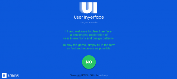
On the surface, User Inyerface is a normal website that challenges user interactions and web site design.
It is not normal. Right click on the blue background and select View page source and you will find the following title and site description in the HTML code:
<title>User Inyerface – A worst-practice UI experiment</title>
<meta name=”description” content=”User Inyerface – A worst-practice UI experiment”>
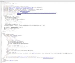
The site is a modern web design experiment meant to challenge designers and web users in a Web 1.0 manner intended to uncover multimodal challenges and to encourage the implementation of Web 2.0 standards. Or is it? The site is tracked with Google Analytics. Here’s a deliberately annoyingly small image with the GA tag highlighted in light grey for obscured viewing:
And here is the code snippet:
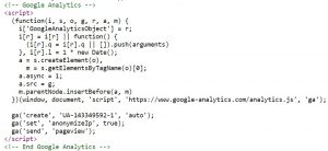
What are the behaviours that are tracked and why are they desirable to track? Grit, perseverance, critical thinking? At least anonymous tracking is set to true, otherwise I might have been inclined to spend less time testing accessibility and code and more on trying to complete the test faster for an anonymous data collector to ignore my improved timeliness of completion.
Did you test the site for Web Accessibility? I did. Buttons are properly identified. Images have alternative text. If a web user is aware of keyboard shortcuts and screen readers, this site is more navigable with closed eyes than to a well-sighted user (sometimes). A web accessibility colour contrast checker proves the site is a fail for people with colour-blindness. Foreground Colour: #0C58DA | Background Colour: #29C566 has a contrast ratio of 2.7:1. Follow that permalink and you will see that normal text, large text, and graphical objects all fail WCAG AA standards that have become the legal and desirable minimal norm in Canada for web accessibility.
Should we be happy that the click path in this annoying but benign web site is not an ad generator and is not linked to other information-feeding mechanisms leading to the dystopia outlined in Tufekci’s (2017) Ted Talk? Yes, quite certainly, because the challenge to complete the exercise exposes our critical thinking abilities and prior knowledge with application used in ways that make targeted information funnels easier to manipulate. And yet I am not completely sure how benign it is. If you disable cookies and javascript do you experience something less confusing (better)? Did you try it on a mobile device and see a message that there isn’t an app version?
Brignull and the darkpatterns.org community have created an interesting pattern library intended to name and shame users of manipulative design that make people sign up for or pay for things they do not need or want or intend to consume. If you are not interested, simply make your way through the labyrinth to the end, take a screenshot, and never return. What is gained from a little perseverance is an understanding of the underlying structure and deliberate means of attention seeking for beneficial aims:

Brignull, H. (2011). Dark Patterns: Deception vs. Honesty in UI Design. Interaction Design, Usability, 338. Retrieved from https://alistapart.com/article/dark-patterns-deception-vs-honesty-in-ui-design/
Tufekci, Z. (2017). We’re building a dystopia just to make people click on ads. Retrieved from https://www.ted.com/talks/zeynep_tufekci_we_re_building_a_dystopia_just_to_make_people_click_on_ads?language=en