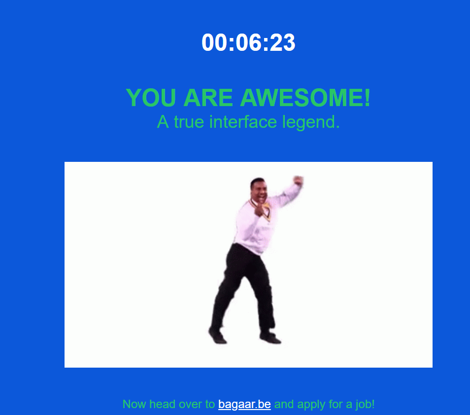
Task 10: Attention Economy

Well, I certainly don’t feel awesome. I feel frustrated and so glad I’m finished with that! I know that this was intentionally designed to manipulate my responses, but that knowledge didn’t lessen how infuriating it was to move through each step!
The two pages that almost stopped me from progressing were the password page and the final choose a picture page. In the password page, it took awhile before I realized how to open the Terms & Conditions pop up in order to scroll painstakingly slow down to select “Accept”. I thought I had figured it out, but I still couldn’t move on to the next screen! There was a message in red saying that my password was not unsafe. I didn’t know what that meant, and honestly I still don’t. I just kept trying different random letters and numbers until finally I was able to move on to the next page.
I also restarted the entire process when I pressed the “NO” button on the first page when I couldn’t find the right spot to click to proceed, so the time above should actually be longer.
On the final page I kept trying to choose the “correct” images (all light photos, checks, circles, and then I think back to light again). Each time I thought I had sussed out the right images and would click on submit, but I would simply be taken to the next page of photos. No matter how many ‘correct’ photos that I thought I selected, it was apparent that I wasn’t completing it ‘correctly’ according to what the website wanted. Eventually when I got back around to the initial light photos, I tried selecting all of them and sure enough that was the winning combination.
Other things that tripped me up, even while I was actively searching for misleads, was the page asking me to select three of my interests. I started unchecking all the boxes one by one until I reached the last column and automatically (accidentally) hit “select all” – bam, I had to start over again. This time I learned to take the shortcut, though, by moving my cursor immediately to the last column and hitting “unselect all”, then only having to uncheck the “select all” box.
Another note, while watching the History of advertising in 60 seconds, right near the end they display an image of an ad popping up on a YouTube video. As soon as the “Skip ads” icon appeared, I actually hovered my mouse over top of it and tried to click it without even thinking about it – it was such an automatic action!
This entire process really illuminated how little I actually think about the choices I make while navigating the Internet. I have been conditioned to automatically respond to the images presented to me on various websites, and it’s crazy to consider how certain presentations have been agreed upon as the ‘right’ way to do things. This task revealed how easy UX designers make our lives every time we go online!

Hi Angela,
I chuckled when I read your first few lines as they were similar to mine as I also did not feel awesome after this task. We shared many of the same observations about this experience and I was impressed with your completion time (but you explain this should be longer).
I really appreciated your connection and reflection on the conditioning we experience as users of websites and how we respond to attention economy techniques. When you say that the “process really illuminated how little I actually think about the choices” it made me more aware too of the ways in which this passiveness can be exploited by using this knowledge in UX design. Ultimately it’s more than just the images we have a conditioned response to but also the way we enter text and as you mentioned engage with the click boxes. One of my biggest takeaways from this website was that how we engage with a website (conditioned or not) the UX is very helpful in determining the credibility of the site’s owner. A presumption of this task is that we are willing to complete all steps which in a real-world environment would not always be true, but I guess there was some benefit to making us more aware of the vulnerabilities of our conditioning.