Task 9: Network Assignment Using Golden Record Curation Quiz Data
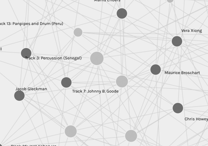
It was interesting to see all of our choices reflected by the nodes and edges. I began by taking a few minutes of playing with the screen: clicking various places, zooming in and out, and dragging the nodes around to watch the shape of the network shift and move. I realized that the darker nodes represented people (us, the students), and the lighter grey nodes represented the song choices. I assume that the size of the light grey nodes indicates how many people selected it; the larger it is, the more it was chosen, and vice versa. I also noticed that the smallest light grey nodes were far towards the edges of the web. This is because they have the least amount of edges connected to people (the dark grey nodes), whereas the more popular songs must be located within the web so their edges can reach all the people connected to them.
Once I was more familiar with the system of representation, I naturally sought out my name. Unfortunately I couldn’t find it anywhere, so I wondered if I was not part of the collected data because I completed the quiz so early in the week. This took a little bit of the enjoyment out of the task since it’s always fun and interesting to explore how you personally connect to other people’s choices, to see what place you have within a set of data. On the other hand, this forced me to be more objective, which I most definitely was not in the initial curation task.
But exactly why are these responses similar? Is the visualization able to capture the reasons behind the choices?
Beyond the connecting edges in this network, there is no identifiable reason for the connections. We are given only names of the people who made the choices, with no discernible information telling us their ethnicity, background, familial relations, education (though of course I know we are all at least at a Master level of education), religious beliefs, etc. Because of this, there is absolutely no visual representation that explains the individual choices that were made.
Using these visualizations as prompts, reflect on the political implications of such groupings considering what data is missing, assumed, or misinterpreted. For example, while you may be able to justify your musical choices in the Quiz, there also may exist reasons why you did not choose other pieces. Can the reasons for these “null” choices ever be reflected/interpreted in the data?
I don’t think that the reasons for the “null” choices could ever be reflected or interpreted in the data as displayed for this task. For example, the largest node in the web shows that most people chose Beethoven’s Fifth Symphony for their curated list, while I did not. In my blog post for Task #8, I was able to explain why I chose to leave it out (not because I didn’t like Classical music, or didn’t like Beethoven, or didn’t like that particular selection), that I felt there was too much of an imbalance toward including Western European ideas of ‘great works’ and I tried to include more diversity in my selections. But that nuanced decision could not ever be reflected in the data, which has only considered quantities and names (from what I can tell, anyway). Thinking about the module videos from this week, Google and larger search engines collect and use hidden data to personalize and individualize each presentation of their results. I don’t believe that this kind of hidden information is represented int he Palladio web because it simply hasn’t had enough time to collect such data, whereas Google does it every day that a person uses the Internet (which, I would hazard a guess, is every single day).
In the end, though, it was still really interesting to see my peer’s choices and consider how my own curated list was similar and different!