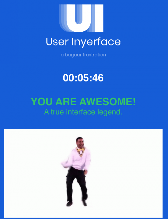
Attention economy is a very interesting topic to which I haven’t given much thought until today. After playing the game “User Inyerface” I realized how I personally just assumed that all websites and interfaces were designed to be “user-friendly”. Not only was the game designed to be not user-friendly, but it made me realize the power that interface and user designers have over us.
Harris (2017) points out how interface designers have such an impact on our daily lives, just by simply bringing our attention to notifications in our phones to something we might not have even wanted to pay attention to. This part really spoke to me, because it is in my to-do list to go through all the settings in my notifications to turn off so many. I just haven’t taken the time to do this task, but in retrospect, I wonder if I have already spent more time paying attention to the unsolicited notifications that are turned on by default.
When playing the game, I went in already knowing that it was important to pay attention to the design, as it was extremely misleading. The first screen had the big “No” which has all the attention, ready to lead us to click on. I had to pause for a moment, to refrain myself from just quick clicking based on learned behaviour, being led by the interface. I then realized the click here note, which was also misleading, as the word “click” was underlined and I assumed it was a link to continue, still no, it was the word HERE that took me to the next screen. Throughout the whole game, I was paying attention to all the misleading and not user-friendly choices. The one that took me the most, was when selecting the gender, as the selected choice ended up being the one not highlighted, I didn’t even think of that as an option. The one that made me laugh was the one to select the bows, as all of the images were bows: a knot, a crossbow, and bending as a sign of respect. The game was very clever in playing tricks to make us actually “pay attention”.
This game reminds me of an anecdote that tricked me because of being used to clicking the same buttons. I was selling something in the marketplace and received an e-transfer, like many other times, I clicked in my email in the logo for my bank and completed all the prompts, then I checked my bank transactions, and it showed that the money was taken out of my account. I went to check the email and then I realized that the email I received, was an e-transfer request for money, instead of a regular e-transfer email. I completely freaked out, because I thought this was a scam, what other information do they have on me? I contacted the person on the marketplace and fortunately, it was all a mistake, and I was able to get my money back, and sell the item. That day, I learned to slow down for a moment to pay attention to the information in digital formats, where I have to click on different interfaces, especially if I am familiar with the interface.
Harris, T. (2017). How a handful of tech companies control billions of minds every day. Retrieved from https://www.ted.com/talks/tristan_harris_the_manipulative_tricks_tech_companies_use_to_capture
_your_attention?language=en
