
For starters, I want to praise any of my colleagues who completed the game to its end. I am embarrassed to say I barely made it past a few stages of the game, despite dedicating a substantial amount of time, and repeated efforts in my attempts.
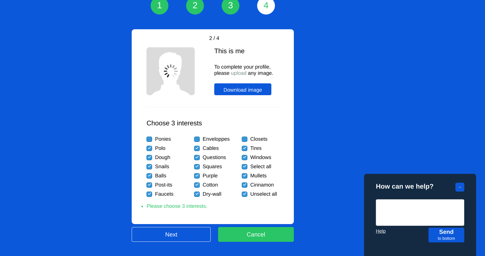
Here is where I ended up:
If one of my attempts to proceed in the game did not work, I would re-click what I knew progressed me prior and then my strategy became to click multiple locations on the page, and see what happened. Not that strategic, more desperate than anything. Frequently, I grew impatient (and I am a very patient person), exited the game, and started it again. I think my impatience stems from feeling so confident navigating web content, and using technology, that the expectation I placed on myself was too high. I am used to familiar patterns of locations and navigation language of hyperlinks, help chat tools, and scrolling. My familiarity with this comprehension is because I grew up shopping online, and researching on the web in high school and University with familiar web patterns. These skills and understandings are transferrable to new sites I visit.
I reflected on the stereotype that older adults have difficulties navigating the web, sometimes clicking buttons at random, and are unsure of how to comprehend how an app works. This is precisely how I felt in this activity. I wonder if this stereotype is prevalent due to their unfamiliarity with patterns of web design and navigation that are so engrained in someone like myself, who belongs to a generation consistently exposed to the web throughout our lifetime. When it comes to shopping or utilizing the web, Brignull’s (2011) term Homo Economicus seems not applicable. All customers are not the same, as they come to the online store with different capacities, and are impacted by their confidence as online shoppers, and prior experience in web navigation. I have recalled hearing older family members stating they gave up or will do it later, when online shopping because navigating was frustrating or difficult, which mimics a familiar feeling of what I had in this game. Maybe instead, the user design experience for an older adult was a VR experience of someone walking into the store, observing items and telling the assistant what they wanted to purchase. This would be in alignment with what an older adult is familiar with when it comes to shopping. This would reduce frustration, and the familiarity would enhance trust.
One of the dark patterns of the activity was being asked for our email addresses without identifying why the email address and information are necessary to be collected. I made up an email address and felt cautious about entering any identifying information because I am unsure how they would use that information. Also throughout my time within the game, it felt as though the game was not trying to make the experience easier for me. It felt as though I was not welcome, and felt unsupported. Certainly, I felt defeated by the game and wanted to leave the site so many times. This is a great activity for new web developers, to understand that the easier and more transparent the site is for the customer, they will see an increase in positive user feedback, leading to more sales, profit, and positive reviews.
References
Brignull, H. (2011). Dark Patterns: Deception vs. Honesty in UI Design. Interaction Design, Usability, 338.