Final Project: Tech Technologies Podcast Episode on ePortfolios

For ETEC 540’s final project, I chose to explore the growing prominence of the ePortfolio as a tool for professional development and resume-building.

The episode itself is 10 minutes in length, followed by the credited secondary sources in APA format.

To access the script as well as the reference list, you can view this Word document.

Hope you enjoy this episode!

Task 12: Speculative Futures

To view my narratives, click the following link: Digitized Education: Utopia & Dystopia

The two narratives I created explored the career trajectory of an ambitious Instructional Technologist in utopian and dystopian futures, relying heavily on ‘what-if’ scenarios. Dunne and Ruby (2013) allude to the financial crash of 2008 and how a new wave of interest and thought around alternatives to our current systems could look. My ‘utopia’ narrative is how I would love the future of EdTech, as well as political and economic systems, to be; conversely, my ‘dystopia’ narrative is how I can conceptualize EdTech, politics, and economics converging in the worst ways based on how these systems operate now. Hariri (2017) writes that a revolution in education is necessitated to not only make the process itself more meaningful, but to prepare them for new jobs as many current jobs could become automated in the coming years. As such, the relationships between EdTech, politics, and economics are crucial to examine.

As the word ‘utopia’ suggests, my narrative leverages Dunne and Ruby’s (2013) summation of how technology is often conceptualized in this type of speculation: perfect people interacting with perfect technologies in perfect worlds. In my narrative, everyone from education professionals to parents are equipped not only with modern learning technologies, but with the appropriate ‘know-how’ and critical thinking skills to use them effectively. Further, political and economic systems function in this narrative so that such knowledge is accessible to everyone. When designing this narrative, I imagined my own ‘fantastical’ desires for the future at the intersection of EdTech, politics and economics: the ‘dystopian’ narrative served almost as a photo-negative version of the utopian speculation, examining just how severely that same intersection can exacerbate preexisting problems, such as the commercialization of post-secondary education. The dystopian narrative is a brief exercise in “dark design… driven by idealism and optimism… [which] aims to trigger shifts in perspective and understanding that open spaces for… unthought-of-possibilities” (Dunnes & Ruby, p. 43, 2013). I wanted to consider how the world of EdTech shapes – and is shaped by – political and economic forces. Additionally, Hariri (2017) asserts that old political and economic models no longer hold and that scholars should strive to create new ones: a great fear for the future is not so much exploitation, but instead irrelevance.

Though I did not explore the fear of irrelevance in-depth in this exercise, engaging in this task had me thinking more critically about which professions within education might be compromised or even eliminated as EdTech grows in global prominence. As for the utopian narrative, Dunne and Ruby (2013) remind us that such speculations are not intended to be manifested into reality but rather to sustain our idealism and always consider the alternatives we aim to build. Above all else, this thought experiment was extremely captivating for me as it directly impacts my own career path and sense of direction as I keenly observe the trends in both education (K-12, college, university, etc.), EdTech, and political and economic affairs.

References

Dunne, A. & Raby, F. (2013). Speculative Everything: Design, Fiction, and Social Dreaming. Cambridge: The MIT Press. Retrieved August 30, 2019, from Project MUSE database.

Hariri, Y. N. (2017). Reboot for the AI revolution. Nature International Weekly Journal of Science, 550(7676), 324-327.

Task 11: Algorithms of Predictive Text

The prompt I selected for this exercise was “Every time I think about the future…”. The prompt itself invokes memories of reading blogs as well as speculative fiction and non-fiction: everything from socioeconomic issues to technological developments was consistently addressed in such writings, often with a skeptical and even dystopian tone. Of course, those writings were not the products of predictive text; rather, they benefitted from writers’ deliberate word choices and structure.

Below is the result of my predictive text prompt:


Admittedly, the predictive text did capture some of my common verbiage: mostly the use of the words “quite” and “rather”. However, the recommended vocabulary to formulate this statement did not really reflect words I would have used to describe my thoughts regarding the future. For instance, the phrase “small place” in this context is certainly not one I would have used; instead, I would have perhaps written something like “competitive place” or “difficult place” in my speculation. Also, the first sentence “…not quite as much as I want…” had no appropriately recommended adjective in lieu of the word “much”. It seems that when I attempt to “translate” this statement, it’s as if the predictive text is trying to articulate the thought that the world won’t have as much abundance and opportunity in the future for the growing number of people. In this respect, I would say it captures my sentiments well, despite the awkward vocabulary and syntax.

Screenshot of prompt “I’m thinking about…” from r/predictivetextprompts

This prompt “I’m thinking about…”, like many of the others on r/predictivetextprompts, resulted in mostly nonsensical statements and even non-sequiturs. I imagine that the vocabulary that appears in each of these statements might reflect the individual user to some degree, but of course does not capture the “voice” with which most people write – even if it is informal.

Predictive text has massive implications for politics, business, and education. As observed by McRaney (n.d.), his prompts “The nurse said…” and “The doctor said…” had very gendered outcomes, being followed by “she” and “he” respectively. The traditional assumption of nurses being women and doctors being men is reflected in this predictive text, perpetuating subtle yet insidious forms of sexism. In my view, the greatest danger of algorithms in public writing is the perpetuation of prejudices, including sexism, homophobia, and racism. McRaney’s (n.d.) podcast notes that bias is necessary for algorithms, but it is necessary for humans to differentiate between ‘just’ and ‘unjust’ bias: in essence, designers of algorithms are responsible for mitigating the unintended consequences of bias in their work. As alluded to in last week’s blog entry, politics is an arena especially vulnerable to creating and perpetuating echo chambers – particularly those that perpetuate these more ‘unjust’ biases.

References

McRaney, D. (n.d.). Machine Bias (rebroadcast). In You Are Not so Smart. Retrieved from https://soundcloud.com/youarenotsosmart/140-machine-bias-rebroadcast

r/predictivetextprompts. (n.d.). Retrieved July 12, 2019, from Reddit website: https://www.reddit.com/r/predictivetextprompts/

Task 10: Attention Economy

‘User Inyerface’ was intentionally designed with ‘dark patterns’ and even chaos at the forefront of the experience. It was exceedingly difficult to navigate the game or even understand the purpose of each page. I documented observations during my brief, yet frustrating experience with the game below:

    • On the main page, you could only advance by clicking “here” – which was in plain-text only and did not appear to have an embedded link
    • Text fields contained placeholder text, even when you click on it to insert your own; the e-mail entry was also strangely separated (i.e., local part, @, and domain)
    • The timer was intense as you only have one minute to enter your information; it becomes “locked” once that time has elapsed
    • The “How can we help?” box moves down very slowly when you want to minimize it, and the options don’t provide any assistance if you click on them
    • The password conditions were too numerous and convoluted to fulfill (e.g., must contain one letter of your e-mail address, needs to contain a Cyrillic character, etc.); I googled Cyrillic characters just to incorporate one into the password field!

After my fourth page refresh and even after meeting all the password conditions laid out in the instructions, I still saw a message that read “Your password is unsafe” (see screenshot below). As such, I could not figure out how to progress any further in the game.

Screenshot of my 4th page refresh and attempt – note the inclusion of a Cyrillic character in the ‘password’ field

The overall “purpose” of each page in the game was also lacking, thereby not incentivizing me or anyone else to continuously want to try navigating through it. It is, in essence, the summation of all “bad practices” in UX/UI design. However, we engage with this game knowing full well its intentionally bad design: as noted by Brignull (2011), dark patterns overwhelmingly perform well in A/B and multivariate tests because design ‘tricks’ are frequently employed to deceptively convert users rather than allow them to make more informed choices – whether this is for purchasing an item/subscription or even signing up for a mailing list.

As an LX Designer, I always try to design eLearning that is both ethical and responsive. For instance, my company will not set up data gathering functionalities without first obtaining the explicit consent of learners. Also, we keep the end user’s needs, time, and intuition at the forefront of all design choices. Brand/company image, credibility, and trust are cornerstones of stable, long-term growth (Brignull, 2011); this crucial insight applies to both UX/UI and LX design, although it does take time to solidify this within an organization or company. There must be an underlying philosophy and strategy of transparency and a direct eagerness to minimize or even entirely remove dark patterns from any type of design.

References

Brignull, H. (2011). Dark Patterns: Deception vs. Honesty in UI Design. Interaction Design, Usability338.

Task 9: Network Assignment Using Golden Record Curation Quiz Data

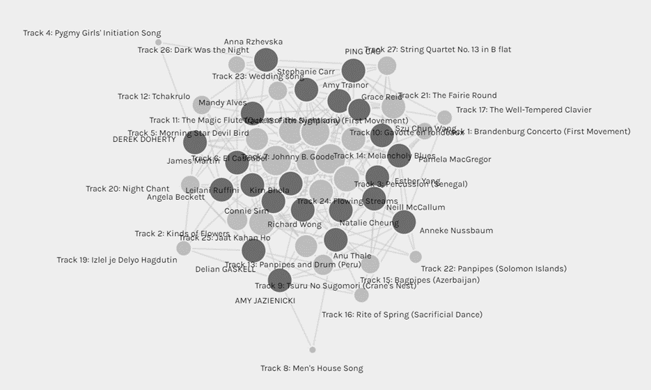
Screenshot: Unfiltered Data

At first glance, this visualization representing everyone and their selected tracks is quite complex and even indiscernible insofar as ‘edges’/’relations’ (Systems Innovation, 2015) are concerned – it is not easy to see who selected which tracks. The individuals and tracks are numerous and are both represented as ‘nodes’ (Systems Innovation, 2015); the resulting visualization gives the impression of great complexity for the reasoning behind everyone’s track choices, but the tool cannot detect these reasons. In our blog entries, we were required to specify our reasoning for our choices; however, the tool is not configured to account for this more nuanced “criteria”. This visualization depicts only a very high-level impression of which tracks might have been selected with greater frequency when compared against others.

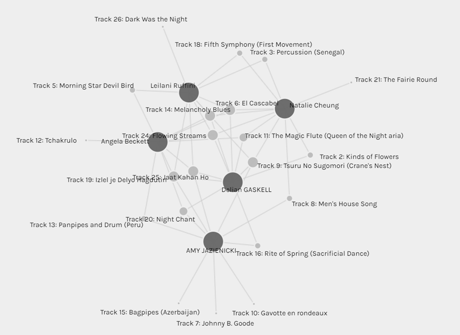
Screenshot: Community 3

When I selected the ‘Community 3’ grouping, it became easier to at least discern who selected which tracks since these individuals’ choices had a fair degree of overlap. Even with this increased clarity however, the reasoning behind everyone’s choices is not indicated in the visualization. At best, we could only speculate as to why some track nodes have greater ‘Degrees of Connectivity’ (Systems Innovation, 2015) when compared with others. In the visualization above, tracks such as ‘Melancholy Blues’, ‘El Cascabel’ and ‘Flowing Streams’ were frequently selected, whereas tracks such as ‘Bagpipes’, ‘Johnny B. Goode’ and ‘Dark was the Night’ were less frequently selected. These selections have great degrees of variation when it comes to instrumentation, vocals vs. no vocals, cultural origins, etc. The only speculation I would make with this data set is that perhaps diverse cultural representation was an important factor for many of us in this exercise. However, without reviewing everyone’s blog posts to provide context for their track choices, it is impossible to know simply from this visualization alone. By extension, “null” choices also cannot be explained without this qualitative context – even then, I doubt that everyone specified why they didn’t select specific tracks in their blog entries. Also, some choices might simply be reduced to much more subjective and even arbitrary criteria, such as simple personal preference.

┏━━━━━━༻❁༺━━━━━━┓

With respect to political implications, how everyone perceives what “represents” humanity through song could be vastly different due to varying biases, worldviews, experiences, and even aspirations. This, of course, is not to suggest that any of these things would result in “wrong” choices, but rather it would be very illuminating to understand the nuance behind everyone’s choices: of course, how we perceive (and engage with) cultural diversity permeates other aspects of our lives outside of an exercise such as this.

Additionally, how data is used for organizational and predictive purposes impacts our perceptions not only of the data in isolation but of the wider world. For instance, the ‘Community 3’ grouping could serve as a microcosm for what we colloquially refer to as “echo chambers”: online communities that propagate views and opinions we already agree with. Social media and search engines operate algorithmically and tend to generate information that it predicts we would be interested in and “align” ourselves with. However, the original screenshot of everyone’s choices could also serve as a microcosm for openness and curiosity when it comes to gathering and interpreting information about the wider world.

Ultimately, I’d make the case that this exercise has emphasized the great need for critical thinking in data literacy. When confronted with such information, it is crucial to ask questions such as:

“Who/Which organization generated this data?”
“What are the explicit and implicit assumptions made in the data set(s)?”
“What other sources could I consult to view this data through a ‘Big Picture’ lens?”

References

Systems Innovation. (2015, April 18). Graph Theory Overview. Retrieved from https://youtu.be/82zlRaRUsaY

Systems Innovation. (2015, April 19). Network Connections. Retrieved from https://youtu.be/2iViaEAytxw

Task 8: Golden Record Curation Assignment

10 Song Choices

Please note, I have specified which tracks do and do not contain vocals.

      1. Azerbaijian Bagpipes (Ugam) (instrumental)
      2. Men’s House Song – Papua New Guinea (instrumental)
      3. Navajo Night Chant – America (with vocals)
      4. Panpipes and Drum Song – Peru (instrumental)
      5. Sacrificial Dance (Igor Stravinsky) – Russia (instrumental)
      6. Johnny B. Goode (Chuck Berry) – America (with vocals)
      7. Jaat Kahan Ho (Surshri) – India (with vocals)
      8. Iziel je Delyo Hagdutin – Hungary (with vocals)
      9. Gavotte en Rondo (Bach) – Germany (instrumental)
      10. Cranes in Their Nest (Shakuhachi) – Japan (instrumental)

Reducing the list of 27 tracks down to 10 was considerably challenging, as I had strenuous criteria that I was employing. In my selection, I wanted to showcase tracks that are exclusively instrumental and those that include vocals as well to highlight the variations in human creativity and self-expression. Additionally, I wanted my list to truly span across different continents, countries, cultures, genres, moods, tones and even types of “stories” that were told through music. Although most of these tracks do not exceed three minutes, ‘more’ is not necessarily ‘better’ for a musical time capsule in my view. As articulated by Smith (1999), digital technology affords us the opportunity to access resources that we otherwise would not have had access to; listening to the tracks and even reading the comments on YouTube enabled me to not only have direct and convenient access to them, but also to explore other people’s perspectives that I would not have met or interacted with otherwise.

References

Smith, A. (1999). Why digitize? Retrieved June 15, 2019, from Council on Library and Information Resources website: https://www.clir.org/pubs/reports/pub80-smith/pub80-2/

Task 7: Mode-Bending

Mode-changing enables us as Designers of multimodal literacies to both inherit and create new meanings, thus empowering us to design social, workplace, public, and community futures (NLG, 1996). In essence, we are involved in developing new uses of old materials with various design modalities (NLG, 1996). For this task, I redesigned Task 1 into an exclusively Audio Design vs. its original inception as a blending of Linguistic and Visual Design. The task “What’s in Your Bag?” is by default linguistic and visual, employing written language to convey what is portrayed in a photo or even artistic rendition of the contents of one’s bag. To make this compelling to a listener, I took full advantage of the Audio Design elements at my disposal to create a “podcast” experience: equipped with intro and outro music, accompanying sound effects and high-quality voice recording and editing, I created an “episode” as if the segment is part of a broader podcast series. To engage the listener further, I avoided simply describing the items and their “literacies” and instead opted to set them up as a “game” for listeners to speculate about and guess at: this encourages more active listening and thoughtfulness when compared against the original design modalities of the task. As noted by Dobson and Willinsky (2009), digital literacy seems to be fostering a higher degree of participation in various activities due to the ease of writing, enhanced linking of ideas and texts, and the aspiration of providing universal access to knowledge. Engaging in this task compelled me to think more critically about how content can be presented through a myriad of modalities to garner an audience and facilitate meaningful participation.

I would make the case that audio-visual modes have become more prevalent, but not necessarily at the expense of written ones: rather, these modes are still very much dependent upon solid written foundations. For instance, when someone watches a YouTube video or listens to a podcast, the content creator still often needs some degree of scripting to ensure their materials ‘flows’ well, written content for transitions/chapters/segments, and even the inclusion of Closed Captioning (CC) for accessibility. Additionally, websites such as Tumblr and Pinterest tend to blend such Designs together – particularly Linguistic and Visual. I don’t believe the question should be “Which modes are dominating?”, but rather “Which modes are dominating which spaces and why? For whom is this content created?”

The Information Age has necessitated not only a general understanding of multiliteracies, but also working knowledge of how to produce them: this is especially true for educators, as they are increasingly challenged to create multimodal content to engage and instruct their learners. NLG (1996) asserts that meaning making requires inheriting and (re)creating multimodal relations within electronic multimedia. Millennials and Zoomers specifically have been acclimated to this reality through simply navigating the world as it currently exists – information permeates our daily lives through the devices and apps we use to the cultures and subcultures that influence (and are influenced by) them. To create relevancy, educators must recognize and integrate subjectivities (e.g., interests, purposes) with their respective languages and discourses to foster compelling learning experiences (NLG, 1996).


References

Dobson, T., & Willinsky, J. (2009). Digital Literacy. In D. Olson & N. Torrance (Eds.), The Cambridge Handbook of Literacy (Cambridge Handbooks in Psychology, pp. 286-312). Cambridge: Cambridge University Press.

The New London Group.  (1996). A pedagogy of multiliteracies: Designing social futures. (Links to an external site.)  Harvard Educational Review 66(1), 60-92.

Task 6: “An Emoji Story”

For context, I used my iPhone’s Notepad app to complete this week’s task.

Did you rely more on syllables, words, ideas or a combination of all of them?

As the series I selected is quite complex and includes many critical and nuanced details, I found it challenging to synthesize all that complexity into simple emojis. I found that I relied almost exclusively on words and ideas, but I can concede that my interpretation of the narrative might differ significantly from someone else’s, thus choosing different emojis and perhaps even sequencing altogether. Bolter (2001) articulates that two readers of the same pictorial writing could use different words to describe what they see, as it is constructed culturally as being closer to the reader since spoken language is not used to mediate the meaning. Without the opportunity to communicate anything orthographically, it will be fascinating to see how my peers might interpret what I have developed here.

Did you start with the title? Why? Why not?

Yes, I started with the title because it could be conveniently constructed using emojis. Even if someone has not watched the series (yet), they can glean a very general impression of what happens throughout the course of the story; the “spoilers” are not easily discernible, but to someone to has watched the series, they may be able to interpret my “retelling” of the narrative through emojis. Interestingly, Bolter (2001) describes pictorial writing as lacking narrative power since the picture elements can contain a myriad of verbal meanings that often mean too much as opposed to too little. In essence, if someone has not watched the series, it could almost represent a game of ‘Broken Telephone’ in which the reader has a drastically different interpretation of the narrative than what it actually is.

Did you choose the work based on how easy would it be to visualize? 

No, I chose the work based on my passion for it and the inherent challenge of conveying major plot points without the convenience of orthographic communication. I tried to focus on the most important events and outcomes, paying special attention to the sequencing of events to cause less confusion to those who might recognize the series and have seen it. I found that it was quite enjoyable to “boil down” the essence of a story I love through a purely pictorial format as I am a highly visual person to begin with.


References

Chapter 4. Bolter, J. D. (2001). Writing space: Computers, hypertext, and the remediation of print (2nd ed.). Mahwah, N.J: Lawrence Erlbaum Associates. doi:10.4324/9781410600110

Task 4: “Manual Script”

Below are four photos capturing my written exercise. Underneath is my reflection. 

I normally type, as it is easier for me to (re)write and (re)organize my text content. Writing by hand is comparatively much more time-consuming and laborious for me: when mistakes are made, such as when I realize I needed to include a word or sentence, it often requires “squishing” it into the content, or even manually erasing and rewriting parts of the text so that the readability remains intact. If I wanted to bring a paragraph or section up or down, that would be virtually impossible without a lot of additional work – for typing though, this is not an issue at all as I can simply copy and paste it as needed. As noted by Clement (1997), texts become more complex in design and layout: applications like Microsoft Word have enabled a ‘digitized’ way to divide, punctuate, colorize, and even visualize content. Since I wanted to avoid significant changes while writing by hand, I had to think carefully about what I wanted to write before putting pencil to paper for this exercise.

As new ideas often come to me while I’m in the process of writing, I prefer more mechanized forms of it as opposed to writing by hand. Typing provides me with a delicate balance of spontaneity and order, allowing me to make drastic alterations quickly without producing “messy” documentation.

During my undergraduate years, I found that most of my peers preferred to type out lecture notes. Bolter (2001) emphasized the concept of remediation when new text technologies and economies of writing emerge: for Gen Y and Gen Z, this mechanized form of writing enables us to quickly and easily (re)write and (re)organize content, as many of us became acculturated to this approach in the Information Age. Innis (2007) reinforces this by articulating that technological change often a major catalyst for cultural shifts, and in my view the digital era is no exception.

References

Bolter, Jay David. (2001). Writing space: Computers, hypertext, and the remediation of print [2nd edition]. Mahwah, NJ: Lawrence Erlbaum.

Clement, Richard W. (1997). “Medieval and Renaissance book production (Links to an external site.)“. Library Faculty & Staff Publications. Paper 10. https://digitalcommons.usu.edu/lib_pubs/10

Innis, Harold. (2007) Empire and Communications. Toronto: Dundurn Press

Spam prevention powered by Akismet