
‘User Inyerface’ was intentionally designed with ‘dark patterns’ and even chaos at the forefront of the experience. It was exceedingly difficult to navigate the game or even understand the purpose of each page. I documented observations during my brief, yet frustrating experience with the game below:
-
- On the main page, you could only advance by clicking “here” – which was in plain-text only and did not appear to have an embedded link
- Text fields contained placeholder text, even when you click on it to insert your own; the e-mail entry was also strangely separated (i.e., local part, @, and domain)
- The timer was intense as you only have one minute to enter your information; it becomes “locked” once that time has elapsed
- The “How can we help?” box moves down very slowly when you want to minimize it, and the options don’t provide any assistance if you click on them
- The password conditions were too numerous and convoluted to fulfill (e.g., must contain one letter of your e-mail address, needs to contain a Cyrillic character, etc.); I googled Cyrillic characters just to incorporate one into the password field!
After my fourth page refresh and even after meeting all the password conditions laid out in the instructions, I still saw a message that read “Your password is unsafe” (see screenshot below). As such, I could not figure out how to progress any further in the game.
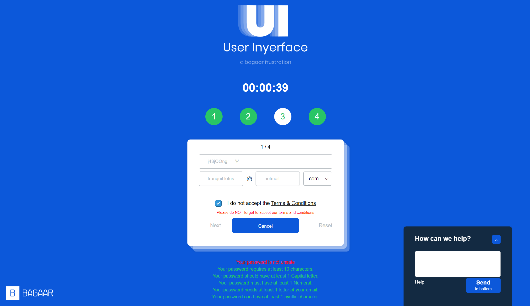
Screenshot of my 4th page refresh and attempt – note the inclusion of a Cyrillic character in the ‘password’ field
The overall “purpose” of each page in the game was also lacking, thereby not incentivizing me or anyone else to continuously want to try navigating through it. It is, in essence, the summation of all “bad practices” in UX/UI design. However, we engage with this game knowing full well its intentionally bad design: as noted by Brignull (2011), dark patterns overwhelmingly perform well in A/B and multivariate tests because design ‘tricks’ are frequently employed to deceptively convert users rather than allow them to make more informed choices – whether this is for purchasing an item/subscription or even signing up for a mailing list.
As an LX Designer, I always try to design eLearning that is both ethical and responsive. For instance, my company will not set up data gathering functionalities without first obtaining the explicit consent of learners. Also, we keep the end user’s needs, time, and intuition at the forefront of all design choices. Brand/company image, credibility, and trust are cornerstones of stable, long-term growth (Brignull, 2011); this crucial insight applies to both UX/UI and LX design, although it does take time to solidify this within an organization or company. There must be an underlying philosophy and strategy of transparency and a direct eagerness to minimize or even entirely remove dark patterns from any type of design.
References
Brignull, H. (2011). Dark Patterns: Deception vs. Honesty in UI Design. Interaction Design, Usability, 338.