I love working with data and extracting meaningful clusters from results. This visualization was nice and simple, and allowed basic extraction of data. However, the visualization is not able to capture the meaning and value behind the data points. The data points are simply numbers encoded for us to gain an understanding of the similarity in patterns between our responses, however, it does not provide depth to our responses. The lack of depth can result in assumptions, miscommunication, and misinterpretation. In an effort to avoid making false assumptions, this data needs to be accompanied by more qualitative data, such as interviews.
In UX, we use data to help us understand our users. The easiest way to collect this data is to conduct surveys, multiple choice surveys in particular, as attrition rates increase as researchers add more short/long answer questions. Therefore, the data from these surveys only captures a snapshot of how our users are feeling. To strengthen our understanding of our users, I will often conduct in-person or virtual interviews to better understand pain points. I then put this data together with teammates using a technique that we call affinity diagramming. Affinity diagramming is a great group activity that allows us to visual our data and group data into meaningful clusters (Figure 1). After I am able to visualize this data, I will take it and create a customer journey map to help build empathy with the users and their pain points (Figure 2). The purpose of these activities is to ensure we are putting humans first and understanding their struggles. If we had only used the survey data itself, our end result would look different to a certain degree, and we would not have the same level of empathy for our users. The same logic applies to this assignment in that we have to rely on our assumptions to guess the parameters that our classmates used in their evaluation. In order to actually understand these results, I would avoid making these assumptions and I would prefer to speak to my classmates and understand how they made their selections.

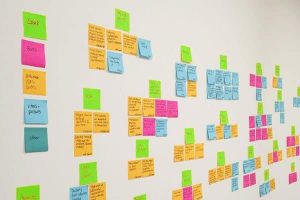
Figure 1: Affinity Diagram
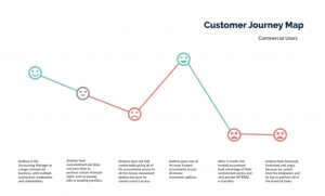
Customer Journey Map