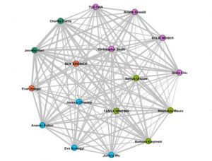
It was interesting to see our choices mapped and networked to show our selections and relationships visualized. I often find visualizations challenging. My preference is for words, text and explanations, more qualitative rather than quantitative information. While visualizations are a great at expressing generalities or trends, I am often suspicious of them as I feel they can lack nuance and be biased or positioned to justify a particular point.
All this being said, this was a pretty fun exercise. My first reaction to the maps was one of trying to make sense of them and feeling a bit overwhelmed by “network of curators and works” and “curator communities.” It was with “curator communities 2”, where all the links were removed, that I was able to get a feel of the relationships and could go back to the other images to analyze the links. The map with just the colored nodes was easier for me and I was curious to see why some people were assigned the same the color or different colors. When I looked at Jennifer’s, who was green like me, post I saw a similar logic to our selection criteria. Then when I went to Johnny’s page who was on the other side of the graph and colored blue, he had completely different reasoning for his selections I hadn’t even considered. I really enjoyed going through everyone’s blog posts and seeing the various arguments and criteria for their selections. I was exposed to ideas I hadn’t considered and found value in. If I had to curate my list again, I’d likely refine my criteria base on some of the arguments of others: emotion, protecting us from harmful aliens, trying to communicate with the aliens, and gender representation.
Regarding the creation of communities, after reading the blog posts and selections, I could see the logic of the nodes and links in the visualizations and found them to be effective in creating communities and commonalities based on our reasoning and selections. My concern about the visualizations and links is that they create communicates based on simplified ideas and miss nuances. In this case, Ernesto created the communities based on his interpretation of our selection criteria. Whether it is human made or a machine looking for common words to link us, there is the potential for bias or a limited view of who we are.
There is also the risk that people just identify themselves as like-minded or part of a community and miss out on other arguments. If we are not open to other perspectives, then we limit ourselves to communities that only share similar views. This has serious political implications. A concern would be algorithms that expose us only to information that we want to hear. Or what if something was not popular or not selected because it has fewer connections. This made me think of this week’s video on search engines, where the sites with the most hyperlinks to them are the ones that show up as top results. One can argue that sites with more hyperlinks are likely the best or most useful, as they are the most selected, but what if valuable information is lost because it has fewer links.
While my preference is for text over visualizations, I do appreciate that others are more visually oriented. I’ll be interested to hear how others reacted to this exercise and if they preferred the visualizations to reading people’s posts. Though I find it a bit disheartening to think about, I’m open to the idea that algorithms may be better able to find links, connection, and commonalities that we cannot perceive. And perhaps algorithms and be set up that collect so much information that they know us better than we know ourselves. My fear would be that this information is somehow used to lock us into communities where we are not exposed to the ideas of other communities.