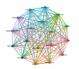
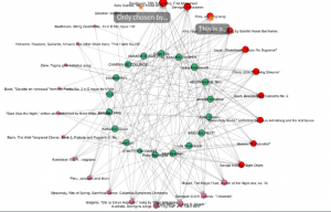
While it was interesting to see which songs were chosen collectively, and who I personally had selections in common with, I can tell that there is a great deal of data missing from this representation.
For starters, the criteria each individual person used to make their selections are missing. This means that my carefully curated song selection could also be one someone chose “just because” leaving us with a connection that is rather invalid. With the criteria out of the picture, we’re left to make assumptions about why those songs came out on top.
When examining the colorful graph that shows connections between individuals, you cannot see which song you both selected which leaves us with a web of connections without much data to read. If I didn’t know what this web was showing, I could make all kinds of assumptions about why people have lines drawn connecting their names.
The second graph that details song choices simply just shows what songs were selected (again without criteria). I feel like this would be better displayed in a spreadsheet where one could apply filters to more easily see and interpret data about who chose what song, how many people chose that song, and more.
Lastly, “null” choices can indeed be represented in this data as you can easily tell which songs were not regularly selected on the left-hand side of the 2nd, more detailed web. This allows you to see which songs were chosen but didn’t make the collective top 10, while any song missing from this chart did not make the cut at all. Again, without the criteria or reasons behind it, this data doesn’t actually tell us much information. In addition, I’d like to see all of the songs on the web, whether they were selected once or not, to help provide more data to an outside viewer.


