Final Project: Describing Communication Technologies

Made with Visme Infographic Maker

Below is a link where you can access my infographic poster on Chatbots and Language Learning.

https://my.visme.co/view/n04xqn9z-didy-etec-540-final-project

References

Huang, W., Hew, K. F., & Fryer, L. K. (2021). Chatbots for language learning–Are they really useful? A systematic review of chatbot‐supported language learning. Journal of Computer Assisted Learning, 38(1), 237–257. https://doi.org/10.1111/jcal.12610

Kim, N.-Y., Cha, Y., & Kim, H.-S. (2019). Future English learning: Chatbots and artificial intelligence. Multimedia-Assisted Language Learning, 22(3), 32-53. https://doi.org/10.15702/mall.2019.22.3.32

Mohamed, S. S. A., & Alian, E. M. I. (2023). Students’ attitudes towards using chatbot in EFL learning. Arab World English Journal, 14(3), 15-27. https://dx.doi.org/10.24093/awej/vol14no3.2

Xiao, Y., & Zhi, Y. (2023). An exploratory study of EFL learners’ use of ChaTGPT for language learning tasks: Experience and Perceptions. Languages, 8(3), 212. https://doi.org/10.3390/languages8030212

Task 12: Speculative Futures

Describe or narrate a scenario about a document found a century into a future in which society as we know it has come apart. Your description should address issues related to disease and elicit feelings of anger.

Click the YouTube video for audio, and read the letter below.

References

[Deleted]. (2020, March 22). Mini deck review! Zombie Tarot by GAR Productions. The cards have Zombie/1950 artwork. card stock is thick. The pentacles are hazards. Only $17! A fun deck if you’re into zombies. The book is very informative and also has 1950/Zombie vibe. Backs aren’t good for reverse reading. 7/10 [Online forum post]. Reddit. https://www.reddit.com/r/tarot/comments/fmk7vt/mini_deck_review_zombie_tarot_by_gar_productions/

Lab, S. (n.d.). The Thing From The Future. Situation Lab. https://situationlab.org/project/the-thing-from-the-future/

Survival Channel. (2021, September 5). Post apocalypse music vol.1 [Video]. YouTube. https://www.youtube.com/watch?v=YUoHI2gDf7k

Task 11: Detain/Release

I decided to do Option 1, the Detain/Release simulation, for Task 11.

At the beginning of the simulation, I spent a lot more time carefully reading the charges for each defendant and their statements, but later on relied a lot more on the low/medium/high risk assessment when deciding whether or not to detain or release the defendant. Towards the end of the simulation, I found myself almost mindlessly selecting “detain” when I saw yellow for medium and red for high when it came to the defendants’ risk assessment in terms of committing a crime and violence. When defendants I released appeared in the newspaper headlines, I became more cautious again with my rulings. I also felt some pressure to release more defendants and be more lax with my rulings when I noticed the jail capacity bar filling up.

While I avoided looking at the blurred faces, the ages, and the sex of the defendants to ensure that I would not be biased in any way when making my decisions, I ended up being more careful with my rulings for defendants that had statements concerning family compared to those that had statements about housing or work; however, for defendants that committing assault or more violent crimes, I detained them regardless of their personal statements.

The most terrifying thing I noticed from doing the Detain/Release simulation is the fact that it almost felt like a game to me, where I felt pressured to keep jail capacity and fear low and at times relied too much on the risk assessment. As Porcaro (2019) stated, “the mere presence of a risk assessment tool can reframe a judge’s decision-making process”, which is definitely what happened when I was doing this simulation. I am also terrified by the thought of real-world judges in pretrial hearings potentially being influenced by these AI risk assessments without realizing they are. Are we relying too much on technology, to an extent where our humanity is being compromised?

References

Detain/Release. (n.d.). https://detainrelease.com/

Porcaro, K. (2019, January 9). Detain/Release: simulating algorithmic risk assessments at pretrial. Medium. https://medium.com/berkman-klein-center/detain-release-simulating-algorithmic-risk-assessments-at-pretrial-375270657819

Task 10: Attention Economy

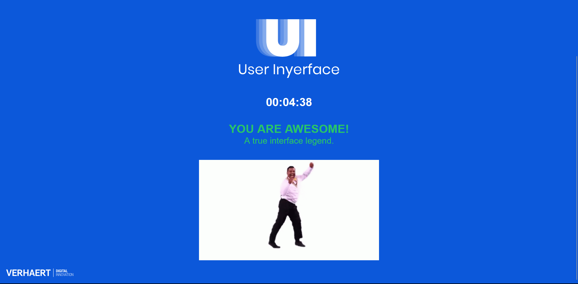
This task was so much fun to complete, and got me thinking about two things in particular: distractions in user interface that purposely try to grab our attention and the effects of good/bad user interface on overall user experience.

The online game for Task 10 had various kinds of distractions to keep us from completing the game quickly. Below are a few that I found particularly annoying when doing this task:

  • The “hurry up time is ticking” pop-up that was first, insanely difficult to close, and second, popping up way too often
  • The “how can we help” box at the bottom right that blocked the form we had to fill, and then really took its sweet time going down
  • The extremely large, bright red banner at the top about cookies

In terms of UI and how bad it was in this game, here are some features that really frustrated me:

  • Text commands that contradicted the visual components presented to us, with random bits capitalized or underlined
  • The password requirements using too many modal verbs
  • Drop-down menus that were not in alphabetical or chronological order when  they should have been, or were in alphabetical order when it was not necessary
  • No option for “select all” when we had to actually select all the images
  • A row of check boxes that were initially hidden because of a page scroll which was only noticed after reaching the bottom of the page
  • The entire section with the pictures, check boxes, and terrible instructions

While the UI of User Inyerface is terrible–and purposely made to be that way–it is definitely not as atrocious as some of the UI I have seen on other websites. As I have been surfing the Japanese side of the net more often since immigrating there, I have come to notice the stark contrast between Japanese webpage design and the more minimalist and sleek designs of Western websites. With “the walls of of text, lavish use of bright colors & 10+ different fonts”, Japanese websites are often headache-inducing, distracting, and a challenge to navigate (Missbichler, 2023). It feels as though the goal of Japanese UI and UX is to cram as much text and visual imagery as possible in the available space. For online shopping websites, this information overload can be a method to push users to make more purchases, or to increase browsing time–something that I have fallen prey to many times.

For those more interested in how wild Japanese web design can be, search up any Japanese YouTuber and look at the thumbnails of their videos. It is a very “the more the merrier” kind of vibe.

It is sad to say that even though I am aware about the tricks and dark patterns in UI and UX, I often still find myself being sucked into the void of the net and of social networking sites. While writing this post, I have checked my Instagram feed and swiped through Tik Tok mindlessly a few too many times, distracting myself from completing this task in one go!

References

Brignull, H. (2011, November 1). Dark Patterns: Deception vs. Honesty in UI Design. A List Apart. https://alistapart.com/article/dark-patterns-deception-vs-honesty-in-ui-design/

Missbichler, M. (2023, October 18). Why Japanese Websites Look So Different – Mirijam Missbichler – Medium. Medium. https://medium.com/@mirijam.missbichler/why-japanese-websites-look-so-different-2c7273e8be1e

User Inyerface – A worst-practice UI experiment. (n.d.). https://userinyerface.com/

Task 9: Network Assignment

Before this task, I thought I was a visual learner; however, after looking at our class data on the Palladio app, I was incredibly confused, overwhelmed, and just ?????, and I wondered if others in the class also felt the same way!

During my first attempt at analyzing the data, I was able to figure out that of the six communities formed, I was part of five of them. Then after playing around on Palladio some more, I was able to find the list of the Golden Record tracks sorted by size from largest to smallest. By looking at this list, I found that out of the top ten pieces selected by our class (Tracks 25, 18, 3, 23, 24, 14, 7, 1, 9, and 20), seven of them were those that I included in my curated list (Tracks 25, 18, 3, 24, 14, 7, and 9).

While the visual representation generated on Palladio is a great first look at the data of our class, I believe that there are some limitations. The visualization of this data can show us which pieces were popular, as well as the links between classmates that chose similar pieces, but there is no indication as to why these pieces were popular, or everyone’s reasoning behind their choices. Only after looking at the webspaces of my classmates was I able to see that we all had very different criteria when it came to our selection process–some selections were made with musical/cultural diversity in mind, while others were made based on emotions and pure feeling. These differences in our selection process criteria make me wonder about the validity of the list in the above screenshot, and whether or not the data would be more valid had there been some sort of rubric everyone had to follow when selecting their pieces. I would also love to see a detailed explanation of the criteria used for the Golden Record itself!

Spam prevention powered by Akismet