Monthly Archives: November 2021

Task 12 – Speculative Futures

I found this week to be very interesting and actually reassuring to hear about what communication might look like in the future. In her video, Shannon Vallor did a great job explaining where AI was likely to go and how AI can be used to make good social change. Having watched many movies about cyborgs taking over the world, she made me feel at ease when she explained that this type of technology is extremely far away from being achieved. Although we can’t really predict the future it was interesting to hear the thoughts and opinions of some of the leaders in these technologies. I especially like the discussion from Vanderbilt University with Doug Fraser, Corbette Doyle, and Jaco Hamman  (This is where I got the inspiration for my two narratives). Even though they all had different educational backgrounds and expertise, they had similar thoughts about the future of AI and its challenges.  I particularly found it interesting when they discussed the ethics of AI and what that meant for its future. Corbette Doyle brought up the idea of humans having personal androids (or AI personal assistants) to be used as extensions of humans where they can be conscious and prompt for wisdom (Bruff, 2019). To me, this is a scary thought but with how fast technology is growing it could be a likely scenario.  Another interesting topic that was brought up from a question from the audience, was the problems that current AI has with intersectionality. Everyone seemed to agree with this but Doug Fraser admitted that it is a current problem with AI but he thinks that AI, if designed correctly, could do a better job with these issues than any human could. He was very optimistic that AI could take in all of the factors and limit bias to solve the problems of intersectionality (Bruff, 2019). As I reflect on the challenges and concerns with AI, machine learning, and automation, I want to be optimistic too but I think there will  hesitancy when using this technology. See my 2 Speculative Futures in the videos below.


References

Bruff, D. (Host). (2019, May 12). Leading Lines (No. 60-The Future of Digital Literacies) [Audio podcast episode]. https://soundcloud.com/leadinglines/episode-060-future-of-digital-literacies-faculty-panel

Vallor, S. (2018, November 6). Lessons from the AI Mirror [Video]. YouTube. https://www.youtube.com/watch?v=40UbpSoYN4k&t=824s

Task 10 – Attention Economy


Resisting the Attention Economy. (2020)

The “Attention Economy” has become a major issue in the world and it is affecting billions of people. It effects how people use the internet, how they communicate, how they shop, what news they receive, how they vote, and how they think, etc. In Tristan Harris’ 2017 TED Talk he says “What we don’t talk about is a handful of people working at a handful of technology companies through their choices will steer what a billion people are thinking today.” (Harris, 2017, 00:41) This is a major problem and many people in the industry are waving the red flags. In most cases, it is not as a result of poor intentions but as a result of the business models and algorithms that are currently in place with the single goal of making the most profits as possible. When most web or UX designers build websites they are most often done with good intentions but it is not always true. Some individuals and groups have been able to use these algorithms in bad faith to manipulate and take advantage of people to acquire some sort of monetary or power gain. Users may not even know that they are being manipulated until the damage it done. Also, sometimes the results of good intentions are actually not good at all either. There are many ways to design websites that grab our attention, alter our behaviors, and manipulate us into clicking or entering different websites. These can sometimes be wanted or sometimes unwanted by users. Most often users are unaware that these things are being done to them behind the scenes. Therefore, it is important for the word to get out, so that users can be aware of this and limit the chances of these unwanted results.

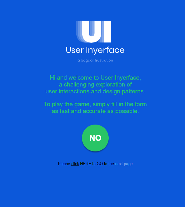
“User Inyerface” is a web based game that was designed to show how manipulative/tricky Graphical User Interfaces (GUIs) can be. It contains web design elements that are meant to draw a users attention and/or to steer them in a certain direction. Our task this week was to play the game and reflect on our experience. At first, when I went to the website, I thought it just had a bunch of “bugs” which prevented it from working correctly, but then realized that it was designed to fool the user. For example, on the first page there is a big green circle button with the text “No” inside. In normal circumstances, this green button would be a button that you would click to start a game because the general public knows it stands for “Go”. However, in this case when I clicked on it, the site didn’t do anything. Again, I was drawn to this green button as it really stood out but it had no use. Also on the first page, it said “Please click HERE to GO to the next page“. Normally underlined or highlighted words are where users click, but in this case I had to click on the word “HERE” to go to the next page. Even at the beginning of the game I was confused and frustrated. What if clicking on these buttons or words took me to an unwanted site or exposed some of my personal data? I would have no way of knowing.

Once I got to the next page, I had to enter a password, email account, and accept the terms & conditions to continue. This brought up a few issues for me, one being that I was weary of providing my email address to an unknown website. So instead of using my own email address I just made one up.  Another problem for me here was there was a timer that counted how much time it was taking me to fill out the form and below the timer there were flashing numbers. This immediately changed my behavior and affected how I was playing the game by speeding up my typing and making me a bit nervous. Unfortunately, I was not quick enough and a warning window popped up . See below.

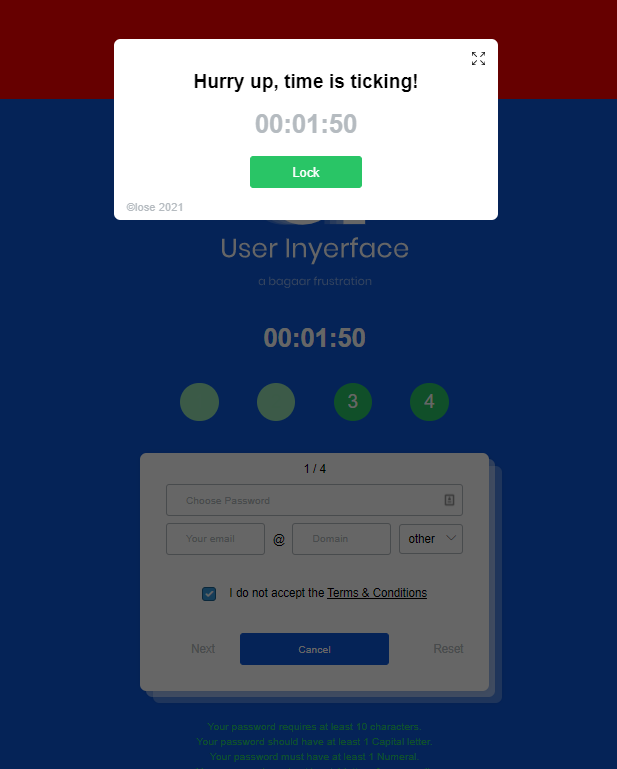
This warning pop-up was confusing as well because I couldn’t get back to the main page. I thought if I clicked the green button that said “Back”, it would take me back to the main page but this didn’t do anything. I had to actually click on the word “close” which was in small text and written in the bottom corner of the window. If I didn’t try to click on the word “close”, the game would have been over for me. To make it even more frustrating and nerve-racking, the popup had a message that said “Hurry up, time is ticking!”

As I continued on through this game, there were more and more confusing forms and prompts. The way the toggles, checkboxes, and buttons worked were not how they normally work on websites. The way this website game was designed definitely affected my behaviour through persuasion and manipulation. But this goes to show how easily others can be persuaded and/or manipulated to do certain things on the web. It is the architecture and algorithms behind the scenes that allow the website to do this.  See a video of my gameplay below.


This week’s module was very eye-opening for me even though I have watched “The Social Dilemma” and know about these issues of the attention economy, online privacy, and persuasion algorithms. In Zeynep Tufekci’s 2017 TED talk video she talks about how the same algorithm architecture that is used for advertisements to persuade us to consume, is that same algorithm architecture that is being used to manipulate our thinking and politics (Tufekci, 2017). She says “As a public and as citizens, we no longer know if we are seeing the same information or what anybody else is seeing. And without a common basis of information, little by little public debate is becoming impossible.” (Tufekci, 2017, 15:28) She also says “The algorithms do not know the difference. The same algorithms that are put upon us to make us more pliable for ads are also organizing our political, personal, and social information flows.” (Tufekci, 2017, 18:35). Every time I hear about this it makes me frustrated and a bit angry yet I still continue to use the web and some of these controlling/manipulative social media platforms. It shouldn’t have to be this way. The web shouldn’t be a place for deception or manipulation just so organizations and companies can gain profit, power, and control. I am hopeful that the world is waking up to these issues and that citizens will continue to push back. Individuals should have the right to the their privacy, their own data, and the same factual information.


References

Harris, T. (2017). How a handful of tech companies control billions of minds every day.
Retrieved from https://www.ted.com/talks/tristan_harris_the_manipulative_tricks_tech_companies_use_to_capture_your_attention?language=en

Tufekci, Z. (2017). We’re building a dystopia just to make people click on ads. Retrieved from (Links to an external site.) https://www.ted.com/talks/zeynep_tufekci_we_re_building_a_dystopia_just_to_make_people_click_on_ads?language=en (Links to an external site.)

User Inyerface. (2019). User Inyerface – A worst-practice UI experiment [Image]. https://userinyerface.com/

Zigmond,D. (2020). Resisting the Attention Economy [Image]. Tricyle.org https://tricycle.org/magazine/jenny-odell-attention-economy/

Task 9 – Network Assignment Using Golden Record Curation Quiz Data

Last week, my classmates and I were tasked with completing the Golden Record quiz where each of us had to choose 10 out of the 27 golden record songs that were sent to space on the Voyager spacecraft in the 1970s. After the quizzes were complete, our instructors took all of the data (songs we chose) and linked it all together using code to produce a .json file. This file contained all of our song selections and linked us together based on the songs that we selected. Once we had the .json file we had to load it into a web application called Palladio which created visuals of our dataset including graphs and charts, etc. Below is an example of a screenshot of a graph of our dataset in Palladio. This is a data visualization.

Data visualizations  like the ones presented here are a form of text or visual language and are meant to show data in a way that can be more easily interpreted by humans than just numbers in tables. Algorithms are run on the data behind the scenes to make connections with that data which is displayed in a graphical form. See the data visualization below.

The Palladio software was easy to use and allowed me to analyze the data in a number of different ways. The graph above is one example and it shows the relationships between the curators (i.e. students) and the tracks (i.e. songs chosen from the Golden Record). The nodes are represented as bubbles and the edges are represented as connecting lines (Systems Innovation, 2015). Each highlighted (dark grey colour) bubble (i.e. node) represents a track and the size of the track represents how often that track was chosen. In other words, the larger the bubble, the more often that track or song was chosen by my classmates and I. It is hard to tell from this screenshot, but the track that was chosen most (16 times) was “Flowing Stream”. The tracks that were chosen the least (4 times) were “The Well-Tempered Clavier” and “Wedding Song”.  The non-highlighted (light grey colour) bubbles represent the curators where the size is determined based off of how many tracks where chosen. You can notice that most of these bubble sizes are the same because most curators chose 10 songs. Another observation that can be inferred from this graph is the grouping of curators. The closer curators are together means that they had more similarities in the songs that they chose and vice versa, the further away curators are from each other, the greater differences in song choices they had.

The second graphic above shows the connections between my song choices and my classmate Emily’s, who I shared the most connections with. Looking at this data visualization you can see that of the ten songs we chose, seven were the same. Unfortunately, this visualization is limited and these connections are one of the only things that can be interpreted. Yes, Emily and I chose seven of the same songs, but why? Was there reasoning behind our choices? One would assume yes but from an outsider just looking at the visualization, the reasonings (or variables) are difficult to determine or in this case not even known. Did Emily choose her songs based off the same criteria I used? Why did she choose the other songs that were different from mine? Were there other variables that influenced our songs choices like politics, emotions, culture, age, gender, or education level? Again, it is difficult to tell. This is one of the downsides of simple data visualizations like the ones presented here, as a lot is left up to the individual to analyze what is displayed. There is no story. Without more detail (connections, visuals, or text) these questions can not be answered and a story cannot be made.

As algorithms and digital technology have advanced overtime, individuals are now able to create data visualizations that tell real stories. Companies like Tableau can allow users take data and turn it into graphics and dashboards that can tell stories and/or “paint a picture”. Currently, these Tableau dashboards are being used by businesses/organizations to monitor, track, and analyze their data in order to make better decisions and/or improve operation efficiencies. Others are using dashboards to share stories about social or environmental issues. Below is just an example of how a dashboard (i.e. data visualization) can create a story from data.

Coral Bleaching #Viz4ClimateAction (Randive,2021)


https://public.tableau.com/views/CoralBleaching_16329323967840/Dashboard2?:language=en-US&:display_count=n&:origin=viz_share_link

As data continues to be created and collected, visualizations will continue to be used to help explain that data. Even though algorithms are advancing to create these visualization automatically, it will still be important for humans to be involved to help tell the stories.


References

Randive, S. (2021, September 29). Coral Bleaching #Viz4ClimateAction [Image]. Tableau. https://public.tableau.com/app/profile/shweta.randive/viz/CoralBleaching_16329323967840/Dashboard2

Systems Innovation. (2015, April 18). Graph Theory Overview [Video]. YouTube. https://www.youtube.com/watch?v=82zlRaRUsaY&t=176s