Last week, my classmates and I were tasked with completing the Golden Record quiz where each of us had to choose 10 out of the 27 golden record songs that were sent to space on the Voyager spacecraft in the 1970s. After the quizzes were complete, our instructors took all of the data (songs we chose) and linked it all together using code to produce a .json file. This file contained all of our song selections and linked us together based on the songs that we selected. Once we had the .json file we had to load it into a web application called Palladio which created visuals of our dataset including graphs and charts, etc. Below is an example of a screenshot of a graph of our dataset in Palladio. This is a data visualization.
Data visualizations like the ones presented here are a form of text or visual language and are meant to show data in a way that can be more easily interpreted by humans than just numbers in tables. Algorithms are run on the data behind the scenes to make connections with that data which is displayed in a graphical form. See the data visualization below.
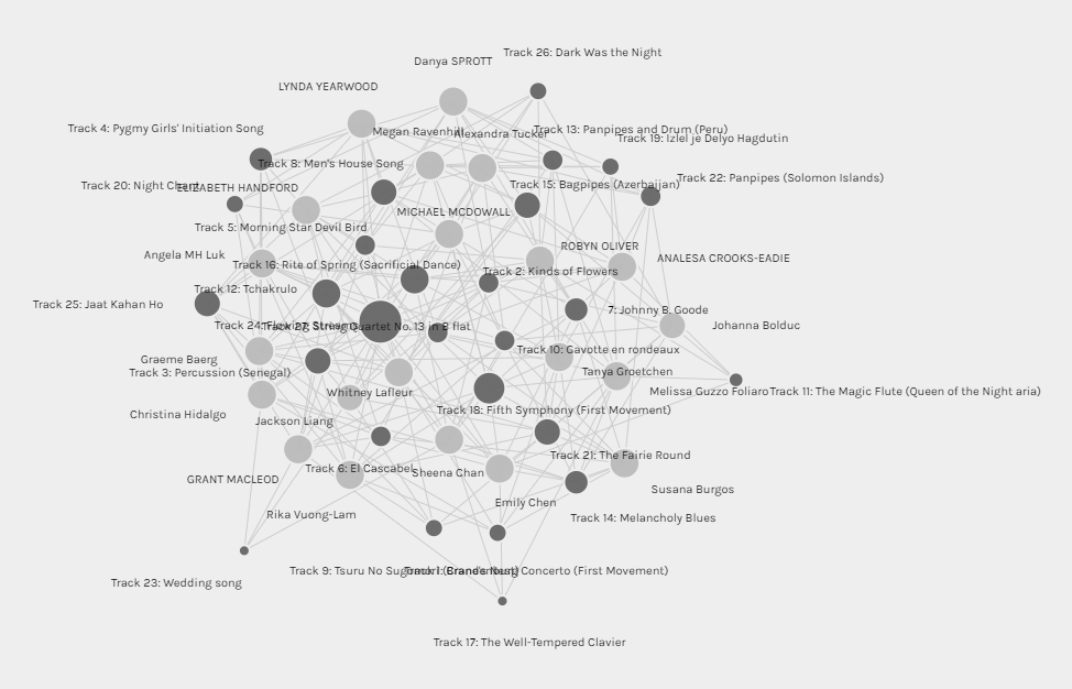
The Palladio software was easy to use and allowed me to analyze the data in a number of different ways. The graph above is one example and it shows the relationships between the curators (i.e. students) and the tracks (i.e. songs chosen from the Golden Record). The nodes are represented as bubbles and the edges are represented as connecting lines (Systems Innovation, 2015). Each highlighted (dark grey colour) bubble (i.e. node) represents a track and the size of the track represents how often that track was chosen. In other words, the larger the bubble, the more often that track or song was chosen by my classmates and I. It is hard to tell from this screenshot, but the track that was chosen most (16 times) was “Flowing Stream”. The tracks that were chosen the least (4 times) were “The Well-Tempered Clavier” and “Wedding Song”. The non-highlighted (light grey colour) bubbles represent the curators where the size is determined based off of how many tracks where chosen. You can notice that most of these bubble sizes are the same because most curators chose 10 songs. Another observation that can be inferred from this graph is the grouping of curators. The closer curators are together means that they had more similarities in the songs that they chose and vice versa, the further away curators are from each other, the greater differences in song choices they had.
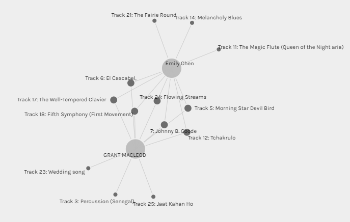
The second graphic above shows the connections between my song choices and my classmate Emily’s, who I shared the most connections with. Looking at this data visualization you can see that of the ten songs we chose, seven were the same. Unfortunately, this visualization is limited and these connections are one of the only things that can be interpreted. Yes, Emily and I chose seven of the same songs, but why? Was there reasoning behind our choices? One would assume yes but from an outsider just looking at the visualization, the reasonings (or variables) are difficult to determine or in this case not even known. Did Emily choose her songs based off the same criteria I used? Why did she choose the other songs that were different from mine? Were there other variables that influenced our songs choices like politics, emotions, culture, age, gender, or education level? Again, it is difficult to tell. This is one of the downsides of simple data visualizations like the ones presented here, as a lot is left up to the individual to analyze what is displayed. There is no story. Without more detail (connections, visuals, or text) these questions can not be answered and a story cannot be made.
As algorithms and digital technology have advanced overtime, individuals are now able to create data visualizations that tell real stories. Companies like Tableau can allow users take data and turn it into graphics and dashboards that can tell stories and/or “paint a picture”. Currently, these Tableau dashboards are being used by businesses/organizations to monitor, track, and analyze their data in order to make better decisions and/or improve operation efficiencies. Others are using dashboards to share stories about social or environmental issues. Below is just an example of how a dashboard (i.e. data visualization) can create a story from data.
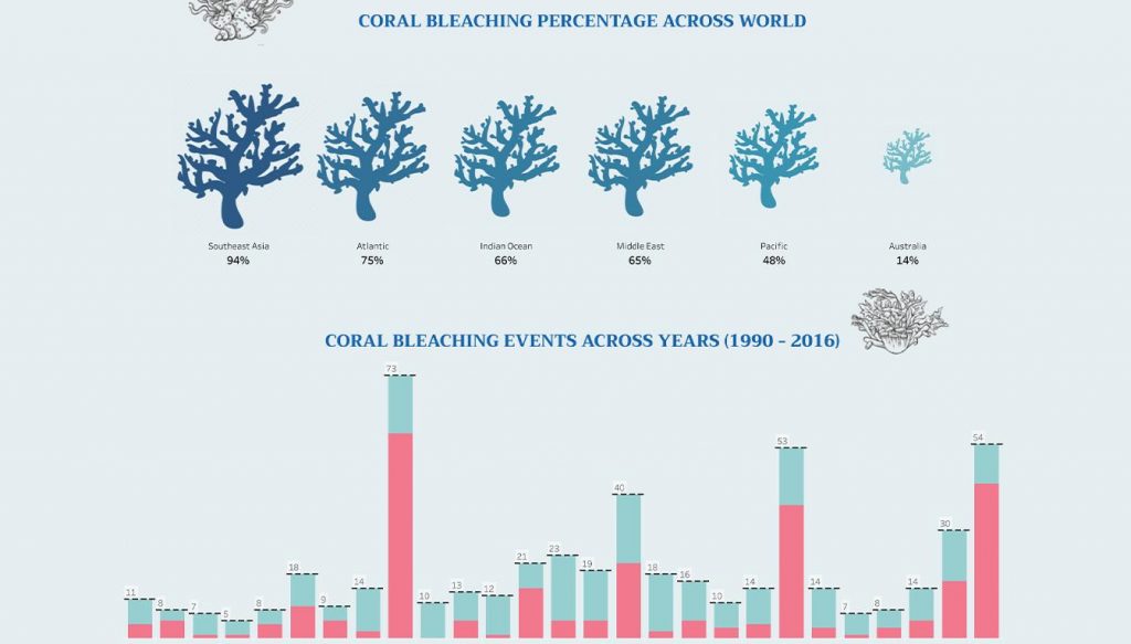
Coral Bleaching #Viz4ClimateAction (Randive,2021)
As data continues to be created and collected, visualizations will continue to be used to help explain that data. Even though algorithms are advancing to create these visualization automatically, it will still be important for humans to be involved to help tell the stories.
References
Randive, S. (2021, September 29). Coral Bleaching #Viz4ClimateAction [Image]. Tableau. https://public.tableau.com/app/profile/shweta.randive/viz/CoralBleaching_16329323967840/Dashboard2
Systems Innovation. (2015, April 18). Graph Theory Overview [Video]. YouTube. https://www.youtube.com/watch?v=82zlRaRUsaY&t=176s
Hello Grant,
I thought you made an interesting point about visualizations being used to understand data. I wonder what a visualization of the Palladio data would look like if people were asked to re-select their tracks after reading T8/T9 posts from curators within their community?