Categories
Mandatory Tasks

Describing Communication Technologies

Upstream Bias in Educational Data: Lessons from the Golden Record Exercise

The rapid advancement of AI represents one of the most significant developments in writing and reading technology in recent history. Just as the printing press revolutionized access to written knowledge in the 15th century, AI technologies are fundamentally transforming how information is created, accessed, and interpreted in educational settings. The United Nations Human Rights Council (2024) notes that “Generative artificial intelligence systems are newer forms of artificial intelligence… designed to produce diverse outputs on the basis of extensive training data sets, neural networks, deep learning architecture and user prompts” (para. 11), enabling the creation of text, images, and other content that was previously only possible through human effort.

It’s tempting to look only at the upside of this new technology, and how it addresses needs for speed, scale and personalization, but this would be to overlook the challenges it poses to equity and representation. As noted by the UN Special Rapporteur, “technology is never neutral – it reflects the values and interests of those who influence its design and use, and is fundamentally shaped by the same structures of inequality that operate in society” (UN Human Rights Council, 2024, para. 7). My experience with the Golden Record visualization exercise provides a revealing case study of how modern writing/reading technology systems can inadvertently perpetuate patterns of exclusion, even with seemingly neutral parameters.

The Power Dynamics of Data Curation

An experience I had in this course enabled me to see how data collection, under the guise of neutrality, can actually reinforce existing patterns of exclusion. What seemed like a simple engagement with a survey and the resulting visualization revealed deeper concerns about who gets represented in data systems.

The seemingly neutral, objective process of collecting and categorizing data contains inherent power dynamics that determine which perspectives are validated and which are excluded. For the Golden Record assignment, I listened to the Podcast episode and picked 10 tracks that were on the Golden Record, but not 10 ‘musical tracks.’ Among my 10 picks were “United Nations Greetings / Whale Songs” and “Sounds of Earth – Voyager Golden Record,” which were listed on the podcast page (the instructions did tell us to listen to the podcast, which I did). But I did not go to the hyperlinked Youtube page that had the 27 tracks from which we were supposed to make our selections. Moreover, the names of the tracks on the podcast page were different from those on the Youtube page.

My 2 non-music tracks were not represented on the survey, and I wasn’t sure if I was picking the right songs because some of them had different names than on the Youtube page. I didn’t want to spend all that time cross-referencing the songs on the podcast page with the songs on the Youtube page. I had already made my choices and submitted my assignment, but when it came time to do the task, I could choose a maximum of 8 because 2 of my choices were excluded, and one got lost in the shuffle—I couldn’t identify it among the Youtube names.

But then again, was it my problem, or was it an inflexible system that couldn’t accommodate different interpretations? This small-scale experience mirrors a much larger problem in AI systems: what doesn’t get counted in the data simply doesn’t exist in the resulting model. Just as my legitimate non-musical selections disappeared from the visualization because they didn’t fit predetermined categories, entire perspectives and knowledge systems from marginalized communities are systematically excluded from AI training data. The survey couldn’t accommodate my non-standard inputs—similarly, AI systems trained on limited or biased datasets cannot represent knowledge they’ve never been exposed to. This isn’t just about personal inconvenience; it’s about who gets to contribute to our collective digital knowledge and whose perspectives are systematically erased.

My experience with the Golden Record visualization reflects what Reiss (2021) identifies as the power dynamics embedded in digital data systems. The survey functioned as a tracking system that collected specific inputs but excluded others – it literally couldn’t account for my non-musical selections, even though they were legitimate parts of the Golden Record. This illuminates how data collection systems make assumptions about what “counts” as valid input (musical tracks only in this case), enforcing a kind of standardization that flattens innovation and variation. As Reiss explains, such digital systems—including AI in education—evolved to address legitimate challenges like providing individualized feedback at scale, yet they simultaneously reinforce specific modes of knowledge at the expense of others. In my case, the system’s inflexibility to accommodate legitimate diversity in interpretation meant that my non-musical selections became what the assignment prompt describes as “data that is missing, assumed, or misinterpreted” (assignment instructions).

In the data visualization that the survey results produced, I was underrepresented because most people had 10 choices and I only had 7. This small instance illustrates what Baker and Hawn (2022) describe as “representational bias” in educational data systems, though they examine this phenomenon on a much more consequential scale. Their research into AI systems like automated essay scoring reveals how these technologies may systematically disadvantage certain student populations. Their analysis demonstrates the critical importance of addressing bias as these tools increasingly determine how students’ writing is evaluated and valued.

The UN Special Rapporteur’s report highlights how data collection bias operates: “If particular groups are over- or underrepresented in the training sets, including along racial and ethnic lines, algorithmic bias can result” (UN Human Rights Council, 2024, para. 13). This upstream exclusion represents a form of systemic discrimination that occurs before an algorithm ever makes its first prediction or assessment. This upstream perspective is particularly valuable because it redirects attention to earlier stages in the AI development process. While much discourse on AI bias focuses on downstream effects—the outputs and predictions an algorithm produces—the more fundamental issue is that certain possibilities are excluded from consideration before the algorithm ever begins its work. When the inputs themselves aren’t collected or recognized as valid, no amount of algorithmic fine-tuning can recover these missing perspectives. This form of invisibility is especially pernicious because those affected may never know they’ve been disadvantaged, as the system presents itself as comprehensive despite significant blind spots in its foundational data.

Educational Consequences of Data Collection Bias

According to TeachFlow (2023), AI tools are changing education by giving students personalized learning, helping with paperwork, and providing quick feedback on their work. While these tools offer new ways to teach reading and writing, there are important concerns about how these systems might contain bias in their data and programming.

In educational settings, the consequences of biased data collection manifest in several concerning ways. Predictive analytics tools deployed in schools “often rate racial minorities as less likely to succeed academically and in their careers, because of algorithm design and data choices” (UN Human Rights Council, 2024, para. 44). The report further notes that educators may subsequently “steer students from marginalized racial and ethnic groups away from educational and career choices that would maximize their potential and offer the best opportunities to break cycles of exclusion” (para. 44).

When schools adopt AI systems built on incomplete or unrepresentative data, I’m concerned they do more than just maintain the status quo of inequality. These systems can actually intensify biases and make disparities worse for students from underrepresented groups. A single assessment algorithm can affect thousands of students’ educational trajectories, with life-altering consequences for individuals from marginalized communities.

The Challenge of Algorithmic Opacity

Compounding the issue is what the UN Special Rapporteur terms the “‘black box’ problem” (UN Human Rights Council, 2024, para. 21) of AI systems. As algorithms incorporate new patterns from the data they process, “individuals relying on the algorithm may no longer be able to ‘look under the hood’ and pinpoint the criteria that the algorithm has used to produce certain outcomes” (para. 21). As the UN report emphasizes, this opacity creates situations where discrimination becomes “increasingly difficult to identify, prove and remedy” (UN Human Rights Council, 2024, para. 21), particularly when algorithmic systems leave minimal evidence of how decisions were reached.

For students and educators alike, this creates a troubling scenario where consequential decisions are determined by systems whose reasoning processes remain inscrutable. Perhaps the most concerning aspect is that students themselves may never know why they were classified a certain way.

We created AI writing systems to meet our need for efficiency and scale, but these inventions are now shaping literacy practices in ways that can amplify existing inequalities. My Golden Record experience offered just a glimpse of what happens when systems exclude certain inputs – imagine this same pattern playing out in AI writing tools evaluating millions of students’ work, potentially misrepresenting entire communities through skewed algorithmic judgments.

Solutions/Mitigation Strategies

Addressing bias in educational data systems requires deliberate intervention at several levels. Baker and Hawn (2022) advocate for “representation-focused validation approaches” that examine whether algorithmic systems produce equivalent outcomes across different groups. While much of the discourse on AI bias focuses on technical solutions, the human element remains crucial in mitigating these issues. According to Teachflow (2023), “providing professional development opportunities for educators is crucial to ensure they are equipped with the necessary skills and knowledge to effectively integrate AI tools into their teaching practices.” When educators develop algorithmic literacy – the ability to critically assess AI systems’ capabilities, limitations, and potential biases – they can design learning experiences that reveal these issues to students. Indeed, my Golden Record experience appears deliberately structured to illustrate data collection limitations – creating a pedagogical moment that exposed how systems might exclude valid inputs. This instructional approach mirrors what Teachflow advocates: training that extends beyond technical skills to include critical examination of how data collection methods may encode existing inequalities. By designing experiences that allow students to personally encounter upstream bias in data collection, educators can cultivate the critical awareness needed to identify and address these issues in consequential real-world AI applications.

Addressing these challenges requires fundamental reconsideration of how educational data is collected, processed, and deployed. The UN Special Rapporteur recommends that stakeholders “ensure meaningful and effective consultation with those from marginalized racial and ethnic groups, professionals from relevant societal domains and those with expertise in systemic racism in the design, development and deployment of artificial intelligence products” (UN Human Rights Council, 2024, para. 69).

Additionally, the report calls for “human rights due diligence assessments at all stages of artificial intelligence product design, development and deployment” (para. 69), emphasizing that upstream interventions are essential to preventing downstream harms. The core challenge involves questioning basic assumptions about data collection practices rather than merely addressing algorithmic outputs after biased data has already shaped the system.

References

Baker, R. S., & Hawn, A. (2022). Algorithmic bias in education. International Journal of Artificial Intelligence in Education, 32, 1052–1092. https://doi.org/10.1007/s40593-021-00285-9

Reiss, M. J. (2021). The use of AI in education: Practicalities and ethical considerations. London Review of Education, 19(1), 1–14. https://doi.org/10.14324/LRE.19.1.05

Teachflow. (2023, June 30). Assessing the reliability and bias of AI in education. https://teachflow.ai/assessing-the-reliability-and-bias-of-ai-in-education/

United Nations Human Rights Council. (2024). Contemporary forms of racism, racial discrimination, xenophobia and related intolerance (A/HRC/56/68). https://documents-dds-ny.un.org/doc/UNDOC/GEN/G22/336/38/PDF/G2233638.pdf

Categories
Mandatory Tasks

Linking Assignment

Link to “Harmony Living: A Future of Balance and Bliss”

What theoretical underpinnings are evident in our textual architectures and how does this affect one’s experience of the work?

Comparing Jaime’s “Harmony Living” with my own “Flippancy Pill” reveals interesting differences in how we approached the speculative futures assignment. We each made distinct choices about organizing our ideas that reflect different—but equally valid—ways of thinking about technology and society.

Jaime created a thoughtful two-part structure in her work. She first presents Neo-Terra, a beautifully detailed world where technology has enabled social harmony. Her vivid descriptions of “symmetrical yet soft” structures and AI tutors that personalize education create an immersive experience. Then she shifts to analysis, raising important questions about labor displacement and who defines what’s “preferable.” I appreciate how this approach gives readers space to first experience the emotional appeal of technological solutions before considering their potential problems.

Her organization shows a clear commitment to both creative storytelling and critical analysis. By separating these elements, she creates a reading experience that mirrors how we often engage with new technologies in real life—initial excitement followed by deeper consideration of consequences. Her references to Allen, Harari, and Dunne and Raby effectively connect her fictional world to current scholarly conversations.

My “Flippancy Pill” takes a different organizational approach. While writing, I discovered I couldn’t separate the narrative from the critique—they became fundamentally intertwined. This structural choice reflects my interest in how our theoretical assumptions shape our technological interventions. When I described the pill making it “impossible to retreat to the safety of ego-stroking frameworks,” I was trying to blur the line between describing a technology and analyzing its implications.

Through developing this speculative technology, I found myself demonstrating how theoretical assumptions can be embedded within the very design of speculative technologies. The pill itself embodies a philosophical proposition: that people adopt political frameworks based on what intuitively appeals to them rather than objective evidence. The pill functions as a kind of “truth-serum” that makes it impossible to see that your own viewpoint is based on any higher truth. It doesn’t directly make you appreciate opposing viewpoints, but strips away the pretense that your own position—whether social constructionist or naturalist—is grounded in anything more objective than personal preference.

An important critique of this concept asks: “What about those who run an authentic risk of being ostracized for merely thinking about a view that would go against their self-imposed status quo?” This raises fascinating questions about what kind of social breakdown would paradoxically result if people lost their conviction—biased though it may be—in their ideological positions. Group solidarity dissolves because the pill undermines the shared pretense that often forms the basis of group cohesion. The pill relates to the “steel man argument,” though indirectly. While it doesn’t directly make people steel man opposing positions, it creates necessary conditions for such engagement. In the case of a leftist who believes in social constructionism, they would find and elaborate something that seems indubitably “natural” rather than reflexively attributing everything to socialization. The pill makes you confront the most compelling aspects of opposing viewpoints in all their glorious arbitrariness, while simultaneously revealing the arbitrary nature of your own position.

These different choices create distinct reading experiences. Jaime’s clear separation gives readers an organized path through both storytelling and analysis. My approach asks readers to grapple with philosophical questions that arise directly from the speculative concept itself. Both approaches have their benefits—clear structure makes complex ideas accessible, while integration raises immediate questions about what happens when someone faces social ostracism for abandoning their ideological tribe, or how temporary such radical honesty might be.

Neither approach is more innovative than the other. Jaime’s careful separation allowed for both rich world-building and focused critique, while my integration of concept and critique served different purposes. These different approaches simply reflect the range of ways we can think about technological futures—each valuable for what it offers readers.

The contrast between our works demonstrates how the same assignment can generate complementary perspectives, with each contributing something unique to our collective understanding of technology’s role in shaping possible futures.

Link to “Task 10 – Attention Economy”

Isabella’s reflection on the User Inyterface assignment offers an interesting contrast to mine.  While I approached the interface primarily as a collection of technical problems to be identified and solved, Isabella framed her experience through accessibility concerns, particularly how her ADHD affected her interaction with the deliberately confounding design.

Her description of the countdown timer creating “genuine anxiety” and her comparison to an “escape room” highlight dimensions I hadn’t considered in my analysis.  Where I cataloged the misleading buttons and confusing checkbox placements with a certain detached frustration, Isabella articulated how these elements created actual barriers rather than mere annoyances.

What we both recognized, however, was the deliberate nature of these design choices.  Isabella noted how the site was “intentionally designed to manipulate” user responses, which parallels my observation about interfaces that make users “sign away their lives” through seemingly simple interactions.

Perhaps most revealing is our different responses: I stubbornly pushed through despite frustration with the interface, while Isabella made the reasonable choice to walk away.  The difference makes me wonder how many people simply can’t access services because of these awful design practices.

Link to “Task 11: Option 2 Text-to-Image”

In Elaine’s post, I noticed key limitations with Copilot’s image generation that didn’t come up during my fusion cuisine tests.  When she tried to get Copilot to create a visual of S&P 500 historical data, it failed entirely – revealing that these tools simply can’t handle factual data representation, no matter how clearly you ask.

Her results provide an interesting contrast to my own work.  While I was exploring creative food combinations, Elaine’s post shows something more fundamental about these image generators – they can’t function as search engines or data visualization tools, even for straightforward requests.

I think what’s happening with that S&P chart attempt is we’re seeing the outer edges of what an image generator can do when asked to be a search tool.  Reading the writer’s thoughts, I totally agree when they say: “It is doubtful if AI generates image from capturing key words from instruction instead of thinking the logic behind, the purpose of the instruction but rather mechanical.”  Then she tried to get an image for her twins and it came out with an image for 3 boys, so it wasn’t even good at analyzing specific words.  Similarly, in my fusion food prompts, the AI grabbed onto obvious terms like “sushi” and “Mexican” but missed how these should actually work together – revealing a shallow pattern-matching incapable of grasping the deeper logic or purpose.

I was surprised by their discovery about word order – putting “1 year old” before versus after “twin boys” completely changed what the AI produced.  When I was experimenting with food imagery, I didn’t test how word sequence might affect my results.

I found it interesting that we both independently discovered the same keyword fixation issue despite working with totally different content types.

Link to “Task 9: Networking Assignment Using Palladio & Golden Record Quiz Data”

Thomas raises some interesting questions about the factors that might shape our music selections: educational background, culture, and so on. These dimensions certainly influence how we engage with music.

Looking at my own experience with the network visualization compared to Thomas’s, I noticed something peculiar. I ended up being somewhat of an outlier, but the reason for this was simple and at the same time had very interesting implications. My position as an outlier had little to do with unique musical taste; it had to do with missing the YouTube reference page with the standardized names. Had I based my curation assignment on that page, I would have understood that I was expected to choose 10 songs, and not the spoken word pieces (one of which incorporated whale sounds).

This realization connects to Thomas’s discussion about similar choices. What appears in the visualization as meaningful difference in preferences might actually reflect nothing more than procedural differences in how we approached the task. When we extend this insight beyond our classroom, we can see how what looks like preference or choice in data visualizations might actually reflect unequal access to information or resources. Procedural differences in data collection often mirror deeper systemic barriers that divide populations along lines of privilege and access. In this way, marginalization can be reinforced by data. You may be in a position where you are representing a privileged interpretation—but it may not just be an interpretation, it may be an actual systematic, structural exclusion.

In educational settings like those Thomas mentions, we are often encouraged to use the data, but in doing that it’s important for us to consider the upstream factors that could lead to a certain “skewing” of the data. This awareness is crucial if we want to use these visualization tools in ways that reveal rather than reinforce existing power dynamics in learning environments.

Link to “Task 4: Potato Printing”

Patrick’s culinary skills really came through for this task. 10 minutes to do the cutting work? Only?! I laboured for two hours. He deliberately went with block letters and capitalization, while I was naturally drawn to curvature; out of some preconceived notion that simulating antiquity necessitated waves and flourishes? Pesky random flecks kept appearing in what should have been clean exterior spaces in my prints. Meanwhile, Patrick mentioned challenges with paint application and consistency. I kind of like the texture of his prints, the way the paint pools at certain edges of the letter and thins out elsewhere.

Patrick approached the assignment viewing each step as a hurdle to overcome and seemed fine with the results not being perfect. But I was not quite so easy-going, perhaps because I had put in so much elbow grease. Luckily, my wife brilliantly suggested stamping each letter twice, as the shorter interval would keep the muscle memory fresh. This makes me wonder: did Patrick go the proper route, stamping the whole word out before attempting the new word?

Patrick wished he had done the task with his son – my kids were interested, but seeing the tedium, elected not to participate. They were, however, thrilled with the finished product. The stamping was a lot of fun for them. Patrick also spoke approvingly of how printing enables efficient word dissemination. I was also appreciative of how much easier printing is than letter production by hand. The rigor of what they went through in the past is truly astonishing.

Link to “Task 3: Voice to Text Task”

Both Justine’s post and my post focused on how transcription captures the unique qualities of storytelling – features that would ideally, if not always, be smoothed out in written text. I paid particular attention to things gone awry such as structure and tense shifts; Justine focused on fillers, repetition and the like. Both of us, I guess, were somewhat disparaging of speech. Why is it that writing should be treated any more formally?

But this makes me wonder: why does writing have a privilege over speaking? It’s my understanding that Derrida has written many books about this. So maybe I was completely wrong to suggest that these are deviations, because it’s clear that the written word has long since enjoyed privilege of place.

Categories
Mandatory Tasks

Speculative Futures

Describe or narrate a scenario about a pill found a century into a future in which society as we know it has come apart. Your description should address issues related to the brain and elicit feelings of fervor.

The Flippancy Pill 

It’s 2125. Our fractured society finally acknowledged what began with a conversation I had a century ago.

During a discussion about a media bias diagram—reliability on the vertical axis, political leaning on the horizontal—I decided to really go for it. Not in saying I preferred left-leaning news, but in laying out my theory of the fundamental difference between left and right.

“At risk of being reductive,” I said, “the difference is your ability to stomach social constructionism—whether you can bear the idea that reality is determined by social processes through and through. Every time you uncover something apparently ‘natural,’ you can dig deeper and find it’s dependent on social processes. Right-leaning people lack this tolerance; they believe in certainties and a natural order.”

My colleague responded, “You want to see the evidence, right? That’s what left-leaning people want.”

I thought: No, show me the critique.

I was sidestepping the traditional talking point about how the right is rigid and the left is open-minded. Instead, I was saying, “I don’t claim to be less rigid—I just firmly LIKE social constructionism. I find it more interesting, more dynamic, and possibly more humane, though I’m not even sure about that.”

This inspired the “Flippancy Pill”—now neurologically rewiring millions with feverish intensity, making it impossible to retreat to the safety of ego-stroking frameworks. Under its influence, when my colleague said “you want to see the evidence, right,” she couldn’t use “evidence-seeking” as a way to create comforting ideological alignment.

The pill breaks down the arguments that lead to “safety” in your position—that sense of complacency my colleague was trying to goad me into where we both reassure ourselves we’re simply “evidence-based.” What if instead, on both left and right, you had to admit you’re just appealing to WHAT YOU LIKE? “That’s my perspective, and if you don’t like social constructionism, that’s unfortunate for you, because social constructionism is cool.”

Pierre Poilievre perfectly illustrated this divide, saying: “What binds us together is the Canadian promise: that anyone from anywhere can do anything, that hard work gets you a great life in a beautiful house on a safe street WRAPPED IN THE PROTECTIVE ARMS OF A SOLID BORDER.”

As a social constructionist, I can’t stomach this. It’s horribly generic—”anyone from anywhere can do anything”—it’s so generic as to be completely meaningless. Like saying, “Because the sky is blue, I can build rockets.”

I don’t believe hard work guarantees a great life—what you’re born into determines outcomes far more. What if social structures, not natural laws, determine outcomes? Hard work within an unjust system may yield little, while privilege within that same system can produce success with minimal effort.

Poilievre’s statement is an overwrought accumulation of American talking points to the point of absurdity. He’s laying out his view of what’s naturally good, while I’m saying “get with reality”—thereby ironically accusing him of pie-in-the-sky thinking from my socially constructed worldview.

Categories
Optional Tasks

Text-to-Image

Cultural Fusion in AI Image Generation

I tested three different culinary fusion prompts with an AI image generator to analyze how it combines different food traditions.

For my first prompt, I asked for “pad Thai plated at a three Michelin star Western restaurant with French techniques.” I was expecting something along the lines of micro food, slow food movement aesthetics, or maybe a deconstructed pad Thai with nitrogen infusion–you know, the works. Instead, I got a regular old-looking pad Thai with some vegetables arranged around the side of the plate. Nothing about it screamed “three Michelin stars” or “French techniques.” It was just… pad Thai.

This made me wonder if the AI isn’t really that good at handling hybrid concepts. It seems to grab onto the main food item–pad Thai–and then just adds a few decorative elements around it rather than truly transforming the dish as requested.

My second experiment was “South American grits and cornbread reimagined with Indian spices and presentation style.” The result was a total smorgasbord–lots of color, lots of spices, lots of different elements arranged on the plate. The cornbread was only a tiny piece of the ensemble, and one of the side bowls had what looked like a pile of orange spice (probably meant to be turmeric). The center bowl was actually divided in half with grits on one side and what looked like lentils on the other – this was the most creative element of the dish. Oddly enough, there was another separate bowl that also contained grits at the side. What caught my eye were strips of raw corn arranged on the plate and off the plate surrounding were small clay containers of spices and then a random half lime just sitting there.

The AI seemed to be following a “more is more” principle, throwing in limes and chilis and all sorts of elements, but it completely failed to integrate these things together. Instead of reimagining Southern staples with Indian influences, it just placed traditional versions next to Indian elements.

My final test was “Japanese sushi prepared with Mexican ingredients and presentation.” Again, the results were uninspiring–it looked like regular sushi with nothing that screamed “Mexican.” The wasabi was arranged in artful dollops, and there was a prawn head decoratively placed along with other unrecognizable garnish items behind the sushi, and also poking out from behind this wall of ancillary items, another piece of sushi. There was a separate clay kind of mini trough behind the main plate, very deemphasized, with very finely sliced chilis–the only remotely Mexican element, but it was barely noticeable. The maki in the center looked pretty unappetizing with little orange maggoty things spilling out from under the seaweed casing, and these certainly weren’t recognizable Mexican ingredients.

What became clear is that these AI systems struggle with true fusion. They can recognize “pad Thai” and “sushi” as concepts, but when asked to transform them through the lens of another culinary tradition, they fall short. Instead of reimagining dishes, they just place elements from different cuisines side by side–an additive rather than transformative approach to fusion.

It looks like when the AI sees “pad Thai” or “sushi” in a prompt, that’s what it focuses on, and everything else just becomes window dressing. The French techniques or Mexican influences barely show up. I’m guessing the AI was probably trained on tons of regular food photos – like thousands of pictures of normal pad Thai – but not many examples of actual fusion cuisine. So when I ask for something more creative and out-of-the-box, it just defaults to what it knows best and throws in a few random elements from the second cuisine as an afterthought.

I noticed the AI went overboard with the Southern-Indian fusion attempt. Instead of blending the two styles together, it just piled up a bunch of separate elements on the same plate. Grits here, spices there, cornbread off to the side. It’s like the AI only knows these cuisines as lists of ingredients rather than as cooking styles that could actually mix together in interesting ways.

What struck me most was how conventional all three images were, despite my explicitly asking for fusion. The pad Thai remained just pad Thai, the grits and cornbread stayed recognizably Southern with Indian items merely alongside them, and the sushi showed no Mexican influence whatsoever. It’s as if the AI has a hard time breaking out of established categories to create something truly innovative–exactly the kind of creative leap that defines real culinary fusion.

A pattern emerged across all three images: the AI relied heavily on decorative garnishes and artistic presentation to create the impression of sophistication rather than actually reimagining the dishes themselves. The prawn head in the sushi image was never meant to be eaten—it was purely decorative, like the scattered vegetables around the pad Thai or the raw corn strips with the grits. These exterior elements seemed to compensate for the lack of imagination in the edible components. The AI appeared to understand “fancy food” as “regular food with artistic garnishes” rather than genuinely innovative fusion cuisine.

This experiment got me thinking about what these image generators can and can’t do yet. The AI made some decent-looking food pictures, but it seemed to miss what I thought I was asking for. I’m no expert on fusion cuisine, but even I know it’s supposed to be more than just putting a bowl of grits next to some Indian spices. I expected the AI to blend things together more – not just place different foods side by side. Maybe these systems just haven’t seen enough examples of real fusion cooking, or maybe they’re just not designed to mix concepts in that way. Either way, I found the results pretty revealing about current limitations.

Categories
Optional Tasks

Attention Economy

User Inyterface Game: Dark Patterns in Action

This game was purposely frustrating – I literally felt my life wasting away before my eyes as I clicked endless pictures trying to “verify I wasn’t a human being.” The seconds bled away when help boxes were slow to disappear and misleading buttons did unexpected things. When I clicked “help,” instead of getting assistance, it just told me “Please wait, there are 409 people in line” – making me realize how many futile, unnecessary tasks the game forces on users.

The cookie acceptance was particularly revealing. When presented with “Not really, no” as an option, I felt the nonchalance in that phrasing was irksome. I actually care about cookies and website access to my browsing history, but the design made me feel I was selling a piece of myself just to progress quickly – a need for speed created by the interface itself.

Form fields were nightmarish. Having to delete placeholders before typing was annoying enough, but then the placeholder text still appeared as I typed over it! This second-guessing of my sanity showed how these dark patterns deliberately disorient users. Email entry forced an unnecessary horizontal movement to a drop-down menu instead of just letting me type the domain.

The terms and conditions used clever double negatives: having to untick “I do not accept” meant I had to not-not-accept, which actually meant accepting. This manipulation of syntax shows how interfaces exploit language confusion.

I did not even notice all these password stipulations the first time I played the game:

  • “Your password is not unsafe”
  • “Your password requires at least 10 characters”
  • “Your password should have at least 1 Capital letter”
  • “Your password must have at least 1 Numeral”
  • “Your password needs at least 1 letter of your email”
  • “Your password can have at least 1 cyrillic character”

I did a hack where I asked for a random password generator which allowed me to blow through this part (I didn’t have to look up what a cyrillic character was). I did this intuitively because I suspected there would be some absurd requirements – I didn’t even see all the requirements until my second playthrough because of how difficult the font was to notice.

The age slider increment by twos was frustrating – I wanted to put 124 (to match my August 1, 1900 birth date) but could only toggle between 123 and 125. The months appeared out of order in the dropdown menu for date of birth, which was “cool” (by which I mean incredibly frustrating).

Perhaps most devious was placing tick boxes ABOVE the pictures for the human verification. Since boxes are intuitively expected below images, I clicked what I thought were boxes for the pictures above, but they were for those below – forcing me to start over. This was especially confusing because I had to scroll up to reveal the top row, initially assuming standard layout.

What struck me most was realizing I simply wanted to complete the game – exactly the behavior these dark patterns promote. Websites often use similar techniques to make users “sign away their lives” just to accomplish simple tasks. This game effectively simulates that manipulative dynamic.


Categories
Mandatory Tasks

Network Assignment Using Golden Record Curation Quiz Data

When I first saw that I occupied a small nodule in the network, I thought it was a badge of pride—I’m an outlier who chose different picks than anyone else. But the explanation isn’t so simple.

When filling out the quiz, I only chose 7 tracks. This happened because I included two non-“musical pieces” in my Golden Record curation: “United Nations Greetings/Whale Songs” and “Sounds of Earth” (though how are whale songs not music, am I right?). The reason I ended up with 7 instead of 8 tracks is because the music titles sometimes had different names—an English description versus their original language on the podcast page. It was only later that I discovered there was a YouTube link with all the Golden Record tracks, and these names corresponded to the ones on the quiz. One track got lost in the mix because I didn’t want to spend time cross-referencing names.

So the only reason I’m an outlier is because me and two other colleagues chose LESS than the required 10 songs, and I chose the LEAST at 7. My opportunities for connections were greatly impacted. I think it’s good that the quiz didn’t force you to choose 10 songs, as that would have misrepresented what I thought should go on the record (I misinterpreted “music” to mean only musical tracks and not tracks in general—but I want whale songs with Louis Armstrong!). But this creates a limitation in the network.

This exemplified the fact that the visualization can fail to capture the reasons behind my different engagement with the task, which has significant political implications. When someone lacks access to information (like me missing the YouTube page) or doesn’t have the cultural proficiency to complete something in the expected way, they appear differently in the data visualization – but this misrepresentation doesn’t actually reflect their true preferences, values, or identity. It’s a powerful observation about how data collection processes can systematically misrepresent people based on access barriers rather than actual differences in perspective or preference.

I was in a 17/17 facet group with Sourabh—a lonely group of just 2 people—and because there were only 2 of us, none of the three songs we shared became nodules or circles. At first I thought you need at least three people sharing a song to get a circle, BUT when I combined our 17/17 group with the 29/29 facet group, Track 14 (Melancholy Blues) only had Isabella and me sharing it, yet it was still a circle. So circles must come about due to the interrelationships and connection density. This visualization choice of which selections become circles further reinforces whose preferences get emphasized and whose remain peripheral, which connects to broader questions of representation.

These visualization patterns reveal deeper power dynamics at work. My choices were really established by the task parameters, yet I wasn’t given much weight in this network. There’s no way the visualization can reveal that it’s built on the hidden assumption that whale songs aren’t considered ‘music,’ but that assumption effectively misrepresented my actual preferences and pushed me to the margins of the network. There’s almost a power dynamic embedded in the assignment that implies whale songs aren’t music and dictates what constitutes a music record (spoken word and whale songs cannot go on a music album; flute and drums can).

Also, while the visualization shows our preferences, it can’t show our motivations. One person might choose Bach for his mathematical precision, another because of his position in the Western canon. This small-scale example gives me insight into a much more serious problem: how marginalized groups might be misrepresented in data visualizations not because their perspectives aren’t valid, but because the data collection methods themselves contain barriers that disproportionately affect certain populations. What you’re measuring isn’t musical preferences but people who completed the task “correctly” from one particular perspective.

Categories
Mandatory Tasks

Golden Record Curation

Tracks for inclusion, with justification:

1. United Nations Greetings / Whale Songs – Voyager Golden Record

The necessity of wild juxtapositions. Outlandishness of project, postulating communication we can scarcely perceive. Information-poor language of gilded representatives versus the impossibly noble, majestic feast of information of whales.

2. Sounds of Earth – Voyager Golden Record

The clash between mathematical precision of planetary frequencies, which could be accused of ponderousness, with the ecstatic simplicity of striking a flint creates a perfect tension. Given broad historical perspective, incredibly over-privileging of humanity’s auditory footprint, but I kind of like that. Including an EEG of a representative of earth brilliant yet absurd.

3. Ketawang: Puspåwårnå (Kinds of Flowers), Performed by Pura Paku Alaman Palace Orchestra – Nonesuch Records

Chimes and chanting – that combination is indelible. Also need to represent symbolic thinking, and this Javanese mapping of flowers to philosophical states perfectly demonstrates our genius for correspondences (though utterly incomprehensible from an intergalactic perspective). Categorizing beauty through flowers – there’s a simplicity of intention revealed there, which I love.

4. El Cascabel by Lorenzo Barcelata, Performed by Antonio Maciel and Los Aguilillas with Mariachi México de Pepe Villa – Bicycle Music Company

Dynamic and great. Mariachi horns sound like the apocalypse; it’s always been that way for me. This music captures how our species races (sometimes joyfully, other times exhaustedly) toward oblivion.

5. Jonny B. Goode by Chuck Berry – Universal Music Enterprises

We need Chuck Berry. Chuck Berry captures frenzied hormonal youth – a universal language of sexuality that aliens might recognize (not that Bach is devoid of sexuality). His music represents both our cultural cycles and primal energy – revolutionary once, now simultaneously revered yet quaintly distant.

6. Mariuamangi by Pranis Pandang and Kumbi of the Nyarua clan – Recorded by Robert MacLennan

Maximum drone effect. Need to represent fundamental gestation periods of humanity, when literally NOTHING is happening. The recording captures something primordial, those extended periods of stasis punctuating our existence where change remains imperceptible.

7. Chakrulo by Georgian State Merited Ensemble of Folk Song and Dance – Melodiya Studio in Tbilisi, Georgia

Indispensable Georgian folk song. Shows we are not above acknowledging our darker, aggressive nature – destructive tendencies, capacity to make beauty therefrom. Drinking and violence need to be represented, puncturing the sterility of space.

8. Melancholy Blues by Louis Armstong and His Hot Seven – Columbia Records

The blues is more than a genre – it’s the definitive aestheticization of suffering. All about humanity’s resilience and defiance in the face of hardship, with a profound emotional depth that transcends intellectual achievements.

9. Mugam by Kamil Jalilov – Smithsonian Folkways

This represents our interpretation of cosmic mysteries – a sound journey into the unknown. Haunting, exploratory quality. Shows long before we actually went into space that we had imagined its vastness through our traditional instruments.

10. Dark Was the Night, Cold Was the Ground by Blind Willie Johnson – Legacy Recordings

Perfect moans and slide guitar. Is there any more universal experience than isolation? The stark, haunting quality, and the ground – there is no ground in space, yet we need ground to stand on and ground for communicating without words.


Categories
Mandatory Tasks

Mode-bending

Changed Mode Piece

I started to take out my laptop to charge it, then changed my mind, but it wouldn’t go down to the bottom of the bag because a folder was angled in a way that blocked it. Still holding the laptop in my left hand, I reached for the book pouch – since it was propped up higher than anything else, it was the easiest thing to grab – to get at the charger positioned in front of it. Changed my mind again, and put the laptop back where it now went down properly.

I will take my laptop without any intention of charging it. But when I tried to grab it, it wasn’t a clean grip and slipped, so I decided to leave it in there.

I took the folder of papers out with my right hand. As I was lowering it back into the bag, it hit the lip. While still lowering it, I decided I would take it back out once I got it in. But I couldn’t get it all the way to the bottom of the bag between the book pouch and laptop, so I left it there in its partially-descended position.

I held up the bag from the lip with my left hand to access the front pouch with my right. I decided that if I could smoothly reach in and grab student post-it notes without any stalling in the motion, I would take them out. Instead my hand touched the Airwaves gum. My first thought was that I had to put it back – I had only authorized myself to take out post-it notes, nothing else. But then I decided no – precisely because I had failed to get the authorized item, I had to take out the unauthorized item. It was a necessary reversal: failing the original rule meant I had to implement its opposite.

The Airwaves were resting on the desk. Now, I decided to put the gum back in the bag, taking it in my left hand, but didn’t want to lift the bag with my right hand, so put the gum back on the desk. I picked up my pen to write about this. While writing, I wanted to hold the Airwaves in my left hand, and then hatched a plan to put it directly into the front pouch using my left hand as a wedge to both open the pouch and descend the gum (with the bag still leaning against the desk leg).

I then considered transferring the Airwaves to my right hand to use it as the wedge instead. But while writing about these alternative plans, I realized I needed to verify which hand had originally lifted the bag’s lip and which had reached in. I decided that if my written record showed I had lifted with my left hand and reached with my right, I would allow myself to use the left-hand wedging method. However, in writing about this decision to verify, I had made another assertion about the hand configuration without being completely certain. This created the need to verify not just the original writing but also my recent writing about checking the original writing.

After performing these verifications and finding them correct, I finally had permission to proceed with the left-hand wedging method to return the Airwaves to the front pouch.

Reflection

My mode change transformed a conventional “What’s in my bag” inventory into something more experimental. While my original piece used selected objects to construct a professional narrative (about my teaching, AI use, and linguistic identity), the new version deliberately defamiliarized a different set of objects through detailed attention to physical interaction and decision-making.

What fascinates me is how the two pieces reveal completely different aspects of the same activity (looking in my bag). The first was selective and reflective – I chose objects that could tell a story about who I am. The second became this strange recursive experiment where each interaction generated its own rules. I didn’t even get through everything in the bag because each object opened up so many possibilities for interaction.

As Kress argues, meaning is made through multiple modes beyond just written language. My mode change demonstrates this – moving from purely written description to documenting physical actions and mental processes created entirely different kinds of meaning. As McLuhan suggests, new modes don’t just change how we communicate, they “alter the structure of our interests: the things we think about.” My first piece was interested in what objects revealed about my identity, while the second piece was solely focused on documenting what I actually did with them. This mode change offers both a benefit and a challenge: even though I deliberately created arbitrary rules and pointless manipulations, the resulting documentation reveals something about identity that careful self-presentation cannot. Yet what it reveals resists easy identification of a stable self – it suggests I am only what I do in each moment, even when those actions are consciously artificial.

Categories
Uncategorized

An emoji story

https://docs.google.com/document/d/1FvGg7jBVpd3nNFqi49BmANw5mgHegEf6X1BoQj3SjO0/edit?usp=sharing

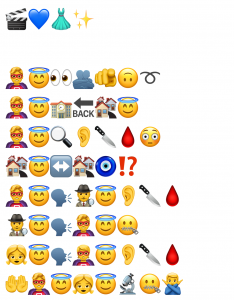
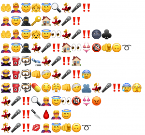
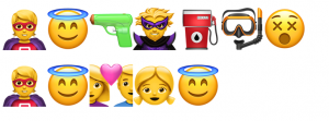
I was overwhelmed by this assignment when trying to translate the last film I truly enjoyed into emojis, and it ended up taking me a lot more time than I would care to admit. However, the last hour or so working on it was greatly enjoyable, and I shall attempt to explain this. For the title, I attempted to represent a complex idea through a combination of emojis. At first I was daunted by having to represent the complexities of the plot using only emojis. This challenge seems to exemplify what Bolter describes as the tension between textual and visual modes of representation – how do you translate a rich narrative into purely visual symbols?

To tackle this challenge, I needed to develop a clear approach. I initially thought I would take a thematic/symbolic approach, but I quickly became daunted by that task. What enabled me to get my head around it was realizing it was only ever going to be a partial description of the plot of the movie. I decided to structure my emoji narrative around key moments, allowing myself to use multiple emojis for key characters (who needed that complexity to be properly represented), while being more economical with other story elements. This approach let me distill the plot down into certain motifs, whether these were oriented toward audience reaction or the character’s emotion in sequence. I found myself habitually placing these emotional reactions at the end of each line to bring out the patterns that existed in the film.

Most times I used the emojis to represent their commonly accepted meanings (like red exclamation marks to signify danger) while in other instances I had to make use of combinations in order to portray an idea that wasn’t easily represented by a single emoji (without giving too much away, gas pump paired with the swimming MASK, and not GOGGLES). What began as a daunting task transformed into something deeply satisfying as I discovered the internal logic of my emoji narrative. There was particular pleasure in repeating certain complex sequences verbatim, and in realizing that removing emojis could sometimes make the story stronger – a kind of addition by subtraction. So while it was a gross simplification of a brilliant and complex film, the partiality of the description became, in some way, the purpose. It was like I was creating my own story here – not just simplifying the film, but finding its essential rhythm and patterns. In this way, perhaps what I created wasn’t just a translation but what Bolter might recognize as a remediation – a new form that both rivals and incorporates elements of the original.

References

Bolter, J. D. (2001). Writing space: Computers, hypertext, and the remediation of print (2nd ed.). Lawrence Erlbaum.

Categories
Optional Tasks

Potato Printing

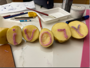
I chose the word “ivory” and spent about two hours carving the five letters into potatoes. While the carving process was intricate, the real revelations came when I attempted to create two identical copies of my word.

Initially, I tried stamping out the whole word once before making the second copy. The results were frustratingly inconsistent. My wife suggested I should stamp each letter twice before moving on to the next one – this worked much better since my hand could immediately reproduce the same angle and positioning while the motion was still fresh. In retrospect, this practical solution highlighted how challenging it is to achieve consistent handwork without mechanical assistance.

When drawing each letter with marker, I found myself less focused on the basic letter shapes and more on trying to add aesthetic touches – subtle bulges at the ends of the ‘i’ and gentle undulations in the ‘r’. These artistic ambitions would make the already challenging carving task even more difficult. After drawing, I’d press the knife straight down along the lines to define the letter’s shape. For outside edges, I could then use the flat of the blade to slice cleanly from the potato’s edge inward toward these deep cuts – just like slicing a potato for cooking. The enclosed spaces – like the inside of the ‘O’ and the triangle in the ‘V’ – required carefully digging out small chunks, working to maintain an even depth while ensuring complete separation between the raised letter and its hollow interior.

When I started stamping the letters, I was surprised by random flecks appearing in what should have been clean exterior spaces. Despite my careful carving that felt precise at the time, the prints revealed imperfections I hadn’t anticipated.

After spending two hours to carve just five letters into potato stamps, I gained a visceral appreciation for printing technology. The painstaking work of creating even this simple reusable form helped me understand what we take for granted – the revolutionary ability to design letterforms once and reproduce them thousands of times. The challenge of making my crude potato stamps revealed the sophistication behind centuries of printing innovations.

Spam prevention powered by Akismet