Task 10: Attention Economy
Attention economy is based on the scarcity of the capacity for the reception of information or cultural goods (Citton, 2017). There are a plethora of books to read, movies to watch and podcasts to listen to but what is limited is my attention and time to attune to these cultural goods. Harris (2017) paraphrases the Netflix’s CEO who recognizes that one of Netflix’s biggest competitors is sleep (Harris, 2017). In this way, attention is considered an economy. Paying attention to something increases its value. Because there is value in our attention, companies are in direct competition for our attention. Harris (2017) states: “What we don’t talk about is that a handful of people working at a handful of technology companies through their choices will steer what a billion people are thinking today” (00:41).
The use of deceptive tricks that companies use to distract users’ attention on the web to trick them into agreeing to share more information, buy more products and/or spend more time on a particular site have been termed “dark patterns” (Brignull, 2011). In today’s task, we were asked to play a game called User Inyerface designed to represent a number of different “dark patterns” used to deceive users and manipulate our attention. I found this game extremely frustrating. It began with this introductory page which took me 10 minutes to move past.
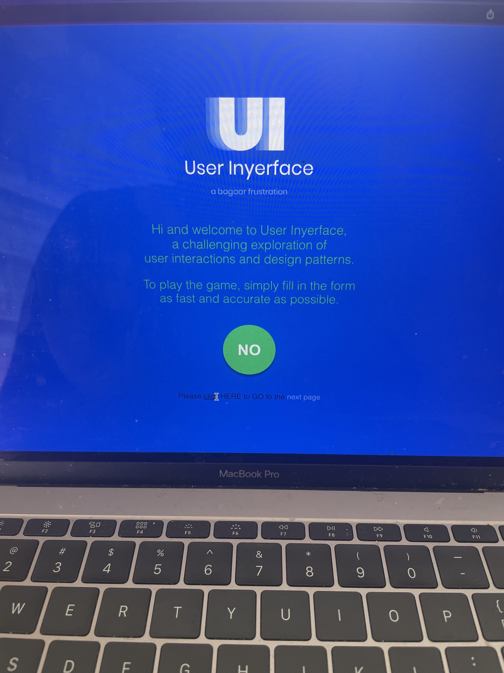
On this page a number of “dark patterns” are present:
- I immediately clicked the large green button to get started on the game. I did not read that the button said “No”, I just clicked it. This is because past experiences impact how color is perceived (Imtiaz, 2016); my past experiences with green circles on a website have always resulted in the game starting. This was not the case with this website.
- After realizing that the green button was not going to let me precede, I looked below and saw: click here to start the game. This did not work. As Birgnull (2011) explains, users don’t want to read pages, they want to scan them, therefore a deceptive website can hide a lot of information in the fine print. This was the case here, as I clicked the underlined word click when I should have been clicking HERE.
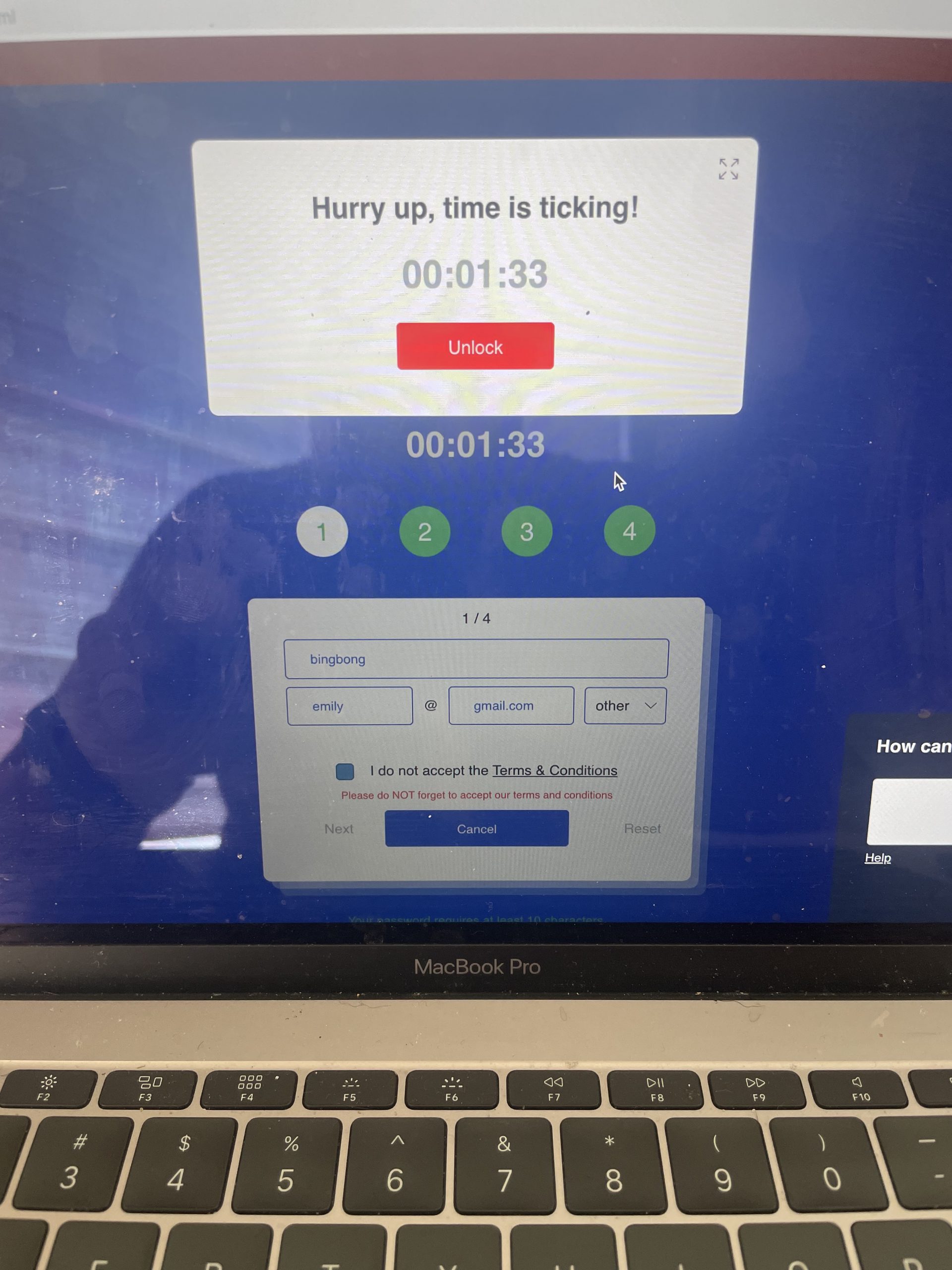
Finally, I was able to get to the next page where I was overwhelmed with visual information: a red banner about cookies, a help button that I couldn’t minimize, the numbers 1-4 changing colors and a timer. These are all deceptive techniques; the timer evokes a feeling of scarcity and urgency which has been shown to increase sales (Imtiaz, 2016). In multiple locations, the size of the writing is used to distract or deceive the user. For example, the red banner at the top asks if cookies are a problem; the options are “not, really” in small text, or a large Yes in a white box. Size is a technique that is used in web design to show dominance and is typically used to encourage users to choose the larger text (Imtiaz, 2016). This is why I clicked YES before realizing I should have clicked “not really”. My next frustration on this page involved my instinct to stick with the default settings, which Brignull (2011) indicated is typical user behavior. I was unable to move to the next page until I deselect the default about agreeing to the terms and conditions. This page was incredibly hard to move past; I needed to google cyrillic characters, create a fake email (because I didn’t trust this page) and constantly had to dismiss a hurry up message!
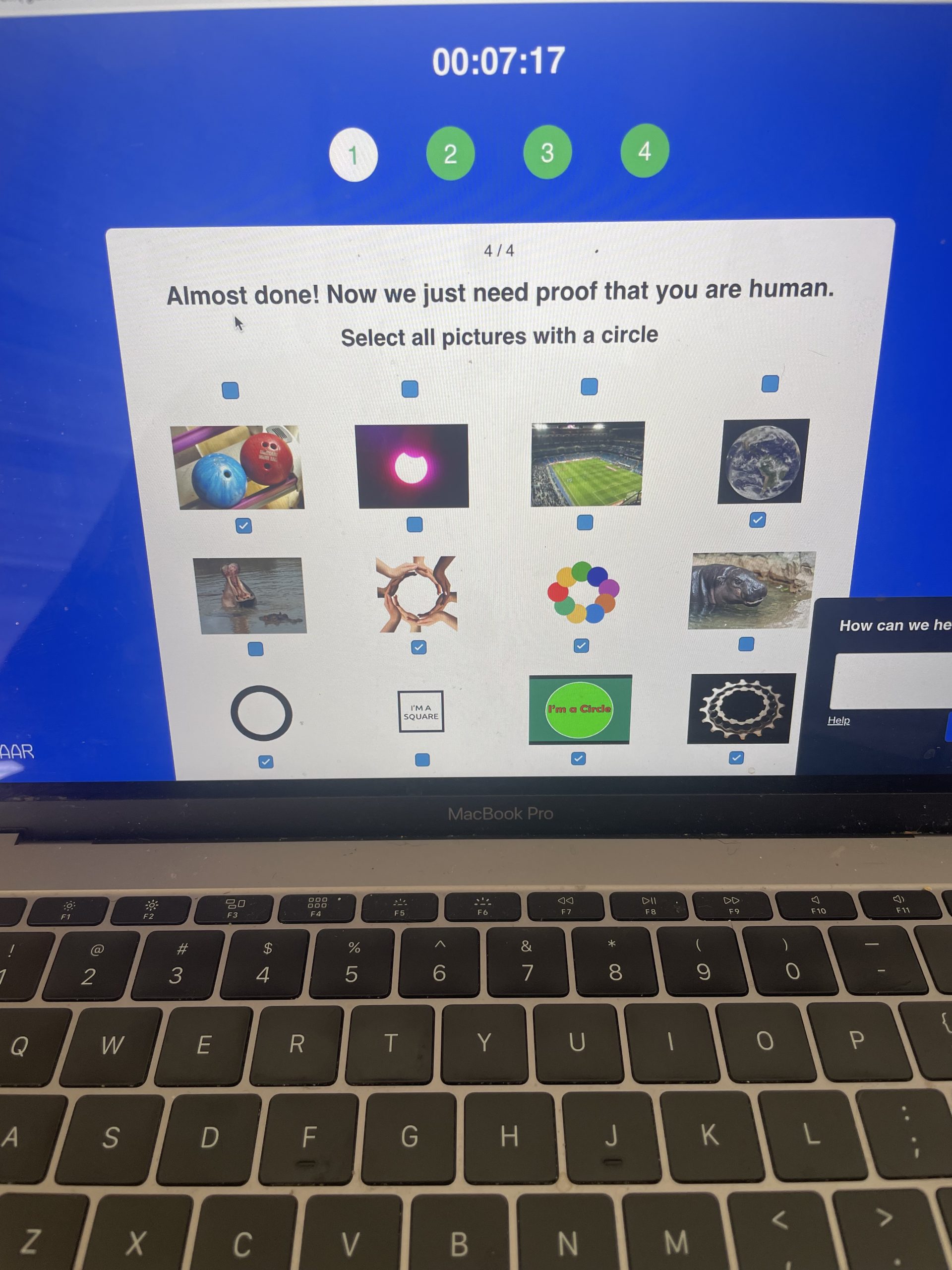
The next couple of pages were just as frustrating; clicking boxes that didn’t want to be clicked and a help button that blocked important information. The final frustration for me was the multiple images I needed to scan through to prove I was human. This page again proved Brignull’s (2011) point that users typically scan; as I just began clicking before realizing that the game was hiding the boxes above the pictures and I had been using the boxes below.
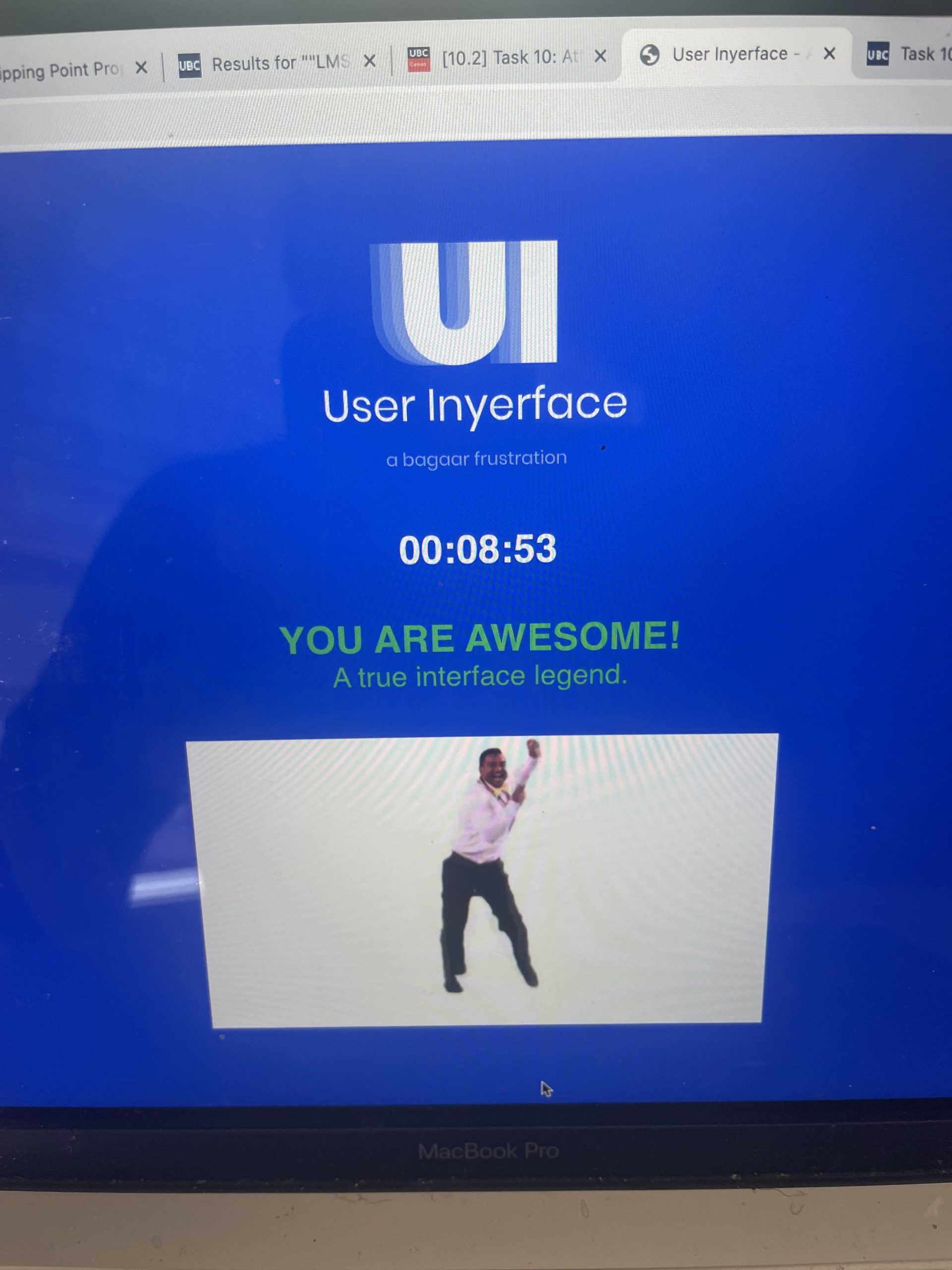
However, I preserved and I managed to complete this game. This module provided me with a better understanding of the deceptive techniques that are used on the web and gave me insight into my weaknesses when exploring the web. As Harris (2017) states, the best way to combat this web deception is to acknowledge that we are persuadable and use this to be more alert.
References:
Brignull, H. (2011). Dark Patterns: Deception vs. Honesty in UI Design. Interaction Design, Usability, 338.
Citton, Y. (2017). The Ecology of Attention. John Wiley & Sons.
Harris, T. (2017). How a handful of tech companies control billions of minds every day. Retrieved from https://www.ted.com/talks/tristan_harris_the_manipulative_tricks_tech_companies_use_to_capture_your_attention?language=en
Imtiaz, S. (2016). The Psychology Behind Web Design. https://doi.org/10.13140/RG.2.2.17394.56001