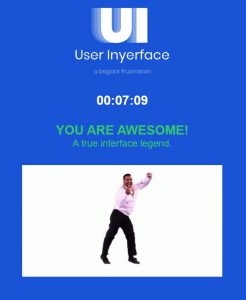
For this task I attempted to complete it twice. In the first attempt when the pop-up screen came up I didn’t know how to get rid of it. Eventually when during my second attempt I managed to get rid of it by clicking a bunch of things and eventually was able to complete the game.
Reflecting on this game I noticed that the creators attempted to design the features as tedious as possible to demonstrate the importance of having an effective UI design. Every UI has a specific purpose behind their design, but what makes a good and effective design is how the creator builds it. One of the most frustrating part of the game was having to manually remove the placeholder words when asked to fill in our personal information like name, email address, and age. While having these placeholder words are important for the user to know what type of information they need to input, it is more effective if the words automatically disappears when the user clicks on the box. Another frustrating design was the continuous pop-up timer screen. Like I said I attempted the game twice, in my first attempt I didn’t know how to get rid of the pop up timer and assumed I took too long to complete the tasks so I decided to do a second attempt. I received the same pop-up screen despite filling out the sections much faster the second time around so I figured there had to be some way of getting rid of it. Eventually after clicking a bunch of places I got rid of the timer, however it would still pop-up from time to time. I wasn’t sure what the true purpose of the having a pop-up timer was, if anything the UI design made it super ineffective for the user.
I am sure through my personal experiences that I have fallen into many of the dark patterns businesses have used for profit. Brignull’s (2011) article post mentions third party travel websites incorporating many ‘hidden’ fees. Speaking from a recent experience, my friends have almost fell into this type of dark pattern. A few years ago I was told when booking hotels or resorts to never use third party sites such as Booking.com and instead book directly through the hotel or resort website as those companies are more likely to avoid any reservation issues and at times may upgrade rooms if you are lucky. A few weeks ago my friends and I were planning a trip and were looking at resort reservations. I noticed that they were using Booking.com so I suggested using the resort website instead. It turns out that booking on the resort website itself saved us $200. What was interesting about comparing the two sites is that Booking.com originally offered a cheaper price so it seemed like they had a better deal, but they had many hidden fees found at the checkout. Of course as a business the best strategy is to include these extra fees at the checkout because it means that the customer has already made their decision with their booking (or commodity in general) and are more likely to spend the extra dollars to get the product. As consumers we don’t truly realize or pay attention to the marketing techniques businesses use until we actively search for them.
References:
Brignull, H. (2011). Dark Patterns: Deception vs. Honesty in UI Design. Interaction Design, Usability, 338
