For Task 9, our class had to first submit some data regarding our top ten track selections from Voyager’s Golden Record. See Task 8. When reading through the assignment I have to admit I was somewhat intimidated by the sounds of running a zip file through another program to create some sort of graph. To our professor’s credit, the process was actually quite easy, as all it required was copying and pasting to load the file in Palladio (Stanford University, 2016) which was the graphing program used for this task.
As I soon found out though, that was the end of the easy part of trying to manipulate the graph. Trying to stumble my way through Palladio and all it has to offer was difficult for someone who has never used the program before. Thankfully I looked up a video on YouTube (Raynor Digital Scholarship Lab, 2018) to help me with the basics of what to do and how to find information through Palladio.
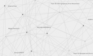
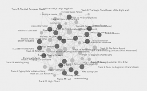
Though I figured out how to sort through the nodes and edges within the undirected graph (Systems Innovation, 2015), trying to comb through all the data was still a difficult task. I could figure out a general sense of the degree of connectivity (Systems Innovation, 2015) of certain nodes, though visualizing it through the other edges made it hard to visualize, and it was best to add weight to the nodes. The rest of the data in my opinion was difficult to extract easily.
At this point I started to realize, trying to develop these types of analytical skills simply takes time and knowledge with a program. This wasn’t going to happen in 1-2 hours I had set out for this task. I could learn the basics and only the basics, and I would be ok with that. This is something I would also keep in mind when considering such a project for my own work context in a k-12 environment. Students need scaffolding to be able to complete a skilled project successfully. That takes time, practice, and patience.
One last aspect which came to mind throughout this task was also the lack of access to the raw data. Having taken a previous learning analytics course in this program, my mind came back specifically to what data was collected, how was the data collected, has it been filtered, and if so, how? It would have been interesting to filter the data between different genders, age sets, etc and see what kind of differences popped up? In the end through, through the Palladio exercise, I am still left wondering about context of the chosen songs. Why did my fellow students choose the songs they did and why? This Palladio task didn’t really help answer that question.
References
Raynor Digital Scholarship Lab. 2018, April 18. Palladio 3 – Data Visualization. [Video]. YouTube. https://www.youtube.com/watch?v=m-OVVAm0utE
Stanford University. 2016. Palladio Project. https://hdlab.stanford.edu/palladio/
Systems Innovation. (2015, April 18). Graph Theory Overview . Retrieved from https://youtu.be/82zlRaRUsaY
Systems Innovation. (2015, April 19). Network Connections . Retrieved from https://youtu.be/2iViaEAytxw