“Gold Leader: It’s no good. I can’t maneuver.
Gold Five: Stay on target.
Gold Leader: We’re too close.
Gold Five: Stay on target.
Gold Leader: Loosen up!”
Star Wars (1977)
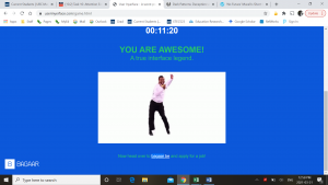
I have no idea why, but after hearing about this “User Inyerface” project this quote got stuck in my head. And I found it really helped; through the attempts at setting up my password and uploading a picture and, slowly, extremely slowly, watching the help window slide down out of view I kept reminding myself that it’s not worth getting frustrated and to just stay on target and get through. It wasn’t until I had to prove that I was human (my family is overjoyed that I now have proof!) that I started to lose it. Choose all things that are glasses? Before my career in education, I was a licensed optician (I made prescription glasses) so this task to me seemed simple. Pictures of glasses? Check. Pictures of drinking glasses? Well… those ones are tumblers, but sure; check! Now pieces of glass? No, that is not glasses!! And then I failed. Choose all things that are light? Lightbulbs are light… fires let off light… a feather is light I guess… but that bike? Well, it’s a road bike, so it’s lighter than my mountain bike, but it looks like it’s steel so it’s not very light compared to my carbon road bike… lighter than a car though.
It was the absolute absence of a black and white answer that killed me. And with nothing on the line short of my existence as a human no less! The last screens were all personal opinions (and I’m pretty sure it didn’t matter what you chose, you were doing all those screens) and when it told me that I had not proven my humanity yet and try again! that I really started to lose my focus (stay on target) and second guessed my answers (stay on target!).
When we interface with sites on the web, we expect our interactions to be smooth and easy; instructions should be clear and concise and transitions between screens should be fluid. Everyone has gotten so used to what these screens will look like that we don’t read them anymore; we scan and quickly fill in the blanks as fast as possible to move on. The answers to prove you are not a robot are black and white (look for star wars characters to prove you are human) because it is a step in the process and not something we are suppose to put time into reflecting on if that bike really is light. Personally, I have a hard time dealing with sites that have spelling mistakes, especially professional or consumer sites as they PAY people to look out for these (and I bet my carbon road bike that we have all come across sites with one or two of these dark patterns in them and still finished our transaction), that if I was to come upon a checkout window as complex as this “User Inyerface”) I think I would happily close the window up and continue searching.
I’d stay on target.

2 Comments
Hi Greg,
I got stuck on the exact same spot that you did! As you said, we have gotten so used to these screens that we don’t read them anymore. In fact, Google often helps you out with the Auto-Fill feature that fills out all the information to save you time. I just clicked on every box as I just assumed that’s what they wanted, I just did not see the scroll on the right to check off the last set of boxes since I’m used to having everything be on that one page once I reach that stage of a transaction.
I think many of us in the MET program have some background in technology so we are able to notice some of these dark patterns and choose to ignore them and continue the transaction but there are an astonishing number of people who don’t realize they are being manipulated. I sometimes get phishing emails in my district and I would read them and think to myself, “How would anyone fall for this email?” A few days later, everyone in the district gets an email that lets us know that people fell for a phishing email and to be more careful.
HI Greg,
I first have to tell you how clever I find the names of your tasks. Actually “A Carlton Dance for the Dark Side!” is what brought me to your site. Like you the one thing that bothered me the most in the user inyerface was how slow the help window would close. I like how you connected this non-user friendly experience with perseverance and staying on target. It was also very interesting that you an optician would get the proof of humanity by choosing “glasses”. This part of the inyerface made me laugh actually, as I had to choose bows, I started by thinking carefully on the choices as I knew everything there was a play on words, at the end I realize all of the pictures were a type of “bow” a knot, a crossbow or bowing as a sign of respect. I did two of my linking assignments using your posts.