To listen to the podcast, click the image below:
To view references for the podcast, please click HERE

To listen to the podcast, click the image below:
To view references for the podcast, please click HERE
Posted in Final Assignment
My first speculative narrative was created using Pixton. It looks at education and the ability for it to be personalized for every student. As Dunne and Raby (2013) suggest, future predictions “usually take the form of scenarios, often starting with a what-if question” (p. 3). I began by thinking of what-if scenarios based on my class at school. I have a very diverse class this year, with a wide range of learning needs. I wondered what-if each student had their own teacher who could scaffold the learning and customize the experience for each student. This is where I can up with the idea of each student having their own holographic teacher, with school happening on the student’s schedule and at any location. Education would become personalized and each learner would learn at their own rate, in the environment that was best for them.
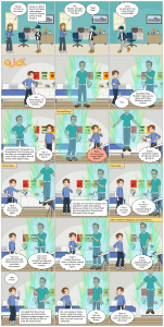
My second speculative narrative was created using Animaker. It looks at the use of technology in a student’s day to day life, but aims to show the negative social implications the technology could pose. While future technological advancements could support day-to-day life and make things easier and more personalized for man-kind, there could also be negative impacts of the technological advancements, such as a lack of social connections. I created this narrative “to draw attention to a scary possibility in the form of a cautionary tale” (Dunne and Raby, 2013, p. 28). The narrative is a something I speculate could happen and want to forewarn others about the possible implications.
(Click HERE if the video doesn’t load:
References
Dunne, A., & Raby, F. (2013). Speculative everything: design, fiction, and social dreaming. MIT press.
Posted in Tasks
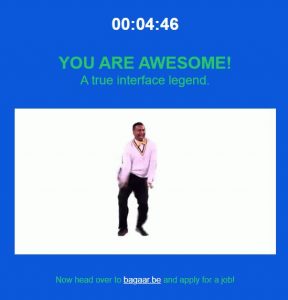
The online game User Inyerface was an interesting experience. It reminded me of an escape room in which you never know if what you are choosing will help or hinder your progress. I played the User Inyerface game two times. The first time I clicked on the terms and conditions. The scroll bar to get through all the terms and conditions moves at a snail pace and there are so many pages to get through, so I quit and restarted the game. I knew I had made a key mistake! On my second try, I spent more time looking and reading things before clicking. There were so many ways in which the GUI is designed to manipulate attention and responses. For example, the game was timed. I am a competitive person so this created a sense of urgency. I wanted to go quickly, but after what happened my first try, I also wanted to read over what I was doing. This lead me to scan the pages, allowing deception by the game as key information was buried in text and was easily overlooked when scanning the page (Brignull, 2011). From being constantly reminded of the time, the use of colors opposite than one would think (ex. green for No, as opposed to red), and clicking on a word instead of what appeared to be a link, to the order of the text boxes that had to be manually deleted, and the ‘I am not a robot’ pages that were open to interpretation, the game was a struggle. Things that I had become familiar with from time spent online, were not the correct choices. The game purposely manipulated me into clicking on specific things.
Tristen Harris (2017) spoke of how the internet is not evolving at random and there is a hidden goal of gaining our attention. This can be accomplished in various ways, but “auto play” was one example that Tristan Harris (2017) used in his Ted talk. Zeynep Tufekci (2017) spoke of persuasion architecture and how both the physical and online world can be designed to persuade us. As I listened to their TED talks, I was reminded of some of my undergrad courses in human geography. The auto play example in the online world that Harris (2017) discussed can be related to the hallways and aisles in malls and casinos. Malls and casinos are designed to appear never-ending. When one hallway or aisle ends, the next begins. Malls and casinos have a hidden goal of gaining time from the customers because the more time that is spent in the facilities generally means more money being spent. There are also other architectural features that are designed to help accomplish this goal. The exits are not easily visible or they are at the end of long hallways. There are no windows so the customers are removed from the outside world and don’t know if it is getting dark outside, snowing etc. And lastly, there are no clocks so the customers have no idea how much time has gone by while inside the mall or casino. This persuasion architecture has been a part of our physical world for many years and it is no wonder that it has expanded to the online world which now makes up a big part of our daily lives. It is scary to think of how much we are persuaded in both the physical and online world, and even scarier to think of how often we are completely oblivious to it!
References
Brignull, H. (2011). Dark Patterns: Deception vs. Honesty in UI Design. Interaction Design, Usability, 338.
Harris, T. (2017). How a handful of tech companies control billions of minds every day. Retrieved from https://www.ted.com/talks/tristan_harris_the_manipulative_tricks_tech_companies_use_to_capture_your_attention?language=en
Tufekci, Z. (2017). We’re building a dystopia just to make people click on ads. Retrieved from https://www.ted.com/talks/zeynep_tufekci_we_re_building_a_dystopia_just_to_make_people_click_on_ads?language=en
Posted in Tasks
Link #6 – James Martin
Linking to James Martin’s Task #7: https://blogs.ubc.ca/etec540jamesmartin/2021/10/24/task-7-mode-bending/
When I came across James Martin’s mode-bending task, I was blown away. What a creative, interactive way to present the information from the bag task! Jame emojified each of the items from his bag and added two types of audio: a voice sharing the name of the item, as well as sounds effects that are made by the items. James went above and beyond with this task. The audio provided snap shots of his day through the use of the items. The items even had different sound effects depending on how the item was used at different times of the day. Because he displayed the emojified items on a grid with times of day at the top, the user was able to get a glimpse into a day in his life, as well as when/what the items were used for. The user was able to interact with the objects in any order and make meaning from the images and sounds.
James was able to convey so much meaning without any text, and the audio added more detail than I thought it could. I feel like I learned a lot about both his public and private life through this presentation and I had fun “reading” the text he created. I, on the other hand, chose a completely different way of completing this task. I changed the semiotic mode and created a spoken word poem. While I had a primarily audio component, my audio was based on a text script. This was very different from James’ audio which was based on sounds. Both of our mode-bending tasks, however, allowed the user to experience audio in different ways and created meaning that was an extended, deeper conversation with the user compared to the original task.
Posted in Linking Assignment
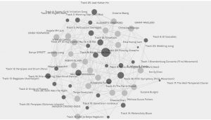
When I first opened the Palladio program, the music choice data from task #8 was displayed for the entire class. The curators were all represented as light grey dots on the graph and each of those dots was the same size as one curator was not any more important than the other. These dots are all vertices or nodes. The music tracks were represented by dark grey dots, or nodes. The lines connecting the curator nodes and the music track nodes are referred to as edges. The dark grey music track nodes were different sizes, proportional to the number of edges each song had, or the number of connections between the particular music track and curators. The more edges/connections, the bigger the node was represented on the graph.
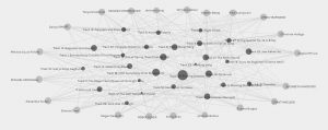
I moved the nodes around as I found it overwhelming to view the graph with all the nodes rather randomly placed on the graph. I moved all the curators to the outside of the graph, leaving the music track nodes in the centre. This allowed me to more clearly see which nodes for the music tracks had more edges. Both the size of the node and the number of edges or lines leaving the node allowed me to see this.
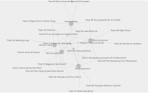
Next I focused on the community I was put into. Community 1 consisted of myself and 4 other classmates. Focusing in on just one community was easier than viewing the graph of the entire class as a whole because it narrowed down the number of nodes and edges. This makes it easier to view all the connections.
I again re-arranged the nodes in order to see the connections and edges more clearly, as well as to see the size of the music track nodes easier. The bigger music track nodes indicated that more of us from the community had selected that particular music track.
There were two particular tracks that all 5 of had chosen. In our community, these two tracks have 5 edges. I was curious as to why we all chose these songs. What was it about them? Flowing Streams is a song from China with sounds from a guqin, a seven-string instrument. The other is a percussion piece from Senegal. I chose these songs because I was trying to showcase a variety of instrument sounds. Did the other community members have the same criteria?
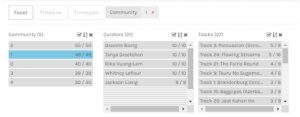
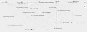
When I looked specifically at the songs that 3, 4 or 5 of the curators in community 1 had in common, the songs were all from different areas of the world, and all featured different instruments. There was also a range of sounds. It appears as though diversity was a common criteria between the community members. Diversity, however, is quite broad. The criteria could have been geographical diversity, instrumental diversity, or sound diversity. Not being able to confirm the criteria made me wonder if there was ever really a way to know what criteria allowed these 5 curators to have commonality, or if it was always an educated guess.
“The community structure of a network can also be a powerful visual representation of the system: instead of visualizing all the vertices and edges of the network (which is impossible on large systems), one could display its communities and their mutual connections, obtaining a far more compact and understandable description of the graph as a whole” (Lancichinetti et al., 2011, p.1). The data for this task was much easier to view and interpret when just one community was displayed as opposed to the date for the entire class. While the nodes and edges of the 5 curators and song tracks were more apparent and much easier to view, the data did not indicate why these curators were grouped together. I can find commonality between the curators song choices and make assumptions about the criteria that was used, but the data can never tell me the exact criteria or thought process of the curators. The data also doesn’t make it clear as to why the curators didn’t chose specific songs. The nodes are smaller for songs that were not chosen as frequently, however if a song was not chosen at all, it doesn’t appear on the graph. This makes it hard to speculate as to why a song was not chosen, in this case, as it would not even be reflected on the graph.
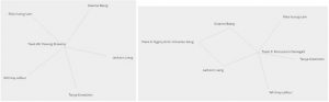
My interpretations of the data presented could be vastly different than someone else’s. Just as there was cultural and personal bias when choosing our songs, there is also bias the interpretation of the data. I think diversity was the criteria that was used by the curators in community 1, but perhaps there are other criteria that I did not consider. The algorithm put the 5 of us together and while I can speculate why, I don’t know that we can ever really know for sure by just looking at the graph.
References
Lancichinetti, A., Radicchi, F., Ramasco, J. J., & Fortunato, S. (2011). Finding statistically significant communities in networks. PloS one, 6(4), e18961.
Posted in Tasks
Link #5 – Maurice Broschart
Linking to Maurice Broschart’s Task #5: https://blogs.ubc.ca/etec540texttech/task-five/
Maurice created a Twine about the first day of school. I enjoyed working my way through the Twine and deciding which path I was going to take. I appreciated all the different options and how he was able to have different text pop up within the task. The images and pop-ups added to the experience as a viewer/reader and allowed some elements of the storyline stand out and have more emphasis than others. In reading his reflection, I right away connected to many of his thoughts. I connected Twine to the “choose your own adventure books” and I also teach using hyperlinks. While I don’t use Canvas as a platform in my teaching, I do use Google Classroom and in a fairly similar way. I also use the Google Apps for Education and link items into documents, allowing students to access audio, visual, text, websites etc. all from a common document. This makes it easy to guide a student through different learning opportunities and provide different resources for learning that cater to different learning styles. In the creation of the Twine, Maurice resorted to pen and paper to map out his storyboard. I tried to do this step digitally in the Twine program, but found that I often had to click back and open previous boxes as I wasn’t sure what the last prompt was. It would definitely be helpful if you could see a little preview of the story boards as you plan instead of just the title each storyboard. Maurice and I both used YouTube clips to support our Twine learning. It is interesting how times have changed where we get our information from. In the past, books or encyclopedias were often used as a source of knowledge when someone was unsure of something. Now, those who have the advantage of computers and smartphones, can google or YouTube almost anything and learn the process. Both Maurice and I learned from someone who had posted their tutorials to YouTube, and this process of learning online through videos is becoming more and more the norm.
Maurice’s blog space is set up so the user can navigate their way through the tasks by using the links at the top of the blog. The user is able to leave a comment after each post, so they are able to interact with the blog if they want to. While the blog space itself is very plain, with a white background and standard blank font, there are some images in some of the posts themselves. Once I navigated to Maurice’s website, I had a hard time knowing who the blog space belonged to and had to go back to the class page and work my way back to the blog in order to know who the author was. Perhaps it was a conscious choice to hide his identity, or perhaps an oversight in the creation of the blog itself.
Posted in Linking Assignment
Link #4 – Chris Howey
Linking to Chris Howey’s Task #6: https://blogs.ubc.ca/chowey/2021/10/13/an-emoji-story/
Chris and I approached this task quite similarly. We both included the TV emoji before our title to suggest that our emoji story was a TV show as opposed to a movie or book. We also both used emojis to represent ideas and whole words instead of syllables. We started the task, however, in an opposite way. Chris chose to start with the title and move his way through the plot. He also ended his line with periods, indicating that the “sentence” or that particular line of emojis represented a particular idea and the next line would be a new idea. I found it easier to start with the plot and then go back to the title after. I also never even considered the possibility of using punctuation to indicate the end of an idea as one would use in writing.
Chris reflected on the limitations of using emojis, such as with the color of the flowers or the positions of the hands. He also reflected on the idea that context matters and that a shared understanding or pre-context between the “readers” is important. I reflected similarly, but went beyond the color of the emojis and the context to include the culture that is “reading” the emojis. I know that certain images can mean different things in different cultures and considered what an emoji may represent to someone else. I also reflected on the limitations occurred in regards to the people emojis. The people emojis were limited in terms of age, skin color, hair color/style etc. Because of the limitations I experienced, I re-looked at Chris’ emoji story and it made me wonder if the emojis that he chose were actually representative of the characters from his chosen show. I know he would have liked different hand positions and different colors on the flowers, but would other emojis have helped him to provide more detail or a more accurate representation of the plot? Or are there a range of interpretations by the “reader” regardless how representative the emoji are?
Chris has set up his blog to be very user friendly. There are menus down the side of the screen, allowing viewers to easily navigate to posts and recent comments. The large, clear image of his emoji story caught my attention right away and because of the size and clarity, I was able to see the details in the emojis. I did find the grey colored text a little harder to read than the usual black text, but that could just be my eyes!
Posted in Linking Assignment
Top Ten Songs (In No Particular Order)
I am not a musically inclined person, nor do I have much background information related to music or musical instruments. As as a result, I found this task challenging. To choose just ten of the pieces, I first listened to each of the pieces and jotted down my initial reaction. Was the song instrumental or were their vocals? Did I know the instrument being used? How did I enjoy the song? Was it similar to other songs? After listening to each song and taking notes, I created criteria to narrow down the songs. I read over my notes and noticed that some of the songs were by the same composer. This lead to my first criteria: Each piece of music would have a different composer/artist. With so many musicians in the world, there is no need to have multiple piece by the same person. I eliminated songs so that there was only one song for a composer. I then noticed that half of the pieces that were left had vocals, while the other half were instrumental. I debated back and forth about what I should keep. Should I focus on areas of the world? Male/female representation? Vocals and/or instrumental? This lead to my second criteria: Songs will not have vocals in them. I made the decision to cut the songs with vocals because I wanted the songs to be representative of the world and without a language being spoken, I felt that songs were more universal. It is the music that is the universal language, not the voices and words within them. Also, because there is also a track with people saying hello in different languages, voices are already represented in space. That left two songs to cut. At this point, I listened to the remaining songs and decided on my third criteria: Songs with a variety of instruments would have priority. I felt that the record should showcase a variety of instruments from the world.
Smith discusses what we can afford to lose as opposed to what we save (Brown University, 2017). Instead of thinking of creating a Golden Record as saving resources to share with those out in space, we can also think of the Golden Record as losing resources. There are millions and millions of songs that are a part of our world, yet the record only has 27. If Earth disappeared, the only music left would be those songs that were on the Golden Record. Are we ok to lose all the other music from planet Earth? Does the Golden Record represent all world and the music of various cultures? This makes me think about how different the Golden Record would be if it were created in today’s day and age, almost 45 years later. Would there be more variety in the representation of artists/songs – age, gender, culture etc.? Would any of the same songs still be on the record? How different would the selection process be now? So much has changed in our world in the last 45 years and I think this would really change what was chosen to represent the world!
References
Brown University. (2017, July 11). Abby smith rumsey: “digital memory: what can we afford to lose?” [Video]. YouTube. https://www.youtube.com/watch?v=FBrahqg9ZMc
Posted in Uncategorized
Link #3 – Karen Wang
Linking to Karen Wang’s Task #4: https://karenw0801.wixsite.com/mysite/post/task-4-manual-scripts-and-potato-printing
Karen and I took completely different approaches to task #4. While Karen chose to complete the potato printing task, I chose to complete the manual scripts task. I really enjoyed reading about Karen’s experiences with the potato printing. I followed along as she discussed the failed attempts she made, and I considered whether I would have done the same. In many cases, I feel I would have gone through the same challenges with the process and could relate to how Karen was feeling. I was impressed with how Karen found solutions to her problems and overcame the challenges, attempting the task over again each time. While there were challenges with both of the tasks, there were also some key differences in our experiences. Karen discusses choosing a different font to make her task easier. When manually writing, however, the font can’t change. What can change is the tool used to write – whether that be a pencil, pen, mechanical pencil, flair pen etc. The font in Karen’s task created the tool that was then used to write, so in this way her choice of font was similar to my choice of tool. Another difference in our tasks was the manual labour involved. In Karen’s task, the manual labour was very front-loaded. She had to create the potato “tool” and once it was completed, she could then create multiple prints with the tool. With my manual script, the labour was less, however it was constant. I had to continue using the tool the entire time, resulting in a sore hand. If Karen used the potato print over and over to create multiple representations, then she too may have a sore hand from the repetitive nature of the printing, similar to the manual script.
Karen chose her platform to be a WIX site. When a user arrives at the WIX site, there is a preview of each post that includes an image and a brief intro to the post. This allows the user to navigate to the post they would like to by scrolling through the previews. If the user wants to be directed to a specific post, however, the menu is no helpful for the user. The menu at the top of the site has three options: Blog, About and Top 10. The “About” and “Top 10” menu lead the user to a standard template with no information. There is also a menu on the blog page, which allows the user to choose between “All Posts” and “Education.” The “Education” menu is also a standard template, and “All Posts” leads to the main blog. The down side of all the post being together is that the posts are from courses other than this course and could be hard to navigate as more and more posts are added to the stream. Overall, however, the site colors are beautiful. I was drawn to the site as soon as I clicked on the link to her site with the soothing, Ombre colors. I also really appreciated that there were many visuals of the process of her task present throughout her post, allowing me to see and read her process.
Posted in Linking Assignment
To redesign task #1, I chose to create a spoken word poem. I have had colleagues do spoken word poems with their students, but it is something I have never tried myself or with my own students. I decided I would give it a try and go through the experience as a student would.
Click HERE to listen to the spoken word poem and see the bag images.
Click HERE to read the poem lyrics.
Task #1 was about introducing ourselves to the class through our bag and what the items from the bag told others about ourselves. To redesign the task, I started by brainstorming all the roles, traits and experiences that help to define who I am, and then compared them to the items that were in my bag from the first task. Many of the items from my bag were in some way represented by my brainstorming, but many other parts of what defines me was not included in my bag at all. I struggled at first with what to do to redesign this task. My go to response was a video, but I wanted to really focus on the audio component of this task. I decided to take my brainstorming about myself and wrote a poem about who I am. I then recorded the poem in the form of spoken word poetry. I was going to only submit the audio poem, but then decided to include images of the parts of the bag that I felt were represented by the parts of the poem. By creating the poem, it allows the listener to learn much more about me and who I am. The poem allowed me to extend the conversation and go much deeper about who I am as compared to task 1 when I only spoke of the physical items in my bag. The poem has allowed for a narrative that goes with the items and tells others about who I am beyond what they can see.
As the New London Group (1996) suggests, redesigning is “neither a simple reproduction… nor is it simply creative” (p. 76). Redesigning changes the task and the result is something new. The redesigned “is the unique product of human agency: a transformed meaning” (New London Group, 1996, p. 76). The poem in this task is completely transformed from the bag assignment in task #1. While some of the items from my bag in the original task loosely link to part of my poem, the poem is a completely new entity. Writing the poem allowed me to introduce myself in a different way. I was able to rely less on physical, public side of me and share more of my private life and thoughts. By redesigning the task and changing the semiotic mode, the meaning has changed.
I have been brought up in a culture in which reading and writing are generally thought of as literacy. There are cultures, however, where that is not the case. The idea of multiliteracies “focuses on modes of presentation much broader than language alone” (New London Group, 1996, p. 64). I found it fascinating that the New London Group (1996) spoke of “sci-fi visions of information highways and impending future where we are all virtual shoppers” and that “new communications media are reshaping the way we use language” (p. 64). While information highways and virtual shopping have become the norm, so much can still be said about new communications media reshaping the way we use language. With emojis, tweet, posts, tik tok videos, snaps etc., our language and literacy is being redesigned and multiliteracies are becoming the norm.
References
The New London Group. (1996). A pedagogy of multiliteracies: Designing social futures. Harvard Educational Review 66(1), 60-92.
Posted in Tasks