Linking to Richard Wong’s Task #1: https://blogs.ubc.ca/richard540/2021/09/19/task-1-whats-in-my-bag/
Richard chose to share his reflection of the “What’s in Your Bag?” assignment through a video. This was very different to my presentation style of a photo with written text. I had not really considered doing a video for this task, so it intrigued me to see how Richard approached this task. Through the video, Richard was able to speak in depth about various items in his bag and what these items might tell the reader about him. Richard was able to relate most items to text technologies and he made connections that I had not thought of. Richard’s car keys, for example, were related to transportation, which Richard then linked into text on the in-car console. I really enjoyed that Richard ended his video with a question: “Will paper ever go completely out of style?” This question really allows the reader/user to interact and share their opinion. A great advantage of the video presentation style is that it allowed me hear tone and inflection in Richard’s voice, to see and hear the humour, and to see Richard’s facial expressions. Being able to see and hear Richard changed the experience of just reading about his bag. I felt like I got to know Richard more than I would have if I just read a written reflection of his bag. The video also removed any misinterpretations that may have existed if I had just read a written reflection.
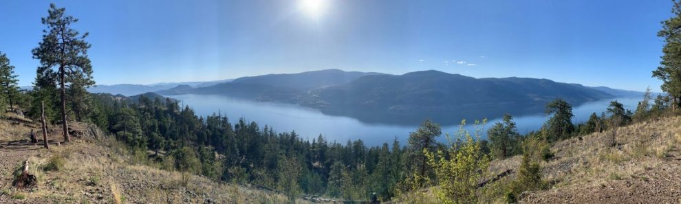
Richard used UBC Weblog for his blog, which is the same platform I chose to use. The visual appearance and the ease of use, however, are very different from my blog. Richard’s blog is very simple, with no images. While I had found his “What’s in Your Bag?” video warm and friendly, his blog space has a very different feel. The blog simply states his name and the course at the top and then then has a homepage that scrolls through all of his posts in the order that they were posted, with the newest post being first. In order to access a particular post, the user must scroll down to find the post, or click on the recent posts that are listed on the side. There is no menu that allows the user to go directly to the tasks. There is a menu bar title ‘sample,’ but it is from the original template and is linked to just a template page. There is no personalization on the blog. On the other hand, I tried to design my blog with a high ease-of-use for the user. I have menus that allow the user to navigate to a specific task, as well as the recent post links that are available to use. While the design of my blog isn’t as appealing as I would like it to be, I worked within the template constraints and did add a picture I took on a local hike to give the user a glimpse into my world, as well as add some color and visual appeal. Both of us did choose a template that allows the user to leave comments on the blog posts.