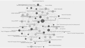
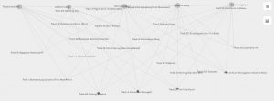
When I first opened the Palladio program, the music choice data from task #8 was displayed for the entire class. The curators were all represented as light grey dots on the graph and each of those dots was the same size as one curator was not any more important than the other. These dots are all vertices or nodes. The music tracks were represented by dark grey dots, or nodes. The lines connecting the curator nodes and the music track nodes are referred to as edges. The dark grey music track nodes were different sizes, proportional to the number of edges each song had, or the number of connections between the particular music track and curators. The more edges/connections, the bigger the node was represented on the graph.
I moved the nodes around as I found it overwhelming to view the graph with all the nodes rather randomly placed on the graph. I moved all the curators to the outside of the graph, leaving the music track nodes in the centre. This allowed me to more clearly see which nodes for the music tracks had more edges. Both the size of the node and the number of edges or lines leaving the node allowed me to see this.
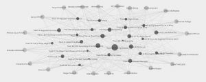
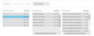
Next I focused on the community I was put into. Community 1 consisted of myself and 4 other classmates. Focusing in on just one community was easier than viewing the graph of the entire class as a whole because it narrowed down the number of nodes and edges. This makes it easier to view all the connections.
I again re-arranged the nodes in order to see the connections and edges more clearly, as well as to see the size of the music track nodes easier. The bigger music track nodes indicated that more of us from the community had selected that particular music track.
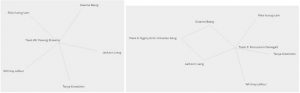
There were two particular tracks that all 5 of had chosen. In our community, these two tracks have 5 edges. I was curious as to why we all chose these songs. What was it about them? Flowing Streams is a song from China with sounds from a guqin, a seven-string instrument. The other is a percussion piece from Senegal. I chose these songs because I was trying to showcase a variety of instrument sounds. Did the other community members have the same criteria?
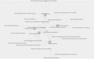
When I looked specifically at the songs that 3, 4 or 5 of the curators in community 1 had in common, the songs were all from different areas of the world, and all featured different instruments. There was also a range of sounds. It appears as though diversity was a common criteria between the community members. Diversity, however, is quite broad. The criteria could have been geographical diversity, instrumental diversity, or sound diversity. Not being able to confirm the criteria made me wonder if there was ever really a way to know what criteria allowed these 5 curators to have commonality, or if it was always an educated guess.
“The community structure of a network can also be a powerful visual representation of the system: instead of visualizing all the vertices and edges of the network (which is impossible on large systems), one could display its communities and their mutual connections, obtaining a far more compact and understandable description of the graph as a whole” (Lancichinetti et al., 2011, p.1). The data for this task was much easier to view and interpret when just one community was displayed as opposed to the date for the entire class. While the nodes and edges of the 5 curators and song tracks were more apparent and much easier to view, the data did not indicate why these curators were grouped together. I can find commonality between the curators song choices and make assumptions about the criteria that was used, but the data can never tell me the exact criteria or thought process of the curators. The data also doesn’t make it clear as to why the curators didn’t chose specific songs. The nodes are smaller for songs that were not chosen as frequently, however if a song was not chosen at all, it doesn’t appear on the graph. This makes it hard to speculate as to why a song was not chosen, in this case, as it would not even be reflected on the graph.
My interpretations of the data presented could be vastly different than someone else’s. Just as there was cultural and personal bias when choosing our songs, there is also bias the interpretation of the data. I think diversity was the criteria that was used by the curators in community 1, but perhaps there are other criteria that I did not consider. The algorithm put the 5 of us together and while I can speculate why, I don’t know that we can ever really know for sure by just looking at the graph.
References
Lancichinetti, A., Radicchi, F., Ramasco, J. J., & Fortunato, S. (2011). Finding statistically significant communities in networks. PloS one, 6(4), e18961.