Link #1 – Speech to Text
Link 1: Speech to Text Task – Kirsten Garret
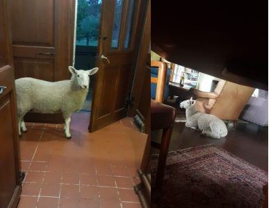
Kirsten experienced this task very differently than myself. When she orally delivered her text to her device she included punctuation as she spoke – which as she noted in her post made her sentences very halted. This changed the experience she had with the oral text because she had to think about when to speak a period, or a comma, etc. When we deliver a story, orally, we give natural pauses and phrase our thoughts according to the story but it would feel unnatural to constantly be saying “period,” or “comma” within a spoken story. I appreciated within her post she included pictures of her lamb that she spoke about in her story. It allowed me, the reader, to gain a better understanding of her story being able to only read the script instead of actually experiencing her tell it.
Kirsten used the tool Speechnotes (https://speechnotes.co/) to record her oral story and embedded this into her UBC blog.
Kirsten blog site includes, at this point in the ETEC 540 course, a homepage shows the newest blog post and encourages you to scroll through all of her posts down her blog, allowing you to see everything as you scroll. Similarly to mine it is organized by date from the latest post down to the oldest post. Both web-authoring tools provide menus on the side showing the different pages of the blog which would allow a reader to find a specific or relevant blog post easier. Her interface is easy to navigate and very catching to the eye with a large number of pictures with each blog post. I like that on the right-hand side of her blog posts she has a small menu that shows the category, date, and author for each blog post to allow for easy scanning when scrolling.
Her blog site privileges the reader to peek into her personal life as well as into her academic life. Immediately, the reader gets a glimpse into images and personal anecdotes that connect Kirsten’s life, her experiences into the pedagogy within the course. Her oral story in the blog post “Speech to Text Disaster” showed her knowledge in story writing. Her post was well organized and easy to follow and understand. She made many relevant connections to her world today through comparison to oral storytelling and comedians, talking about the ability to read the audience. She made a great connection to Ong’s lecture in light of her own oral story noticing that we naturally sift through extra words, or only partially speak words – which we understand to listen to, however, is broken and undecipherable when attempted to be translated. Comparatively to my own post, I focused on the more literate side looking at grammar, punctuation, and the work of Gnanadesikan and Ong’s perspective on oral language and the written language. I appreciate Kirsten’s deviation from the weekly readings to bring in your own connections, and relativity from her world around her.
I enjoyed my experience of exploring Kirsten’s blog site. Her menu on the left-hand side was well organized to find each page. The landing pages were well organized with the correct links in order to see all of her posts in order from most recent at the top down to the oldest. Even though her home page requires you to scroll through her posts the landing pages share the names of each of her posts for an easy selection. On the right-hand side of her page, each post has a small menu that allows you to see the publish date, author, and category for the specific post. As well as her archive of posts for each month. The theme she has chosen to work with has laid out her post and her pages for a seamless experience for the reader to find relevant and interesting posts.
With the course requiring weekly tasks to be completed, it is important that the blog posts are organized and easily identified. I felt as though this was a constraint when initially titling my tasks, however, I think Kirsten’s blog does a great job of identifying the task and skillfully adding an interesting and grabbing title to her post that not only gives you a hint of what she will allude to in her post but her experience with the task. The theme of Kirsten’s blog compliments the design of the course well. Her landing page for her weekly tasks is designed well for a reader to quickly identify the desired post. On her home page, the post is quite narrow and does require a fair bit of scrolling in order to read her longer posts, but still formats the page well. I think this theme would be more conducive if the menus scrolled down with the reader, allowing them to change pages without having to scroll back to the top. I have thoroughly enjoyed following along with Kirsten’s posts and the experiences she has shared throughout the ETEC 540 course so far.

