Manipulation of attention and responses
From the beginning of the task, I found it interesting the landing page was set up. The colour choices, the large “NO” button (which was not a button at all), and then the Please click HERE to GO to the next page where click is underlined (making me think this is what would have been linked to continue) but it was not. The pop-up on the next page reads “This site uses cookies, is that a problem for you?”… giving options of “Not really, no” and “Yes”. This design is a little devious and tricky for users with the wording and the use of a double negative (Brignull, 2011). The timer and movement between 1,2,3,4 made me a little anxious and the pop-up window of “Hurry time is ticking” with a strange close option was a little annoying but made me want to continue and go faster. The use of not in “I do not accept the Terms & Conditions” was interesting, so you had to deselect the check-marked box and it was very slow to scroll down on the link (this may be a good feature though as it may convince others to read if they HAVE to scroll slowly). I actually spent a very long time on this page, embarrassingly so, because I added my email incorrectly (although it did not prompt me to change it) and I did not figure out I had to change the “other” box to .com for my email. I was also getting an error message for “Your password is not unsafe” making me think I had to not follow the password requirements and make it unsafe.
The next page where we were asked to “Choose 3 interests” required we deselect them all first to then make our 3 selections. The following page was interesting as we had to first delete the “Placeholders” for each section to entire our information. The age button was a silly design as we had to pull it along and it could be somewhat finicky. The selection of our country and the use of flags rather than words were entertaining, to say the least. I was interested in the Help box in the lower right-hand corner so for curiosity’s sake I pressed the Help button and was given the response “Please wait, there are 477 people in line.” It was interesting how slowly this help box went away when send to bottom was selected. The next (and last) page was interesting as we had to “Select all images with glasses” which was all of the images…
Tufekci (2017) talks about this threat to freedom and dignity. I felt a little bit of this as I raced against this arbitrary timer with annoying reminders and lost a bit of dignity because I couldn’t figure out what I was missing to move on from page 1. I am left wondering about the idea presented by Harris (2017), of ethically steering people’s thoughts, and how they do not evolve randomly but rather in a specific direction. I know this simple task was racing for our attention and simply steering us to the next page to complete but it is a simple example of how we are drawn into these technologies (racing against a clock and providing personal information), how we are easily persuaded, and there was little to no transparency in the task (Harris, 2017).
References
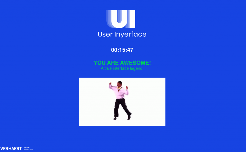
Bagaar. (2019). User Inyerface. [web game].
Brignull, H. (2011). Dark patterns: Deception vs. honesty in UI design. A List Apart, 338.
Harris, T. (2017). How a handful of tech companies control billions of minds every day. [Video]. TED.
Tufekci, Z. (2017). We’re building a dystopia just to make people click on ads. [Video]. TED.