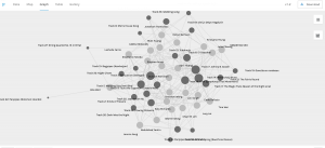
The data collected from Task 8 is visualized as above using the Palladio app. The tracks are highlighted as darker nodes and its size indicates its popularity. For example, tracks 3, 5, 7 and 14 are represented with bigger nodes – meaning it was selected by many students. The link/edges show the relation between the tracks and students. I tried isolating one node but whenever I move it, the whole structure moves in response. The same goes for the students’ nodes. Like a web, the students are linked through their common selection or shared interests, even though they may not know each other or realize they are connected. This reminded me of algorithms on YouTube or Instagram. When we view a post or watch a video, the system keeps track of my choices/preferences and uses it to make future recommendations. However, it does not know why I chose to watch that video specifically – my reasoning or motivation. Why I chose these tracks are most likely to be different from other students. However, the network paradigm is unable to differentiate. It makes predictions based on patterns shown by previous users, which brings up significant issues. Firstly, is the content accurate? Is it biased? The algorithm is unable to carefully sort out the quality of content to ensure accuracy, and a well-thought-out and balanced view. “Within network, how connected an individual node is becomes a key metric of its significance within the network” (Systems Innovation, 2015). In other words, how much the node/content is clicked, viewed, retweeted, or mentioned may influence its significance regardless of what the actual content is. Usually, controversial content receives the spotlight on social media. This can be problematic in the spread of false news or misused in political campaigns – as in the Cambridge Analytica scandal a few years ago. It also reminded me of how Google intentionally focused on official sources such as government websites and public health officials at the top of the search along with its credentials during COVID-19, because almost everyone was searching at home trying to gather information and the accuracy of information was ever crucial. Moreover, such data visualization does not capture the whole picture. It is making assumptions such as that the user favours each of the tracks equally or has no order of importance for going on the Golden Record. Is the track chosen as the last of the 10 less favoured than the first choice? Or was it chosen as the user went through each track as systematically laid out on the YouTube channel?
Reference
Systems Innovation. (2015, April 19). Network connections. [Video]. Youtube.