Absolute ridiculous fun. I cannot count how many times I got frustrated with the interface and started to laugh at how much time I was taking to complete a seemingly familiar set of tasks. In general, the entire process was frustrating as a result of the individual tasks intentionally designed to be unfamiliar as it was employed in an opposite form of general usage on the internet. As I originally wrote out each observation, I found my written work too long, so I decided to condense my observations into point form:
- Front page: Interface” is misspelled as “Inyerface”, perhaps as a tongue-in-cheek joke to represent “In your face” (though this is not so evident until you complete the whole exploration)
- Front page: The large green button is typically a ‘GO’ button for most online interfaces, but not here; rather, you need to read the smaller print below the button and choose either “click” (which is underlined), “HERE” (which is capitalized), “GO” (also capitalized)”, or “next page” (which is in a different colour). This challenges consumer norms for moving to the next task as the obvious options are not the correct choice. Most importantly, the cursor does not change when you hover over the correct option, as it would in most cases; the user only progresses when they realize that they literally need to click “HERE”. *Cue smirk.
- First page: The giant red bar at the top that demands me to allow cookies, and the bottom text chat box asking if I need help. Personally, I tend to ignore both items when I move about online, so these were simple distractions to overlook.
- First page: The boxes of password and email are arranged in a rare format; password is usually on the bottom, but is arranged on the top.
- First page: The agreement to the term of conditions is in the negative tense (again, used in an non-typical manner). The buttons to move on to the next step are laughably in a different order; the typical ‘center’ button that completes our submission is actually a cancel function, paired with a second ‘reset’ button to its right; so there are essentially two button functions to erase your work compared to just one ‘Next’ button. Not to mention, its font is faded and more difficult to see against the white background.
- First page: The green text on the bottom was cryptic; the design intentionally separated all of the rules instead of a naturally combined statement. I almost stopped to verify what a ‘cyrillic’ character was; I just ended up skipping it as I was distracted by the timer reminding me that I needed to rush.
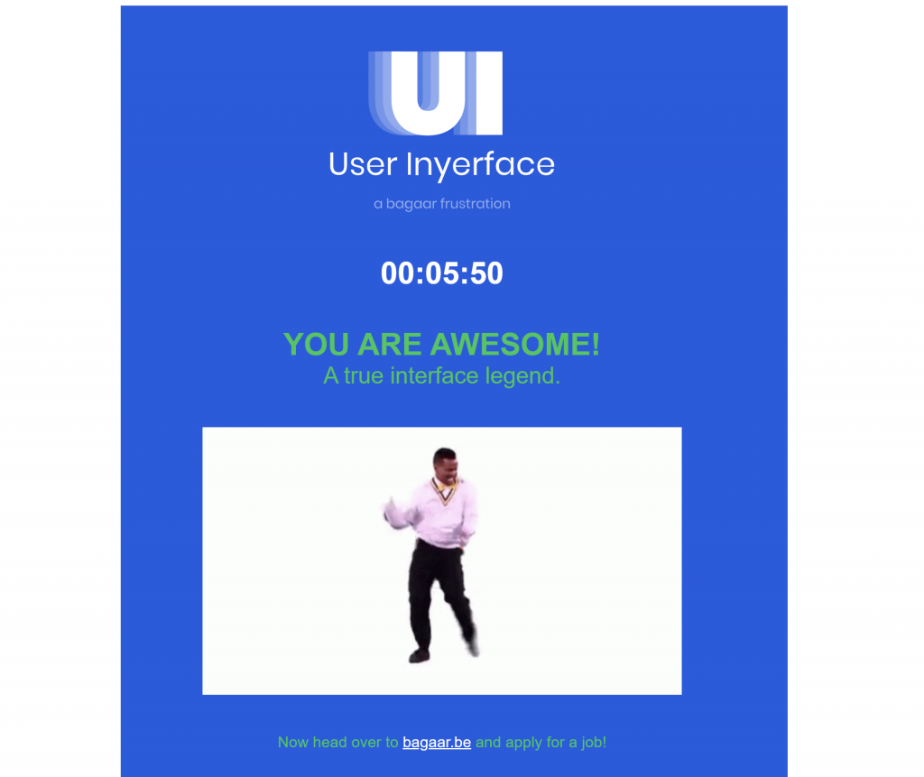
- Overall: Frustratingly throughout the entire game/task, this timer appearing on every minute shaped the environment as if I was racing against a clock (for a result that is somehow unspecified). The reminder, however, is a good example of a ‘dark pattern’ which forces an individual to complete the task and gloss over items, even when you do not know the full task or what the final reward will be. Returning to the task, requires a bit of good humour, as you need to select the ‘close’ button that is not highlighted or different from the rest of the text; the typical X in the top-right corner is now an enlarge-to-full-screen button, and the green OK button is now a lock function which requires you to unlock. These buttons play extremely well on the consumer’s general experience of how internet interfaces will operate; with new functions in new locations, the individual’s attention is secured for the full task.
- Second page: Opposites galore! Instead of an ‘upload image’, it is ‘download image’. The ‘cancel’ button is highlighted in green as opposed to the normal ‘next’.
- Second page: The upload button is quite straight-forward; it leads to your folders and the process to uploading an image is the same as other interfaces.
- Second page: The interests are relatively scattered and does not seem to follow a particular pattern. In addition, a ‘select all’ and ‘unselect all’ button is included in the chaos of interests, but are not placed in typical holding locations such as the bottom right or top right.
- Third page: The interface plays with unconventional placements for their boxes once again! Typically, first name and surname should be close together but are separated by the title. The number box was the most frustrating, as you needed to individually click the up/down arrow to get to your specific number (no number keypad allowed!) I can’t imagine the pain it would be for someone with an address number in the thousands.
- Third page: The age was a scroll bar – what a painful choice if you needed a precise number!
- Third page: The country drop down menu was black/white flags of each country; thankfully the full flag revealed its colours when your mouse hovered on top; this relied a lot on brief hovering over each flag to identify the right one.
- Third page: Box? No idea what this did. Har har.
- Third page: Month was listed as alphabetical instead of chronological. The year was also listed in the opposite direction starting with 1900 instead of the most current year.
- Third page: The gender selection was frustrating as multiple clicks on your specific gender did not actually stay set; it moved between the two genders. As well, the natural choice is that your selection is highlighted in a different colour, but this was actually the opposite.
- Fourth page: Photo selections that match criteria to prove you are human are relatively common. For most interfaces, you can choose the picture itself, but the check box is above instead of typically below. As well, most verification questions do not have as much ambiguity as this interface did; who knew that “bow” could be interpreted in so many different ways?
In sum, all of these individual tasks stirred me into becoming an emotionally-charged consumer who was racing against time to complete this task. If this were to be a real interface, I would have likely unintentionally volunteered/signed up for things that I normally would not have selected. I also would have glossed over critical elements in my haste to complete the task, courtesy of the minute reminders throughout the entire exercise. I would have become an ideal candidate for being manipulated into offering personal information or profit for the interface’s company. If the interface was clear, familiar, and unrushed, I would feel more comfortable at the end of the day whereas the company would be profit-less on my behalf. As Harris (2017) and Tufekci (2017) have identified in their talks, stronger accountability is required at the highest level to ensure that such interfaces are designed with the consumer in mind, rather than its parent company, as it would likely be favouring profits over humanity’s justice.
References:
Harris, T. (2017). How a handful of tech companies control billions of minds every day. Retrieved from https://www.ted.com/talks/tristan_harris_the_manipulative_tricks_tech_companies_use_to_capture_your_attention?language=en
Tufekci, Z. (2017). We’re building a dystopia just to make people click on ads. Retrieved from (Links to an external site.)https://www.ted.com/talks/zeynep_tufekci_we_re_building_a_dystopia_just_to_make_people_click_on_ads?language=en (Links to an external site.)