Author Archives: ian lee

Task 12 – Speculative Fiction

Narrative 1:

Mar 1, 2055
Dear Diary,

Greed. Humans are so good at it. Our insatiable hunger for energy and money led us to fight each other over the meager pickings that Earth’s bones still had left, till they were licked clean. Roots of trees and plants that once held the soil together were all consumed, leaving nothing to prevent the incremental creep of sand and desert closing in. The air stings the lungs thanks to endless smoke from factories burning anything, everything, for energy. Buildings lay bare as skeletons thanks to scavengers ripping and salvaging everything for the factories. Law? Order? Figments of the past. What humans are still alive after numerous wars are like animals packed together over precious remaining resources. Survival is the only focus for anyone and everyone.

The giant factories can only last as long as there are things to burn. The sun, however, is always here. Hot and scorching. I hate the sun. I need my ski goggles to soften the day’s light so I can see. I give the middle finger to the sun as much as I can, but I need it. Or her. Or him. Them? I can’t remember the pronouns from school. I wish for school again; care-free, plenty of food, Tiktoks, and worrying about pronouns. Out here, nothing matters except to survive the day. And the next. And the one after that. It’s crazy just thinking how carefree life was so many years ago… Now, it’s just about the basics. It doesn’t matter how human you are… you do whatever you must to survive.

My savior in all this is my small portable solar panel; I got it as a birthday gift from mom and dad just before the Giant Short. I still have the birthday card with me. It sucks that I didn’t get a chance to say thank you for it – I couldn’t reach them by phone, so that’s why I’m trying to get to their cabin on foot. I’m only able to charge my battery pack as long as I have the sun, and some days are pretty sparse with the smoke cloud – I hope it gets better. 

If someone finds this diary, my name is Ian Lee. I’m a survivor of the Great Short. 


Narrative 2: 

Apr 1, 2055
Dear Diary, 

I still remember the day the Great Short happened. Stupid politics; stupid old white men in power. Stupid flexes of whose country was the ‘baddest’ – turns out the idiot who got trigger happy is one idiot and the responding one is also just as big as the first idiot. Things started flying back and forth. Every country wanted the last hit. The biggest one was rigged with an EMP and knocked out every single piece of tech for miles – and kudos to whoever who made it such that the magnetic waves lingered in the air just like radiation. Anything with a circuit fried. Older stuff like analog or battery-powered became stuff for kings – and people started fighting for it. Hard. It’s easier to be alone than being in groups (too much attention). I’ve done well in hiding from scavengers; two close calls in the beginning when they searched my bag but didn’t find my solar panel – I hide it under my shirt on my back just in case.  

My luck hit rock bottom yesterday though – the charging cable that connects to the solar panel is starting to fray. I can see the copper wiring under the rubber bits. Lol – it reminds me of how much we used to gripe about Apple’s sucky wires and potentially being fire hazards. I’ll have to risk going into a community or city to find a cable, but I’m not sure what I can trade; canned food is always worth a lot, but there’s no way I’m trading my panel. I hope a pack of alcohol pads might be worth something. There’s a community halfway up the mountain that might be still running – hope I can trade for a cable and some food or water there. Wish me luck.

If I’m still alive after the trade or if that community isn’t even there, I still plan to head up Cypress Mountain to find Mom and Dad’s cabin without hitting the main roads. Maybe the magnetic radiation isn’t that bad up there with the altitude – won’t know until I get up there and test it out. Smoke is getting pretty bad, and I wish for the old Vancouver rain to wash some of this grime off of me. Doesn’t matter how bad I stink, I’m not planning to impress anyone nowadays.

If someone finds this diary, my name is Ian Lee. I’m a survivor of the Great Short. 
 

Task 11 – Algorithms of Predictive Text

For this week’s task, I decided to test the predictive text algorithms of my text messaging by first selecting words that I felt made the most sense as an entire message. As predictive text messaging offers three choices of following words, the second attempt was to deliberately select only the ‘left’ predictive word, the third attempt was to intentionally choose only the ‘middle’ predictive word, and the fourth and final attempt was to actively default to only the ‘right’ predictive word. For consistency, I chose the same prompt for all four microblog attempts:

(1) Selective choice:  

Every time I think about… our future in our lives we will be relying upon the best of all worlds to make sure that our lives are not the same as the last. We have been blessed by our family and friends and we have been very happy with our new home. I am sure that we can find a way to make a difference in the lives of our children and their lives and the future.

(2) Left choice only: 

Every time I think about… you and the family had some great time to talk to me and our kids we were very happy to have tutoring today until 5. We have been in a lot more of our time and we have quiet time to get back to work with our parents. We have been very busy and I have not been able to make our time to meet with the family and friends.

(3) Middle choice only: 

Every time I think about… it I will be there for you and Electra tomorrow. I will see you and Electra tomorrow and I will be there as soon as I can. I will see you and Electra tomorrow and I will be there as soon as I can. I will see you and Electra tomorrow and I will be there as soon as I can.

(4) Right choice only: 

Every time I think about… how you are able I don’t know if there are a few minutes of the Bible study that I am just not a big word. But if it doesn’t have a good night then it would have been good for you both and we are so glad to be working in your prayers with your friends on this.

What is remarkable about each microblog is the variability between each post; there are similar uses of grammar and vocabulary, but they have vastly different meanings and contexts. Humourously, the 3rd microblog (where I selected only the middle choice), was an endless loop of the same sentence over and over; a likely assortment of sentence structures that I frequently composed in coordinating tutoring with a family. I should add that my interjection in adding a period to complete the sentence may have contributed into the final product; adding a concluding piece of punctuation then informed the predictive algorithm to offer sentence starting pronouns as opposed to continuing the sentence before.

The only context in which I have read statements like the ones I generated are only (thankfully) within the text messaging platform. My preferred alternative to the text messaging platform is Whatsapp, which I am subjectively casual in my communication. As O’Neil (2017), algorithms are not free from objectivity; their decision-making is based on subjective data that is continually fed in an endless loop. It is likely that each application has its own predictive algorithm, so its subjective use will tailor different forms of data; more formal sentences/grammar for text messaging and more casual sentences/grammar (even emojis!) for Whatsapp.

Although it is must more difficult for demonstrate how email utilizes predictive text algorithms, it is noticeable that my email compositions do have ‘auto-complete’ for commonly used sentence structures that I frequently use in my writing. As opposed to the text algorithms for my phone, the email auto-complete algorithm does wait (as if it is determining whether my sentence will be the same/similar compared to previous emails) for me to input a few of the words before offering to complete my sentence for me. As an educator, many of my emails to parents or colleagues or students follow a typical professional format,  so the auto-completion function does serve a purpose in quickening my writing and saving time. It is noteworthy that this predictive text algorithm is likely linked to my Google account, so this algorithm is widespread enough to follow me whenever I sign in on other devices. Although it is certainly widespread, it is thankfully not mysterious or destructive (O’Neil, 2017).

When I consider the use of algorithms in the public space, I am reminded of the feedback loops that it perpetuates; just as how policing generated new data, it justified more policing (O’Neil, 2017), or the recent accelerant fueling of conspiracy theories in the recent year (Vallor, 2018). Algorithms, in their intended purpose, serve to support humans for simple and task-specific functions. Though they are not sentient, their computing power depends on what we, as its users and audience, feed into the algorithm as data. The creation and implementation of algorithms has likely led to the pushing of philosophies to vast extremes on every side, as we examined in previous weeks how companies may manipulate algorithms to benefit their profits by the allurement of escalating forms of extremism by suggesting more controversial material. This danger is serious. The more we surrender control to algorithms without prior reflection of ourselves as data sources, we risk the accumulation of amplified expression of our moral failures and deficiencies.

This week’s module has enlightened me in realizing the importance of taking technology slow, and reflecting frequently. The rapid implementation and use of technology (and involved algorithms) may seem life-saving in its moment just as CompStat did for policework, but as humans are imperfect, source data for technology will also be imperfect. We simply won’t know how good a technology/algorithm will be until there is a significant amount of data over time.

References:

O’Neil, C. (2017, April 6). Justice in the age of big data. Retrieved June 18, 2019, from ideas.ted.com website:  (Links to an external site.)https://ideas.ted.com/justice-in-the-age-of-big-data/ (Links to an external site.)

O’Neil, C. (2017, July 16). How can we stop algorithms telling lies? The Observer. Retrieved from https://www.theguardian.com/technology/2017/jul/16/how-can-we-stop-algorithms-telling-lies

Santa Clara University. (2018). Lessons from the AI Mirror Shannon Vallor.


Task 10 – Attention Economy

Absolute ridiculous fun. I cannot count how many times I got frustrated with the interface and started to laugh at how much time I was taking to complete a seemingly familiar set of tasks. In general, the entire process was frustrating as a result of the individual tasks intentionally designed to be unfamiliar as it was employed in an opposite form of general usage on the internet. As I originally wrote out each observation, I found my written work too long, so I decided to condense my observations into point form:

  • Front page: Interface” is misspelled as “Inyerface”, perhaps as a tongue-in-cheek joke to represent “In your face” (though this is not so evident until you complete the whole exploration)
  • Front page: The large green button is typically a ‘GO’ button for most online interfaces, but not here; rather, you need to read the smaller print below the button and choose either “click” (which is underlined), “HERE” (which is capitalized), “GO” (also capitalized)”, or “next page” (which is in a different colour). This challenges consumer norms for moving to the next task as the obvious options are not the correct choice. Most importantly, the cursor does not change when you hover over the correct option, as it would in most cases; the user only progresses when they realize that they literally need to click “HERE”. *Cue smirk.
  • First page: The giant red bar at the top that demands me to allow cookies, and the bottom text chat box asking if I need help. Personally, I tend to ignore both items when I move about online, so these were simple distractions to overlook.
  • First page: The boxes of password and email are arranged in a rare format; password is usually on the bottom, but is arranged on the top.
  • First page: The agreement to the term of conditions is in the negative tense (again, used in an non-typical manner). The buttons to move on to the next step are laughably in a different order; the typical ‘center’ button that completes our submission is actually a cancel function, paired with a second ‘reset’ button to its right; so there are essentially two button functions to erase your work compared to just one ‘Next’ button. Not to mention, its font is faded and more difficult to see against the white background.
  • First page: The green text on the bottom was cryptic; the design intentionally separated all of the rules instead of a naturally combined statement. I almost stopped to verify what a ‘cyrillic’ character was; I just ended up skipping it as I was distracted by the timer reminding me that I needed to rush.
  • Overall: Frustratingly throughout the entire game/task, this timer appearing on every minute shaped the environment as if I was racing against a clock (for a result that is somehow unspecified). The reminder, however, is a good example of a ‘dark pattern’ which forces an individual to complete the task and gloss over items, even when you do not know the full task or what the final reward will be. Returning to the task, requires a bit of good humour, as you need to select the ‘close’ button that is not highlighted or different from the rest of the text; the typical X in the top-right corner is now an enlarge-to-full-screen button, and the green OK button is now a lock function which requires you to unlock. These buttons play extremely well on the consumer’s general experience of how internet interfaces will operate; with new functions in new locations, the individual’s attention is secured for the full task.
  • Second page: Opposites galore! Instead of an ‘upload image’, it is ‘download image’. The ‘cancel’ button is highlighted in green as opposed to the normal ‘next’.
  • Second page: The upload button is quite straight-forward; it leads to your folders and the process to uploading an image is the same as other interfaces.
  • Second page: The interests are relatively scattered and does not seem to follow a particular pattern. In addition, a ‘select all’ and ‘unselect all’ button is included in the chaos of interests, but are not placed in typical holding locations such as the bottom right or top right.
  • Third page: The interface plays with unconventional placements for their boxes once again! Typically, first name and surname should be close together but are separated by the title. The number box was the most frustrating, as you needed to individually click the up/down arrow to get to your specific number (no number keypad allowed!) I can’t imagine the pain it would be for someone with an address number in the thousands.
  • Third page: The age was a scroll bar – what a painful choice if you needed a precise number!
  • Third page: The country drop down menu was black/white flags of each country; thankfully the full flag revealed its colours when your mouse hovered on top; this relied a lot on brief hovering over each flag to identify the right one.
  • Third page: Box? No idea what this did. Har har.
  • Third page: Month was listed as alphabetical instead of chronological. The year was also listed in the opposite direction starting with 1900 instead of the most current year.
  • Third page: The gender selection was frustrating as multiple clicks on your specific gender did not actually stay set; it moved between the two genders. As well, the natural choice is that your selection is highlighted in a different colour, but this was actually the opposite.
  • Fourth page: Photo selections that match criteria to prove you are human are relatively common. For most interfaces, you can choose the picture itself, but the check box is above instead of typically below. As well, most verification questions do not have as much ambiguity as this interface did; who knew that “bow” could be interpreted in so many different ways?

In sum, all of these individual tasks stirred me into becoming an emotionally-charged consumer who was racing against time to complete this task. If this were to be a real interface, I would have likely unintentionally volunteered/signed up for things that I normally would not have selected. I also would have glossed over critical elements in my haste to complete the task, courtesy of the minute reminders throughout the entire exercise. I would have become an ideal candidate for being manipulated into offering personal information or profit for the interface’s company. If the interface was clear, familiar, and unrushed, I would feel more comfortable at the end of the day whereas the company would be profit-less on my behalf. As Harris (2017) and Tufekci (2017) have identified in their talks, stronger accountability is required at the highest level to ensure that such interfaces are designed with the consumer in mind, rather than its parent company, as it would likely be favouring profits over humanity’s justice.

References:

Harris, T. (2017). How a handful of tech companies control billions of minds every day. Retrieved from https://www.ted.com/talks/tristan_harris_the_manipulative_tricks_tech_companies_use_to_capture_your_attention?language=en

Tufekci, Z. (2017). We’re building a dystopia just to make people click on ads. Retrieved from  (Links to an external site.)https://www.ted.com/talks/zeynep_tufekci_we_re_building_a_dystopia_just_to_make_people_click_on_ads?language=en (Links to an external site.)

Task 9 – Network Assignment

When I first read the module for this week, I thought to myself that this week’s task may go relatively smoothly; I was so wrong! Even with my comfort level in math and science, I was perplexed with simply how and where to begin. One of the main frustrations in navigating the Palladio file was how the facet dimensions were labeled in a non-sensical framework; Id, Id_1, Id_2, etc. Clearer identification of labels and facets would have eased the process immensely, as I resorted to systematic clicking through each target to best understand how each graph changed as a result of changing the base variables. A second frustration concerned how limited I was not able to individually select data and change its position/orientation in space; when I pulled on one data point it often grabbed the entire web of networks and moved in the same amount and direction. On top of the difficulty of analyzing the data, another important consideration is how limited the data really is; the data that is available consists mainly of the track title, student name, and some descriptive statistics of how many times it was selected. The task of determining the reasons for similar responses, or capturing the reasons behind the choices is, in my opinion, simply too large for the small amount of data that is provided. Helpful data could have included general data demographics such as the respondent’s sex, age, preferred pronouns, etc., in addition to contextual data demographics such as musical background, current musical tastes, and musical aversions, etc.

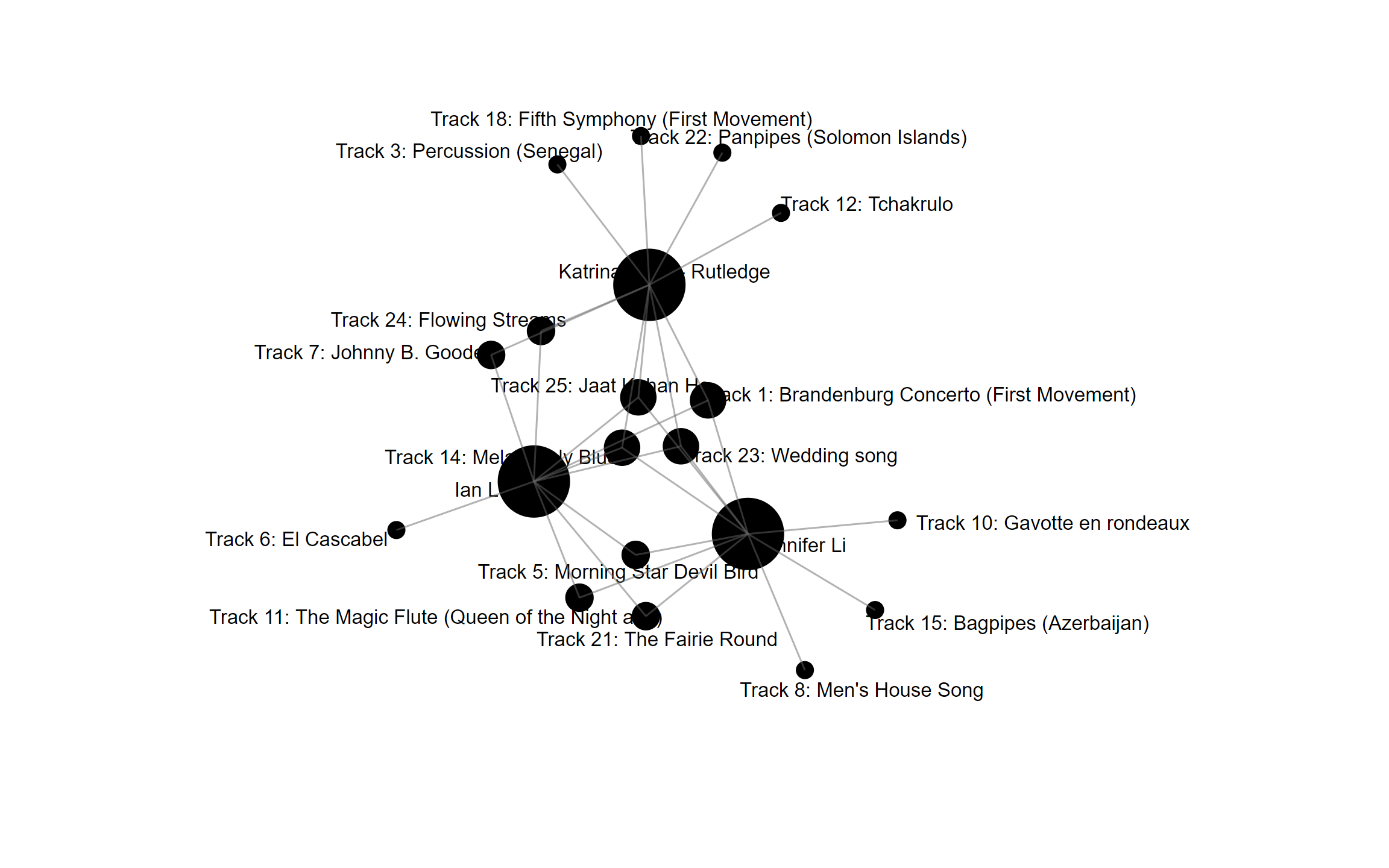
I decided to begin with commonalities, much like most programs which use AI programs to offer friend suggestions based on your personal data, online behaviour, (and even offline behaviour when your microphone manages to listen to what you’re saying!). Although I mentioned that I wanted to start with commonalities, I really did not know where and how to begin. As I alternated through various choices, I found a common theme between myself and two other students: Jennifer Li and Katrina Wong-Rutledge. This graph highlights 4 points of intersection between the 3 of us: Track 1, 14, 23, and 25. I also shared 2 additional points of commonality with Katrina and 3 additional points of commonality with Jennifer.


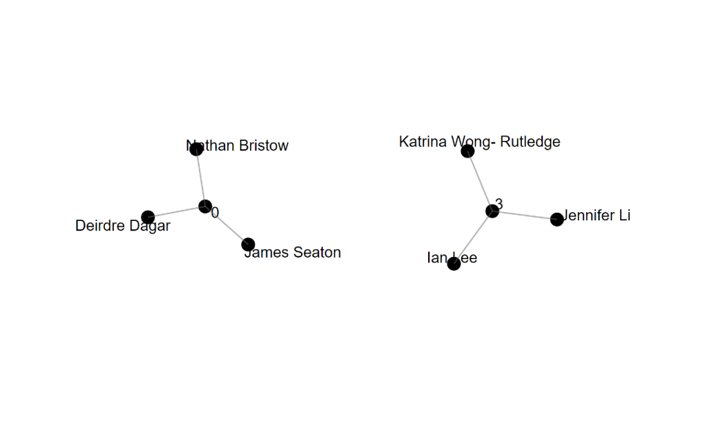
The difficulty in interpreting this graph again returned to the confusion regarding the variable’s designation of “Modularity_Class”. My first thought was that it referred to points of intersection, but that clearly made no sense as ‘0’ was a result for a group of three: Nathan, Deidre, and James. Likewise, when selecting the modularity_class for myself, Katrina, Jennifer and I are in group 3, which also doesn’t match our 4 points of intersection. Frustrating!


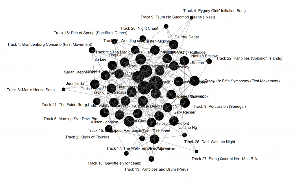
A decisive step occurred partway through my hair-pulling when I decided to reverse the Source of the graph to be the Track #, and the Target of the graph to be the student (source). Amidst the chaos, I selected that the side of the node would depend on the number of commonalities, and thus realized that the following graph displayed the most popular track as the largest node and the least popular track as the smallest node:

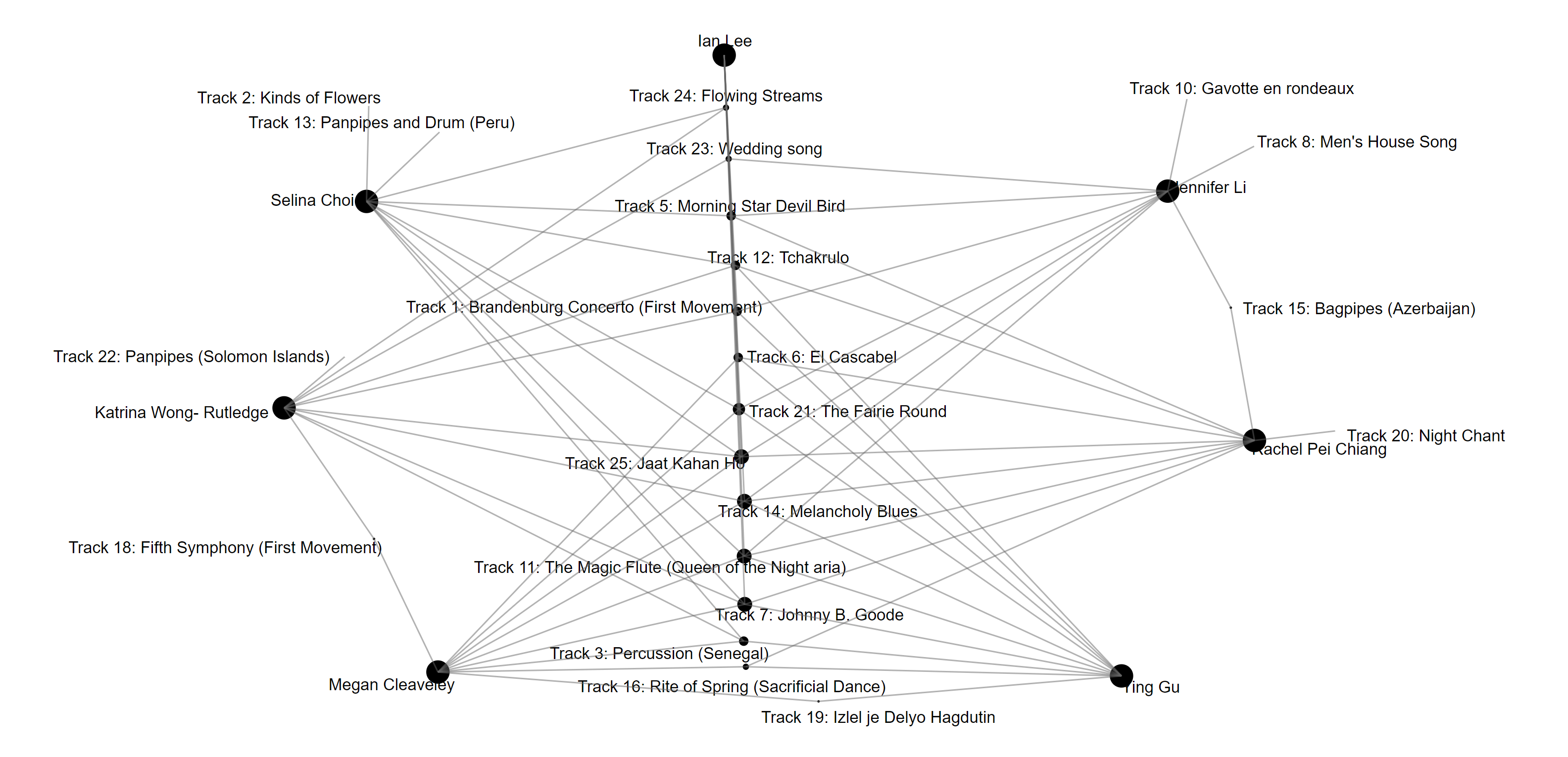
And so, I started my journey in the reverse direction using the graph above. I noted my personal choices: (#1, #5, #6, #7, #11, #14, #21, #23, #24, #25), and removed the other tracks from the chaos. At this point, the source table became a valuable resource as I was able to determine the actual number of points of commonality with each student: the highest number of intersecting points was 7 of 10, and the lowest was 3 of 10. The most shared points of commonality was with 1 student (7 point): Jennifer, followed by 5 students (6 points): Ying, Selina, Rachel, Megan, and Katrina. I decided to remake the graphs focusing on these 6 students:

By rearranging the common tracks to be the ‘spine’ of the graph and arranging them by size with the most popular at the bottom and the least popular at the time, I finalized this graph by placing the students on the outside edge. I was able to identify the strongest point of commonality to be Track 7 and Track 24 being the weakest.

Assigning this role to an AI algorithm is likely the logical choice for applications that seek to make connections between given parameters. For a social application, networking sites would benefit from this use as it would strengthen connections between existing members, suggest commonalities, or even recommending new connections to further the complexity of the interconnected figurative web. For a medical application, this may benefit tracing sites for points of contact in reversing back time to find commonalities, and thus, a source of interest such a contaminated source, or a point of infection. For dating applications, this would likely be another source of suggesting best matches by selecting high degrees of commonality while disregarding others with low degrees of commonality. For business applications, data could be tailored to ‘suggest’ similar material to further entice consumers to spend on additional products, while shelving other products that are likely to not be interesting. As the enticement to make profits based on consumer interest would be a huge draw, it is no wonder that data mining companies would purchase consumer data from as several different sources. To benefit further from this application, it would likely suggest that the more information you feed into the algorithm, more accurate the results would be. For us students in ETEC540, we simply offered our names and our top 10 choices with less else to distinguish who we are. I believe that additional data points would increase the complexity while refining the list of commonalities between all of us.

On a final note, I found it most interesting that the students that I also shared the most commonalities with have recognizable Asian surnames; although it may mean little due to the limited information, this would be a good place to start with more data from our class set. In a reversal of data, the strategies that I employed to find commonalities could be used to find differences, starting with my peers who had the least amount of commonalities, and identifying key characteristics that could be distinguishing factors.

Task 8 – Golden Record Curation

The mystery of the universe is that we do not know if there is anything (or anyone) out there; and if so, whether they would be able to communicate in the same way that we do. The project ‘Golden Record’ is designed to include a multitude of languages, sounds, expressions, etc., in hopes of having a connection with its distant listener (whoever or whatever it may be). I imagine when listened in its entirety, it is like throwing a net into the water for one fish; it is hopefully wide enough that just one part of the net will catch. Combined with the dreams of humanity that we are not alone, the Voyager (in its three parts) reaches out with its wide assortment of curated works from Earth to reach someone (or something) else out there in the vast space of our universe.

This week’s task was particularly difficult for me, as I have an attribution bias towards classical music due to my childhood. There were obvious choices as I went through the list of collected works, while recognizing that each track had an important aspect of humanity contained within its tones and sounds; who was I (a mere human being) to determine that 10 was the simplified number from the original 27? Which led me further down the rabbit hole of asking why stop with only 27? It was incredible to hear that Carl Sagan opted to choose the copper and gold plate to memorialize the work instead of digitizing; in choosing a hard version, he chose preservation and longevity of the work over the quantity that it could hold (NASA). As each track had already went through a rigorous curation phase of connecting to its history, geography, impact, and development in human history (Twenty Thousand Hertz), I confess that I leaned more towards my interpretation of what felt best of matching humanity and what I would desire for an alien species to learn about us.

My selected few were intentionally focused on the aspect of humanity’s diversity; I reasoned that should aliens ever learn about us, it should be how diverse, complex, and capable we are. And so, I decided to select tracks that demonstrated a wide range of human sounds and abilities:

In focusing on the human voice, I selected the following:

  1. Peru, wedding song, recorded by John Cohen. 0:38
  2. Mozart, The Magic Flute, Queen of the Night aria, no. 14. Edda Moser, soprano. Bavarian State Opera, Munich, Wolfgang Sawallisch, conductor. 2:55

The wedding song was an example of the human voice in its simplicity, whereas the aria is a perfect example of the extent of how virtuosic the voice can reach.

In focusing on the diversity of sounds, I selected the following:

  1. Bach, Brandenburg Concerto No. 2 in F. First Movement, Munich Bach Orchestra, Karl Richter, conductor. 4:40
  2. India, raga, “Jaat Kahan Ho,” sung by Surshri Kesar Bai Kerkar. 3:30
  3. China, ch’in, “Flowing Streams,” performed by Kuan P’ing-hu. 7:37
  4. “Melancholy Blues,” performed by Louis Armstrong and his Hot Seven. 3:05
  5. “Johnny B. Goode,” written and performed by Chuck Berry. 2:38
  6. Australia, Aborigine songs, “Morning Star” and “Devil Bird,” recorded by Sandra LeBrun Holmes. 1:26

Each track that I selected intentionally focused on a particular ‘sound’. The orchestra, a complex sound, is the fitted ramble of multiple instruments working together. The raga was chosen for the unique timbre of the main instrument native to India, the sitar. The ch’in was played on the guqin, another unique instrument, but native to China. Melancholy blues focused on the brass instruments, coupled with the rhythmic jive that is found prominently in jazz. Johnny B. Goode, the only rock song on the album, featured the rock’n’roll groove with the electric guitar. Lastly, Australia’s native digeridoo was selected for its unique timbre and quality of sound.

In focusing on the human aspect of sounding together, in and out of harmony, I selected the following:

  1. Holborne, Paueans, Galliards, Almains and Other Short Aeirs, “The Fairie Round,” performed by David Munrow and the Early Music Consort of London. 1:17
  2. Mexico, “El Cascabel,” performed by Lorenzo Barcelata and the Mariachi México. 3:14

The final two tracks that I selected focused on the vibrant chorus of human voices together singing together in unison and singing together in harmony. I felt that this represented humanity especially well in supporting each other with the same goal, and in repeated call-and-reply to represent our desire for communication.

Task 7 – Mode-Bending

For week’s task, I was inspired to recreate Task 1: What’s in your bag, by removing the visual element that we are typically dependent on and replacing it with audio cues that hint at what it truly is. As I did not include any photo or visual answer key, please see below for the answers:

Full list of items according to object #:

  1. Computer
  2. Book
  3. Asthma inhaler
  4. Calculator
  5. Assessments (to be marked)
  6. Pencil case
  7. Hand sanitizer
  8. Medicine

In this re-design process, a recurring thought throughout this week’s task was that I am the author and thus the sole authority over the content of this mini-video. As its author, I select the audio clips that I am biased in believing that the object represents. In the testing phase of presenting this to my wife, even she struggled with a few of the items; but why did she not perceive all of them (despite knowing me for so many years)? Perhaps it is precisely that the connection between audio form and its object is subjective; individuals may have different connections with the same object and thus may not see (or hear) the context in the same lens as I do. It would be more interesting in hearing another student who replicated their bag in the same form as I did, and having the opportunity to offer answers to each other to test the accuracy. It is likely that our bags may be similar as we may be contextually similar; either as educators, living in BC, or studying this ETEC540 course. An international comparison would be most interesting; perhaps their items are vastly different though relevant and important to them, less or more, or maybe the same (New London Group, 1996)! I found that the re-designing of this task in relying solely on the audio clips of the objects relied more on the listener’s imagination and past experience; instead of visually seeing what the object is and receiving information from its text or non-verbal communication, the listener relies much more on the action and/or functionality of the object itself.

There were several challenges as I was constructing this task. For one, I scoured the sound clip repository “Freesound” for audio clips that I felt best representative of the items in my bag, and I typically checked several pages of multiple clips before deciding on one that I agreed with the most. Even when I agreed with a sound that I felt best represented an object, there were limitations in the length and style of the audio clip; some had background noise, and others were too long or too short. It was pain-staking considering the amount of time that was dedicated to the research for the right audio clip. Another challenge considered how some items were difficult to find on the repository as it did not have a relatable sound. An example of this would be my spare medical mask that I have as an emergency; what precisely could be its relatable sound? I attempted to use an audio clip of full mask breathing (it sounds like Darth Vader to be honest), but felt that it would suggest that I have a full hazmat style mask in my bag instead of my actual small medical mask. In the end, I decided to avoid including it at all as I was unable to find a suitable audio clue that gave enough hints to its function and/or action. A final challenge that was slightly humourous was the decision to include the “Windows shutdown” sound. I realized that not everyone may be familiar with Windows (a listener may be pure devotees to Apple), or not everyone grew up with that system of Windows (it is certainly from an older Windows version). This was clearly an experiential audio clip, but I felt that it was easily recognizable given the assumption that most of us would have experienced at some point.

The potential benefits of redesigning this task this way includes the transcendence across cultural context, and the use of the imagination. As several of these objects are used for their function around the world, its audio clips may be the same while the visuals may be incongruent. For instance, the calculator. Depending on accessibility, calculators may range from the simple to the expensive, either in small or large form. However, the use of the calculator is likely identical for all users, rapid pressing of its keys to find the right answer. This would be the transcendence across language by focusing on its action and/or functionality. This simplification also works extremely well with my object #2: book. Book covers and content may be different and written in another language, but we may all agree that the rifling through its pages is purely descriptive of what a book it is. Finally, the benefit of relying on the imagination was stimulating as a listener answers by looking through their experiences, rather than already seeing the information. A relatable experience that matches this closely is the adaptation of the Harry Potter series from the book to the movie; in the book, I utilized my full imagination to interpret and paint the storyline of the plot. Whereas in the movie, I was given what event and character looked like; I no longer had control. By adapting this resource to focus on a different form of literacy, the same task is interpreted differently and crosses more lines of diversity, globality, and modes than our schools typically accommodate (New London Group, 1996).

The New London Group.  (1996). A pedagogy of multiliteracies: Designing social futures. (Links to an external site.)  Harvard Educational Review 66(1), 60-92.

Task 6 – An emoji story

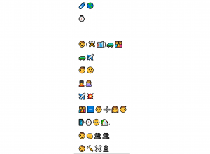
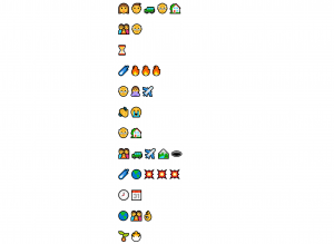
Hint: It is a recent movie.

It should also be noted that my storyline constructed on the emoji keyboard did not translate well onto the wordpress platform, requiring the use of screenshots to transfer my work. The screenshots do not share the same resolution as it did on my individual screen nor on the emoji keyboard platform, so it is heartbreaking as fine details on the emojis may be missed. Although this is a minor issue that was relatively easy to overcome, this complication highlighted the issues that occur with communication not only between persons, but also between technologies. As users may struggle in networking between competing operating systems such as Apple and Windows, software programs on the same device still can miscommunicate, and as a result, be misunderstood.

In describing the film’s plot, I resorted to utilizing well-understood and common symbols to communicate my message. As I was constructing the general plot of the film, the main struggle was in searching for symbols that could communicate specific actions, such as changes in orientation, or changes in time, or concurrent events happening at the same time. I organized my work through remediation (Bolter, 2001), which resulted in a chronological reading (left to right) to communicate events that happened in that order, and over time (up to down) to communicate new layers of specific events. I relied mostly on words and ideas that translated to single word connections. In this overly simplified form, any reader becomes a viewer, and another ‘viewer’ who speaks a different language than I do may also understand the movie plot created (Bolter, 2001). I stress the phrase ‘may understand’, as the interpretation of emoticons is dependent on cultural and lived experience. As an example, my use of the Queen’s guard with the stereotypical black bearskin was to be representative of a soldier (there was no emoji for soldier), but another audience may assume it as an Englishman. Secondly, the use of the sand timer is intended to communicate diminishing time; but another audience may interpret it as a death as the sand runs out.

I decided not to share the title of the film, as it would have translated into a single symbol that is globally understood without misinterpretation. As Kress (2005) would appreciate, the film’s title and its matching symbol would be independent of cultural assumptions related to authorship and readership.

I chose this work mainly for its recent viewing and, luckily for me, its simplicity in plot structure. I also found it extremely easy as presently available emoticons on the emoji keyboard were enough to explain the majority of the film. Should the film’s plot summary be more complex, such as multiple characters, traversing through changes in time, space, and multiple concurrent events, (such as Harry Potter or even Lord of the Rings), I do not think that there would be enough emojis present to effectively communicate its story to any reader/viewer. It is heartwarming to see that the encyclopedia for emojis continues to expand and allow for greater range of expression and identity (Burge, 2021); though its size and pace is rather lackluster compared to the growing encyclopedia we have for our individual language today.

Bolter, J. D. (2001). Writing space: Computers, hypertext, and the remediation of print (2nd ed.). Mahwah, N.J: Lawrence Erlbaum Associates. doi:10.4324/9781410600110

Burge, J. (2021). 117 New Emojis in Final List for 2020. Retrieved from https://blog.emojipedia.org/117-new-emojis-in-final-list-for-2020/

Kress (2005), Gains and losses: New forms of texts, knowledge, and learningComputers and Composition, Vol. 2(1), 5-22.


Task 4 – Manual Scripts


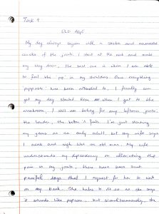
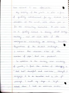
Written Commentary

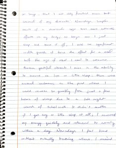
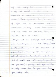
It is evident that my writing ability has declined as of late, as my endurance to commit pen to paper has shortened considerably (as my penmanship started out well but devolved into chicken scrabble near the finale). I mainly use my computer as means of writing and composing of text, though do write things with pen when completing marking on student assessments.

This task was more difficult than I had planned; just as the monks struggled with their procurement of writing materials (Harris, 2018), I had to scavenge around my environment for lined paper (not grid or computer), a working pen, and a clean and flat surface to write upon. Although my computer paper was within easy reach, I deliberately searched for lined paper, as I knew that my alignment of sentences would likely curl and hardly qualify as straight (and if I had to repeat each page as the monks had to do as well, I would have likely quit the whole monastery itself). The flat surface was somewhat a difficult task; my laptop computer is a convenience to bring anywhere and everywhere, so I tend to work comfortably in a variety of spaces as opposed to a dedicated flat surface.

As I wrote this in pen, I could not erase my work as I would easily do with virtual text. I opted to scribble out the incorrect word or write over it, and I recognize that it did not look quite professional or as ‘clean’ as I intended it to be. One consideration that I re-discovered with writing on paper was how I had to think about how much space I would have for the whole word on the remainder of the line; if I did not have enough space, I would need to start the next line below or choose to squeeze in the word by changing the spacing between letters. With virtual writing, I have no consideration at all; the words wrap down to the next line as soon as the technology deems that the space is insufficient.

There are several significant differences between writing mechanically on paper and writing virtually on a screen. The first and perhaps the most critical, is the speed at which words can connect onto the paper as I form a sentence in my head. The physical limitations of my hand severely hamper the mechanization of writing; I think much faster than I can write and thus lose formed thoughts and direction of my writing. In contrast, the virtual mechanization of writing on a screen is more fluid and free; my typing speed can closely match the sentence formation in my head and thus my virtual text seems more connected together. The second difference is the opportunity to edit my work. For the monks writing on their animal hide, they had but a few seconds to remove the ink before it set forever (Harris, 2018). And when the page was brought for peer review for a higher order monk, any displeasure in how it looked would result in the entire page thrown away to be redone (Harris, 2018). With mechanized writing on paper today, I (thankfully) did not need to throw my paper away and redo its entirety; rather, I just crossed out the word or wrote over it (due to laziness) and kept on writing. With mechanized writing on my computer, a life-saving button – backspace – is sufficient in removing all presence of a word I wrote in the past; therefore, the significant difference is the erasure of proof of writing. With the paper copy, my written work (mistakes and all) are scribed onto its page and all my work can be seen. In contrast, my written work on the virtual copy looks clean and perfect (I do hope so) as if I wrote it on my first attempt. Finally, the last significant difference is a secondary perspective in checking my work. With the paper version of my work, there is only one perspective; my own. If I misspelled a word or used grammatically incorrect phrasing, I would be none the wiser. For my virtual work, a computer program informs me gently through the use of coloured underlines that something is amiss; hence, the second perspective. Even as I spelled colour with a ‘u’, it is nudging me to attend to its correct adherence of spelling it as ‘color’. I am, however, not a monk and refuse to bend to the higher power of the red underlines and will choose to keep my spelling as I originally intended. In closing, the three major differences are writing speed, editing power, and a second perspective.

References:

Harris, Brad. (Host). (2018, February 5). THE PRINTED BOOK: OPENING THE FLOODGATES OF KNOWLEDGE. [Audio podcast episode] In How It Began. https://howitbegan.com/episodes/the-printed-book/


Task 3 – Voice to Text

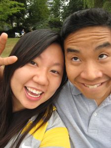
Photo 1: October 2013 – My wife (girlfriend back then) as carefree students
Photo 2: July 2016 – A bit more grown up together as young adults

________________________________________________________________

Unscripted written text:

So the unscripted story that I wanted to share with you is How I Met my wife we both met at University of Toronto where she is from Vancouver and I am from Ottawa we were both starting the same program so there was ample opportunity for us to meet together but we first met at a joint University club at this club I first met her as a brand new student as I am when you’re older but it wasn’t the typical love at first sight as Hollywood would portray it certainly wasn’t any like jaw dropping or heart beating out of my chest it was certainly a fatal attraction but I wanted to see her certainly a friend and get to know her better but it wasn’t really like that Hollywood kind of crazy affection sort of thing so after a number of projects that we worked on together for our University School club so we coordinated a graduation ceremony for our graduating students as well as arranging welcome parties I could say for our brand new students it was a great opportunity for us to see how we collaborated but also built teamwork together it was during this time that a lot of our friends in addition to me we like I noticed how how well we got along together and it was this spark that eventually led us closer together near the end of our graduation where we after we were officially together for about 2-3 years there came a critical point for us to decide whether to stay in Toronto or to move to Vancouver or to really decide if our relationship was to stay together that was a difficult point as obviously my home family is from Ottawa ON and her whole family is from Vancouver BC we decided to give it a try in which as soon as we would graduate my wife would return back to Vancouver to attend nursing college for another four years and I would stay in Toronto for one year to pursue my teaching degree during this one year long distance as everyone would say long distance was really really hard we certainly went through ups and downs and there almost came a point in which we decided that it was too difficult there wasn’t really much opportunity for for us to kind of continue together however we we pursued it through and it came as a point for me to really kind of consider you know can I give in cooperman try much against the wishes of my parents I I decided to really you know buy a one way ticket fly to Vancouver in pursuit of a summer job in which then I would try my best to work on transferring all my teacher accreditations and hopefully find a place here in Vancouver and it was through that process in which I know I really kind of did everything and anything to kind of prove my parents wrong and make the relationship work so I did pretty much everything I worked at the graveyard shift at a dormitory school in which you know I would end my day at 2:00 AM and and and then head home and kind of sleep I kind of like you know the afternoon of the next day and then repeat the whole process but I again my driving force was that I really wanted to make our relationship work while you know second motivation listed prove my parents role in the end I think my wife but then again back then she was not my wife but my wife and I worked together we collaborated together we practiced for introduced together and it was it was through her endless support that I was able to eventually you know secure teaching position and I kept working hard everything in anything to really get to the point where I am today and after you know securing my very first kind of full time job I then proposed to her on that sports field just as a testament of thanking her for all that she’s done for me and how grateful i am that everything worked out the way that it was melting

Identification and Analysis

The program that I used for this voice-to-text assignment was the dictation function in Microsoft Word. I was inspired to use this particular program as several of my students use this feature for their assessments, and to empathize with my colleagues who support them by scribing and editing of their final work. In a frustrating sense, the written text deviates significantly from English conventions. I did my best to minimize my environment’s noise by recording in a closed off room and attaching a wearable microphone. I found that significant differences between oral and written language occur with the tempo/rhythm, silence, and filler words. With oral language, the tempo/rhythm creates an ebb and flow to enrapture the attention of the listener; a quickening of pace communicates an energy whereas the slowing of pace communicates a conclusion. For written text, the tempo is determined by the reader; although the pace of reading can become faster when things become exciting, this may not be the original intent of the story that the author intended. Silence is the second deviation. As I would in sharing an oral story, a pause or silence allows for the digestion of the sound before; much like how music utilizes the power of silence to elevate its impact of sound. With written text, silence is decided by its reader, and thus the impact of its prior words may lose its weight. Finally, the final deviation is filler words. Fillers, or hesitation markers, serve to allow the speaker time to organize thoughts in the middle of an oral sentence. In a social conversation, fillers are naturally given less weight and value to the story; such as ‘like’, ‘um’ and ‘yeah’, etc. However, with written text, as all words are seen as the same value, fillers are confusedly elevated to be important which is opposite to its use in oral language.

As I re-read the written text, it is hardly coherent; the voice-to-text program did not include any form of punctuation such as periods, commas, or anything that would separate my train of thought. My text thus reads as a giant string of an immensely-long run-on sentence. When I tried the program again, punctuation IS possible but I need to distinctly say “comma”, or “period” to inform the program that this is the break in the sentence. I imagine how frustrating this would be if a student were using this program to explain how to write a sentence in English, or the cycle of waves or the monthly biological cycles of the female reproductive system. Surprisingly, numbers came out correctly; the program was able to differentiate numbers in time and numbers in non-time formats, such as 2AM and one year. It was also able to identify geography well; Toronto, Vancouver, and Ottawa were all corrected identified as locations and given the right capitalization. I recall using ‘Ontario’ as the term to follow Ottawa, which the program simplified to just ‘ON’. Several words came out incorrectly; ‘Cooperman’ is an unknown word which I have difficulty recall even saying anything similar! Likewise, I ended my story with ‘meant to be’, but perhaps due to the lowering volume of my voice and decreasing tempo which would signify coming to a conclusion, the program decided to go with ‘melting’.

The most common mistakes were punctuation. In an oral story, punctuation is inherently included through the use of pauses, inflections, and rhythms of the voice. With this particular voice-to-text program, such punctuation was undetected, thus leaving a bewildered reader in identifying where a thought begins and ends. In oral communication, the speaker’s words phrase a message that is meant to be understood. However, when its translation fails in framing the correct structure, that message is lost. For me, my unscripted story unfortunately would be a large ‘mistake’ as individual mistakes are indecipherable due to the lack of sentence structure.

With a script, I would have had a guide for my thoughts so I would not stray too far on tangents or feel the need to use fillers. In addition to knowing how the program works, I would need to include words to dictate punctuation; an obvious interruption into the natural flow of the oral story but it would be required if I used the same program again. The difference would be substantial; my written story of how I met my wife would be immortalized and it would be comprehensible to any reader. The oral version, however, would be unpleasant to listen to.

Oral storytelling has excitement, flair, and energy to accompany its content. Even as I wrote the description in the sentence before, I included body language as if I was saying it out loud! I recall when I was in elementary school, I wrote out sentences such as “NOOOOOO!!!!” and “POWERRRRRRRRR!!!!” in an effort to communicate the feelings and context that the character was feeling. My teacher was unimpressed; too many report cards went home saying that I had to learn to write more professionally, and thus, dim it down so I would use less capital letters and misspelled words. But it is precisely that difference that separates the oral and written language! The oral form of storytelling captivates its audience through the speaker’s combined use of body language, energy, volume, inflection, tempo and rhythm. In contrast, the written form of storytelling allows the imagination of the reader to be in control of everything, starting with the tempo, pauses, volume, and even, stopping right then and there to prevent knowing how the story ends.


Task 1 – What’s in your bag?

My name is Ian Lee. I work as a middle school math teacher at an independent school in West Vancouver, BC and have been working here for 6 years.

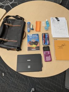
For this exercise, I chose to reveal my work shoulder bag that I carry for work purposes. I also carry a second bag, but as it only serves as a lunch bag and overflow for assessments to be marked, I have decided to only focus on my shoulder bag primarily. This photo is taken on early January, 2021.

In this bag, I hold my work essentials as a math teacher; my work computer (Surface hybrid tablet-computer) with paired stylus, agenda, student assessments, graphing calculator, and pencil case. There are several health-related items as well that I carry as necessities; my asthma puffer and aerochamber, hand sanitizer, eye-drops, a spare facemask, and over-the-counter pain medication for emergencies. An additional item unrelated to my work and health is a novel that I borrowed recently from the library, titled ‘Andromeda Strain’ by Michael Crichton.

Of all my items from my bag, I use my work computer the most, agenda, followed by my graphing calculator and pencil case. Student assessments are non-daily but occur periodically throughout the academic year; this batch represents three classes of tests my students completed prior to the holidays. My health-related items serve only for emergencies; my hope is that I do not actually need to use them at all.

  • My puffer, with its health sticker slightly faded due to its frequent jostling against its walls in my shoulder bag, reminds me of my dependency on having it close to me. Its textual details identify my full name as its host, prompting my reality that I am getting older and that my peak physical condition as a swimmer was eons ago.
  • My agenda serves as a resource to organize my day and week. It is filled with sporadic bursts of lists of things to do and empty spaces, as I shuffle between using a digital to-do list on my computer and a textual to-do list in this agenda.
  • My collection of student assessments communicate my occupation and remind me that work and home life intertwine. As I bear the responsibility of educating my students well, the symbolic checkmark in red signifies my success (or lack of as my failure).
  • My choice of leisure reading was inspired by the current events of the pandemic; the identification of an unknown biological affliction supposedly from space and the complexity (and simplicity of human responses).

Text Technologies:

The text technologies of my bag show my engagement with both written text and digital text. As a math teacher, I still depend heavily on written assessments as student proof of understanding as opposed to digitally constructed answers. Among my stack of assessments, some student work is digital; these students completed their assessments at home, but still submitted their files electronically, and I printed them out to mark. My agenda is a reminder of my constant fluctuation between depending on my digital list and written list to organize my weeks. My calculator reveals my daily interaction with symbolic text with numbers, as I work with students in understanding and engaging with their curriculum. Finally, my book of written text is my getaway from the digital world.

The health contents of my bag are usually more private, as I hesitate to share any signs of weakness despite knowing that it is not really one at all. Even though I remind myself that each person has their own health profile of pains and ailments to varying degrees, I try to tuck such information away; after all, the pandemic has pushed the quality of health into the spotlight, and any identifying factors of risk such as asthma incurs a conversational “uh-oh”.

If I look back in time to 15 or 25 years ago, I was in school. My shoulder bag would have been a backpack, my lunch would have been the biggest thing I carried, and my health items replaced with textbooks and its pages. I still would have had a good book to read, calculator, pencil case, and agenda. Remarkably, most things would have stayed the same; just the health items would have been absent.