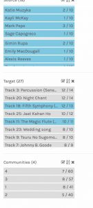
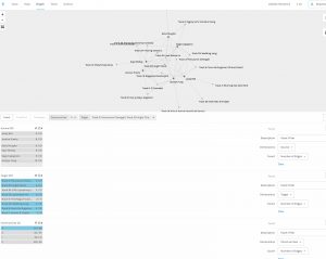
The first thing I noticed in the visualization is that one person in our section selected all 27 tracks (Selene). In my manipulation of the data (filters), I removed Selene’s data from the sets by deselecting Selene each time. This only seemed to affect Community 3.
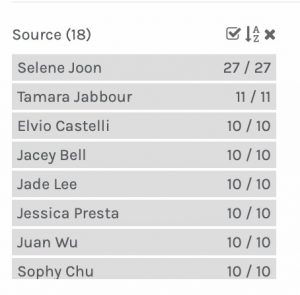
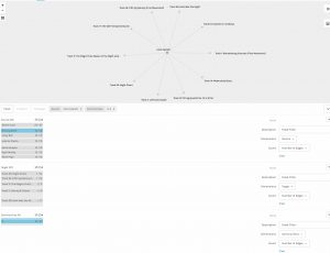
The most common tracks selected were #3 (Percussion) and #20 (Night Chant), which were selected by all participants. Track #18 (5th Symphony) was selected by all but one, and track #11 (Jaat…) was selected by all but two of the 13.
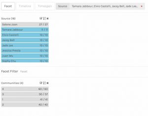
The least common tracks selected were #17 (Clavier), #27 (String Quartet) and #8 (Men’s House Song), all selected only once. Two of those were selected by Elvio, so I isolated Elvio’s selection in the filters. Elvio appears only in Community 3, with Mark and Zoe. Interestingly, Zoe was the only other participant to select one of the singletons. The only track that was common to all three participants in this community was #18–which is not surprising, as that track was selected by 12 out of 13 participants. These three participants appeared to be the most individual in their selections, as even within Community 3, each had one to three choices not shared with the rest of the community
.
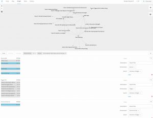
The largest community was Community 4, with six participants, and the common choices to all six were tracks #3 and #20 (both chosen by all participants), and track #25 (Jaat…), which was selected by all but two participants. These six participants appeared to be the least individual in their selections.
I wanted to consider if a cultural bias might influence the choices that were made, and filtered for only the four Western Classical tracks. Only one person did not select at least one of these four tracks, Jocelyn. Jocelyn was not one of the three participants who selected the least common tracks (see above). Jocelyn appeared in Community 4, however, so they had many other selections in common with the five others.
In each of these visualizations, I don’t think any reason for why certain participants made their choices can be determined. Certain hypotheses can be made, but with the data available, they cannot be tested. For instance, one might hypothesize that the inclusion of at least one Western Classical track by all but one participant is indicative of a Western musical training bias, but testing this hypothesis would require more demographic information than was included: cultural background, degree of formal music training, in which genre(s) was a person trained or exposed to in their upbringing, age, gender, etc.– these variables are all missing from the data sets.
The reasons for similar responses cannot be determined from the visualizations, and neither can the reasons why certain tracks were excluded be determined. Visualizations like these can only show correlations, and correlation does not imply causation (JMP, n.d.). A correlation, even a strong correlation like all participants choosing two specific tracks, cannot determine the cause/effect relationships between these variables. Correlations can merely suggest hypotheses, which must then be tested, and we are lacking further data upon which to test. All we can truly conclude is which tracks were chosen the most often, which were chosen the least often, and which people chose more tracks that others chose, and which people chose fewer tracks in common with others.
I, as a science teacher, have always wanted to get a T-shirt made that says “5 out of 4 people don’t trust statistics”.