The most important thing to take from the game is the description of the “game” as a “frustration”. The game is designed to include many of the common elements of webpages that we have been trained to respond to:
- help window at the bottom right (often this is a chat window). It’s position on the right is a strong position to gain attention, as most people will scan a page starting at the top left and moving to the bottom right, diagonally (for Western readers). The only way to have the help screen disappear is to click the button that resembles an “enter” button, and any entered question give you the “please wait” message.
- regular pop up widow screaming that you are running out of time…close button is not obvious, and at lower left (low visual priority)
- Big red banner asking if you are OK with cookies
- selection buttons are pre-filled.
- count-down numbers flashing install panic, and draw attention from task
- the only way to proceed past the demographic collection is to have a mis-match with gender and honorific.
- April Fool’s Day is the birthday that is force-fed to you in the drop down menus
It is my belief that the end of the game is the “Validate” pages…there is an endless loop of “check all checks”
“check all bows”
“check all glasses”
“check all circles”
which are the Captcha-like validators. As selection boxes for the bottom row of images were not shown, it is impossible to complete the task.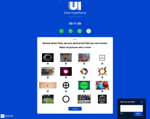
If this was not the end, I did not have the patience to bother figuring out the necessary pattern for success.
Many of the options one might expect to be available are contrary to the options presented – “pre-selected” options and “opt-out” buttons are a common way in which companies will push consumers into subscribing to options they do not want.