All posts by Jocelyn

[12.2] Speculative Futures

Retrieved from https://twitter.com/BKergin/status/1552760072576438272

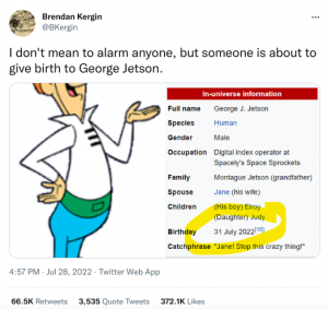
A timely Twitter post about living in the future- someone would have given birth to George Jetson last week! The iconic cartoon show from 1962 shared some fantasies  about what living 100 years from then would be like. I remember scenes from the show of hovercrafts flying around and robot helpers at home- not too far from reality. My two speculative narratives are loosely based on the show with some plausible or even possible events in 30 years. (Dunne & Raby, 2013) 

In the Leading Lines podcast, one of the panelists,  Doug Fisher, references how digital technology could support IEPs for all students. I used this as a guide for my design as well as incorporating the HyperHuman design by IDEO from Core77 as part of the narrative. As an elementary teacher, the future of education and the role of the teacher will be greatly impacted by AI. Educators will need to refine and advance their skill sets to stay relevant in the field. That is the origin of my storyline- how technology can be implemented to enhance the profession in a utopian perspective, but also threaten it from a dystopian viewpoint. As Harari (2017) predicts in her article, “In the twenty-first century, if the masses lose their economic value they might have to struggle against irrelevance rather than exploitation.” This could be the downfall to AI in education replacing human jobs.  If my career plans are in place, I should be retired in 30 years, so I wonder if I would have the opportunity to live this narrative, or at least some parts of it. 

The speculative design itself- the “EdVe”- is a robot EA that uses AI to support the teacher in planning lessons and assessments. Its main feat is the ability to generate Individualized Education Plans for each student that is connected to a personalized augmented reality machine used to transform the learning experience. Please enjoy the video below:

References:

Dunne, A. & Raby, F. (2013). Speculative Everything: Design, Fiction, and Social Dreaming. Cambridge: The MIT Press. Retrieved August 30, 2019, from Project MUSE database.

Hariri, Y. N. (2017). Reboot for the AI revolution. Nature International Weekly Journal of Science, 550(7676), 324-327.

All pictures in the video from https://www.istockphoto.com

[11.3] Algorithms of Predictive Text

Everytime I think about our future, I am hopeful for what it holds. I think about my girls, all grown up, in a world that chooses selflessness over selfishness and to spread kindness whenever possible. I hope my girls use the power of technology to connect to and learn from others, while embracing the diversity that exists around them. 

When was the last time you opened the front door to grab the daily newspaper and flipped through to your favourite section while getting black ink on your hands? It’s more likely that you unlock your phones to open an app, like Twitter, and begin to scroll through the newsfeed as you read updates. How we consume and produce information has changed over the years. I am frequently checking my Instagram account (more than I’d like to admit) and find much of my parenting information on the platform by following experts in the field. The IG algorithm also ensures that more of these similar accounts show up on my feed and I am able to read a compact amount of information in a shorter period of time.  These short statements are typically used on social media platforms to share  personal opinions or experiences. These microblogs have exacerbated the need to constantly share and post about our everyday doings- from taking pictures of our food to tagging our location. I would ask, is it really necessary? By condensing our thoughts into these bite-sized captions, often accompanied by a # or picture, it limits the in depth conversations and analysis, focusing on the entertainment value and the number of likes rather than the content itself. In this regard, I think it alters the way we write, as we want to be perceived in a certain light or to capture a wider audience- adding emojis to make it more light-hearted or tagging a friend/ company to receive a response. Moreso, predictive text takes away some agency over the writing process as it guides the sentence structure and selects the next word to resemble your voice. 

When I was generating my post on IG, the  software was able to correct my spelling errors (notably,  separating the words every-time) and predict a few of my words. Interestingly, as I was typing out the first few letters, it was able to predict the root word but not in the correct grammatical sense. For example, the word ‘hopeful’ came out as ‘hoping’, suggesting that my sentence would continue. Based on the context of the statement, the software was able to decipher my thoughts by drawing from hundreds of words and phrases that were used in the past. Since I used my iPhone for this task, there could also be an abundance of data drawn from a larger dataset from other Apple devices. 

In terms of other textual products, I would argue that these statements are not commonly found in academic articles or novels, it is more likely to find such writings in magazines. That being said, there is potential for algorithms to be used in those contexts in a way that captures the specific topics by selecting from a more discrete data set.  As AI systems learn personal typing patterns, it has the potential to streamline work and to improve productivity. Moreso, for education, this algorithmic technology used to predict text can assist students in writing tasks, particularly for those students who may struggle to start generating ideas by making the process less frustrating. These deep learning software have the potential to become more adaptive with the context and more accurate with its capabilities to target domains by suggesting certain words.  

[10.2] Attention Economy: Sophy

Linked to the post: https://blogs.ubc.ca/etec540thc/2022/07/23/task-10-attention-economy/

Even before I began playing the game, I recognized the irony of the name “Inyerface”, now fully understanding why this game is truly “in-your-face” as I attempt it to completion. Only 2 minutes into the game, I found myself clicking aimlessly in hopes of leaving the timer screen. Sophy and I shared the same sentiment towards this game- a level of frustration beyond measure. Her reference to Don Norman’s concepts in design and use of genial.ly to highlight the misleading signifiers was an effective  approach to emphasizing  UI/UX. These ‘unintuitive’ signifiers are suggestive of  deceptive user interfaces that are used to manipulate our responses to perform a forced action. Adding to Sophy’s example of the ‘opt-in’ boxes, this is similar to  one of the tricks employed for the A/B and multivariate tests to elicit user preferences (Brignull, 2011). To give a name to these signifiers, I found this infographic informative in detecting some of the most common dark patterns that businesses may use to force them to do something that is not in their interest. (Khindri, 2021) 

Taking Sophy’s researching style leads to asking and observing her roommates’ interactions with the game, I sought out my own expert advice on UI/UX- my sister, who worked as a project manager at a technology studio to design some of the interactive exhibits at Vancouver Science World.  She provided me with a case of a poor UI suggestion where the client wanted to put the “x” for the exit screen on all four corners of the app on the iPad. This correlates to Sophy’s comment about our expectations and habits as users in the online environment, where we are conditioned to look at the upper right corner for that “x”. As we navigate our lives in an online space, we may have become so comfortable and familiar with a certain design but serves as a reminder to  be more cognisant of traps that still exist and require our attention. 

Khindri, D (2021, July 9) 10 Common Dark Patterns in UX and How to Avoid Them. Net Solutions. Retrieved from https://www.netsolutions.com/insights/dark-patterns-in-ux-disadvantages/

[9.4] Golden Curation Network Assignment: Mark Pepe

Linked to the post: https://blogs.ubc.ca/etec540mpepe/2022/07/10/8-2-golden-record-curation/

Written like a true musician. I purposely  chose  Mark’s Golden Record Curation task to link to because I remember his musical background from another course that we took together. Given his expertise and talents in this field,  I wanted to know about his  reasoning for the song selections. As one might expect from his music  background, Mark’s trained ears warranted a theoretical approach to this task as he analyzed the elements of each piece and found the universal components. As I listened to the excerpts again, I was drawn to distinct aspects that Mark drew attention to in his analysis such as the contrast in Mozart’s “The Magic Flute”. 

In terms of comparisons, we shared four of the same top 10 picks but for different reasons.  While Mark was able to identify the details of the instruments and specific elements, I listened to the song as a whole, placing an emphasis on the emotions that were brought to surface. Our personal preferences and appreciation of certain musical genres were dictated by our context. Now translate this to space. Given the purpose of the Golden Record was to share a glimpse of humanity with extraterrestrial life forms, would they be able to make meaning of our message through music? In the Scientific American article aptly titled “Voyager Golden Records 40 Years Later: Real Audience Was Always Here on Earth”, the significance of the record is, in actuality, for us humans to “inspire us to broaden our minds about what it means to be human; what we value as humans; and about our place and role in the cosmos.” (Wright, 2017). Fast forward to 2022, in a time where we are even more connected by the internet and the wealth of information through digitization,  we have the opportunity to learn from one another and from our past. The question becomes, how are we going to use this power to join humanity and appreciate our differences?  So I am left with the quote “Music makes the world go around” It is through this simple music curation task that we can find ways to relate to one another and connect to people and cultures globally. 

Wright, J (2017, August 14)  “Voyager Golden Records 40 Years Later: Real Audience Was ALways Here on Earth”. Scientific American. Retrieved from: https://www.scientificamerican.com/article/voyager-golden-records-40-years-later-real-audience-was-always-here-on-earth/#:~:text=The%20Golden%20Records%20mark%20our,flag%20of%20exploration%20in%20space.

[9.2] Network Assignment Using Golden Record Curation Data

Upon first glance of the data presented in the graph, it was an overwhelming amount of information spread across the web. With further dissection of the data into communities (and the help of Ernesto), I found myself situated in a group of six with Jessica, Katie, Jacey, Sage and Kayli. It was also helpful to filter by the size of the nodes to determine which targets held the most weight. In our group, we all selected Night Chant and Jaat Kahan Ho as one of the top 10 songs from the Golden Record. There were four more tracks that 5  of us shared in common and each of us had individual outliers that we chose. Upon further analysis of this data by reading my peers’ blogpost on their selection process, it would seem that these commonalities occurred because of our desire to cast a wide range of musical selections with more diversity. As Sage aptly explained in her justification process, “I wanted to create a ratio that was more representative of humanity”. 

This reasoning seemed logical for our grouping but upon deeper analysis of the entire dataset it appeared that these two songs had a high degree of connectivity for the entire class. Therefore, unlike my original assumption, it is not because we share these two songs that we are in the same group. That begs the question, why did the algorithm put us together in Community 4? Looking at the wider scope, it could be because of the number of connections between one or more group members that are similar. Our common null choices could also be considered in the algorithm that created these facets. 

The quantifiable data visualizations do not consider the qualitative nature of the selection process. Whereas each of our group members had different criteria to either include or exclude tracks, whether it be on emotional value, personal experience or ‘decipherability’ as Sage decided, there are multiple paths that can be taken to garner the same results. The political implications of this filtering criteria causes a discrepancy between the intent and the outcome. That is, opposing political groups may reach the same conclusion in different contexts as a result of missing or assumed data that is not aligned with the intent. Take for example the controversial topic of vaccination status.  One might make assumptions about a person’s educational background, political views and even religion without truly understanding the reasoning.  Even a topic as simple as mask wearing can cause tension between groups because of assumptions or misinterpretations for a person’s decision. These choices or results in data are not a direct reflection of one’s identity as it fails to consider the underlying intentions.

[8.2] Golden Record Curation

*click on the image to go to an interactive map of “My Top 10 Tracks from the Golden Record” on genial.ly*

A snippet of time in space. I was interested to learn how the Gold Record would capture the cultural diversity in music that exists in the world to share the story of humanity with interstellar life forms. There was a variety of musical genres from classical, to jazz and the blues. It also included some prominent languages from around the world.  As noted in the podcast by Dallas Taylor, “Music is non-specific but communicates something to someone”. From this inclusionary lens, I selected a compilation of songs that I was not familiar with. In the selection process, I wanted to ensure that there was cultural representation as I narrowed down the list with a mix of both instrumental and vocal music from around the globe. 

1.Senegal, percussion, recorded by Charles Duvelle

The fast paced beat of the percussion instruments was intriguing. After reading about the traditional African drum music, it was interesting to learn that there are certain elements that have influenced American and Cuban music. In the background, I could also hear a wind instrument joining along with the rhythm of the drums. 

2. Mexico, “El Cascabel,” performed by Lorenzo Barcelata and the Mariachi México.

I chose this upbeat song which happens to be a well-known Mexican folk song that means “Little Bell”. At first, it was hard to decipher the many different instruments playing, then I learned that a mariachi band consists of trumpeters, guitarists and violinists. 

3. New Guinea, men’s house song, recorded by Robert MacLennan. 1:20

The vagueness of the title intrigued me. I imagined the playing of the long flutes told a story amongst the men as a form of initiation. The back and forth of the long flutes sounds as if it were a playful  ‘face off’ between the men. 

4. Japan, shakuhachi, “Tsuru No Sugomori” (“Crane’s Nest,”) performed by Goro Yamaguchi. 4:51

The translation of the title of the song “Crane’s Nest” was fitting to the tune of the flute and woodwind as I began to visualize the graceful movements of the crane as it built its home.

5. Azerbaijan S.S.R., bagpipes, recorded by Radio Moscow. 2:30

My initial assumption was that this bagpipe song would derive from Scotland. But the rhythm and almost soft tones were different from my expectations of the Scottish bagpipes.

6. Stravinsky, Rite of Spring, Sacrificial Dance, Columbia Symphony Orchestra, Igor Stravinsky, conductor. 4:35

I can feel the suspense of this sacrificial dance through the dissonance of the string instruments. The Rite to Spring orchestral movement is the score that accompanies a ballet about a young girl who dances as a sacrificial victim. Viewing the 1989 version of this Rite to passage dance, I found it to be quite offensive towards Indigenous groups and the representation of their culture. 

7. Navajo Indians, Night Chant, recorded by Willard Rhodes. 0:57

The sounds from the singer’s voice were airy and enchanting with the rise and fall of the notes. The repetitive melody were characteristics of a chant. It piqued my interest to learn that the night chant is a healing ritual to restore balance between humans and the universe.

8. Peru, wedding song, recorded by John Cohen. 0:38

The woman’s voice sounds as if she is young and innocent, so it was surprising to discover that the chorus of the song translates to “What a fool I was, stupid fool” to serve as warning about marriage rather than a celebration. 

9. China, ch’in, “Flowing Streams,” performed by Kuan P’ing-hu. 7:37

The sounds of this string instrument were unique. The guqin is a seven string musical instrument from China that is plucked. The quaint sounds emanate the calm of the flowing streams. 

10. India, raga, “Jaat Kahan Ho,” sung by Surshri Kesar Bai Kerkar. 3:30

The translation of the title in English “Where are you going along, girl?” features an Indian female vocalist. The woman speaks as if she is relaying imparting wisdom onto the younger generation.

[7.4] Mode- Bending

Click here to view the task.

*Note: Please view it first then click on the links! 

After reading the New London Group article on multiliteracies and applying it to the mode bending task, I drew a connection to  the SAMR model created by Dr Ruben Puentedura as a means to enhance and transform teaching and learning with the use of technology. As Terada (2020) pointed out, educators must determine how and when to apply the strategies to best suit the learners. To engage 21st century learners and a generation of digital natives, there needs to encompass “broad forms of representation” taking into consideration the cultural context and dynamic nature of language (Dobson & Willinsky, 2009). The challenges that exist in using digital technologies to redesign literacy practices involve an understanding on both the production and consumption of the multimodal designs. There is a complex relationship between the design elements. Rather than having to ‘reinvent the wheel’, there is an abundance of knowledge and skills to implement these modes of learning to allow for new meaning-making practices. 

Using the New London Group  diagram of multimodal design of meaning, I began to think of how I could redesign the original visual task to include various other elements of design.  Using the flat 2D image captured with my iPhone as the Available design, I remembered another student’s (Jocelyn Chan) presentation  of the task using the website genial.ly to elevate the design into an interactive sensory experience. Initially, I was searching for a digital tool that would allow me to maximize the modes of representation. Here I will outline how I used some of the modes of meaning: 

  • Linguistic Design: On each of the pages in the slideshow, there are subtitles that are meant to ‘nominalize’ the content on the page. I also took a lighter, slightly more humorous approach to this task using metaphors to support the description of the image. 
  • Visual Design: In order to produce a visually dynamic piece, I included transitions and interactive elements into the slideshow. Furthermore, I decided to highlight each of the items inside the bag  by focusing on individual or groups of items  rather than a holistic approach with all the items in one layout as it was for the original task. 
  • Audio Design: In the background of the slideshow, I included a voice over of a description of each of the elements on the page. This accessible feature would allow for inclusion of a wider range of audiences based on reading ability. 

Arguably, I found it more difficult to include elements of spatial and gestural design into the task. To some degree, there are spatial elements as the audience is redirected to new websites when they click on an image. For example, if you were to click on the image of the board books, it would direct you to a read aloud of the text on YouTube. It takes you to various spaces on the web to gain more information on the topic. The main challenge with this platform was including an audio that fit the timing of the transitions of the page. It took a few tries to ensure that the audio matched with the description. Overall, the use of the platform genial.ly was effective in modifying the original task for the redesign process. 

Reference: 

Dobson & Willinsky (2009) Digital Literacy Cambridge Handbook of Literacy

Terada, Y. (2020, May 4) A Powerful Model  for Understanding Good Technology Integration. Edutopia. Retrieved from: https://www.edutopia.org/article/powerful-model-understanding-good-tech-integration

The New London Group.  (1996). A pedagogy of multiliteracies: Designing social futures.Harvard Educational Review 66(1), 60-92.

[6.4] An Emoji Story: Agnes

Linked to the post: https://blogs.ubc.ca/etec540ag/2022/06/26/task-6-an-emoji-story/

Admittedly, I do not watch many shows and the ones that I do are limited to Netflix, so my guess may seem dated. It wasn’t obvious to me with simply the emojis what the show could be, but based on Agnes’ reflection and some clues (that being one her daughter watches) my prediction would be “The Big Bang Theory”. I’m not even convinced with my answer as the choice of scientist emoji was a woman and there are male scientists. Clearly,  I was very focused on the one emoji and came up with other ideas like “Magic School Bus” or “Bill Nye the Science Guy” (classic TV shows I used to watch growing up) but decided against it as there would be more appropriate icons to use. 

Both Agnes and I used our iPhones  as devices to generate the emoji story and it took a few added steps to have it appear on WordPress. Interestly, Agnes initially began the process using Joypixel on her Chromebook which was not compatible with WordPress. With such universal picture symbols, it would appear that there are still errors in recognizing its functionality across digital platforms- unlike copying and pasting typed words. 

Agnes’ reference to the Objiwe’s cultural use of image content in Bolter (2001) in relation to our cultural use of emojis stood out. Over time, our culture has become so richly immersed in visuals and a reliance on these symbols to evoke certain emotions and convey meanings in a digital space. The emoji lexicon has evolved to represent a diverse range of symbols ranging from religion, professions and even skin colour choices. So much so, they have become part of our popular culture and have been branded into plush toys and clothing lines. In Pardes (2018) article in Wired, she suggests  that  “In the future, as the world becomes increasingly digital and increasingly globalized, emoji will become important tools for translation and communication—a lingua franca for the digital age.” This ‘bridge language’ could potentially allow for cross cultural communication and support inclusion of various audiences that would undoubtedly be better at deciphering the emoji language and stories such as this. 

Reference:

Pardes, A. (2018, February 1). The WIRED Guide to Emoji. Wired. Retrieved from: https://www.wired.com/story/guide-emoji/

[6.4] An Emoji Story

We are immersed in a hypermedia world with constant bombardment of visuals on our screen (Kress, 2005). Emojis influence our digital communication, thus it is no surprise that the word ‘emoji’ was named the word of the year in 2015 by the Oxford English Dictionary (Bai, et al.  2019)  So it would seem simple or second nature to be able to translate our ideas using pictorial representations. This was not the case for this reverse ekphrasis task where the emojis are used to explain the words (Bolter 2001). I found it challenging to find the appropriate emojis to accurately describe the title of the movie and had a strong reliance on text to help convey the message. In my multimodal space, the use of emojis for my personal communication is to enhance the conversation and add emotional value, not to replace the words themselves, so finding icons to match my words was limiting. In this regard, Bolter (2001) suggests that “picture writing lacks narrative power.” 

Breaking down the task itself, I began with the title of the movie which [hint] was a verb itself. Even though there was a diverse collection of emojis, being able to depict the action using the icons was restrictive, each one emoji could have multiple meanings but not one corresponded with the word completely. Furthermore, I used the number of syllables in the single-word title to decide the number of emojis used. After looking up the definition of the title, I carefully scoured through the selection of emojis to determine the most suitable options, not completely satisfied with the result. For the other half of the task,  the use of emojis to describe the plot was more open ended and left to ambiguous interpretation for the reader (Bai, et al. 2019). Following the conventions of reading, I thought of the logical flow and began choosing the images to represent the sequential storyline. This method  was less effective in conveying the semantic meanings in the plot as it provided a gross generalization rather than honing in on the details. The  specificity of written language allows for a precise description whereas the emojis often lacked the subtle nuances when adjectives play a large role. The clarity of the message using emojis may get lost in translation and allows for multiple interpretations. Let’s see what the responses will bring! (Answer is below) 

References: 

Bai, et al. (2019) A Systematic Review of Emoji: Current Research and Future Perspectives. Frontiers in Psychology. Retrieved from https://www.frontiersin.org/articles/10.3389/fpsyg.2019.02221/full

Chapter 4. Bolter, J. D. (2001). Writing space: Computers, hypertext, and the remediation of print (2nd ed.). Mahwah, N.J: Lawrence Erlbaum Associates. doi:10.4324/9781410600110

Kress (2005), Gains and losses: New forms of texts, knowledge, and learning. Computers and Composition, Vol. 2(1), 5-22.


Answer: Hustle

Plot: An American scout finds a talented basketball player in Spain hoping to bring him to America to become a basketball star in the NBA. 

[4.4] Potato Printing: Emily MacDougall

Linked to the post: https://blogs.ubc.ca/etec540emilymacdougall/2022/06/09/task-4-potato-printing/

I was pleased to see that Emily had chosen the potato printing task as I opted for the first paper and pencil option for two main reasons: I did not have the materials readily available and the time consuming nature of having to carve out each individual letter (the perfectionist in me would have to redo it until it was suffice in being identical). Over the holidays, I have created very simple shapes on potato stamps for cards and wrapping paper, so the thought of having to carve out more complex letters was enough to deter me. I love how Emily included her children in the entire process, from choosing the letters to maneuvering them on the page. It would be a lesson in patience as it took 40 minutes to reproduce 10 painted letters  compared to the speed at which I am typing out this 100+ word response.  As Collier mentioned in “Upside Down, Left to Right: A Letterpress Film.”, with the onset of the mechanized forms, we can “change things in an instant” as opposed to having to redo the entire printing process, that of which Emily experienced with changing the direction of the “E” and “L” to make it legible. Furthermore, if we think about the process of remediation explained by Bolter (2001), the idea of ‘fonts’ and Emily’s use of only upper case letters come into mind. I have the ability to choose an array of fonts on my computer for the purpose of the task whereas Emily was limited to straight letters to ease the carving process. Once more, it is a reminder of how technology provides us with an immediate outcome by “accelerating the rate of information production” and an appreciation of how far mechanized forms have improved since Gutenberg’s printing press.