
I will be extending this task into my final assignment, check out my final assignment tab to see the results.
Task 11: Algorithms of Predictive Text
StandardMicroblog #1
Education is not about the risk of being able to make the necessary money for a non governmental organization.
Microblog #2
Every time I think about our future and the kids a lot more stuff like this stuff and it’s not going on anymore.
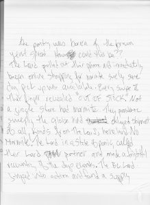
I have played this game of using only predictive text many times throughout this pandemic with many friends and family as a way to laugh at what our phone’s predictive text chooses as words. I have also done something similar where you choose a certain number of emojis in a row from your most recently used list and it pertains to a question like what will your 2021 be like?
The above video shows emoji prediction to which we laugh which month will be and when we should be wary. It’s a game but the reality of how much algorithm plays into this is a bit frightening. The algorithm is calculating which emojis I use most and displaying them for recently used which usually makes choosing them easier and more likely feeding the cycle.
I tried this again in Gmail to see if the predictive text pattern changed. It did a little, it offered me more emojis. The structure of sentence construction also seemed oddly less professional. I would assume text messaging to be the place of language-like “stuff” and not necessarily email. I was, however, still using my phone so rather than google predicting my text I imagine my IOS was still in charge.
From the perspective that the IOS predictive text is machine learning from my pattern of text input, it is interesting to note that as I listened to the podcast “ You are not so smart” I followed along with the text typed in at the beginning. My phone did not use only she for nurse and actually had they or she for doctor. This tells me that it’s not an unlearning algorithm or my text choices would have been the same as the host.
So what has the IOS text prediction tool learned about my speech pattern and what is it assuming? I can tell that because I use my phone a significant amount for my union vice-president’s position which involves messaging a lot of educational issues. The first microblog entry is closer to the words and syntax I would likely use in a professional situation. It’s a repetitive conversation on my phone. The second microblog entry, however, is not given such specific keywords like educational at the beginning and thus likely triggers text prediction more in line with my quick back and for texts with family and friends. The language used is more akin to the quick abbreviated and sloppy language I use with close family and friends. I am actually quite surprised that the machine learning nature of my IOS is so sophisticated when given keywords to provide a little context.
This context-oriented word and syntax choice is potentially a positive part of the algorithm as it lends itself to what Dr. Cathy O’Neil outlines about the context of algorithm use. Using context to require decision tree analysis for fairness is likely not how my predictive text works and pattern-based learning is likely the case. The patterned-based mechanism of my text prediction would allow for a pseudo decision tree outcome because it supports the idea of two contexts, however, it is likely that it is simply the self-propagating cycle as found in codifying recidivism which is discussed in many of this week’s podcasts. My use of the word educational moves the predictive text into a pattern of language that is more in line with how I respond to professional messages. It’s a false sense of learned fairness.
This kind of surface support for the use of predictive text is very similar to the false sense of the efficacy of Comcast in measuring crime rates. At first glance, it looks as though it is doing its job but where is it not doing its job? That is why I wrote the second microblog and email. I gave the text predictor all the data by copying and pasting the previous text for context, and the resulting text produced for the email remained in the colloquial language I use with family and friends. The algorithm could not predict which kind of text I was writing as it is only codified to make a best-guess prediction based on what was initially input, likely based on the information from the Enron emails, and maybe text patterns I have created. The amount of texting I do is heavily weighted toward short bursts with family and friends.
Text prediction on IOS is a far cry from sentencing algorithms or health prediction algorithms for insurance agencies, its bearing on my life is an annoyance, not life or death. I have the opportunity to override the algorithm by typing my chosen text. When algorithms are relied upon blindly as Dr. O’Oneil points out we lose the ability to interject fairness from a human decision-making process and view it as a score created from science and thus void of bias. The codified and amplified societal bias is embedded in algorithms. This bias is amplified over time as more data in the self-perpetuating cycles of ill-used algorithms feeds the machine learning.
I had a unique experience at the BC TECH Summit listening to the emerging field of AI ethics a few years back. Ultimately the questions asked by Dr. O’Neil were echoed in this research. What needs to be written into law, constitution, governance in order to demystify algorithms and create awareness and transparency of how they are created and what kind of collated data they are creating. How do we ethically use algorithms as a powerful tool that is also just? Military, political, health and judicial systems and decisions are made internationally based on data collated by algorithms. The widespread issue of racism is amplified in those decisions. Imagine we use an algorithm to predict which group will be the next terrorist group to strike. You need only follow the media trail of terrorist rhetoric to know that an algorithm based on the published information of terrorism is going to predict that the next group will be from the middle east. What if that drove all military action. The racism present in the media coverage of terrorism could roll the military machine into war with a middle eastern country that is benign.
Algorithms are powerful tools and are currently being used in the wild, wild west landscape of modern data-driven society. We need to establish checks and balances to create a fair and just system that uses algorithms as a tool with awareness for bias.
References
McRaney, D. (n.d.). Machine Bias (rebroadcast). In You Are Not so Smart. Retrieved from https://soundcloud.com/youarenotsosmart/140-machine-bias-rebroadcast (Links to an external site.)
O’Neil, C. (2016). Weapons of math destruction: How big data increases inequality and threatens democracy (First edition). New York: Crown.
O’Neil, C. (2017, April 6). Justice in the age of big data. Retrieved June 18, 2019, from ideas.ted.com website: https://ideas.ted.com/justice-in-the-age-of-big-data/
O’Neil, C. (2017, July 16). How can we stop algorithms telling lies? The Observer. Retrieved from https://www.theguardian.com/technology/2017/jul/16/how-can-we-stop-algorithms-telling-lies (Links to an external site.)
Santa Clara University. (2018). Lessons from the AI Mirror Shannon Vallor.
The Age of the Algorithm. (n.d.). In 99 Percent Invisible. Retrieved from https://99percentinvisible.org/episode/the-age-of-the-algorithm/
- TED-Ed. (2013). What’s an algorithm? – David J. Malan.
- Vogt, P. (n.d.-a). The Crime Machine, Part I. In Reply All.
- Vogt, P. (n.d.-b). The Crime Machine, Part II. In Reply All.
Task 10: Attention Economy
StandardUser Inyerface by Bagaar, was an excellent foray into how UI design has become so patterned. When navigating computer-based content we have come to expect certain things from our experience. Growing up learning computing from before there was a GUI, I can look back and see how things have changed. Computers went from something you needed some expertise to control, to something an expert controls for you to use. How did that switch come about?
I don’t think it’s groundbreaking to say that technology-based devices are consumed not often harnessed for creation outside of their market purpose. Even when creating it is likely that a person is using the software and hardware for the purpose it was designed. I don’t know too many people sending rockets to the moon using a smartphone, even though the computing power of the smartphone is far superior to the computing power used in the first flights to the moon. So why the change? In my opinion, technology has become more about convenience than innovation. Consumer buying power is driven by convenience, e-commerce apps show that consumer buying power is about Individual Internet worth. The worth of the individual is important in weighted networks of the consumer coupled with social media. This worth was recently explored in India where the e-commerce market is still developing. As outlined by (Ahuja & Khazanchi, 2016), E-commerce is governed by several factors: Convenience, Collaboration, Hedonic Motivation, Habit, Degree of Internet Savviness, and Internet worth. These factors create a dichotomous App Adoption Strategy
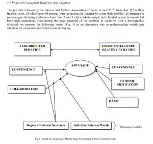
(Ahuja & Khazanchi, 2016).
How do UI and Inyerface by Bagaar play into this model of consumption? If we explore the golden rules of UI design the link between consumer adoption of technology and GUI creation becomes more apparent. The golden rules of design as outlined by ADOBE are as follows:
“The UI design principals are:
- Place users in control of the interface
- Make it comfortable to interact with a product
- Reduce cognitive load
- Make user interfaces consistent (7 et al., 2019)”
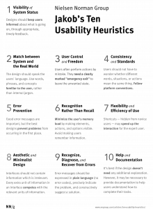
In order to explore these, you have to dive into their origins. Why are these the “golden rules?” Jakob Neilsen began writing about heuristics in design in 1994 and continues to write to date. He has even created a poster series of the 10 Usability Heuristics(click here).
Ben Shneiderman has distilled these into 8 rules of UI design and published them in the book “Strategies for Effective Human-Computer Interaction: Sixth Edition, Pearson” As stated above Adobe has further distilled the principles to the 4 Golden Rules.
All of these rules are linked to patterns of attention in user interaction with computer technology. Natural Mapping is a key component to the patterns habituated by users and can be seen as one of the backbone theories for the UI golden rules.
Natural mapping has its roots in the ’50s with the now-famous Fitts law in which Paul Fitts and Charles Seeger experimented with stimulus-response effects using sidedness. As outlined by Sherwin, this has become a practice for design whether physical design like the placement of cooktop knobs or App and GUI design where natural patterns dictate navigational tools. I found the quiz by Bruce Tognazzini really informative as to how this has translated into software construction ( click here for quiz).
Natural Mapping is the psychological link to why Ahuja & Khazanchi include Hedonic, Habit, and Internet Savviness as part of their criteria for app adoption. App’s are designed using UI golden rules to capitalize on the natural mapping of software navigation tools created within a GUI starting with Apple’s first GUI and carrying on into modern-day app development.
Inyerface by Bagaar is so interesting as it forces the individual playing to ignore the natural mapping for interaction with the software. It negates the golden rules of UI design in many ways. It places distractor buttons like lock and unlock in a place that would normally equate to okay or cancel. The close mechanisms for pop-up windows were not where you would anticipate (top right for windows users, top left for Mac) moving them to the bottom in fine print, forcing the user to read every piece of text on the screen in order to navigate. This is shown in psychology to be the opposite of how we navigate digital content (Brignull et al., 2011). The overall experience is frustrating and counterintuitive to natural mapping patterns so critical to the golden rules of UI design.
I did manage to complete Inyerface but it was a slow and very frustrating experience.

The GUI structure relies on natural mapping but that is not to say that is not malleable. Dark patterns are the purposeful manipulation of that psychology used to steal attention within a given application. Manipulating user experience through natural mapping and other psychological information to steer users to increase their Individual Internet Worth with a given business in order to weigh social networks in favour of their platform. From e-Commerce to social media and news sites, dark patterns are used to manipulate natural mapped patterns to move users to spend more time, money, and energy where they want it. The job of the UI designer is to follow the golden rules to make the experience hedonistic, while also manipulating rules to create patterns that suit the attention-seeking nature of Individual Internet Worth, centred on their product/platform often under the guise of service. The psychology of design especially with the addition of dark patterns is about attention control.
References
7, N. B. O., Babich, N., Words by Nick Babich Nick Babich is UX architect and writer. Nick has spent the last 10 years working in the software industry with a specialized focus on research and development. He counts advertising, Babich, W. by N., Nick Babich is UX architect and writer. Nick has spent the last 10 years working in the software industry with a specialized focus on research and development. He counts advertising, Babich, N., … May, M. (2019, October 7). The 4 Golden Rules of UI Design: Adobe XD Ideas. Ideas. https://xd.adobe.com/ideas/process/ui-design/4-golden-rules-ui-design/.
Ahuja, V., & Khazanchi, D. (2016). Creation of a Conceptual Model for Adoption of Mobile Apps for Shopping from E-Commerce Sites–An Indian Context. Procedia Computer Science, 91, 609–616. https://doi.org/10.1016/j.procs.2016.07.152
Ben Shneiderman. (2016, May). https://www.cs.umd.edu/users/ben/goldenrules.html. From his book Shneiderman, B., Plaisant, C., Cohen, M., Jacobs, S., and Elmqvist, N., Designing the User Interface: Strategies for Effective Human-Computer Interaction: Sixth Edition, Pearson (May 2016) http://www.cs.umd.edu/hcil/DTUI6
Brignull, H., Barth, L., Wagner, J., Gilbert, R., Nugent, L., & Patterson, M. E. (2011, November 1). Dark Patterns: Deception vs. Honesty in UI Design. A List Apart. https://alistapart.com/article/dark-patterns-deception-vs-honesty-in-ui-design/.
First Principles of Interaction Design (Revised & Expanded). askTog. (2014, December 18). https://asktog.com/atc/principles-of-interaction-design/. First Principles of Interaction Design” is copyright 1978-2014 by Bruce Tognazzini.
Nielsen, J. (1994, April 24). 10 Usability Heuristics for User Interface Design. Nielsen Norman Group. https://www.nngroup.com/articles/ten-usability-heuristics/. Apr. 24, 1994; Updated Nov. 15, 2020
A Quiz Designed to Give You Fitts. AskTog. (n.d.). https://www.asktog.com/columns/022DesignedToGiveFitts.html.
Sherwin, K. (2018, October 14). Natural Mappings and Stimulus-Response Compatibility in User Interface Design. Nielsen Norman Group. https://www.nngroup.com/articles/natural-mappings/.
Waldman, A. E. (2020). Cognitive biases, dark patterns, and the ‘privacy paradox.’ Current Opinion in Psychology, 31, 105–109. https://doi.org/10.1016/j.copsyc.2019.08.025
Task 9: Network Assignment Using Golden Record Curation Quiz Data
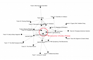
StandardIn exploring the groupings created in Palladio from the golden record survey, I was struck first by the outlier tracks, those tracks on the edge of the graph that if we analyze the graph as a weighted graph, we can see that their degree of connectivity is significantly less (Systems Innovation, 2015).
Why did those songs get chosen less often? They are of diverse geographical nature, and a mix of instrumental and human voices, as well as gender diverse, so what caused them to be chosen less often? This type of metric for data display does not give causal evidence as to why each node has a higher or lower degree of connectivity simply that it is or is not more or less connected. This is telling about the algorithm used to create these facets using degrees of connectivity to create a closed graph of nodes. A computer just follows the instructions of the algorithm used to make the graph (BBC,2017). The qualitative nature of track choice is not evident in this matrice as it does not translate into a set of instructions in this software. This is a sorting algorithm not unlike Bubble Sort or Merge Sort (see the video clips below).
Originally on BBC currently MindLensMovies. (2017). “The Secret Rules of Modern Living Algorithms” – Documentary. https://www.youtube.com/watch?v=kiFfp-HAu64.
Could you create a graph that quantifies the qualitative nature of song choice? Yes, but it would be infinitely more complicated. This would be more like how PageRank works, and the survey would require many more questions. I love the visual explanation of PageRank in the video “ The Secret Rules of Modern Living” by the BBC. I use this video to begin discussing computer programming, algorithms, and networking with the students I teach (The Internet: How Search Works 2017)
Originally on BBC currently MindLensMovies. (2017). “The Secret Rules of Modern Living Algorithms” – Documentary. https://www.youtube.com/watch?v=kiFfp-HAu64.
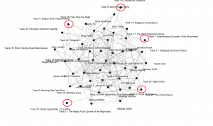
I turned my attention to my group and the track choices that sorted us into our own facet of the network. Each of us had a common set of three tracks as shown below.
The degree of connectivity for each track outside that center ring decreases until you can see that some tracks were only chosen by one person.
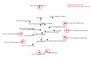
It was interesting to note which people had more degrees of connectivity within our facet. Ryan is the most connected to all of us, and me being the least. Facets are connected together through any track choice, with varying degrees of connectivity of those tracks. If we consider each facet its own graph you can see how quickly an adjacency matrix becomes complicated.
I took our individual explanations of why we chose our tracks and copied the text into a word art generator to get an algorithmic look at the word choices we used in our explanations. I am not sure of how the words are ranked in size but I assumed it was based on the number of repetitions in the text. This gives a very inaccurate visual look at how our qualitative decision-making was done.

If you read our explanations and compare criteria, it is interesting to note that I chose based on geography and everyone else in the group was fairly specific about not choosing based on geography, and yet we ended up in the same facet. This cements the idea that the qualitative data behind the choice is not represented in the graph created by sorting and degrees of connection.
None of these connections are directed and creating walks through the whole class graph only shows the complexity of the travelling salesman problem. I do like that mathematicians have turned to nature to potentially solve this problem by looking at bees; although, it is through heuristics (see the clip below).
Originally on BBC currently MindLensMovies. (2017). “The Secret Rules of Modern Living Algorithms” – Documentary. https://www.youtube.com/watch?v=kiFfp-HAu64.
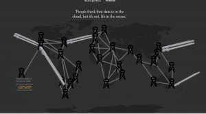
What does all of this mean to data presentation and computer searching? I think our ability to interpret data and our ability to search for answers within a data set is only as effective as the algorithms we create to compile data into something understandable. The advent of the computer and subsequent transcontinental physical connection of servers that house data are only the water tanks connected to the pipes.
Water tank and pipe analogy
Satariano, A., Russell, K., Griggs, T., Migliozzi, B., & Lee, C. W. (2019, March 11). How the Internet Travels Across Oceans. The New York Times. https://www.nytimes.com/interactive/2019/03/10/technology/internet-cables-oceans.html.
The consumption of water is where computing both machines and humans comes into play. This is a problem unique to the computer age. Information repositories and dissemination of information would have been much slower and much more selective before the advent of the computer, and the subsequent creation of the Internet and Web. Data storage was from stone petroglyphs to the printed book. As we discussed in previous weeks, currently knowing which information to store, and how and where it will be accessed is very difficult. There is more data out there than can be processed by a single machine. Perhaps quantum computing will create processing power that can match the quantity of data created by humans and then perhaps we will be able to create algorithms to match that power reimagining our searching and data storage and retrieval.
The full episode of The Secret Rules of Modern Living Algorithms
References
Code.org. (2017). The Internet: How Search Works. https://www.youtube.com/watch?v=LVV_93mBfSU.
Systems Innovation. (2015). Graph Theory Overview. https://www.youtube.com/watch?v=82zlRaRUsaY&t=13s.
Systems Innovation. (2015). Network Connections. https://www.youtube.com/watch?v=2iViaEAytxw.
Nat and Friends. (2016). A Journey To The Bottom Of The Internet. https://www.youtube.com/watch?v=H9R4tznCNB0.
Originally on BBC currently MindLensMovies. (2017). “The Secret Rules of Modern Living Algorithms” – Documentary. https://www.youtube.com/watch?v=kiFfp-HAu64.
Satariano, A., Russell, K., Griggs, T., Migliozzi, B., & Lee, C. W. (2019, March 11). How the Internet Travels Across Oceans. The New York Times. https://www.nytimes.com/interactive/2019/03/10/technology/internet-cables-oceans.html.
Task 8: Golden Record Curation
StandardIn considering the idea that we don’t know what will be important as a collection as outlined in the reading and viewings this week, and with the broadest strokes I could imagine, I tried to pick tracks that were as culturally and geographically diverse as possible. Here is my list:
Task 7: Mode-bending
StandardIn the pedagogy of multiliteracies, There is an explanation of post-Fordism or fast capitalism that assumes that workplaces are flattening the hierarchy. I can see how in the early to mid-’90s that would have appeared as the case, as the optimism of technological literacies was burgeoning in the industrial world. I do, however, think that this did not really manifest itself as postulated, rather than flattening hierarchy in workplaces, it only served to expand the gap of “unskilled” work like in the case of Amazon. Technology is ever-present, but it is used to control unskilled labour, reporting on speed and accuracy of repetitive work, rather than promoting vision, mission or corporate values.
“We know from every other algorithmic audit of these kinds of systems that there are people for whom this kind of tracking and evaluation performs more poorly, and they are the populations already most likely to be surveilled at work and in their communities,” she wrote over Twitter direct message. “Will the motions of employees of colour, of older employees, employees with disabilities be more likely to be misread or determined to be substandard or inefficient, and threaten their employment?”(Morse, 2020)
This serves to support the later assertion that there are two ways to engage workplace discourse “ as opening new educational and social possibilities, or as new systems of mind control or exploitation.”
Civic pluralism as a filler for monocultural nationalism is reaching a fever pitch in western society especially in the USA where the black lives matter movement is publicizing the places in society where wealth, power, symbolism, and dialect are identity markers that determine social class (The New London Group, 1996).
I am forced to evaluate a current situation in my district, like many other districts, where antiracist teachings are coming under fire from senior management in that the mere discussion of historical/current implicit and explicit biases used to discriminate on the basis of race is being grossly misused as a means to evaluate the teaching practices of individual teachers. There is a totalitarian promise of discipline and dismissal. Cohesive society and new civility as a productive resource are being quashed as assimilation in how race literacy is explored is mandated. This is in direct opposition to actively recognizing differences and negotiating them in a way that compliments each other, limiting cultural and linguistic repertoires censoring access to a broader range of cultural and institutional resources (The New London Group, 1996).
As the London group states ending “the public” is essential to making subculture accessible, however, this leads to invasion of private spaces as Kevin Kelly postulated in 2008 we would be willing to give up privacy in order to allow, specifically the Internet, access to total transparency to facilitate convenience of knowledge acquisition and tools or as the London group defines it conversationalization of public language(see Youtube video) (Kelly,2008).
The changing realities outlined by the London group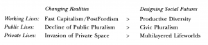
(The New London Group, 1996)
This demonstrates an evolution of literacies and parallels the continuum discussed by Dobson and Wilinsky in Digital Literacies. I would argue that this evolution has not yet completed the transition outline above but rather as Dobson and Wilinsky outline continues to have one foot in the traditional while shifting to the new reality.
The diagram, presented in the London group paper, to create a grammar of modes for people to use in my mind overlaps with the diagrams being used to explain Inclusion by Shelley Moore.
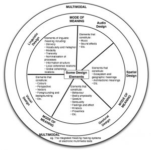
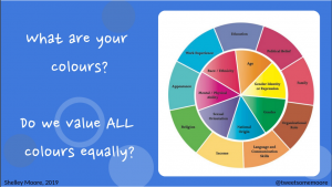
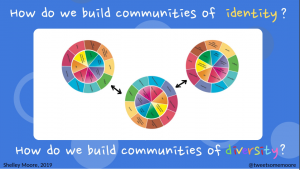
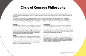
Which in turn mimics the medicine wheel approach to education created by Dr. Martin Brokenleg.

This overlap inspired my reinterpretation of Task 1 changing its semiotic modality. I originally approached this task as an audiovisual task rather than a written task. I went back to reimagine how the instructions could adhere to a multimodal approach to completion while honouring inclusion and cultural diversity. This is a process I have been engaging in with my own lesson planning this year so the idea of what I know to be universal design sprang to mind.
The original task’s goal was an introduction of self, through the lens of what you carry around in your bag. What does this say about you and how that compares to your view of self while paying attention to text, technology and history.
In order to reimagine this task while still accomplishing the same goal. I would rephrase the task to include oral tradition and multimodal interpretation.
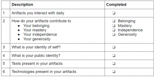
Tell me a story about you. Using objects that you interact with daily, tell me about where you belong, how you are independent, where you are generous or experience generosity and what you have mastered with those objects. Pay attention to how you see those objects contributing to your identity of self and identity of public self. What texts and technologies (see this week’s readings) within your artifacts contribute to your inward and outward self. You may demonstrate this understanding however you see fit ex: blog post, graphic, video, audio recording etc…
Here is a checklist of items you should include (This part is particularly important for learners who need structured and chunked criteria. It is an aspect of inclusion that harms no one and could help everyone. I am making this part up as I wasn’t entirely sure what was the full criteria of the assignment.)
A written example is provided for you. Please feel free to use a reader for audio of the example, or listen to the audio file attached (this is where Dr. Dobson’s example would be. I do think that audio files or at the very least texts that allow for the use of a screen reader are essential… * some of our readings do not allow for the use of a screen reader for example this week’s “A Pedagogy of Multiliteracies” is formatted such that you only hear the footnote text as shown in the video clip)
Here is my reinterpreted Task 1 “What’s in your bag” I filmed this as a meta exercise showing how I film using all of my pieces of text and technology.
References
Brokenleg, M. Circle of Courage. Mantiboa Education. Government of Manitoba. https://www.edu.gov.mb.ca/k12/cur/cardev/gr9_found/courage_poster.pdf.
Moore, S. (2019, January 2). Presentation slide from What is Inclusion? [web log]. https://blogsomemoore.files.wordpress.com/2019/11/pembina-trails.pdf
Morse, J. (2020, December 2). Amazon announces new employee tracking tech, and customers are lining up. Mashable. https://mashable.com/article/amazon-aws-panorama-worker-customer-tracking-technology-smart-cameras/.
The New London Group. (1996). A Pedagogy of Multiliteracies: Designing Social Futures. Harvard Educational Review, 66(1), 60–93. https://doi.org/10.17763/haer.66.1.17370n67v22j160u
TED. (2008). Kevin Kelly: The next 5,000 days of the web. https://www.youtube.com/watch?v=yDYCf4ONh5M.
Task 6: An emoji story
Standard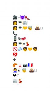
In order to complete this task, I relied heavily on ideas. The concepts of the title and plot summary were paramount. I definitely started with the title as it was the easiest part of the task in this case. I chose this work because my partner and I actually play an emoji game with TV shows and movies from time to time just for fun, and this was the most recent thing we had watched together.
I pondered this task with this week’s writings in mind and found myself thinking emojis are so archaic in their visual representation in the current day. We have so much technology at our fingertips, I would even say emojis have evolved. My Bitmoji collection is far more advanced than the emoji keyboard.
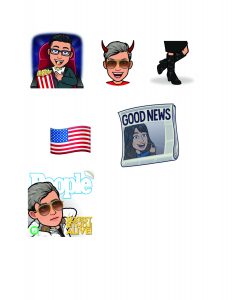
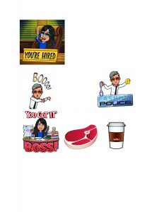
Here is the same sample in Bitmoji’s :
The face tracking version of my analysis.
(All video’s mentioned in animation linked in the transcript below)
Transcript of Animation:
In my opinion, Bitmoji explains it more clearly, granted they are not just visual representations but also include text. What if we were to communicate as seen in Stark Trek the next generation episode Darmok. Is the species that communicate all in metaphor, the oral equivalent of emoji communication?
Perhaps the evolution of writing is more about recreating events with regard to time and energy. Historically, writing has been the more efficient use of time over image creation. The technology for image creation and reproduction has been too time-consuming and did not allow for larger and larger volumes of information to be communicated efficiently. The advent of the computer and cellphone have reimagined what is efficient for recreating the most accurate depiction of an event or thought the “natural state” (Bolter 2001).
Video image and hypermedia give an “easy” or efficient way of more accurately demonstrating an event or author’s position than text alone. This may be less about the evolution of text and more about the evolution of technology to convey the natural state in the case of Medieval writing the audience that was literate and Anglo Saxon was infinitely smaller than the future populations. The ability to print writing matched the size of the audience as it does now with computer technology and population. After the medieval time, populations of those consuming text were out of proportion with the technology capable of producing the increasing volumes of written work re-rendering the technology to writing equations out of balance and plunging the “evolution of writing” back to a more alphabet driven endeavour (Bolter, 2001).
The explosive radiation of technology throughout the globe and its efficiency to recreate the natural state of events and thoughts has realigned the equation of technology to writing allowing for a renaissance of the medieval-style relationship of the image and text.
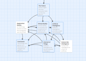
Hypertext and Hypermedia have reestablished the marginal notes of medieval publications (Bolter 2001). The progression of text is directly linked to the evolution of technology associated with recreating the natural state for others. Projecting into the future, we will likely see a serious jump in the evolution of text when the efficacy of 3D environments like Virtual Reality and Augmented Reality become more ubiquitous. These media will create a new way of creating the natural state for others. The ability for thought via computer to be linked to these technologies will even further confound text and natural state.
So why the resistance to change if the shift in communication is to the more natural state. Without exploring this in-depth as there is no time. Economics and Class have the power to resist change in order to preserve the elitist attitudes towards knowledge. This is especially evident in academic writing even more so academic writing that may have an economic value attached as in the case of research leading to patent. The open-access and near-ubiquitous ability of technology to convey the natural state and provided insertion points for all abilities is in direct conflict with the maintenance of capital structures used to perpetuate class as a product of economic wealth and as a mechanism of control. We need only consult the perpetuation of ableism as a demonstration.
The evolution of technology and its subsequent availability to the western population at large has yielded unintended consequences. Voice and knowledge are being given to marginalized populations which in turn is pulling back the curtain on the societal structures maintained to perpetuate class and economic prosperity. See the video on image boards for communication and hear the voices of those long silenced.
Congruent with this line of thinking it isn’t difficult to see how institutions indoctrinated to maintain industrial revolution models of society have been and continue to be resistant to the change in the text as outlined by Kress.
References
Task 5: Twine task
StandardHere is the compressed folder for my Twine task
In order to create this Twine, I built on a very short Twine I created for ETEC 565D. I had to decide how to weave the readings and information from this course into the storyline I had previously created. It was actually a great expansion of why someone might choose to use Twine as the backbone of a learning activity.
I wanted to illustrate how the text has evolved alongside technology as framed by the readings this week, and then make some projections into the future with emerging technologies, culminating in how this would all affect the learning activity I began with.
Creating the weblike structure it took to postulate future technological impacts on text and learning was difficult to visualize until I actually started coding the links and the topography of the web began to take shape on Twine board.
Writing tends to be so linear in consumption and the hypertext world allows for some lateral movement, however, I found the planning for the lateral movement required a chronological and thus linear approach to planning.
I found myself sifting through old assignments from previous classes as mental links surfaced in my creation. I even went as far back as conference notes taken at the BC Tech Summit in 2018. Technology changes at such a rapid rate that following the impact on text and learning has been difficult for me to distill into a single text-based “game.” My reference list is my paired down the use of what I researched as I found myself sliding deeper down rabbit holes I found interesting.
I hope the resulting game in a more coherent way reflects the convoluted path I took to formulating my postulations.
References
Task 4: Manual Scripts
Standard


Task 2: Does language shape the way we think?
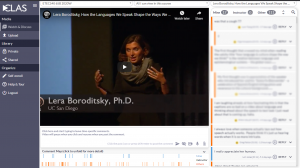
StandardTask 2 : Does language shape the way we think?
This task was completed in CLAS as an annotated video assignment. I really like this software and the interaction it provides collaborators.
Task 1 What is in your bag?
StandardI don’t have a bag right now. All of my bags are empty and have been hanging for almost a year. Check out my video to see how I navigated what’s in my bag.
Hello ETEC 540 Colleagues
StandardWelcome to my site for ETEC 540. I look forward to learning from and with everyone.