
User Inyerface by Bagaar, was an excellent foray into how UI design has become so patterned. When navigating computer-based content we have come to expect certain things from our experience. Growing up learning computing from before there was a GUI, I can look back and see how things have changed. Computers went from something you needed some expertise to control, to something an expert controls for you to use. How did that switch come about?
I don’t think it’s groundbreaking to say that technology-based devices are consumed not often harnessed for creation outside of their market purpose. Even when creating it is likely that a person is using the software and hardware for the purpose it was designed. I don’t know too many people sending rockets to the moon using a smartphone, even though the computing power of the smartphone is far superior to the computing power used in the first flights to the moon. So why the change? In my opinion, technology has become more about convenience than innovation. Consumer buying power is driven by convenience, e-commerce apps show that consumer buying power is about Individual Internet worth. The worth of the individual is important in weighted networks of the consumer coupled with social media. This worth was recently explored in India where the e-commerce market is still developing. As outlined by (Ahuja & Khazanchi, 2016), E-commerce is governed by several factors: Convenience, Collaboration, Hedonic Motivation, Habit, Degree of Internet Savviness, and Internet worth. These factors create a dichotomous App Adoption Strategy
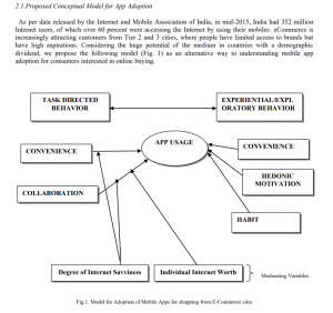
(Ahuja & Khazanchi, 2016).
How do UI and Inyerface by Bagaar play into this model of consumption? If we explore the golden rules of UI design the link between consumer adoption of technology and GUI creation becomes more apparent. The golden rules of design as outlined by ADOBE are as follows:
“The UI design principals are:
- Place users in control of the interface
- Make it comfortable to interact with a product
- Reduce cognitive load
- Make user interfaces consistent (7 et al., 2019)”
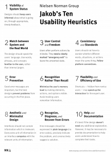
In order to explore these, you have to dive into their origins. Why are these the “golden rules?” Jakob Neilsen began writing about heuristics in design in 1994 and continues to write to date. He has even created a poster series of the 10 Usability Heuristics(click here).
Ben Shneiderman has distilled these into 8 rules of UI design and published them in the book “Strategies for Effective Human-Computer Interaction: Sixth Edition, Pearson” As stated above Adobe has further distilled the principles to the 4 Golden Rules.
All of these rules are linked to patterns of attention in user interaction with computer technology. Natural Mapping is a key component to the patterns habituated by users and can be seen as one of the backbone theories for the UI golden rules.
Natural mapping has its roots in the ’50s with the now-famous Fitts law in which Paul Fitts and Charles Seeger experimented with stimulus-response effects using sidedness. As outlined by Sherwin, this has become a practice for design whether physical design like the placement of cooktop knobs or App and GUI design where natural patterns dictate navigational tools. I found the quiz by Bruce Tognazzini really informative as to how this has translated into software construction ( click here for quiz).
Natural Mapping is the psychological link to why Ahuja & Khazanchi include Hedonic, Habit, and Internet Savviness as part of their criteria for app adoption. App’s are designed using UI golden rules to capitalize on the natural mapping of software navigation tools created within a GUI starting with Apple’s first GUI and carrying on into modern-day app development.
Inyerface by Bagaar is so interesting as it forces the individual playing to ignore the natural mapping for interaction with the software. It negates the golden rules of UI design in many ways. It places distractor buttons like lock and unlock in a place that would normally equate to okay or cancel. The close mechanisms for pop-up windows were not where you would anticipate (top right for windows users, top left for Mac) moving them to the bottom in fine print, forcing the user to read every piece of text on the screen in order to navigate. This is shown in psychology to be the opposite of how we navigate digital content (Brignull et al., 2011). The overall experience is frustrating and counterintuitive to natural mapping patterns so critical to the golden rules of UI design.
I did manage to complete Inyerface but it was a slow and very frustrating experience.

The GUI structure relies on natural mapping but that is not to say that is not malleable. Dark patterns are the purposeful manipulation of that psychology used to steal attention within a given application. Manipulating user experience through natural mapping and other psychological information to steer users to increase their Individual Internet Worth with a given business in order to weigh social networks in favour of their platform. From e-Commerce to social media and news sites, dark patterns are used to manipulate natural mapped patterns to move users to spend more time, money, and energy where they want it. The job of the UI designer is to follow the golden rules to make the experience hedonistic, while also manipulating rules to create patterns that suit the attention-seeking nature of Individual Internet Worth, centred on their product/platform often under the guise of service. The psychology of design especially with the addition of dark patterns is about attention control.
References
7, N. B. O., Babich, N., Words by Nick Babich Nick Babich is UX architect and writer. Nick has spent the last 10 years working in the software industry with a specialized focus on research and development. He counts advertising, Babich, W. by N., Nick Babich is UX architect and writer. Nick has spent the last 10 years working in the software industry with a specialized focus on research and development. He counts advertising, Babich, N., … May, M. (2019, October 7). The 4 Golden Rules of UI Design: Adobe XD Ideas. Ideas. https://xd.adobe.com/ideas/process/ui-design/4-golden-rules-ui-design/.
Ahuja, V., & Khazanchi, D. (2016). Creation of a Conceptual Model for Adoption of Mobile Apps for Shopping from E-Commerce Sites–An Indian Context. Procedia Computer Science, 91, 609–616. https://doi.org/10.1016/j.procs.2016.07.152
Ben Shneiderman. (2016, May). https://www.cs.umd.edu/users/ben/goldenrules.html. From his book Shneiderman, B., Plaisant, C., Cohen, M., Jacobs, S., and Elmqvist, N., Designing the User Interface: Strategies for Effective Human-Computer Interaction: Sixth Edition, Pearson (May 2016) http://www.cs.umd.edu/hcil/DTUI6
Brignull, H., Barth, L., Wagner, J., Gilbert, R., Nugent, L., & Patterson, M. E. (2011, November 1). Dark Patterns: Deception vs. Honesty in UI Design. A List Apart. https://alistapart.com/article/dark-patterns-deception-vs-honesty-in-ui-design/.
First Principles of Interaction Design (Revised & Expanded). askTog. (2014, December 18). https://asktog.com/atc/principles-of-interaction-design/. First Principles of Interaction Design” is copyright 1978-2014 by Bruce Tognazzini.
Nielsen, J. (1994, April 24). 10 Usability Heuristics for User Interface Design. Nielsen Norman Group. https://www.nngroup.com/articles/ten-usability-heuristics/. Apr. 24, 1994; Updated Nov. 15, 2020
A Quiz Designed to Give You Fitts. AskTog. (n.d.). https://www.asktog.com/columns/022DesignedToGiveFitts.html.
Sherwin, K. (2018, October 14). Natural Mappings and Stimulus-Response Compatibility in User Interface Design. Nielsen Norman Group. https://www.nngroup.com/articles/natural-mappings/.
Waldman, A. E. (2020). Cognitive biases, dark patterns, and the ‘privacy paradox.’ Current Opinion in Psychology, 31, 105–109. https://doi.org/10.1016/j.copsyc.2019.08.025