
In exploring the groupings created in Palladio from the golden record survey, I was struck first by the outlier tracks, those tracks on the edge of the graph that if we analyze the graph as a weighted graph, we can see that their degree of connectivity is significantly less (Systems Innovation, 2015).
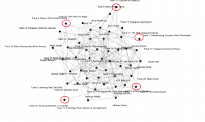
Why did those songs get chosen less often? They are of diverse geographical nature, and a mix of instrumental and human voices, as well as gender diverse, so what caused them to be chosen less often? This type of metric for data display does not give causal evidence as to why each node has a higher or lower degree of connectivity simply that it is or is not more or less connected. This is telling about the algorithm used to create these facets using degrees of connectivity to create a closed graph of nodes. A computer just follows the instructions of the algorithm used to make the graph (BBC,2017). The qualitative nature of track choice is not evident in this matrice as it does not translate into a set of instructions in this software. This is a sorting algorithm not unlike Bubble Sort or Merge Sort (see the video clips below).
Originally on BBC currently MindLensMovies. (2017). “The Secret Rules of Modern Living Algorithms” – Documentary. https://www.youtube.com/watch?v=kiFfp-HAu64.
Could you create a graph that quantifies the qualitative nature of song choice? Yes, but it would be infinitely more complicated. This would be more like how PageRank works, and the survey would require many more questions. I love the visual explanation of PageRank in the video “ The Secret Rules of Modern Living” by the BBC. I use this video to begin discussing computer programming, algorithms, and networking with the students I teach (The Internet: How Search Works 2017)
Originally on BBC currently MindLensMovies. (2017). “The Secret Rules of Modern Living Algorithms” – Documentary. https://www.youtube.com/watch?v=kiFfp-HAu64.
I turned my attention to my group and the track choices that sorted us into our own facet of the network. Each of us had a common set of three tracks as shown below.
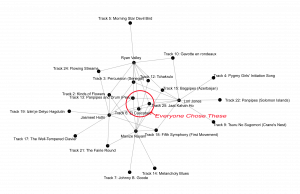
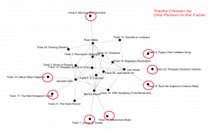
The degree of connectivity for each track outside that center ring decreases until you can see that some tracks were only chosen by one person.
It was interesting to note which people had more degrees of connectivity within our facet. Ryan is the most connected to all of us, and me being the least. Facets are connected together through any track choice, with varying degrees of connectivity of those tracks. If we consider each facet its own graph you can see how quickly an adjacency matrix becomes complicated.
I took our individual explanations of why we chose our tracks and copied the text into a word art generator to get an algorithmic look at the word choices we used in our explanations. I am not sure of how the words are ranked in size but I assumed it was based on the number of repetitions in the text. This gives a very inaccurate visual look at how our qualitative decision-making was done.

If you read our explanations and compare criteria, it is interesting to note that I chose based on geography and everyone else in the group was fairly specific about not choosing based on geography, and yet we ended up in the same facet. This cements the idea that the qualitative data behind the choice is not represented in the graph created by sorting and degrees of connection.
None of these connections are directed and creating walks through the whole class graph only shows the complexity of the travelling salesman problem. I do like that mathematicians have turned to nature to potentially solve this problem by looking at bees; although, it is through heuristics (see the clip below).
Originally on BBC currently MindLensMovies. (2017). “The Secret Rules of Modern Living Algorithms” – Documentary. https://www.youtube.com/watch?v=kiFfp-HAu64.
What does all of this mean to data presentation and computer searching? I think our ability to interpret data and our ability to search for answers within a data set is only as effective as the algorithms we create to compile data into something understandable. The advent of the computer and subsequent transcontinental physical connection of servers that house data are only the water tanks connected to the pipes.
Satariano, A., Russell, K., Griggs, T., Migliozzi, B., & Lee, C. W. (2019, March 11). How the Internet Travels Across Oceans. The New York Times. https://www.nytimes.com/interactive/2019/03/10/technology/internet-cables-oceans.html.
The consumption of water is where computing both machines and humans comes into play. This is a problem unique to the computer age. Information repositories and dissemination of information would have been much slower and much more selective before the advent of the computer, and the subsequent creation of the Internet and Web. Data storage was from stone petroglyphs to the printed book. As we discussed in previous weeks, currently knowing which information to store, and how and where it will be accessed is very difficult. There is more data out there than can be processed by a single machine. Perhaps quantum computing will create processing power that can match the quantity of data created by humans and then perhaps we will be able to create algorithms to match that power reimagining our searching and data storage and retrieval.
The full episode of The Secret Rules of Modern Living Algorithms
References
Code.org. (2017). The Internet: How Search Works. https://www.youtube.com/watch?v=LVV_93mBfSU.
Systems Innovation. (2015). Graph Theory Overview. https://www.youtube.com/watch?v=82zlRaRUsaY&t=13s.
Systems Innovation. (2015). Network Connections. https://www.youtube.com/watch?v=2iViaEAytxw.
Nat and Friends. (2016). A Journey To The Bottom Of The Internet. https://www.youtube.com/watch?v=H9R4tznCNB0.
Originally on BBC currently MindLensMovies. (2017). “The Secret Rules of Modern Living Algorithms” – Documentary. https://www.youtube.com/watch?v=kiFfp-HAu64.
Satariano, A., Russell, K., Griggs, T., Migliozzi, B., & Lee, C. W. (2019, March 11). How the Internet Travels Across Oceans. The New York Times. https://www.nytimes.com/interactive/2019/03/10/technology/internet-cables-oceans.html.
I found your analyses to be very informative, Lori! Thank you for illustrating your ideas with these great video clips!
Interestingly, the results of the analysis in my group were similar to yours – although each one of us had VERY different selection criteria, we ended up sharing many songs together. To me, this means that quantitative analysis that seems to be prevailing in academia, is not enough to reveal the whole story,