
The instructions for this task were to navigate through a misleading GUI game – User Inyerface – designed to distract and manipulate the user by employing what Brignull (2011) refers to as “dark patterns” (essentially, misleading practices involving online interfaces). I ended up navigating through the game in seven minutes and 22 seconds (see below).

Reflection:
I likely could have made it through the game much faster if I had focused less on examining the ways in which it attempted to manipulate and distract me, and instead just earnestly attempted to comply with each item requested of me. Aside from the obvious reason that I knew I would have to create a reflection and therefore wanted to be as perceptive as possible, I didn’t know what the rules of the game were, and whether or not I could lose at some point in time. I was initially concerned that this game might play out in a choose-your-own-adventure style manner like the twine task, and that I would go down a dead-end path that would simply waste my time. However, after not immediately losing the game by selecting (well, attempting to select) the “NO” button on the initial landing page (see “A” below), I decided to worry less about losing by selecting or completing something incorrectly, and focus more on doing whatever I could to satisfy the requirements of each page as quickly as possible to progress to the next.
Overall, I found the game to be way more misleading than manipulative, but at the same time it helped me to reflect on how these dark patterns might be employed in the real world in unethical ways.
As there were so many frustrations that I had while attempting to complete this game – I was very much not a fan of the ways in which it attempted to waste my time – I have decided to focus on four of the major issues:
Issue #1 – Useless Buttons/Hidden Links
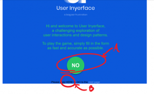
A – Not a button, despite all appearances.
B – Apparently “HERE” is a hyperlink despite the signifying characteristics of a hyperlink being associated with the words “click” and “next page” instead
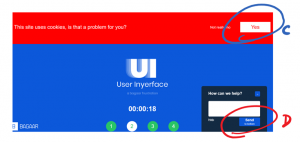
C – Not a button. No option provided for those who have a problem with cookie usage.
D – At first glance, this button looks like it will “send” your message, but instead slowly removes a useless chatbot.
Issue #2 – Double Negative/Explicit Choice Issues
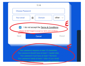
E – Double negative aspect to accepting terms and conditions is not intuitive. Though technically users are forced to make an explicit choice (Brignull, 2011) by deselecting the option, some may do so as a force of habit (as they may associated pre-selected boxes with subscribing to email lists)
Issue #3 – Hidden Information
F – Password requirements are not visible initially unless you scroll down the page (and include requirement of a Cyrillic character)
Issue #4 – Privacy Concerns
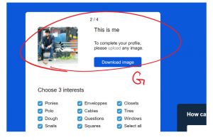
G – Especially considering I didn’t actually read the terms and conditions (that’s another issue altogether), I don’t know what is being done with my photos and information, so I don’t want to share an actual picture of myself: enter Sad Keanu
There were a lot of other frustrations that arose as I worked through this game, including some components which weren’t inherently misleading, but were obviously incorporated due to their poor design. Examples of this include placeholder values on submission forms that didn’t easily erase when selected, and the inability to use the tab button to move between different components of those forms.
All in all, it was quite a frustrating experience to work through the game, and I have to say that I am very glad to be done with it.
References
- Brignull, H. (2011). Dark Patterns: Deception vs. Honesty in UI Design. Interaction Design, Usability, 338.